Tocara
Senior Graphic Designer // 2012–2013
Senior Graphic Designer // 2012–2013
THE PROJECT
Bilingual Catalogue Templates
Nationwide Impact with High-Volume Print-Ready Design
Bilingual Catalogue Templates
Nationwide Impact with High-Volume Print-Ready Design
Situation
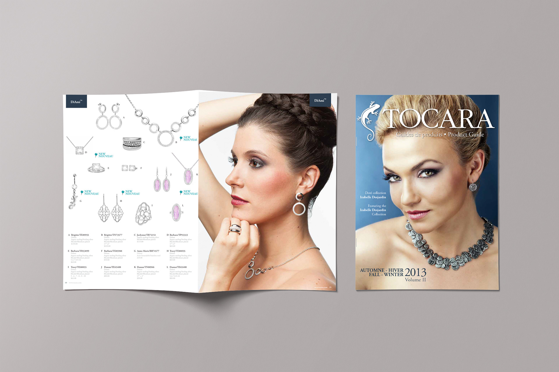
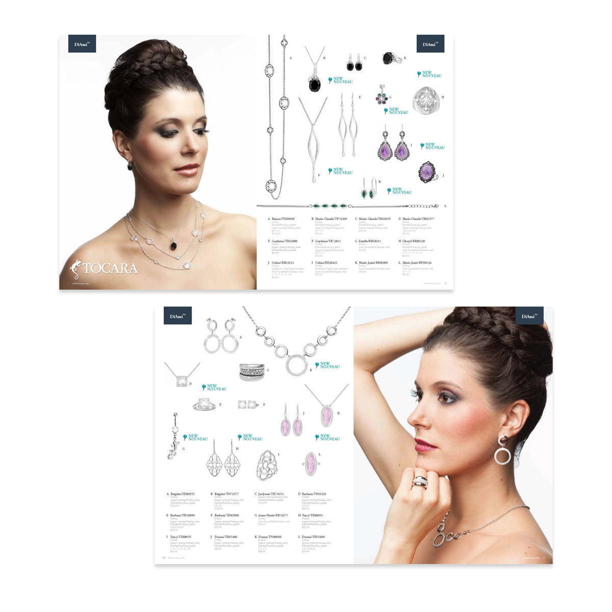
Tocara, a direct-selling jewelry retailer (similar in model to Avon, selling through independent consultants rather than retail stores), needed a reusable bilingual catalogue system for its quarterly editions that could appeal to a diverse Canadian audience while standing up to high-volume national print distribution.
Tocara, a direct-selling jewelry retailer (similar in model to Avon, selling through independent consultants rather than retail stores), needed a reusable bilingual catalogue system for its quarterly editions that could appeal to a diverse Canadian audience while standing up to high-volume national print distribution.
Solution
Using Adobe InDesign, I designed and produced a comprehensive, reusable bilingual (English/French) catalogue template, balancing stunning aesthetics with clear content hierarchy across product photography, specifications, pricing, and promotional messaging.
Using Adobe InDesign, I designed and produced a comprehensive, reusable bilingual (English/French) catalogue template, balancing stunning aesthetics with clear content hierarchy across product photography, specifications, pricing, and promotional messaging.
Execution
I took full ownership of the end-to-end production process, preparing press-ready files with precise bleed, colour management (CMYK plus spot colours), trim marks, and printer-specific requirements to ensure flawless execution at scale.
I took full ownership of the end-to-end production process, preparing press-ready files with precise bleed, colour management (CMYK plus spot colours), trim marks, and printer-specific requirements to ensure flawless execution at scale.
Result
A premium, consistent catalogue delivered in 100,000 units distributed nationwide each quarter, maintaining brand integrity across every page while maximizing visual appeal and sales potential in the competitive jewelry retail market.
A premium, consistent catalogue delivered in 100,000 units distributed nationwide each quarter, maintaining brand integrity across every page while maximizing visual appeal and sales potential in the competitive jewelry retail market.





PRINT DESIGN
Custom Bilingual Brochures
Bilingual Z-Fold & Recto/Verso Brochures
Custom Bilingual Brochures
Bilingual Z-Fold & Recto/Verso Brochures
Situation
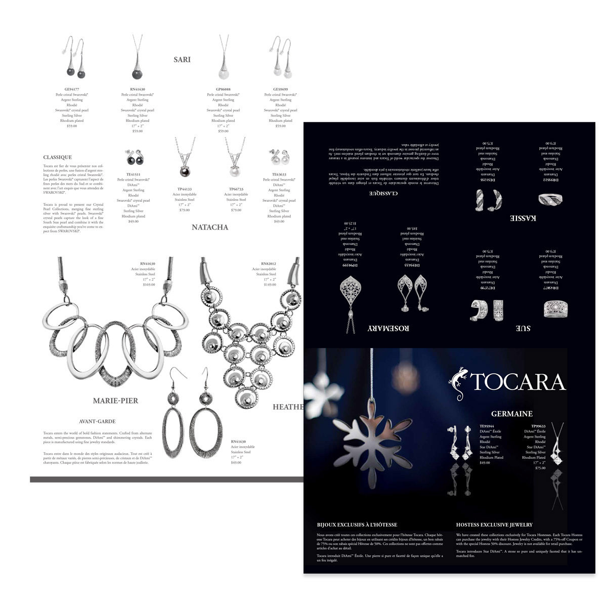
Tocara needed seasonally themed brochures to showcase new jewelry offerings for both in-person events and online access, requiring a bilingual (English/French) format that worked equally well in premium print and as a downloadable digital reference.
Tocara needed seasonally themed brochures to showcase new jewelry offerings for both in-person events and online access, requiring a bilingual (English/French) format that worked equally well in premium print and as a downloadable digital reference.
Solution
Using Adobe InDesign, I crafted Z-fold and recto/verso brochures engineered for dual use: premium glossy print for distribution at events, parties, and retail touchpoints, and optimized PDF versions hosted on the website for easy online access and sharing.
Using Adobe InDesign, I crafted Z-fold and recto/verso brochures engineered for dual use: premium glossy print for distribution at events, parties, and retail touchpoints, and optimized PDF versions hosted on the website for easy online access and sharing.
Execution
I prepared press-ready files with embedded fonts, spot colour management, proper bleeds, crop marks, and PDF/X-1a export standards to ensure flawless execution at the printer. I curated a blend of stock photography, client-supplied product images, and lifestyle visuals, strategically selected and retouched to resonate with the target audience while maintaining consistent colour palette, typography, logo usage, and overall aesthetic.
I prepared press-ready files with embedded fonts, spot colour management, proper bleeds, crop marks, and PDF/X-1a export standards to ensure flawless execution at the printer. I curated a blend of stock photography, client-supplied product images, and lifestyle visuals, strategically selected and retouched to resonate with the target audience while maintaining consistent colour palette, typography, logo usage, and overall aesthetic.
Result
A cohesive print-to-digital system that highlighted seasonal collections, drove customer interest, and reinforced Tocara's premium jewelry identity across both physical and online channels nationwide.
A cohesive print-to-digital system that highlighted seasonal collections, drove customer interest, and reinforced Tocara's premium jewelry identity across both physical and online channels nationwide.