Situation
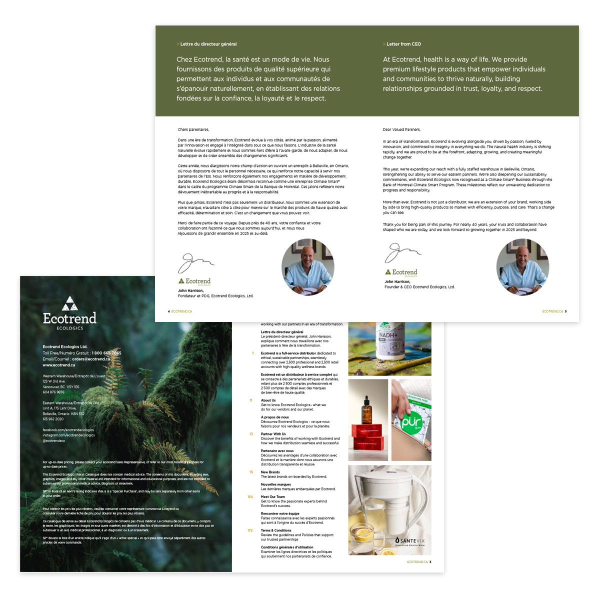
Ecotrend Ecologics, a leading Canadian health and wellness distributor, required a cohesive brand presence across retail and professional channels. Marketing assets were fragmented, catalogues required modernization, and cross-department collaboration needed stronger creative direction to support growth and sustainability goals.
Ecotrend Ecologics, a leading Canadian health and wellness distributor, required a cohesive brand presence across retail and professional channels. Marketing assets were fragmented, catalogues required modernization, and cross-department collaboration needed stronger creative direction to support growth and sustainability goals.
Execution
As Marketing Art Director, I led a cross-functional team of graphic designers, social media specialists, programmers, copywriters, and marketing coordinators to unify and elevate the brand.
As Marketing Art Director, I led a cross-functional team of graphic designers, social media specialists, programmers, copywriters, and marketing coordinators to unify and elevate the brand.
• Directed the redesign of a 100+ page flagship catalogue and mini bilingual version
• Developed bilingual sell sheets, fact sheets, and promotional templates
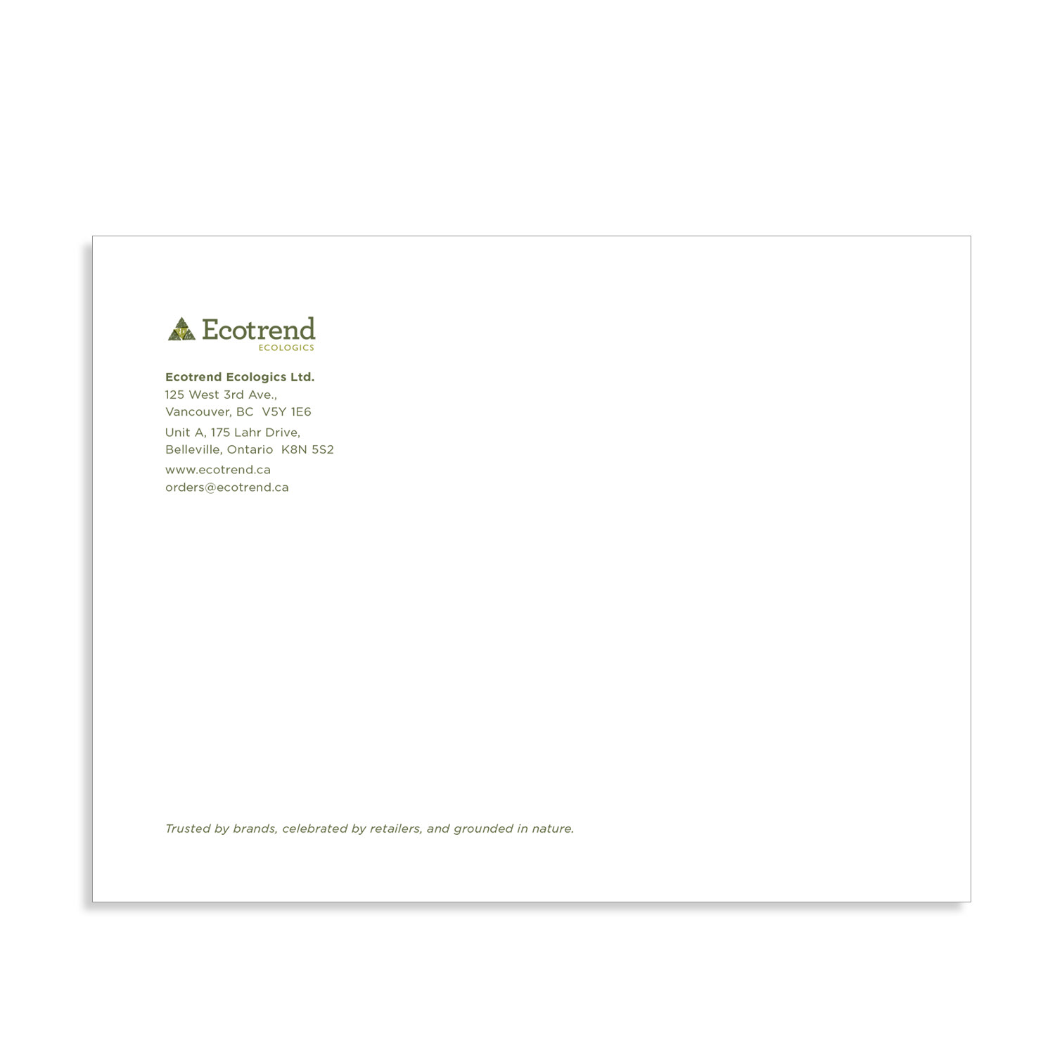
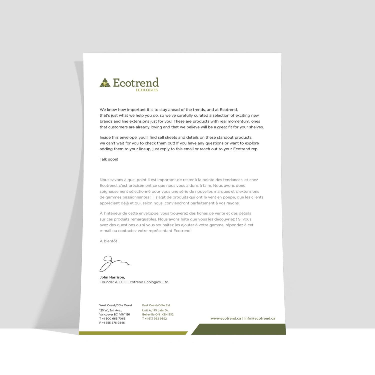
• Created comprehensive brand guidelines and refreshed corporate stationery
• Designed pitch decks, trade show materials, pull-ups, and backdrops
• Built scalable email banners, retail and professional newsletter templates
• Produced monthly promotional campaigns and drop-ship marketing assets
• Collaborated closely with vendor relations, sales teams, ownership, QC, accounting, and external suppliers to ensure brand consistency and operational alignment
• Developed bilingual sell sheets, fact sheets, and promotional templates
• Created comprehensive brand guidelines and refreshed corporate stationery
• Designed pitch decks, trade show materials, pull-ups, and backdrops
• Built scalable email banners, retail and professional newsletter templates
• Produced monthly promotional campaigns and drop-ship marketing assets
• Collaborated closely with vendor relations, sales teams, ownership, QC, accounting, and external suppliers to ensure brand consistency and operational alignment
Result
Delivered a cohesive, scalable brand system that strengthened market presence, improved internal alignment, and supported both retail and professional growth initiatives. Established streamlined marketing workflows and consistent visual standards across all channels.
Delivered a cohesive, scalable brand system that strengthened market presence, improved internal alignment, and supported both retail and professional growth initiatives. Established streamlined marketing workflows and consistent visual standards across all channels.
Scaling a Sustainable Brand Through Strategy + Performance
Focus: Brand elevation, omni-channel growth, vendor marketing systems
Impact: +2,000% sales growth // +1,300% online orders // 27% cost reduction
Focus: Brand elevation, omni-channel growth, vendor marketing systems
Impact: +2,000% sales growth // +1,300% online orders // 27% cost reduction
Situation
Ecotrend, a leading Canadian eco-conscious distributor, was growing fast — but its brand systems, vendor assets, and digital performance needed alignment.
Ecotrend, a leading Canadian eco-conscious distributor, was growing fast — but its brand systems, vendor assets, and digital performance needed alignment.
Solution
Unify the brand. Modernize e-commerce. Scale vendor marketing. Drive measurable growth.
Unify the brand. Modernize e-commerce. Scale vendor marketing. Drive measurable growth.
Execution
Brand Unification: I built a cohesive visual and communication system across:
• 100+ page flagship catalogue + mini bilingual edition
• Trade show materials + pitch decks
• Vendor sell sheets + promotional templates
• Sustainable packaging + print production
• Email and digital campaign assets
Brand Unification: I built a cohesive visual and communication system across:
• 100+ page flagship catalogue + mini bilingual edition
• Trade show materials + pitch decks
• Vendor sell sheets + promotional templates
• Sustainable packaging + print production
• Email and digital campaign assets
Result
A consistent, premium, sustainability-driven brand presence across all channels.
A consistent, premium, sustainability-driven brand presence across all channels.
Omni-Channel Campaign Engine
I developed integrated monthly campaigns spanning:
• Email (14,423 subscribers)
• E-commerce promotions
• Vendor marketing toolkits
• Social + print collateral
I developed integrated monthly campaigns spanning:
• Email (14,423 subscribers)
• E-commerce promotions
• Vendor marketing toolkits
• Social + print collateral
Performance
• 36.6% unique open rate
• 8,632 total opens
• 0.5% unsubscribe rate
• 50+ daily orders generated
• 36.6% unique open rate
• 8,632 total opens
• 0.5% unsubscribe rate
• 50+ daily orders generated
E-Commerce Transformation
I spearheaded a full UI/UX redesign in collaboration with developers.
I spearheaded a full UI/UX redesign in collaboration with developers.
Within 6 months
• +1,300% online orders
• +145% conversion rate
• +2,000% online sales
• +267% sessions
• +1,300% online orders
• +145% conversion rate
• +2,000% online sales
• +267% sessions
The website evolved from functional to high-performing growth engine.
Operational Excellence
Managing a $100K budget, I
• Reduced marketing production costs by 27%
• Researched sustainable printers + materials
• Built scalable vendor template systems
• Streamlined cross-functional workflows
Managing a $100K budget, I
• Reduced marketing production costs by 27%
• Researched sustainable printers + materials
• Built scalable vendor template systems
• Streamlined cross-functional workflows
Impact
Higher ROI. Lower waste. Stronger creative governance.
Higher ROI. Lower waste. Stronger creative governance.
Leadership
I led designers, programmers, coordinators, and vendor partners while collaborating closely with Sales and the Director of Vendor Relations.
I led designers, programmers, coordinators, and vendor partners while collaborating closely with Sales and the Director of Vendor Relations.
Through structured objectives and creative oversight, we delivered consistent weekly growth and strengthened vendor trust across the network.
Result
Strategic brand thinking + performance-driven design resulted in:
• Accelerated digital growth
• Stronger vendor relationships
• Scalable marketing systems
• Elevated market positioning in eco-conscious distribution
Strategic brand thinking + performance-driven design resulted in:
• Accelerated digital growth
• Stronger vendor relationships
• Scalable marketing systems
• Elevated market positioning in eco-conscious distribution
This project demonstrates expertise in brand leadership, omni-channel campaign architecture, e-commerce optimization, cost efficiency, and high-growth creative direction.
BRANDING DESIGN
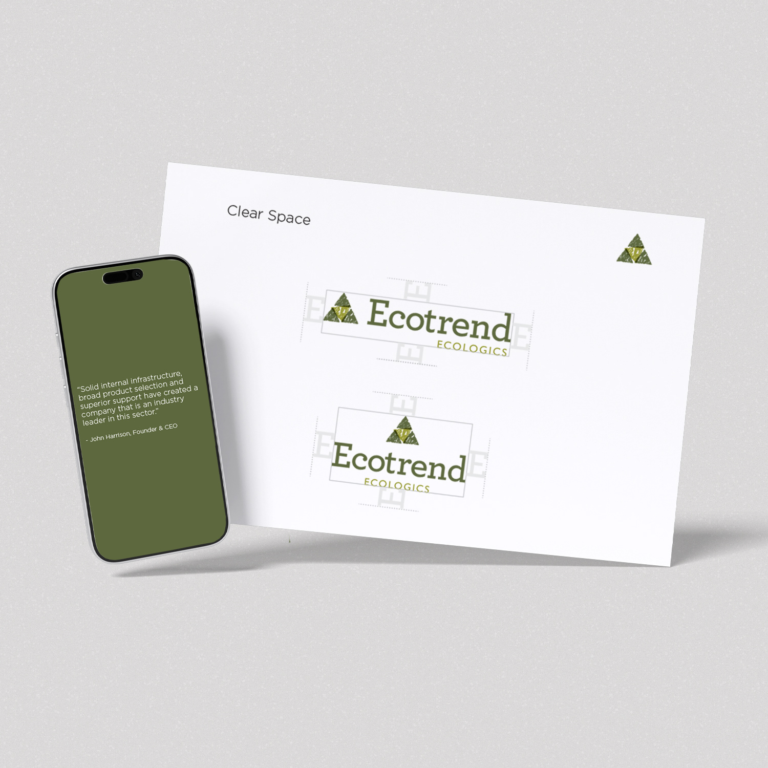
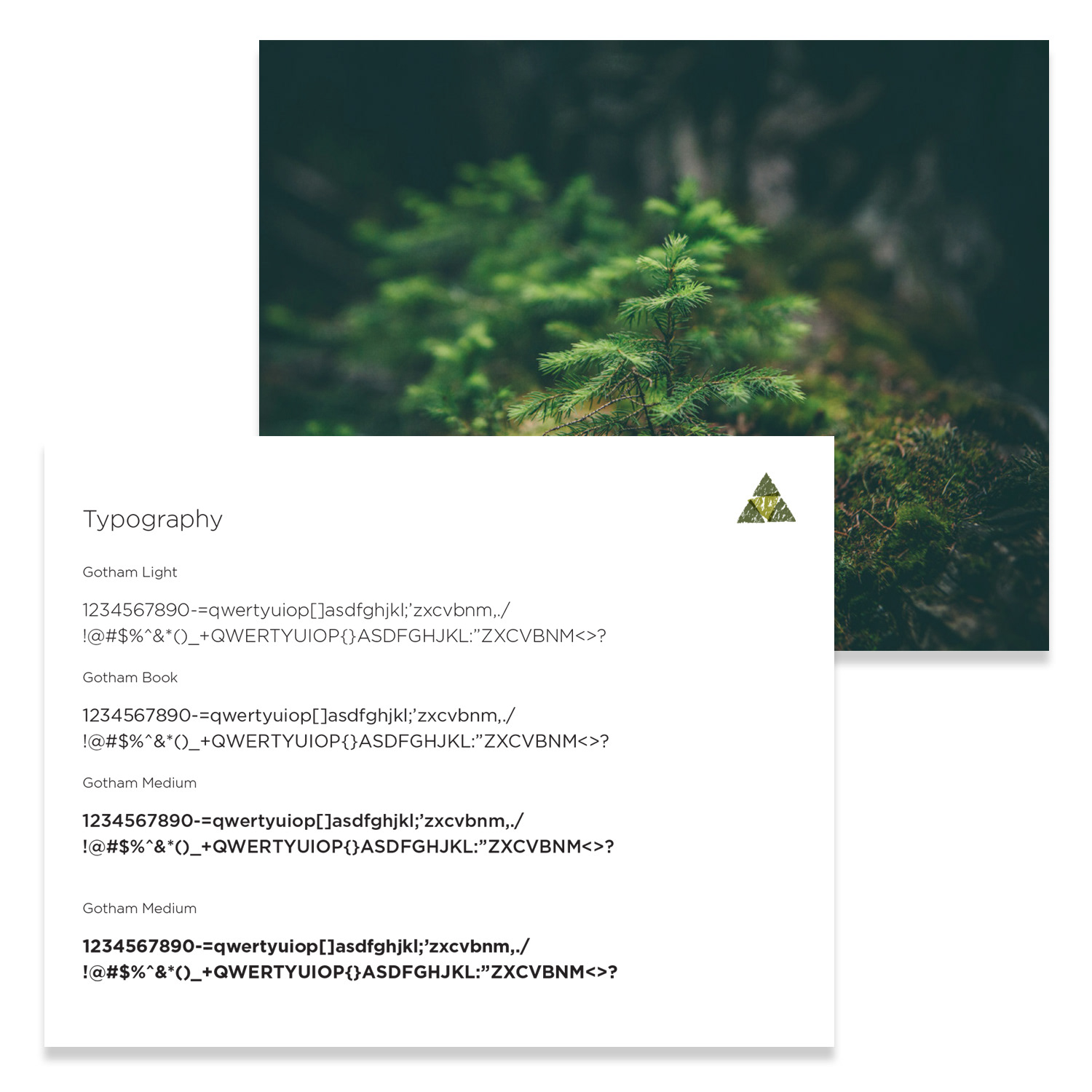
Corporate Branding — Brand Guidelines System
Corporate Branding — Brand Guidelines System
Situation
As Ecotrend scaled across retail, professional, digital, and vendor channels, brand usage became inconsistent. Multiple stakeholders — internal teams, vendors, agencies, and partners — required clear, enforceable standards to prevent brand dilution and ensure consistency across print, packaging, signage, e-commerce, and social media.
As Ecotrend scaled across retail, professional, digital, and vendor channels, brand usage became inconsistent. Multiple stakeholders — internal teams, vendors, agencies, and partners — required clear, enforceable standards to prevent brand dilution and ensure consistency across print, packaging, signage, e-commerce, and social media.
The company needed a comprehensive yet accessible brand system that could scale with growth.
Execution
I authored Ecotrend’s definitive Brand Guidelines as a fully interactive PowerPoint presentation designed for clarity, usability, and cross-functional adoption.
I authored Ecotrend’s definitive Brand Guidelines as a fully interactive PowerPoint presentation designed for clarity, usability, and cross-functional adoption.
The system included:
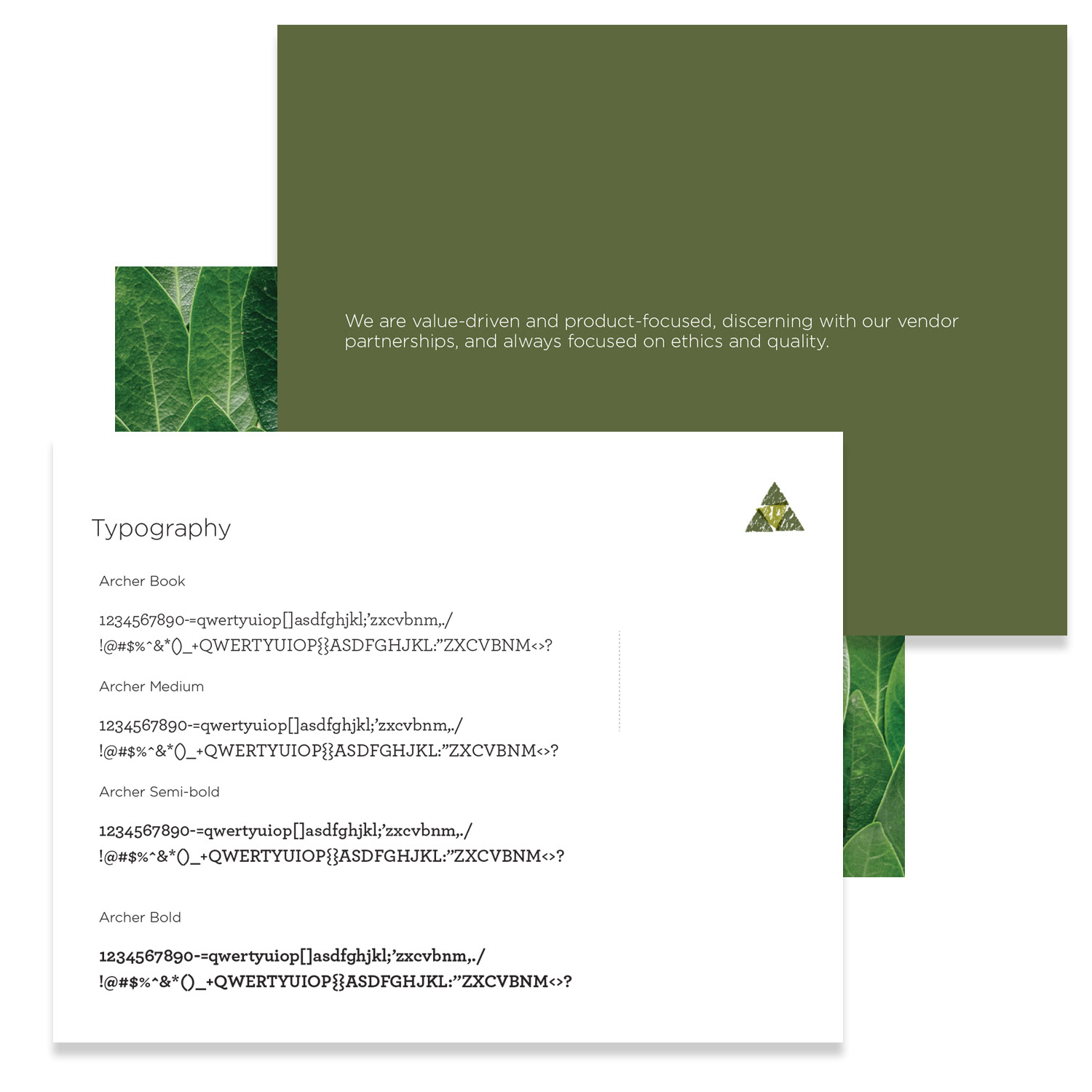
• Typography families and hierarchy standards
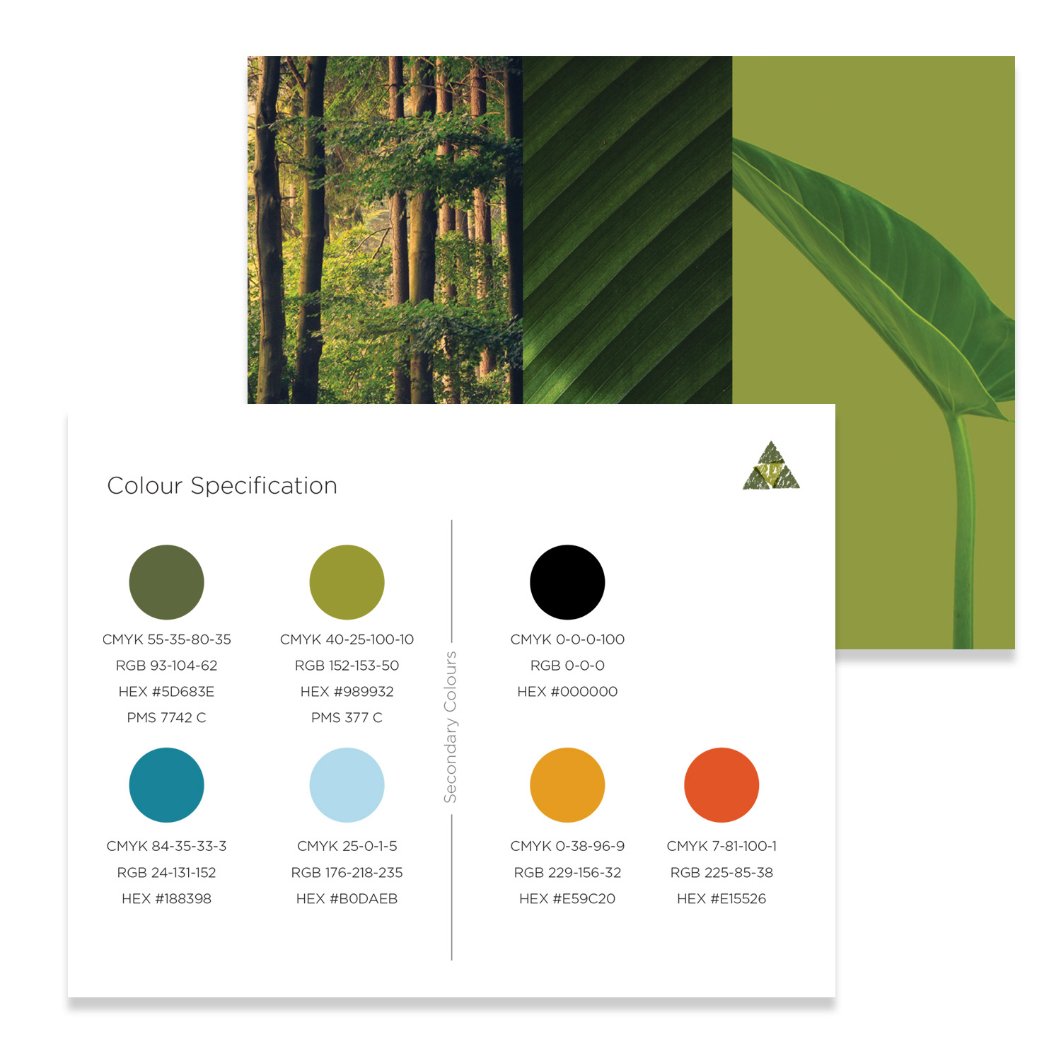
• Complete colour system (HEX, RGB, CMYK, Pantone specifications)
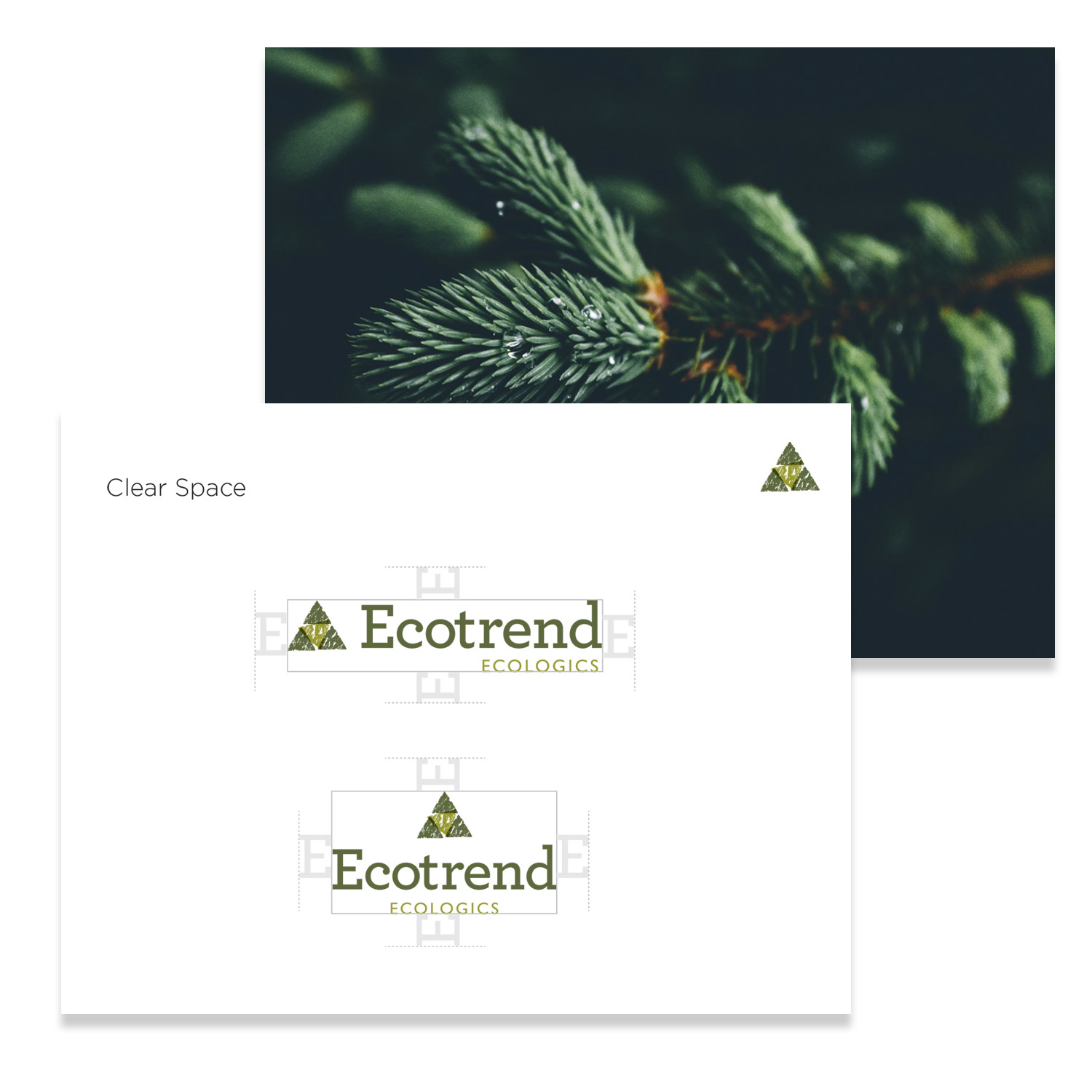
• Logo variations, clear space, minimum size, and usage rules
• Correct vs. incorrect applications with annotated examples
• Cross-platform implementation guidance (digital, print, signage, social)
• Typography families and hierarchy standards
• Complete colour system (HEX, RGB, CMYK, Pantone specifications)
• Logo variations, clear space, minimum size, and usage rules
• Correct vs. incorrect applications with annotated examples
• Cross-platform implementation guidance (digital, print, signage, social)
To increase usability, I designed the deck with:
• Intuitive navigation and embedded hyperlinks
• Logical content architecture
• Visual do’s and don’ts
• Clean, brand-aligned layouts for immediate comprehension
• Intuitive navigation and embedded hyperlinks
• Logical content architecture
• Visual do’s and don’ts
• Clean, brand-aligned layouts for immediate comprehension
The result was a practical, stakeholder-ready tool rather than a static PDF document.
Result
• Established enforceable, company-wide brand standards
• Reduced application errors and brand inconsistencies
• Accelerated onboarding for new team members and partners
• Improved vendor alignment and creative workflow efficiency
• Strengthened Ecotrend’s unified, premium market presence
• Established enforceable, company-wide brand standards
• Reduced application errors and brand inconsistencies
• Accelerated onboarding for new team members and partners
• Improved vendor alignment and creative workflow efficiency
• Strengthened Ecotrend’s unified, premium market presence
The guidelines now serve as a scalable, living reference that supports long-term growth and reinforces brand integrity across all channels.
CORPORATE BRANDING
Brand Evolution & Modernization
Brand Evolution & Modernization
Situation
As Ecotrend expanded its presence in the eco-conscious distribution and wellness market, its visual identity no longer fully reflected its innovation, sustainability leadership, or evolving audience expectations.
As Ecotrend expanded its presence in the eco-conscious distribution and wellness market, its visual identity no longer fully reflected its innovation, sustainability leadership, or evolving audience expectations.
The brand required modernization — without losing the recognition and trust built over time. The goal was to enhance relevance, emotional impact, and market positioning while preserving brand equity.
Execution
After conducting a comprehensive brand audit, I developed and executed a strategic brand refresh aligned with Ecotrend’s mission and long-term growth objectives.
After conducting a comprehensive brand audit, I developed and executed a strategic brand refresh aligned with Ecotrend’s mission and long-term growth objectives.
Rather than pursuing a full logo redesign, I implemented a thoughtful evolution:
• Enhanced the existing colour palette for greater vibrancy and emotional resonance
• Refined typography systems for improved readability and a contemporary feel
• Updated imagery and visual elements to align with sustainability, innovation, and reliability
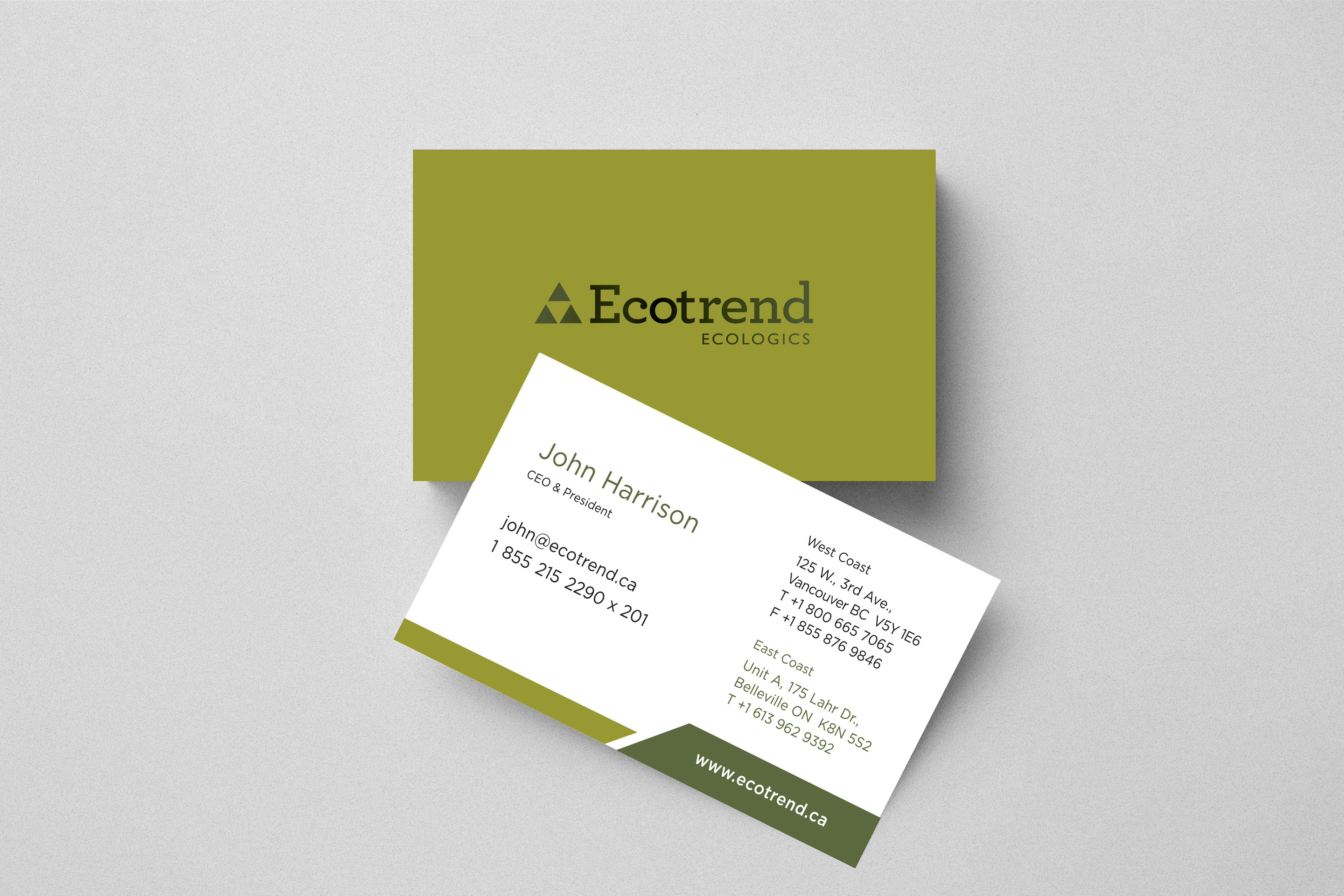
• Redesigned core collateral (business cards, letterheads, packaging, promotional materials)
• Authored comprehensive brand guidelines outlining usage standards across all platforms
• Led stakeholder alignment sessions and internal rollout training to ensure adoption and consistency
• Enhanced the existing colour palette for greater vibrancy and emotional resonance
• Refined typography systems for improved readability and a contemporary feel
• Updated imagery and visual elements to align with sustainability, innovation, and reliability
• Redesigned core collateral (business cards, letterheads, packaging, promotional materials)
• Authored comprehensive brand guidelines outlining usage standards across all platforms
• Led stakeholder alignment sessions and internal rollout training to ensure adoption and consistency
This approach balanced heritage with forward-thinking design, protecting brand equity while increasing visual impact.
Result
• Elevated brand relevance and perceived market value
• Strengthened trust among vendors, retailers, and partners
• Improved visual consistency across digital, print, and packaging touch-points
• Created scalable systems to support continued growth
• Established a unified, modern identity aligned with Ecotrend’s sustainability leadership
The rebrand positioned Ecotrend as both established and progressive — reinforcing its authority in the eco-conscious distribution space while building a foundation for long-term brand equity.
Ecotrend Corporate Materials
PRESENTATION DESIGN
Corporate Investor Pitch Deck
Corporate Investor Pitch Deck
Situation
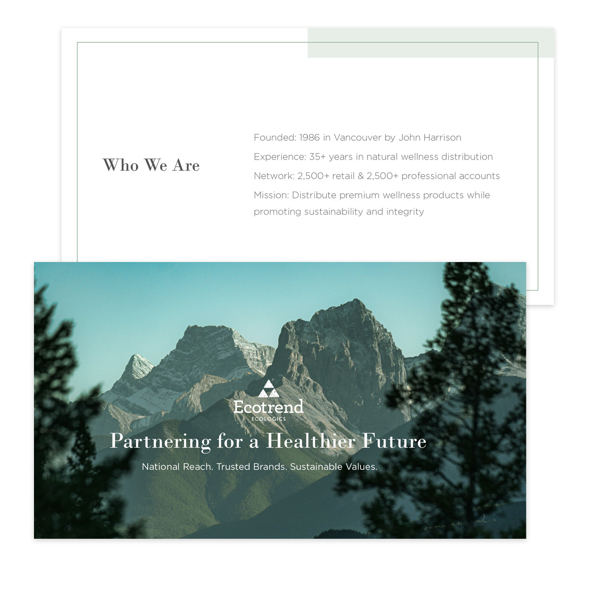
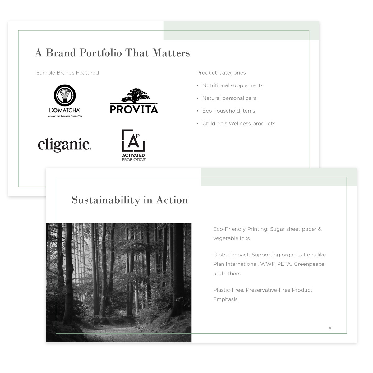
Ecotrend required a high-impact corporate pitch deck to communicate complex business strategies, sustainability initiatives, market positioning, and growth projections to investors and strategic partners.
Ecotrend required a high-impact corporate pitch deck to communicate complex business strategies, sustainability initiatives, market positioning, and growth projections to investors and strategic partners.
The existing materials were information-heavy and lacked a cohesive narrative structure capable of building confidence, accelerating decision-making, and positioning the company competitively within Canada’s growing green economy.
Execution
I led the full development of the investor presentation, overseeing both strategic messaging and visual execution. I:
• Crafted persuasive, investor-focused copy aligned with stakeholder priorities
• Transformed dense business data into clear, digestible storytelling
• Designed custom data visualizations, charts, and infographics
• Established strong visual hierarchy for clarity and flow
• Applied consistent typography, colour systems, and brand standards
• Structured slides for narrative progression and executive-level readability
Each slide was intentionally designed to balance data credibility with visual sophistication, reinforcing Ecotrend’s leadership in sustainable distribution.
Result
• Delivered a polished, executive-ready presentation
• Strengthened investor trust and credibility
• Improved clarity around growth projections and sustainability impact
• Positioned Ecotrend as a forward-thinking, high-potential partner
• Elevated the company’s corporate storytelling and market perception
This project highlights expertise in investor presentation strategy, persuasive copywriting, data visualization, and brand-aligned corporate storytelling for sustainable and growth-focused organizations.
Ecotrend Corporate Materials
Ecotrend Corporate Materials
GRAPHIC DESIGN
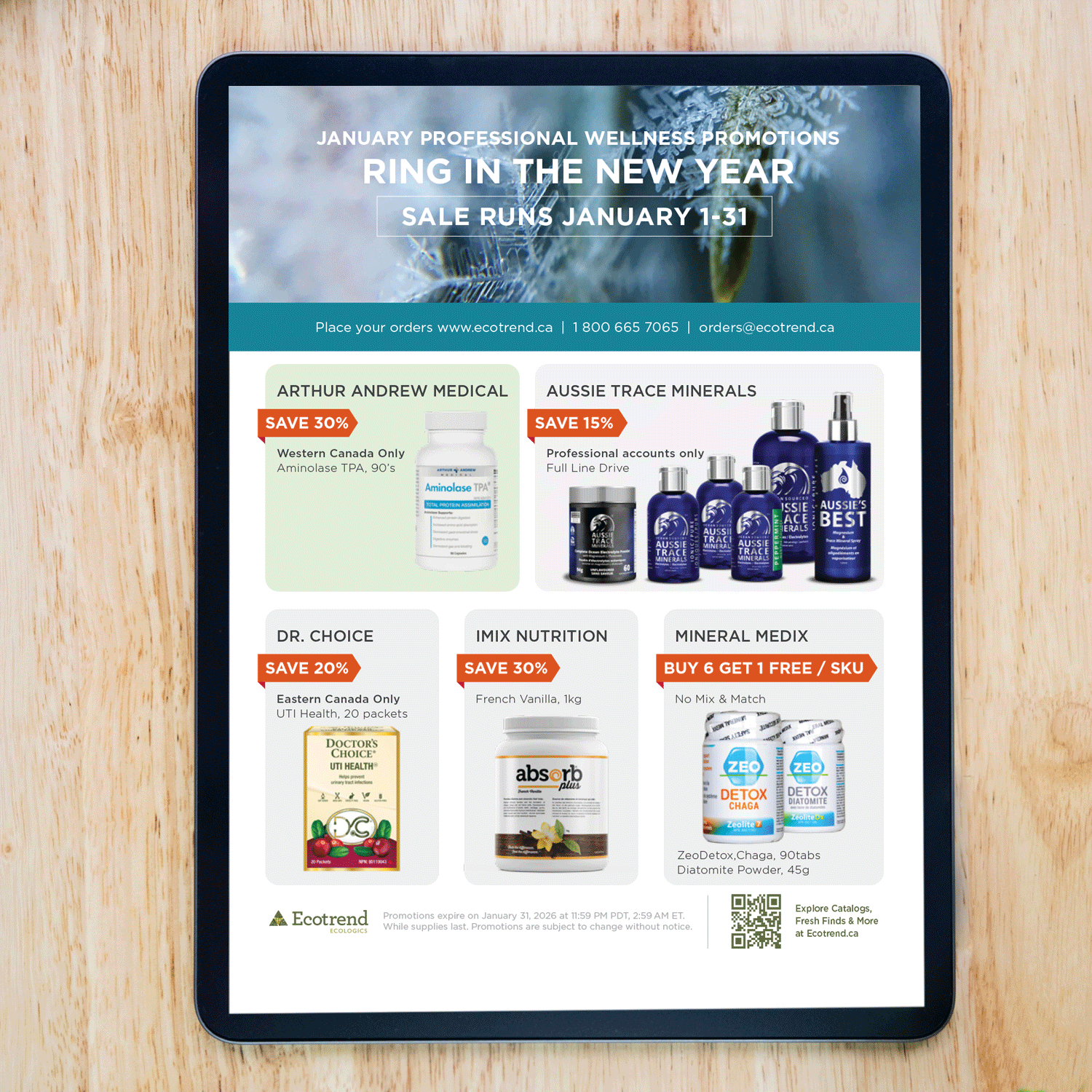
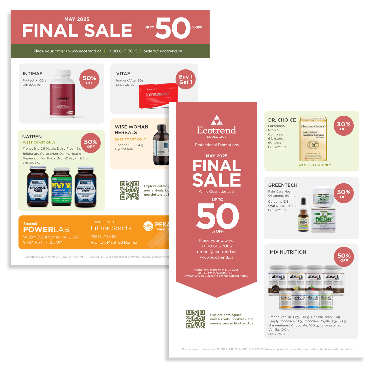
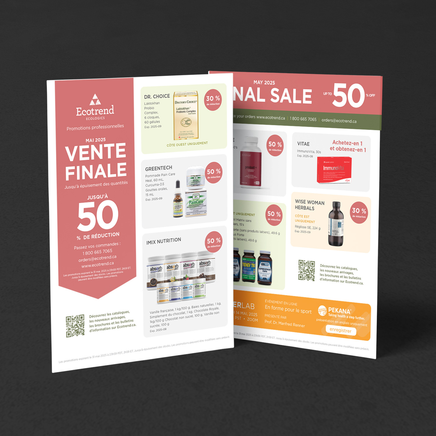
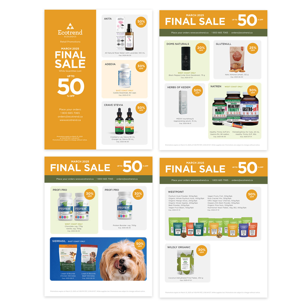
Monthly Retail Promotional Campaign
Monthly Retail Promotional Campaign
Situation
Ecotrend needed a consistent, high-impact flyer template to promote monthly retail offers. The goal was to capture customer attention quickly, communicate key messages clearly, and maintain brand consistency across campaigns.
Ecotrend needed a consistent, high-impact flyer template to promote monthly retail offers. The goal was to capture customer attention quickly, communicate key messages clearly, and maintain brand consistency across campaigns.
Execution
I led the design and development of a versatile flyer system by:
• Defining clear objectives and audience insights to guide content and layout
• Crafting bold, concise headlines and strategic placement of key offers
• Applying consistent brand identity through colours, typography, and logo usage
• Incorporating high-impact imagery and illustrations to reinforce messaging
Establishing strong visual hierarchy with bold fonts, varied text sizes, contrasting colours, and ample white space for clarity and readability
Result
• Delivered a clean, engaging flyer template that elevated brand presence
• Increased audience engagement with clearer, more persuasive messaging
• Created a scalable, reusable design system for monthly retail campaigns
• Delivered a clean, engaging flyer template that elevated brand presence
• Increased audience engagement with clearer, more persuasive messaging
• Created a scalable, reusable design system for monthly retail campaigns


CAMPAIGN DESIGN
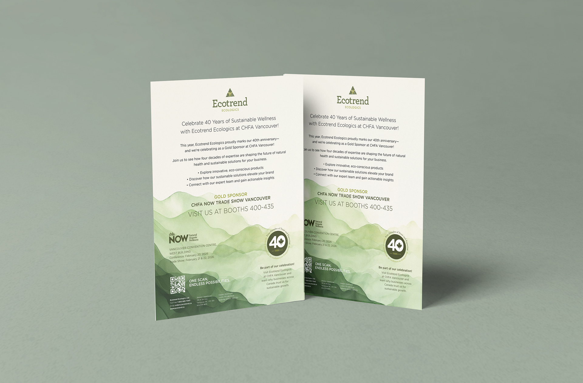
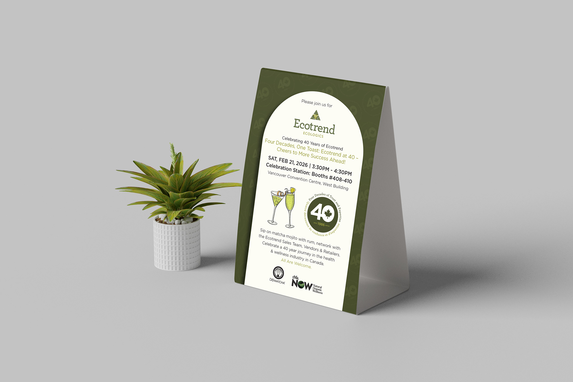
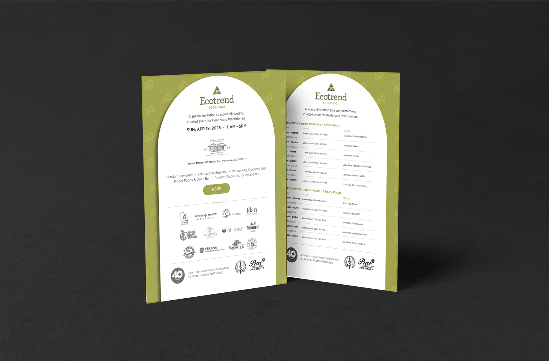
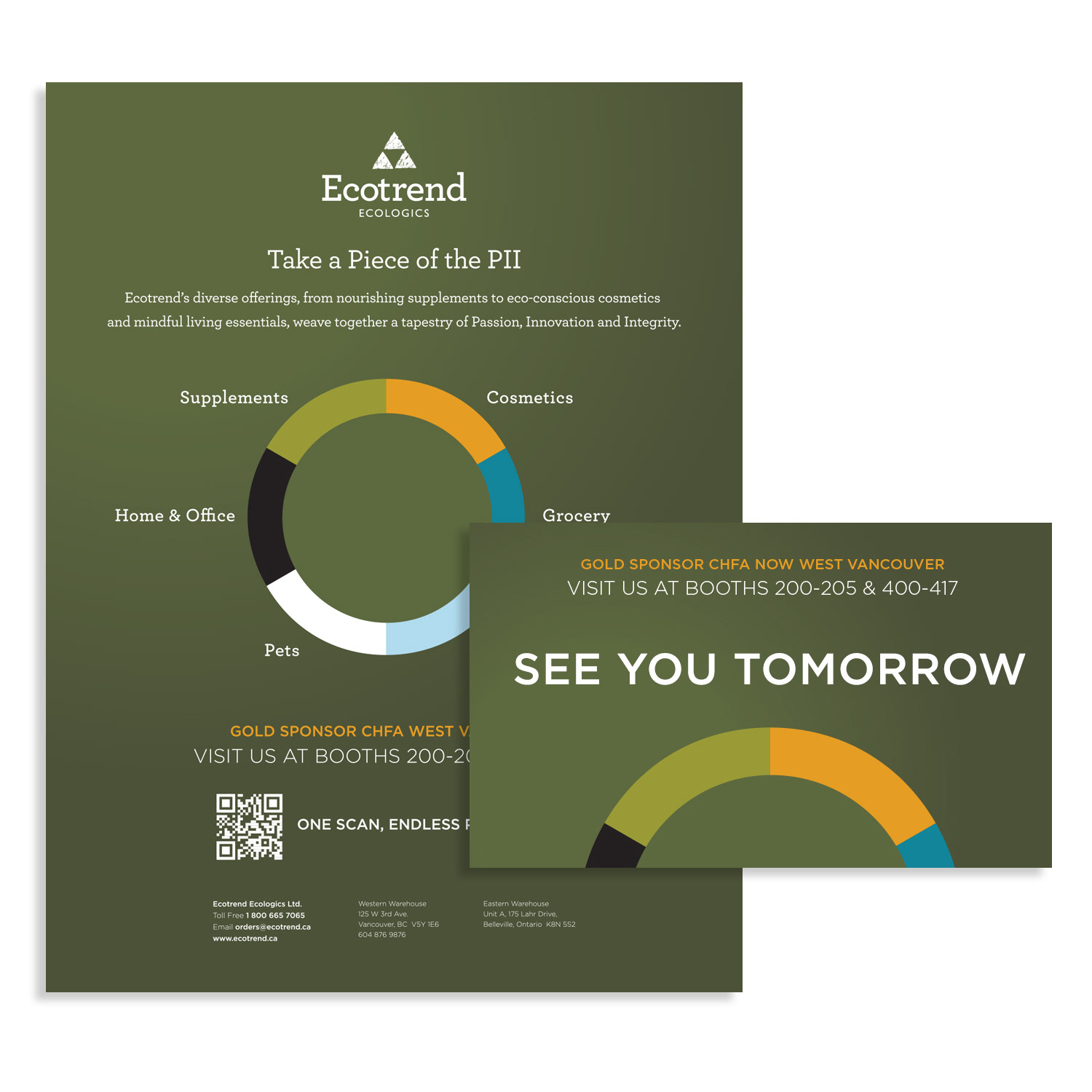
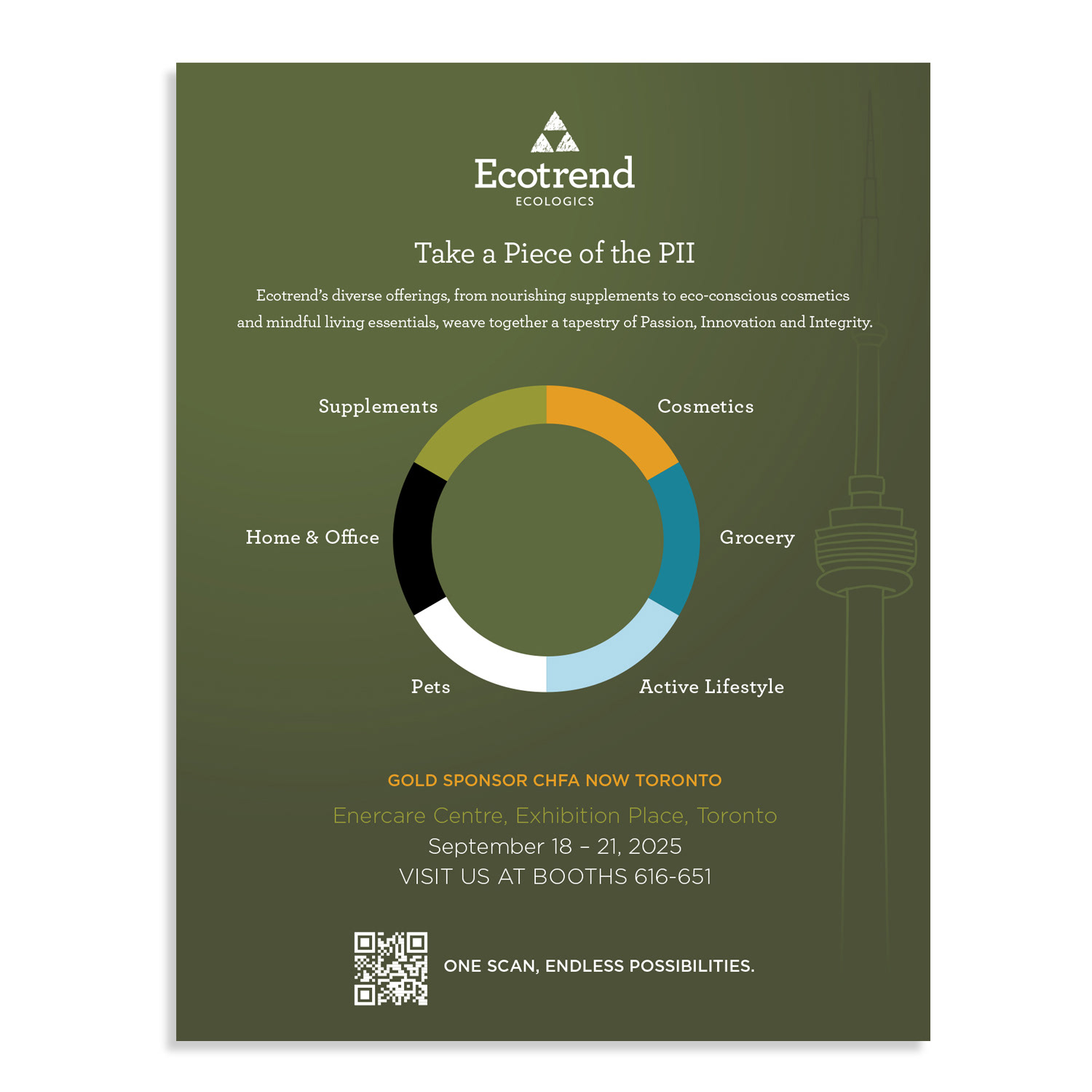
CHFA Trade Show Campaigns (Vancouver & Toronto, 2024)
CHFA Trade Show Campaigns (Vancouver & Toronto, 2024)
Situation
Ecotrend needed a cohesive, high-impact campaign to maximize visibility, engagement, and brand authority at the 2024 CHFA trade shows in Vancouver and Toronto. The objective was to attract booth traffic, communicate sustainability leadership, and strengthen retailer and vendor relationships.
Ecotrend needed a cohesive, high-impact campaign to maximize visibility, engagement, and brand authority at the 2024 CHFA trade shows in Vancouver and Toronto. The objective was to attract booth traffic, communicate sustainability leadership, and strengthen retailer and vendor relationships.
Execution
I designed and executed a multi-channel trade show campaign, including:
• High-visibility print ads optimized for show directories and guides
• Mobile-responsive email banners for pre-event outreach and post-show follow-ups
• Data-driven infographics highlighting sustainability metrics, vendor partnerships, and industry support
• Consistent application of Ecotrend’s colour palette, typography, and messaging across all assets
• Bold layouts and compelling headlines to capture attention and guide attendees
The campaign was strategically structured to unify messaging, communicate brand authority, and drive measurable engagement before, during, and after the events.
Result
• Boosted booth visibility and attendee engagement
• Generated qualified leads and strengthened retailer and vendor relationships
• Reinforced Ecotrend’s position as a trusted leader in eco-conscious health and wellness distribution
• Boosted booth visibility and attendee engagement
• Generated qualified leads and strengthened retailer and vendor relationships
• Reinforced Ecotrend’s position as a trusted leader in eco-conscious health and wellness distribution
Delivered a fully integrated, brand-consistent suite of trade show marketing assets that could be reused for future events
POSTCARD DESIGN
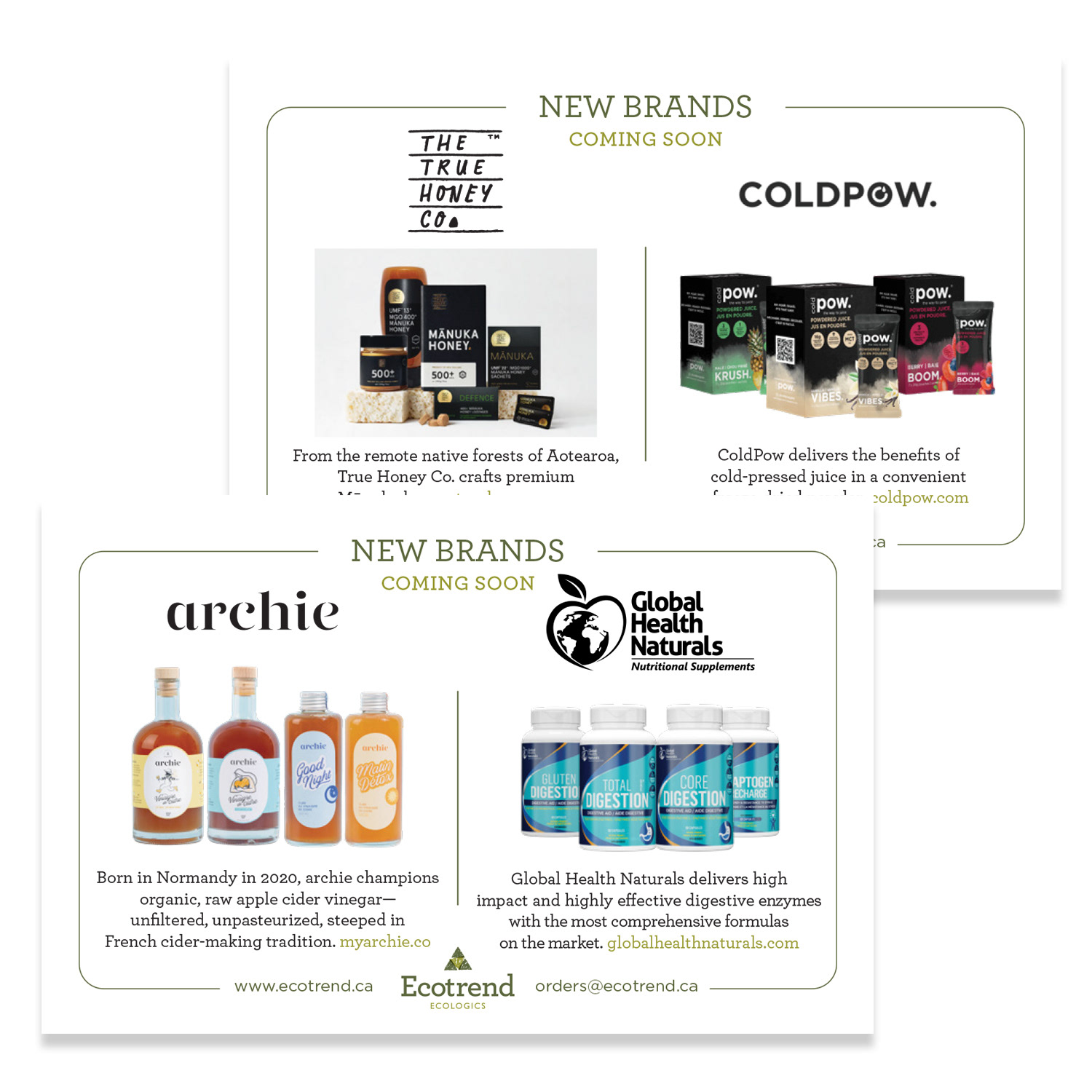
New Vendor Drop-Ship
New Vendor Drop-Ship
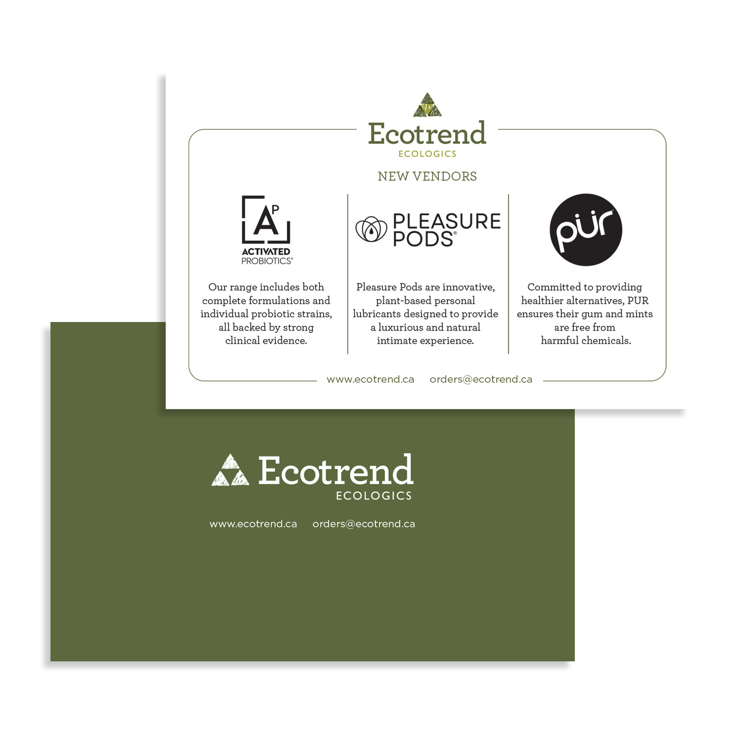
Situation
Ecotrend needed an elegant, high-impact way to introduce new vendors to retailers across Canada. The goal was to create a professional, premium mailer that would excite recipients, encourage inquiries, and seamlessly integrate new partners into Ecotrend’s ecosystem while maintaining brand trust and visual cohesion.
Ecotrend needed an elegant, high-impact way to introduce new vendors to retailers across Canada. The goal was to create a professional, premium mailer that would excite recipients, encourage inquiries, and seamlessly integrate new partners into Ecotrend’s ecosystem while maintaining brand trust and visual cohesion.
Execution
I designed a double-sided, mail-ready postcard that:
• Featured high-quality product imagery and concise vendor highlights on the front
• Showcased all vendor logos on the back in a visually balanced, timeless layout
• Applied brand-aligned typography, colour systems, and generous white space
• Ensured an upscale, professional aesthetic that unified diverse brands without visual conflict
• Optimized messaging for clarity, brevity, and maximum engagement
The design functioned as both an introduction and onboarding tool, reinforcing brand professionalism and credibility.
Result
• Created a visually compelling, premium postcard that captured retailer attention
• Encouraged immediate vendor inquiries and engagement
• Strengthened integration of new partners into Ecotrend’s distribution network
• Created a visually compelling, premium postcard that captured retailer attention
• Encouraged immediate vendor inquiries and engagement
• Strengthened integration of new partners into Ecotrend’s distribution network
Reinforced brand trust, credibility, and professional positioning across the natural health and wellness market
CATALOGUE DESIGN
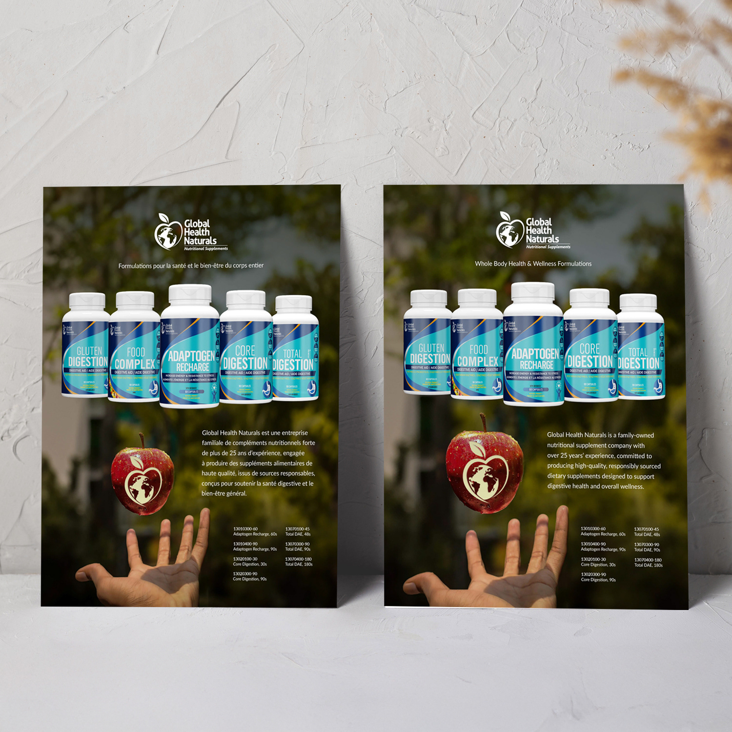
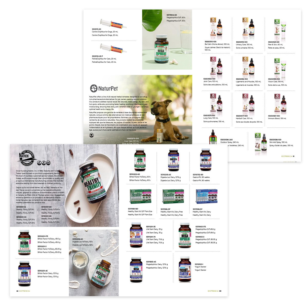
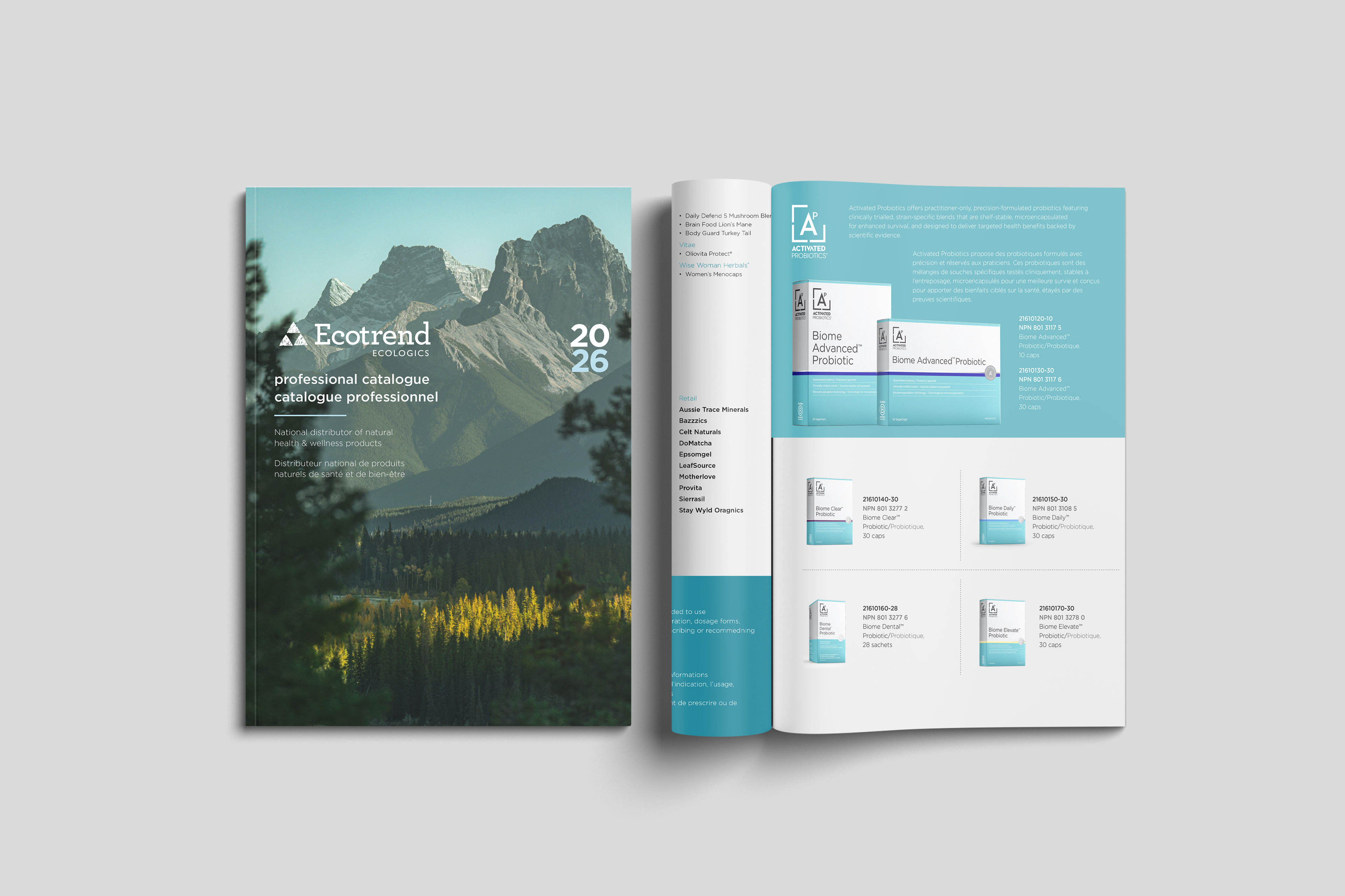
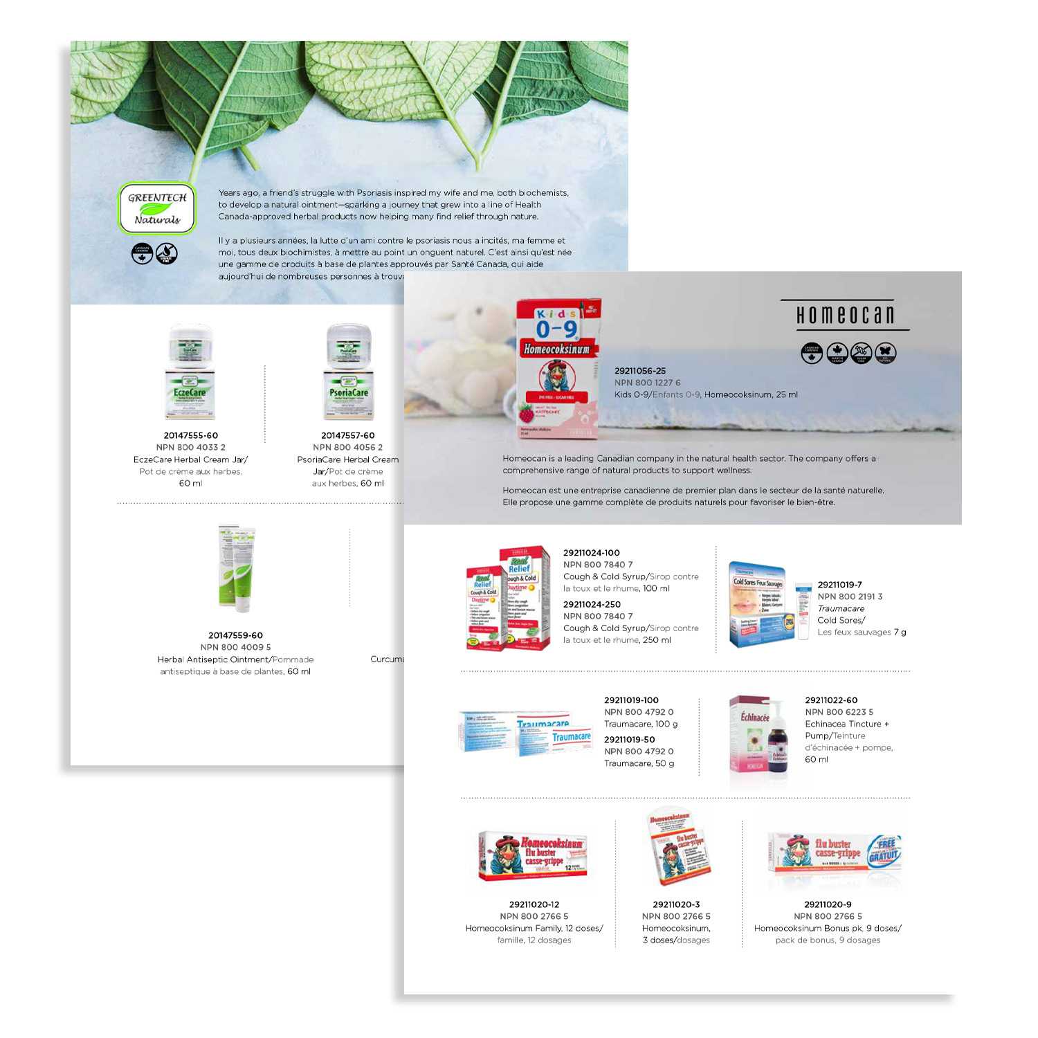
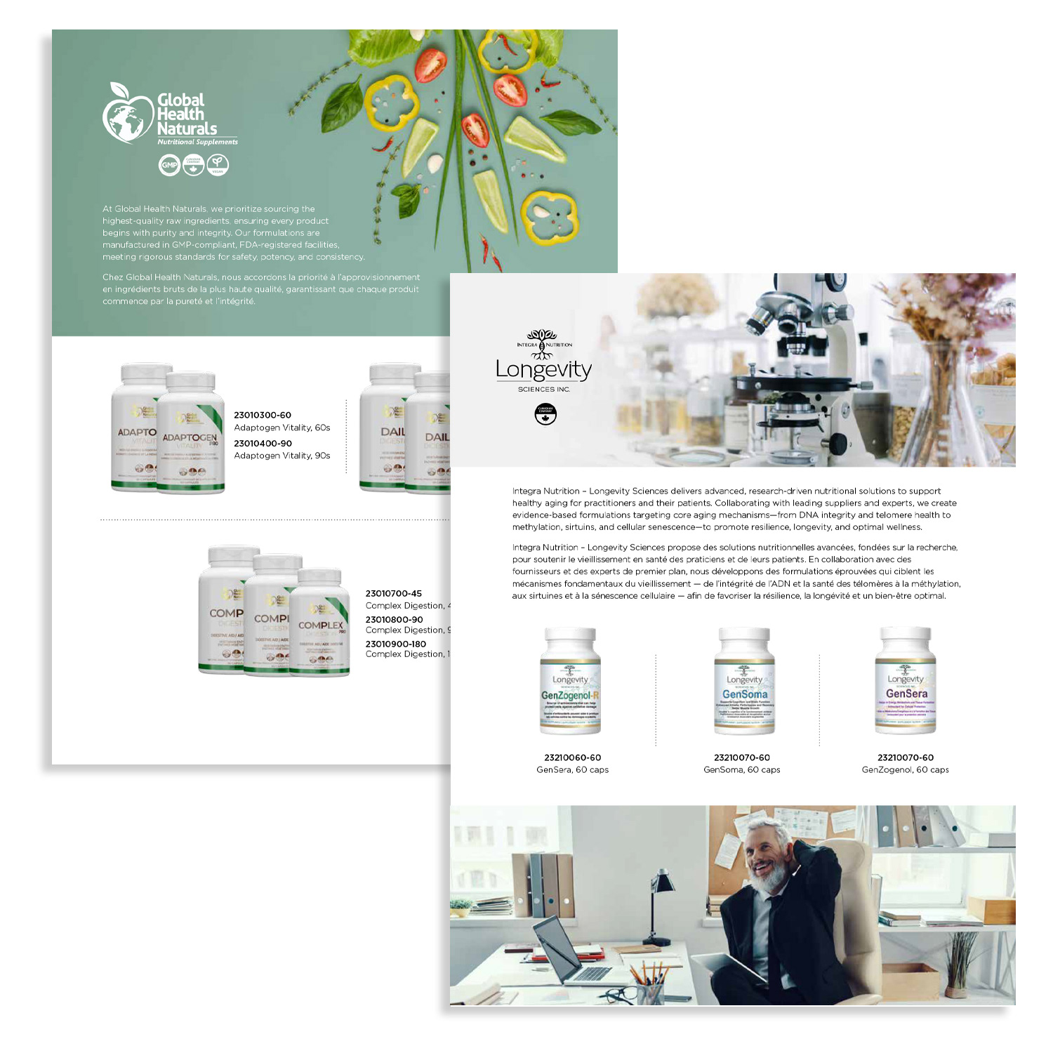
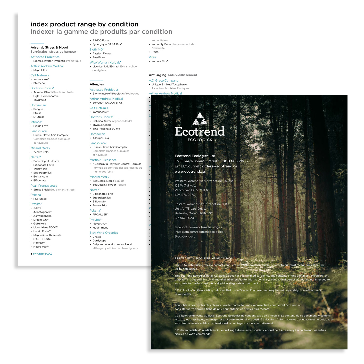
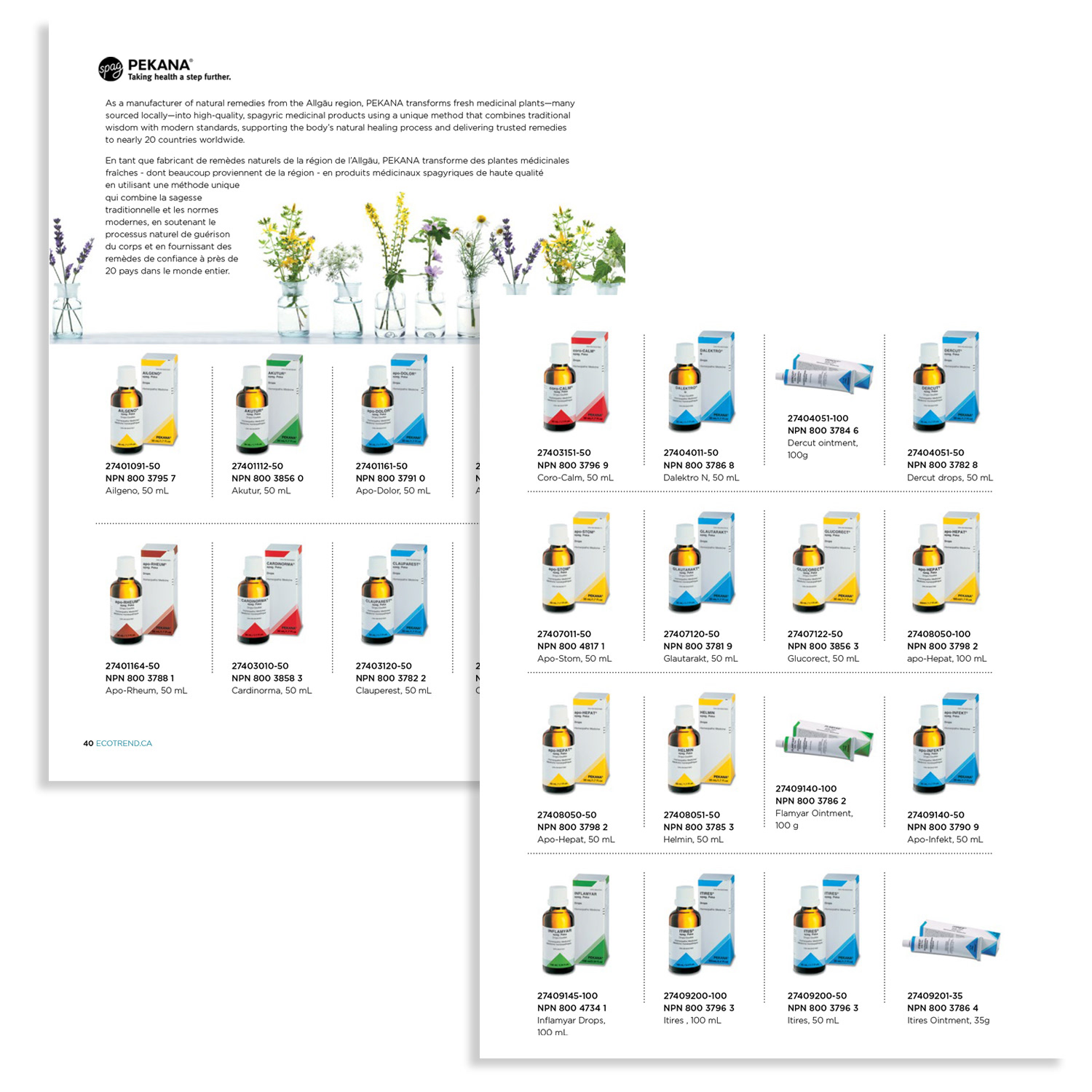
Bilingual Retail Product Catalogue (100+ Pages)
Bilingual Retail Product Catalogue (100+ Pages)
Situation
Ecotrend’s French and English product catalogues were separate, causing redundancy, inconsistent messaging, and higher production costs. The company needed a unified, bilingual catalogue that would provide a seamless, professional experience for Canada’s diverse retail and professional audience while maintaining strong brand identity.
Ecotrend’s French and English product catalogues were separate, causing redundancy, inconsistent messaging, and higher production costs. The company needed a unified, bilingual catalogue that would provide a seamless, professional experience for Canada’s diverse retail and professional audience while maintaining strong brand identity.
Execution
I led the redesign of Ecotrend’s 100+ page flagship catalogue, merging French and English editions into a single, streamlined bilingual format. Key actions included:
• Enlarged product imagery for enhanced clarity, shelf appeal, and buyer engagement
• Integrated curated social media brand imagery as dynamic section dividers to highlight vendor lines and key collections
• Maintained strict brand alignment with clean layouts, intuitive hierarchy, precise typography, and harmonious colour use
• Designed for readability, navigation, and ease of use for busy retailers and professionals
• Ensured consistent messaging, visual impact, and premium wellness aesthetic across both languages
Result
• Delivered a cohesive, user-friendly bilingual catalogue that strengthened Ecotrend’s professional brand presence
• Reduced production costs by eliminating duplicate editions
• Elevated product presentation and shelf appeal
• Reinforced Ecotrend’s position as Canada’s leading sustainable distributor in the natural health and wellness sector
• Created a scalable, visually engaging catalogue system for ongoing vendor and product updates
https://acrobat.adobe.com/id/urn:aaid:sc:US:8718750c-785e-4cf7-8110-0491b6d6d724
Bilingual Catalogue
EVENT DESIGN
Trade Show Pull-Up Banners
Trade Show Pull-Up Banners
Situation
Ecotrend needed high-impact, portable display assets for trade shows like CHFA to increase booth visibility, attract attendee engagement, and reinforce the brand’s eco-conscious leadership in a competitive natural health and wellness market.
Ecotrend needed high-impact, portable display assets for trade shows like CHFA to increase booth visibility, attract attendee engagement, and reinforce the brand’s eco-conscious leadership in a competitive natural health and wellness market.
Execution
I designed a series of professional retractable pull-up banners that:
• Featured bold hero imagery, concise taglines, scannable product highlights, and strategic calls-to-action
• Maintained brand consistency with corporate colour palette, typography, and sustainability-focused design
• Engineered lightweight, durable, and weather-resistant materials for indoor/outdoor versatility
• Created modular messaging for easy adaptation to seasonal launches, vendor partnerships, or event themes
• Optimized layouts to maximize attention and readability in high-traffic environments
Result
• Delivered a cohesive, high-visibility display system that consistently drew booth traffic
• Strengthened Ecotrend’s professional brand perception and premium positioning
• Converted foot traffic into meaningful retailer conversations, wholesale inquiries, and long-term partnerships
• Provided reusable, scalable signage solutions for ongoing trade show campaigns
CATALOGUE DESIGN
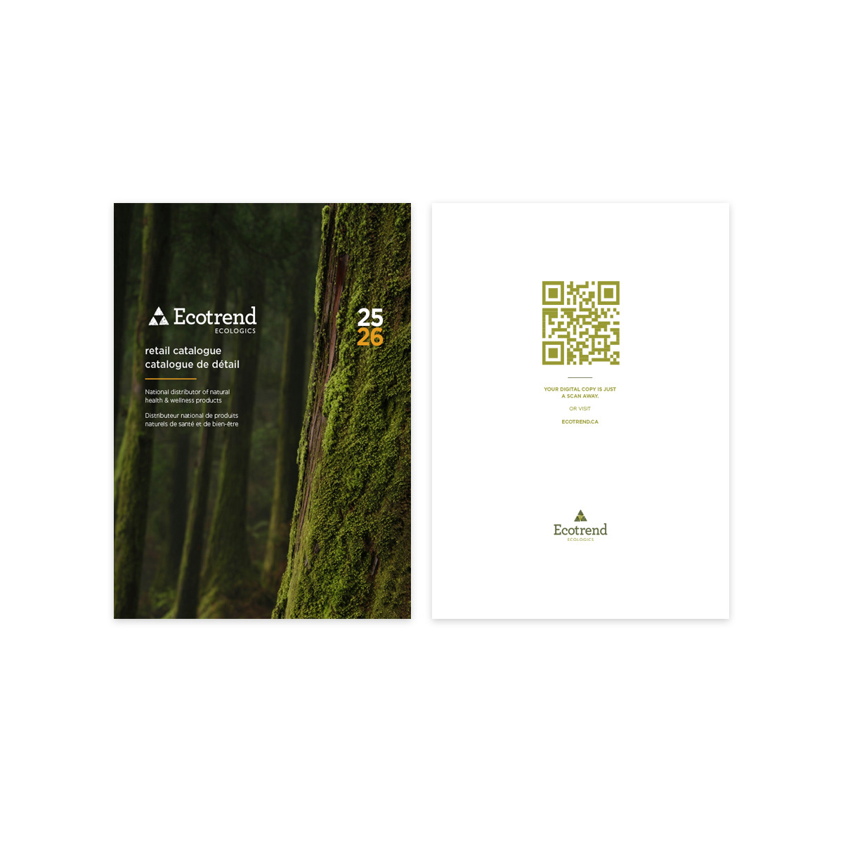
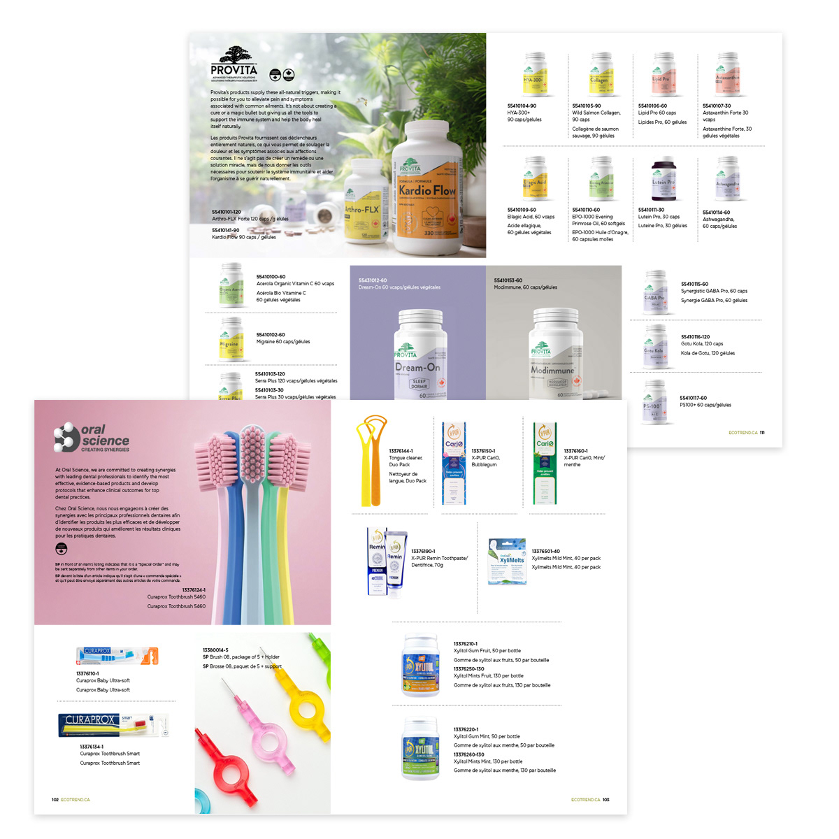
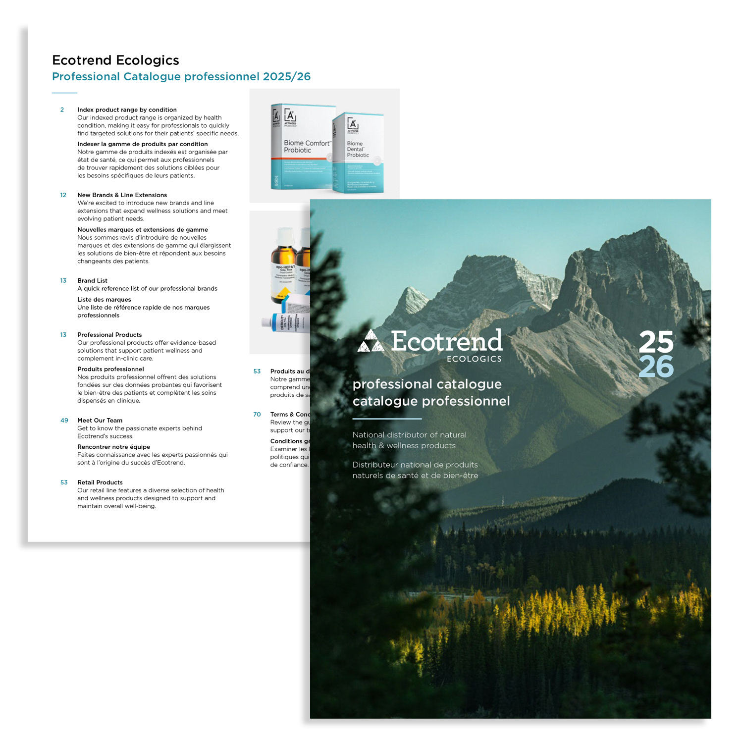
2025–26 Bilingual Professional Product Catalogue (100+ Pages)
2025–26 Bilingual Professional Product Catalogue (100+ Pages)
Situation
Ecotrend’s French and English professional catalogues were produced separately, resulting in duplicated content, inconsistent messaging, and higher printing and production costs. The company needed a unified bilingual catalogue that would provide a seamless experience for Canada’s diverse retail and professional audience while reinforcing brand authority and improving cost efficiency.
Ecotrend’s French and English professional catalogues were produced separately, resulting in duplicated content, inconsistent messaging, and higher printing and production costs. The company needed a unified bilingual catalogue that would provide a seamless experience for Canada’s diverse retail and professional audience while reinforcing brand authority and improving cost efficiency.
Solution
As Marketing Art Director, I was responsible for redesigning Ecotrend’s flagship catalogue into a single, cohesive bilingual publication that improved usability, elevated product presentation, and reduced production costs without compromising brand quality.
As Marketing Art Director, I was responsible for redesigning Ecotrend’s flagship catalogue into a single, cohesive bilingual publication that improved usability, elevated product presentation, and reduced production costs without compromising brand quality.
Execution
I led the redesign and production of the 100+ page catalogue, merging the French and English editions into a streamlined bilingual format. Key initiatives included:
• Enlarging product imagery to enhance clarity and visual impact for buyers
• Integrating curated social media visuals as dynamic section dividers to distinguish vendor lines and highlight key collections
• Designing clean, brand-aligned layouts with intuitive hierarchy, precise typography, and harmonious colour usage
• Prioritizing readability and fast navigation for time-pressed buyers and retail decision-makers
• Ensuring consistent messaging and visual balance across both languages on every spread
• Conducting vendor research and negotiating with printers to identify more cost-effective production options
Result
• Delivered a cohesive, high-value bilingual catalogue that strengthened Ecotrend’s brand authority
• Reduced duplication and improved efficiency by consolidating two catalogues into one
• Saved the company approximately 25% in printing costs through strategic printer research and vendor selection
• Elevated product presentation and improved the buyer experience
• Reinforced Ecotrend’s position as a leading sustainable distributor in Canada’s natural health and professional channels
Skills Demonstrated
Bilingual catalogue design, large-scale print production (100+ pages), vendor and printer sourcing, cost optimization, buyer-focused visual merchandising, social media brand integration, and strategic B2B graphic design.
Bilingual catalogue design, large-scale print production (100+ pages), vendor and printer sourcing, cost optimization, buyer-focused visual merchandising, social media brand integration, and strategic B2B graphic design.
https://issuu.com/ecotrendecologics/docs/ecotrendecologics_pro_bilingual_catalogue2026v4_lr
https://acrobat.adobe.com/id/urn:aaid:sc:US:fb5d1c8e-b613-4c3f-be0c-cd452a71d1c9
https://acrobat.adobe.com/id/urn:aaid:sc:US:90e9e9f1-c9f4-42fb-985a-e63c2edd5616
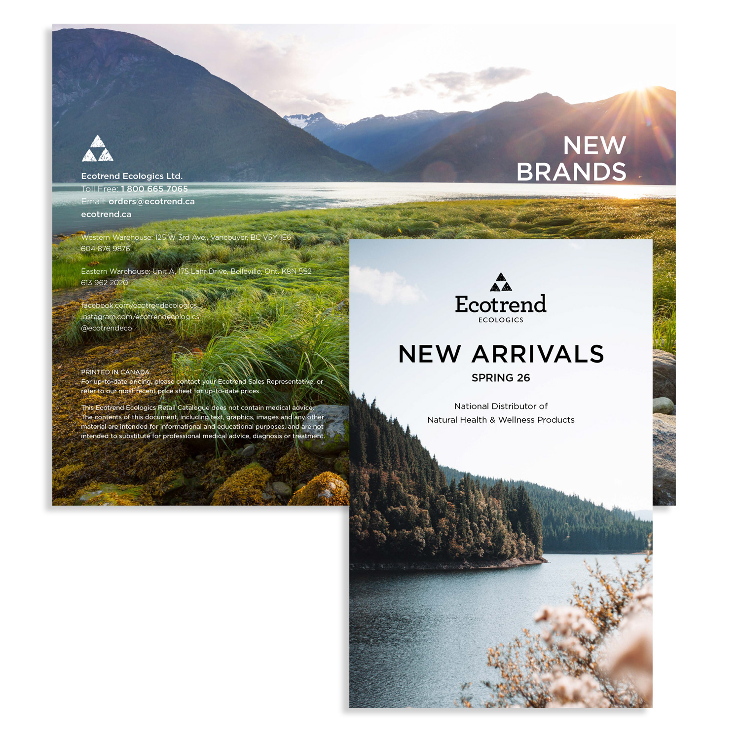
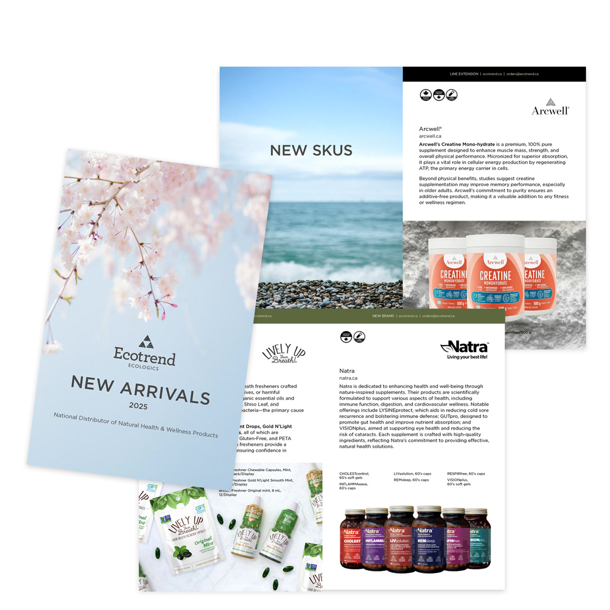
CATALOGUE DESIGN
Mini-Catalogue 2025/26
Mini-Catalogue 2025/26
Situation
Ecotrend needed a compact, visually compelling mini-catalogue to spotlight new SKUs, line extensions, and core brand values for retailers, practitioners, and wellness professionals across Canada. The existing mini-catalogues lacked bilingual structure, visual hierarchy, and production efficiency, limiting readability, engagement, and shelf impact.
Ecotrend needed a compact, visually compelling mini-catalogue to spotlight new SKUs, line extensions, and core brand values for retailers, practitioners, and wellness professionals across Canada. The existing mini-catalogues lacked bilingual structure, visual hierarchy, and production efficiency, limiting readability, engagement, and shelf impact.
Execution
I led the full redesign, production, and project management of the biannual mini-catalogues:
• Restructured layouts with dedicated French and English sections for inclusivity and clarity
• Enlarged product imagery, refined typography, and expanded content for an engaging user experience
• Applied vibrant yet brand-consistent colour palettes, premium finishes, and intuitive navigation
• Managed the complete production cycle: concept, stakeholder approvals, printer coordination, quality control, and on-time delivery
• Optimized output for both print distribution and downloadable PDFs
Result
• Delivered a visually impactful, dual-purpose catalogue that strengthened Ecotrend’s premium wellness positioning
• Increased product awareness and wholesale inquiries
• Enhanced user engagement and brand resonance across Canada
• Established a scalable, high-quality template for future biannual mini-catalogues
This project highlights expertise in: bilingual print layout, catalogue redesign, mini-catalogue production, project management for print, brand-consistent collateral, enlarged product imagery, and strategic design for natural health, sustainability, and distribution brands.
https://acrobat.adobe.com/id/urn:aaid:sc:US:55aa0cff-a1e3-49df-bd3b-163e6b517ed3
GRAPHIC DESIGN
Promo & Evergreen Campaign
Promo & Evergreen Campaign
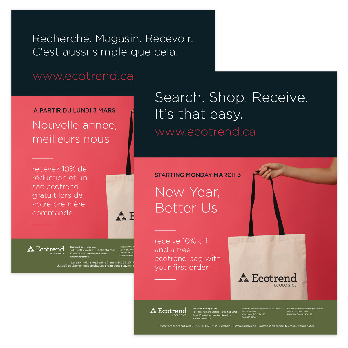
Ecotrend was launching a new Shopify website and needed a high-impact bilingual (English/French) campaign to drive immediate traffic, attract first-time buyers, and position the brand as a leading destination for sustainable health and wellness products in Canada. The launch required both short-term promotional urgency and long-term evergreen performance across print and digital channels.
Situation
• My objective was to design a cohesive bilingual ad series that:
• Generated immediate conversions through a limited-time offer (free reusable bag + 10% off)
• Established a strong evergreen campaign for sustained traffic and conversions
• Maintained strict corporate brand consistency
• Performed seamlessly across print and digital platforms
Execution
I designed a fully integrated bilingual campaign featuring bold headlines, clean typography, on-brand imagery, and strategic calls-to-action tailored to Canada’s eco-conscious consumers and retailers.
I designed a fully integrated bilingual campaign featuring bold headlines, clean typography, on-brand imagery, and strategic calls-to-action tailored to Canada’s eco-conscious consumers and retailers.
The campaign included:
• Limited-time promotional ads to create urgency and drive first-time purchases
• Evergreen ads optimized for ongoing conversions and brand reinforcement
• Print materials (trade show handouts, flyers)
• Digital assets (social media ads, email banners, website banners, Google & Amazon ads)
• Limited-time promotional ads to create urgency and drive first-time purchases
• Evergreen ads optimized for ongoing conversions and brand reinforcement
• Print materials (trade show handouts, flyers)
• Digital assets (social media ads, email banners, website banners, Google & Amazon ads)
All designs were mobile-responsive, optimized for fast loading, and built for seamless cross-platform performance while ensuring flawless English/French layout execution and corporate colour consistency.
Result
The campaign successfully drove immediate website traffic, increased first-time purchases, and strengthened Ecotrend’s market positioning as a trusted sustainable wellness brand.
The campaign successfully drove immediate website traffic, increased first-time purchases, and strengthened Ecotrend’s market positioning as a trusted sustainable wellness brand.
It delivered measurable growth in engagement and conversions while reinforcing brand credibility across channels.

GRAPHIC DESIGN
Ecotrend Bilingual Promotional Flyer Template
Ecotrend Bilingual Promotional Flyer Template
Situation
Ecotrend required a bilingual (English/French) promotional flyer that could effectively communicate monthly offers to Canada’s diverse retail audience while maintaining strict corporate brand standards. The company needed a scalable solution that would reduce redesign time, control costs, and ensure consistent visual quality across recurring campaigns.
Ecotrend required a bilingual (English/French) promotional flyer that could effectively communicate monthly offers to Canada’s diverse retail audience while maintaining strict corporate brand standards. The company needed a scalable solution that would reduce redesign time, control costs, and ensure consistent visual quality across recurring campaigns.
Execution
My objective was to design a versatile, brand-aligned flyer template that:
• Seamlessly integrated French and English into one cohesive layout
• Applied corporate colours and a clear font hierarchy
• Guided readers naturally through key messaging and calls-to-action
• Allowed easy monthly updates without compromising design integrity
Solution
I developed a modular bilingual flyer template built around Ecotrend’s established corporate colour palette and typography system.
I developed a modular bilingual flyer template built around Ecotrend’s established corporate colour palette and typography system.
Key design decisions included:
• A structured font hierarchy to prioritize headlines, key promotions, product highlights, and strong calls-to-action
• A clean, intuitive layout to enhance readability and professional polish
• A flexible, modular framework allowing promotions, imagery, and copy to be swapped efficiently without requiring a full redesign
• Careful bilingual spacing and balance to ensure visual harmony between English and French content
The system was built to accelerate production timelines while preserving premium design standards.
Result
The template streamlined monthly campaign production, reduced design turnaround time, and maintained consistent brand presentation across all promotional materials.
The template streamlined monthly campaign production, reduced design turnaround time, and maintained consistent brand presentation across all promotional materials.
It strengthened retailer relationships, supported wholesale inquiries, and reinforced Ecotrend’s leadership position in sustainable natural health distribution.
GRAPHIC DESIGN
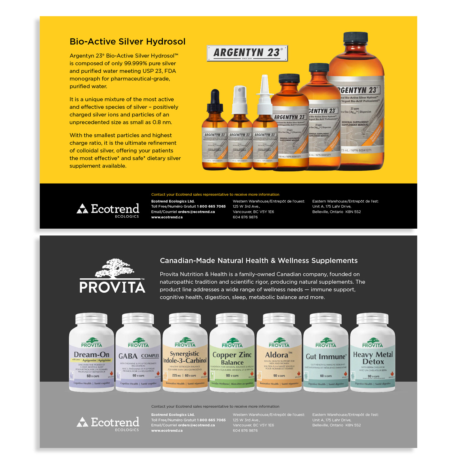
Retail Vendor Quarterly Newsletter
Retail Vendor Quarterly Newsletter
Situation
Ecotrend needed a high-value, premium print piece to strengthen relationships with retail clients across Canada while showcasing new vendor products, seasonal promotions, and sustainability stories. The newsletter had to position Ecotrend as a leader in sustainable natural health distribution while serving as a trusted, practical sales tool for retailers.
Ecotrend needed a high-value, premium print piece to strengthen relationships with retail clients across Canada while showcasing new vendor products, seasonal promotions, and sustainability stories. The newsletter had to position Ecotrend as a leader in sustainable natural health distribution while serving as a trusted, practical sales tool for retailers.
Execution
My objective was to design and produce a quarterly printed newsletter (24–32 pages) that:
• Highlighted vendor products with dedicated, visually prominent space
• Balanced editorial storytelling with product-driven marketing
• Maintained strong corporate branding and elegant typography
• Delivered clear visual hierarchy for readability and engagement
• Functioned as both a relationship-building tool and a wholesale driver
Solution
I curated and designed each edition with a strategic layout system that combined editorial flow with bold product imagery and strong calls-to-action.
I curated and designed each edition with a strategic layout system that combined editorial flow with bold product imagery and strong calls-to-action.
Key design elements included:
• Consistent corporate branding and refined typography
• Clear visual hierarchy to guide readers naturally through features, promotions, and vendor spotlights
• Thoughtful use of whitespace, icons, and colour accents to enhance clarity and engagement
• Balanced multi-vendor placement to ensure fairness while maintaining a cohesive aesthetic
• Full print production oversight to ensure premium quality and consistency across 24–32 pages
The newsletter was intentionally designed as a tangible, high-impact touchpoint that retailers could reference in-store for education and sales support.
Result
The quarterly newsletter strengthened vendor-retailer relationships, increased product awareness, and encouraged wholesale inquiries.
The quarterly newsletter strengthened vendor-retailer relationships, increased product awareness, and encouraged wholesale inquiries.
It reinforced Ecotrend’s leadership and credibility in the sustainable wellness market while contributing to stronger partner loyalty and sustained growth within the competitive eco-conscious retail channel.
https://acrobat.adobe.com/id/urn:aaid:sc:US:8e60d4a1-5d63-437d-b58c-c30d9ea0c31a
Ecotrend Retail Newsletter
Ecotrend Retail Newsletter
GRAPHIC DESIGN
Professional Vendor Quarterly Newsletter (18–24 Pages)
Professional Vendor Quarterly Newsletter (18–24 Pages)
Situation
Ecotrend required a premium quarterly print newsletter to strengthen relationships with retail clients across Canada and position the company as a leader in natural health and sustainable distribution. The publication needed to showcase multiple vendors, highlight seasonal promotions, and share compelling sustainability stories—all while maintaining strict brand consistency and professional polish.
Ecotrend required a premium quarterly print newsletter to strengthen relationships with retail clients across Canada and position the company as a leader in natural health and sustainable distribution. The publication needed to showcase multiple vendors, highlight seasonal promotions, and share compelling sustainability stories—all while maintaining strict brand consistency and professional polish.
Execution
My objective was to design and produce an 18–24 page quarterly newsletter that:
• Gave each vendor dedicated, visually prominent exposure
• Balanced editorial storytelling with product-focused marketing
• Maintained cohesive corporate branding and elegant typography
• Guided readers through content using strong visual hierarchy
• Functioned as both an educational resource and a wholesale driver
Solution
I curated and designed a dynamic layout system that blended editorial flow with bold product imagery and clear calls-to-action.
I curated and designed a dynamic layout system that blended editorial flow with bold product imagery and clear calls-to-action.
Key design decisions included:
• Establishing consistent brand application across typography, colour palette, and layout structure
• Creating strategic visual hierarchy to prioritize headlines, promotions, and product highlights
• Using whitespace, icons, and colour accents to guide reader attention and improve clarity
• Ensuring fair and balanced multi-vendor placement while maintaining cohesive design integrity
• Managing print production standards to deliver a premium, tangible piece aligned with Ecotrend’s market positioning
Each edition was thoughtfully structured to serve as a trusted in-store resource for retailers.
Result
The quarterly newsletter became a cornerstone marketing tool that strengthened vendor-professional relationships, increased product awareness, and encouraged wholesale inquiries.
The quarterly newsletter became a cornerstone marketing tool that strengthened vendor-professional relationships, increased product awareness, and encouraged wholesale inquiries.
It reinforced Ecotrend’s leadership in sustainable, eco-conscious distribution and contributed to stronger partner loyalty, enhanced brand credibility, and sustained growth within Canada’s competitive natural products channel.
https://acrobat.adobe.com/id/urn:aaid:sc:US:e974ab78-97dc-4166-b024-4ff1ae76e8db
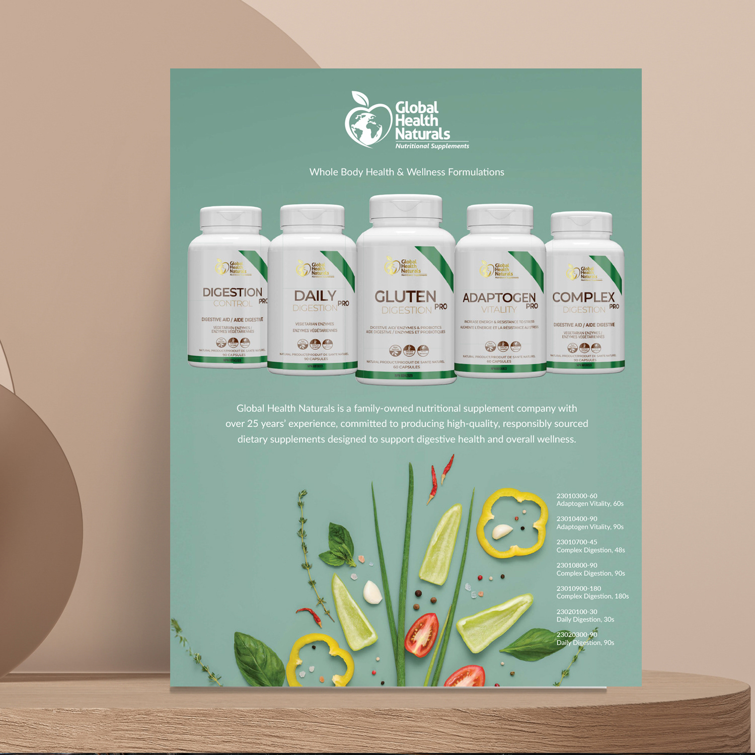
GRAPHIC DESIGN
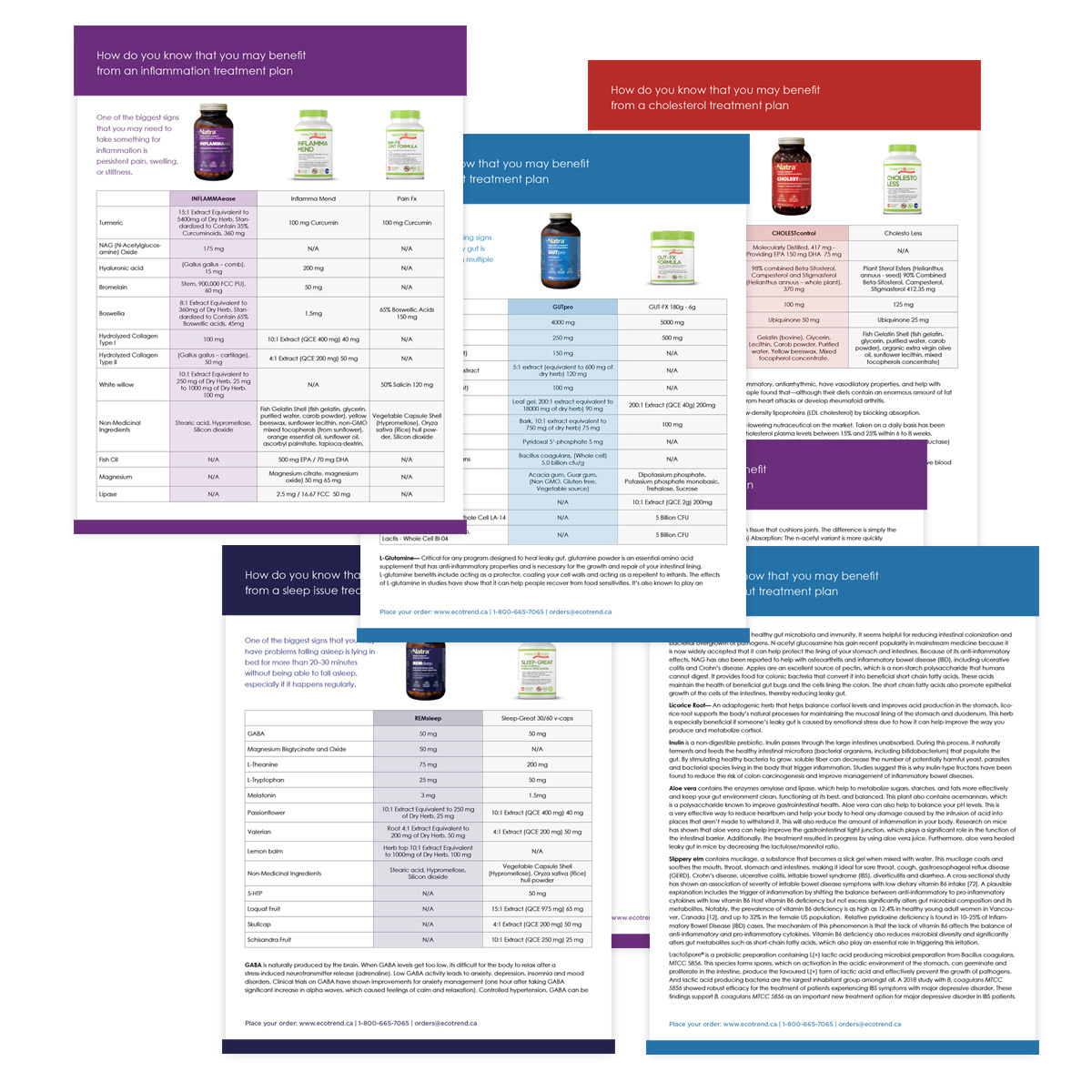
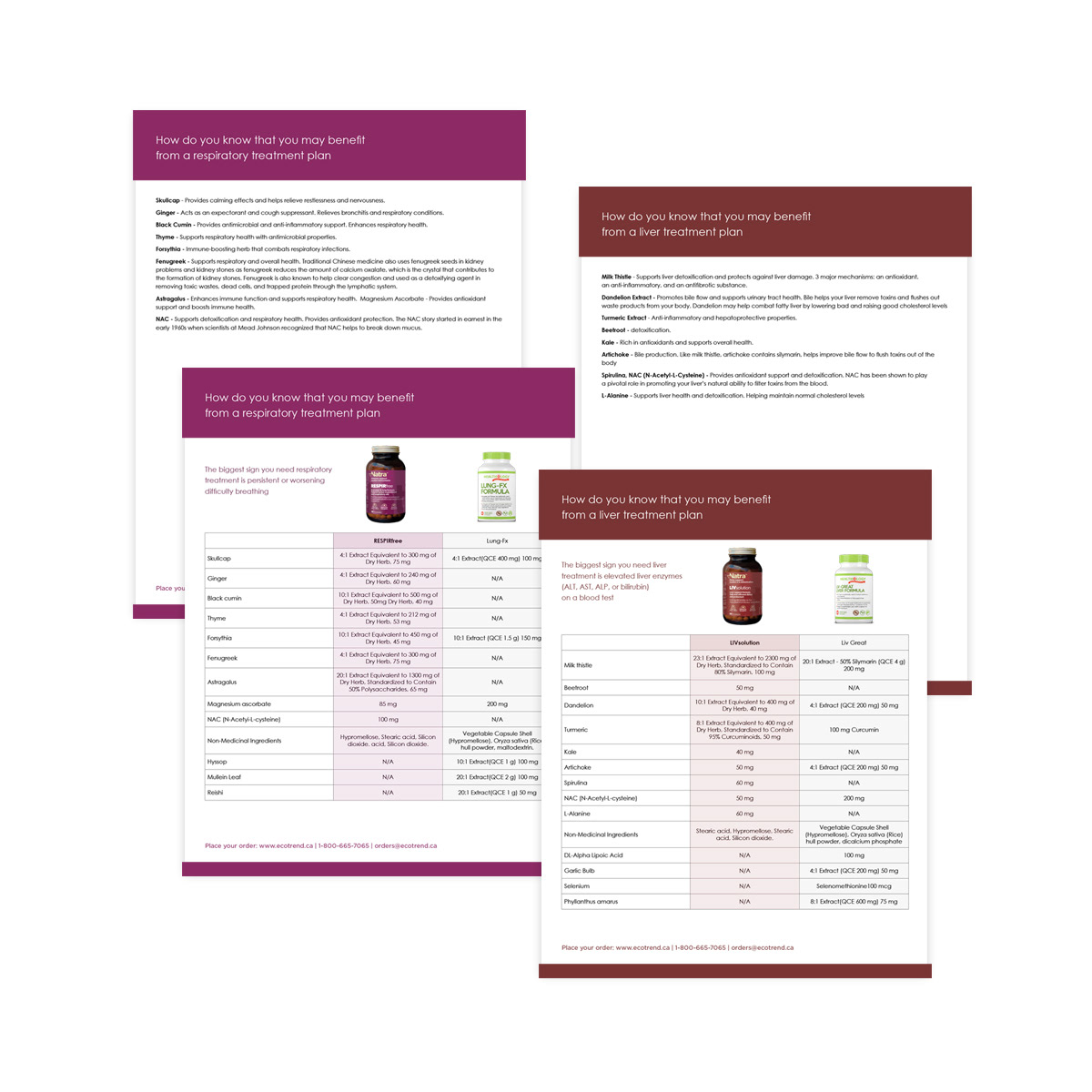
Vendor Competitive Factsheet
Vendor Competitive Factsheet
Situation
An Ecotrend vendor needed a concise, visually compelling sales tool to clearly communicate its competitive advantages within the crowded natural health and wellness market. The challenge was to distill complex product comparisons—including features, pricing, and sustainability metrics—into a format that busy retailers could quickly understand and act on.
An Ecotrend vendor needed a concise, visually compelling sales tool to clearly communicate its competitive advantages within the crowded natural health and wellness market. The challenge was to distill complex product comparisons—including features, pricing, and sustainability metrics—into a format that busy retailers could quickly understand and act on.
Execution
My objective was to design a high-impact competitive factsheet that:
• Presented side-by-side product comparisons in a clear, scannable format
• Highlighted key differentiators and sustainability advantages
• Reflected the vendor’s brand identity while aligning with Ecotrend’s overall aesthetic
• Functioned as a persuasive B2B sales enablement tool
Solution
I developed a structured, data-driven layout that simplified complex information into intuitive tables and visual comparisons.
I developed a structured, data-driven layout that simplified complex information into intuitive tables and visual comparisons.
Key design decisions included:
• Extracting authentic colours directly from the vendor’s product packaging to create immediate brand recognition and ownership
• Using clean typography and strong visual hierarchy to guide readers through features, pricing, and sustainability metrics
• Incorporating strategic iconography and balanced whitespace to enhance readability
• Designing the layout for quick scanning and easy reference during sales conversations
The result was a professional, data-forward collateral piece that empowered distributors and store buyers with clear, trustworthy insights.
Result
The factsheet strengthened the vendor’s competitive positioning, accelerated sales discussions, and supported informed purchasing decisions.
The factsheet strengthened the vendor’s competitive positioning, accelerated sales discussions, and supported informed purchasing decisions.
It provided a versatile, high-value sales tool that reinforced Ecotrend’s reputation as a trusted partner in sustainable distribution while directly contributing to vendor success in a competitive marketplace.
GRAPHIC DESIGN
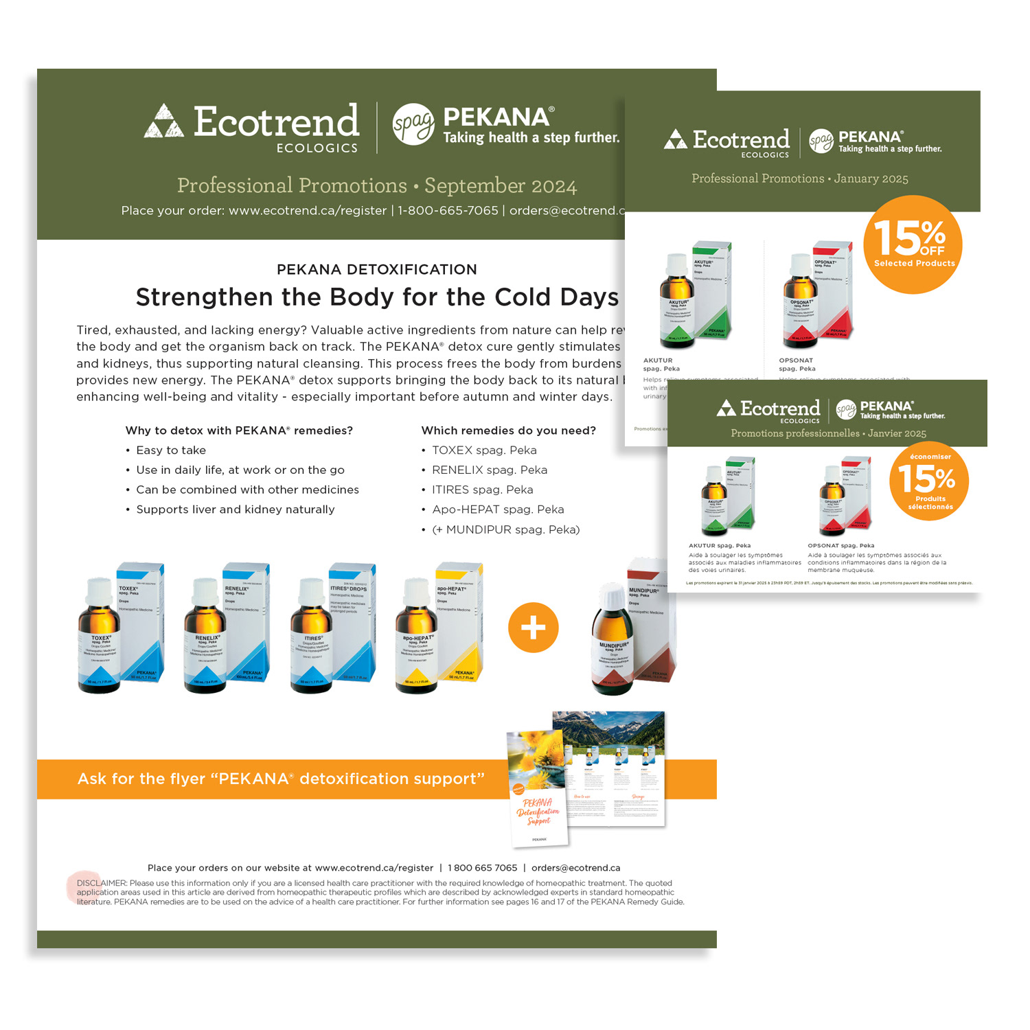
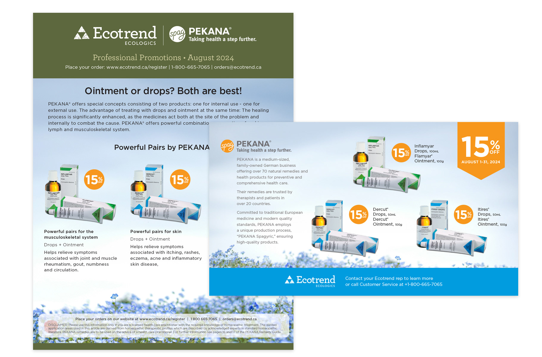
Vendor Monthly PDF Ad Series (Print + Digital Distribution)
Vendor Monthly PDF Ad Series (Print + Digital Distribution)
Situation
Ecotrend required a consistent, professional marketing touchpoint to promote vendor products, seasonal offers, and educational content to healthcare practitioners, retailers, and wellness professionals across Canada. The materials needed to perform equally well in digital formats and high-quality print, while maintaining strict brand consistency.
Ecotrend required a consistent, professional marketing touchpoint to promote vendor products, seasonal offers, and educational content to healthcare practitioners, retailers, and wellness professionals across Canada. The materials needed to perform equally well in digital formats and high-quality print, while maintaining strict brand consistency.
Execution
My objective was to design a recurring monthly PDF ad series that:
• Showcased new products and timely promotions
• Maintained strong visual consistency with corporate branding
• Functioned seamlessly across digital viewing and professional print
• Drove ongoing engagement, inquiries, and conversions within the professional channel
Solution
I developed a bold, modern layout system optimized for dual-purpose distribution (email attachments and professional print runs).
I developed a bold, modern layout system optimized for dual-purpose distribution (email attachments and professional print runs).
Key design decisions included:
• High-resolution imagery paired with scannable typography for clarity and impact
• Clear calls-to-action to guide reader response
• Strict adherence to brand standards in colour palette, logo usage, and typography
• Mobile-friendly readability and fast-loading file optimization
• Structured layouts that ensured seamless cross-channel performance
The recurring format created a reliable, high-impact monthly communication touchpoint.
Result
The series strengthened vendor relationships, kept Ecotrend top-of-mind within the professional market, and contributed to sustained demand, inquiries, and conversions.
The series strengthened vendor relationships, kept Ecotrend top-of-mind within the professional market, and contributed to sustained demand, inquiries, and conversions.
It established a dependable promotional cadence that reinforced brand credibility and supported continuous growth within Canada’s natural health and wellness distribution channel.
DIGITAL DESIGN
Monthly Pro Product Banners – Third-Party Industry Website
Monthly Pro Product Banners – Third-Party Industry Website
Situation
Ecotrend sought to increase product visibility and drive qualified traffic by advertising on a key third-party industry website frequented by wellness professionals, retailers, and practitioners across Canada. The opportunity required high-impact banner ads that would rotate monthly in a prominent hero placement while maintaining strict brand consistency and technical compliance with the host platform.
Ecotrend sought to increase product visibility and drive qualified traffic by advertising on a key third-party industry website frequented by wellness professionals, retailers, and practitioners across Canada. The opportunity required high-impact banner ads that would rotate monthly in a prominent hero placement while maintaining strict brand consistency and technical compliance with the host platform.
Execution
My objective was to design a dynamic monthly banner series that:
• Spotlighted a different professional-grade product each month
• Captured immediate attention in a high-visibility rotating hero showcase
• Maintained seamless brand identity alignment
• Met all technical specifications for optimal performance (dimensions, file size, responsiveness, load speed)
• Allowed for efficient monthly updates without full redesign
Solution
I developed a responsive banner system combining bold, on-brand typography, high-resolution product photography, and concise, benefit-driven copy to encourage clicks and engagement.
I developed a responsive banner system combining bold, on-brand typography, high-resolution product photography, and concise, benefit-driven copy to encourage clicks and engagement.
Key execution elements included:
• Designing within strict third-party technical parameters to ensure flawless display across breakpoints
• Maintaining consistent colour palettes, logo placement, and visual harmony to reinforce brand recognition
• Creating a modular framework that enabled easy monthly product swaps while preserving design integrity
• Optimizing file sizes and load speeds to maximize performance and user experience
This evergreen campaign structure ensured longevity, efficiency, and strong ROI.
Result
The banner series consistently increased product visibility, generated qualified traffic to Ecotrend’s platforms, and reinforced the brand’s authority in the natural health and wholesale distribution sector.
The banner series consistently increased product visibility, generated qualified traffic to Ecotrend’s platforms, and reinforced the brand’s authority in the natural health and wholesale distribution sector.
The recurring placement transformed passive industry site visitors into engaged prospects and strengthened Ecotrend’s leadership positioning within the eco-conscious professional market.


GRAPHIC DESIGN
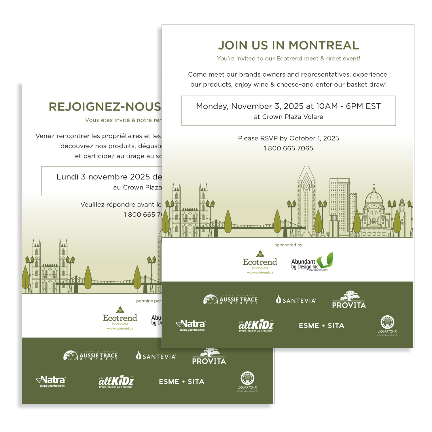
Healing Skies Conference – Ecotrend Bilingual Sponsorship Promotion
Healing Skies Conference – Ecotrend Bilingual Sponsorship Promotion
Situation
Ecotrend was sponsoring the Healing Skies Conference in Saskatchewan and required a high-visibility promotional campaign to amplify brand presence among practitioners, retailers, and wellness professionals. The campaign needed to reflect Ecotrend’s commitment to holistic health and sustainability while serving Canada’s bilingual (French/English) audience with equal clarity and impact.
Ecotrend was sponsoring the Healing Skies Conference in Saskatchewan and required a high-visibility promotional campaign to amplify brand presence among practitioners, retailers, and wellness professionals. The campaign needed to reflect Ecotrend’s commitment to holistic health and sustainability while serving Canada’s bilingual (French/English) audience with equal clarity and impact.
Execution
My objective was to design and execute a cohesive bilingual campaign that:
• Promoted Ecotrend’s conference sponsorship
• Drove registrations and booth engagement
• Maintained premium brand alignment across all materials
• Delivered seamless integration across print and digital channels
• Ensured equal visual strength and clarity in both French and English
Solution
I developed a fully integrated creative concept featuring culturally resonant messaging, bold professional visuals, and clear event details to attract attendees.
I developed a fully integrated creative concept featuring culturally resonant messaging, bold professional visuals, and clear event details to attract attendees.
This included:
• Designing high-impact print ads for conference programs and publications
• Adapting the core creative into responsive email headers, web banners, and social media graphics
• Ensuring mobile optimization and technical consistency across platforms
• Maintaining perfect bilingual symmetry in tone, hierarchy, typography, and imagery
• Applying strict brand standards to preserve Ecotrend’s premium aesthetic
This structured yet flexible approach allowed for strong cross-channel visibility while reinforcing brand credibility.
Result
The campaign successfully increased conference awareness and contributed to event registrations and booth engagement.
The campaign successfully increased conference awareness and contributed to event registrations and booth engagement.
It strengthened Ecotrend’s positioning as a leader in sustainable wellness distribution and fostered meaningful professional connections within the holistic health community.

CATALOGUE DESIGN
Biannual Mini-Catalogue Redesign, Production & Project Management (2025)
Biannual Mini-Catalogue Redesign, Production & Project Management (2025)
Situation
Ecotrend’s biannual mini-catalogues were essential promotional tools used to highlight new SKUs, product line extensions, and core brand values within Canada’s competitive natural health distribution market. However, the format required modernization to improve usability, bilingual clarity, and overall visual impact while maintaining strong brand consistency.
Ecotrend’s biannual mini-catalogues were essential promotional tools used to highlight new SKUs, product line extensions, and core brand values within Canada’s competitive natural health distribution market. However, the format required modernization to improve usability, bilingual clarity, and overall visual impact while maintaining strong brand consistency.
Execution
My objective was to lead the complete redesign, production, and project management of the 2025 mini-catalogues to:
• Improve readability and inclusivity for both French and English audiences
• Elevate visual hierarchy and product presentation
• Enhance perceived quality despite the compact format
• Ensure seamless execution from concept to print delivery
• Create a dual-purpose asset optimized for both print and digital distribution
Solution
I restructured the layout to include clearly defined French and English sections, improving navigation and reader experience.
I restructured the layout to include clearly defined French and English sections, improving navigation and reader experience.
Key design and production initiatives included:
• Enlarging product imagery to increase visual impact and product clarity
• Refining typography and strengthening hierarchy for intuitive scanning
• Applying vibrant yet brand-consistent colour palettes
• Introducing premium finishes to elevate tactile and visual quality
• Expanding content strategically to provide more value without clutter
Beyond design, I managed the full production lifecycle, including stakeholder approvals, file preparation, printer coordination, quality control, and on-time delivery to ensure flawless execution and strong shelf presence.
Result
The redesigned mini-catalogue became a highly usable, visually compelling marketing asset that strengthened Ecotrend’s leadership positioning in sustainable wellness distribution.
The redesigned mini-catalogue became a highly usable, visually compelling marketing asset that strengthened Ecotrend’s leadership positioning in sustainable wellness distribution.
It increased product awareness, supported wholesale inquiries, and improved overall engagement through enhanced readability, premium presentation, and brand resonance.
Mini Catalogue
Mini Bilingual Catalogue
GRAPHIC DESIGN
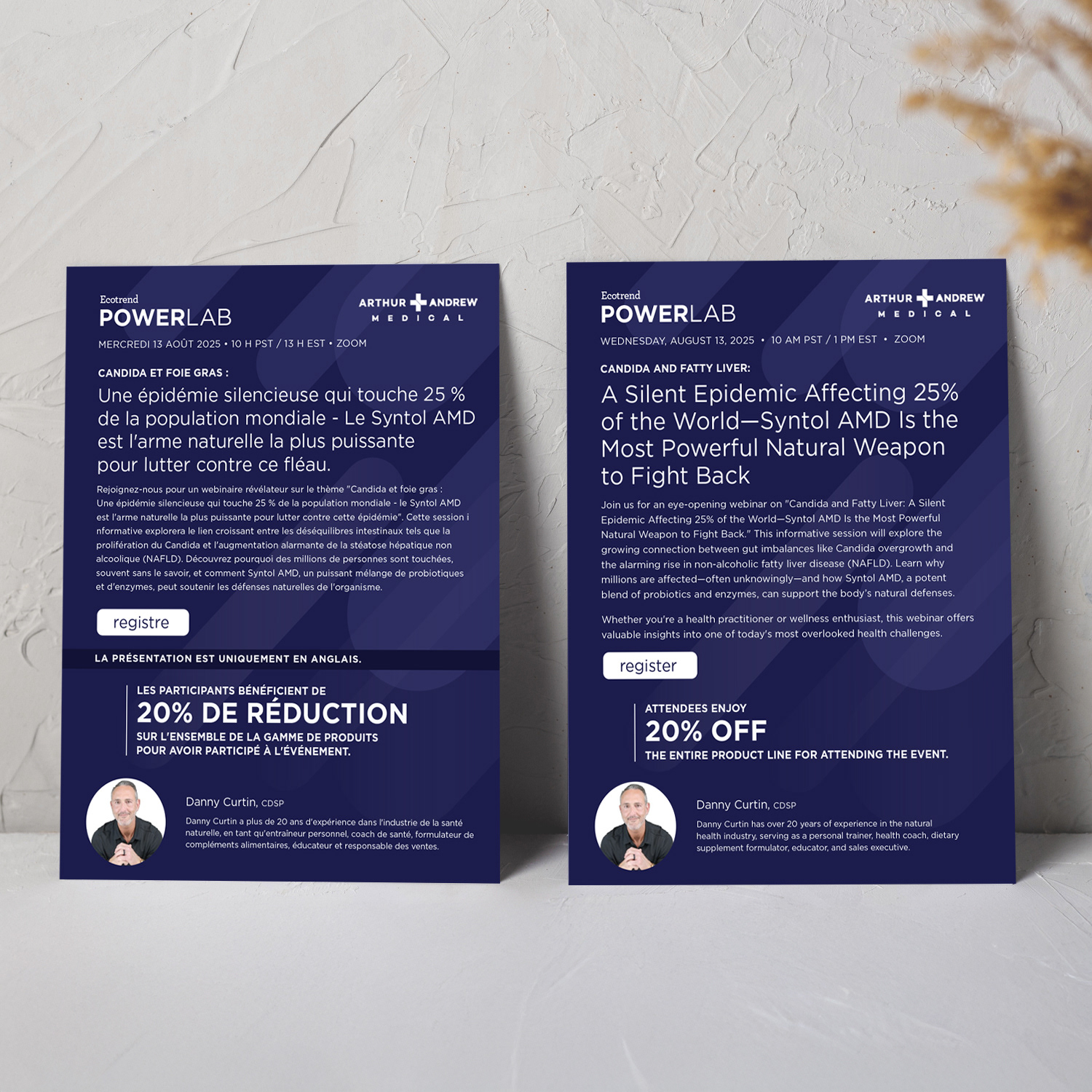
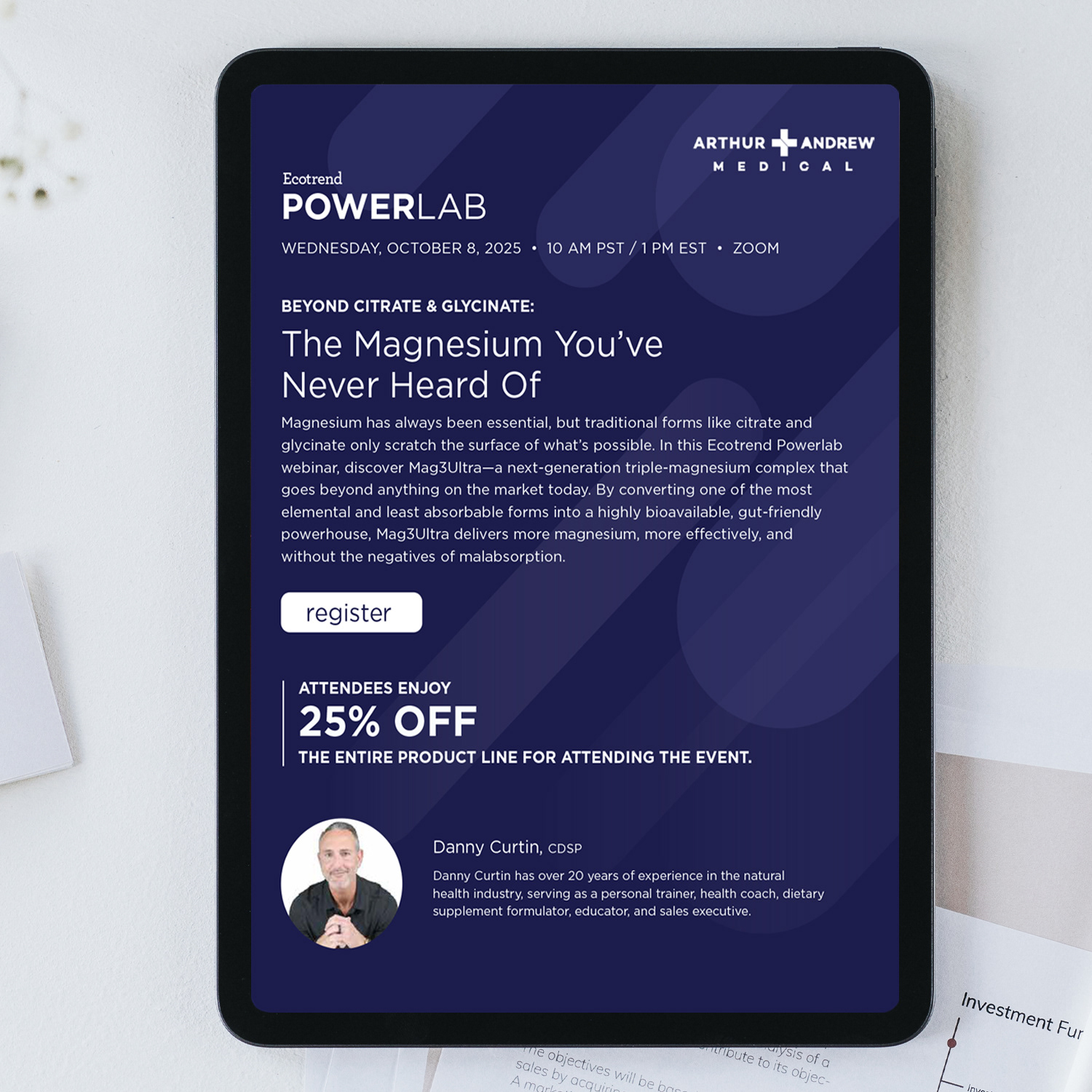
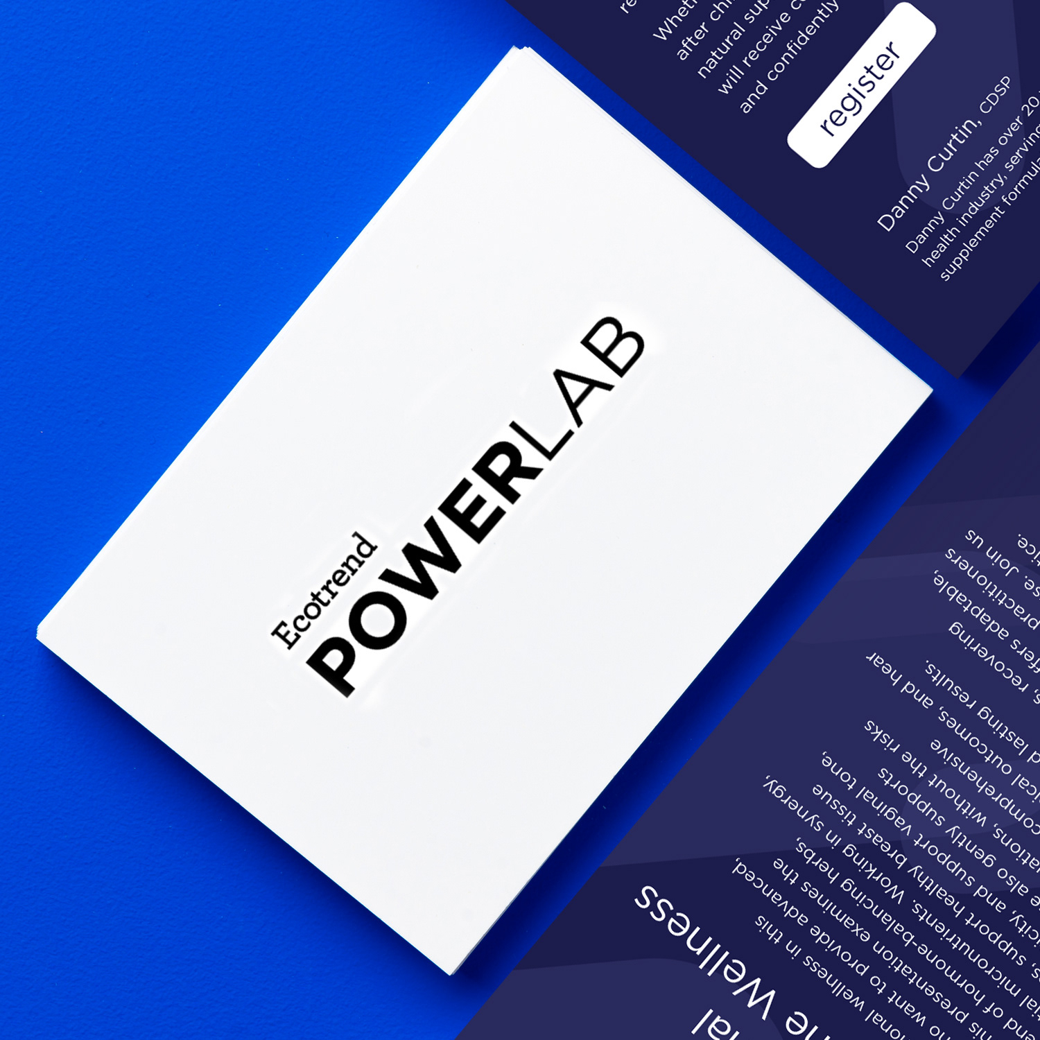
Quarterly Professional Webinar Campaigns
Quarterly Professional Webinar Campaigns
Situation
Ecotrend Ecologics aimed to strengthen connections between its vendors and professional audiences—including health practitioners, retailers, and wellness experts—through educational webinars. The company required cohesive, high-impact promotional campaigns that would drive registrations, maintain brand authority, and deliver a polished virtual experience across Canada’s competitive natural health market.
Ecotrend Ecologics aimed to strengthen connections between its vendors and professional audiences—including health practitioners, retailers, and wellness experts—through educational webinars. The company required cohesive, high-impact promotional campaigns that would drive registrations, maintain brand authority, and deliver a polished virtual experience across Canada’s competitive natural health market.
Execution
My objective was to create and execute quarterly multi-channel webinar campaigns that:
• Promoted high-value professional education sessions
• Generated strong registrations and attendance
• Maintained consistent brand alignment across all touchpoints
• Delivered a seamless and credible virtual event experience
Solution
I developed comprehensive promotional toolkits for each webinar, ensuring consistent messaging and visual identity across platforms.
I developed comprehensive promotional toolkits for each webinar, ensuring consistent messaging and visual identity across platforms.
Campaign components included:
• Professionally designed PDF invitations featuring event details, agendas, speaker bios, and strong calls-to-action
• High-impact email banners optimized for inbox visibility
• Integrated promotional placements within monthly catalogue emails
• Supporting social media graphics to expand reach
• Professionally designed PDF invitations featuring event details, agendas, speaker bios, and strong calls-to-action
• High-impact email banners optimized for inbox visibility
• Integrated promotional placements within monthly catalogue emails
• Supporting social media graphics to expand reach
In addition to marketing design, I managed the full Zoom webinar production process, including technical setup, branded overlays, interactive polls, and professional moderation to ensure smooth execution and strong audience engagement.
Result
The campaigns successfully increased webinar registrations and participation while strengthening vendor-professional relationships.
The campaigns successfully increased webinar registrations and participation while strengthening vendor-professional relationships.
They enhanced product knowledge and adoption, reinforced Ecotrend’s leadership in natural health distribution, and contributed to measurable engagement and sales growth within the competitive B2B wellness sector.
PRESENTATION DESIGN
Ecotrend Corporate Pitch Deck – Strategy, Copy & Visual Design
Ecotrend Corporate Pitch Deck – Strategy, Copy & Visual Design
Situation
Ecotrend required a compelling corporate pitch deck to communicate its business strategy, sustainability initiatives, vendor partnerships, market positioning, and growth projections to investors, partners, and key stakeholders. The existing materials were dense and complex, requiring a clear, persuasive narrative that aligned with the company’s premium, eco-conscious brand identity.
Ecotrend required a compelling corporate pitch deck to communicate its business strategy, sustainability initiatives, vendor partnerships, market positioning, and growth projections to investors, partners, and key stakeholders. The existing materials were dense and complex, requiring a clear, persuasive narrative that aligned with the company’s premium, eco-conscious brand identity.
Execution
My objective was to design and author a high-impact PowerPoint presentation that:
• Transformed complex business information into a concise, persuasive story
• Built investor confidence and credibility
• Reflected Ecotrend’s leadership in sustainable distribution
• Maintained strong brand consistency across every slide
• Accelerated stakeholder understanding and decision-making
Solution
Working closely with leadership, I crafted strategic copy tailored to decision-makers and structured the deck as a cohesive business narrative.
Working closely with leadership, I crafted strategic copy tailored to decision-makers and structured the deck as a cohesive business narrative.
Key execution elements included:
• Translating data and projections into clear, high-contrast charts and infographics
• Designing custom visuals aligned with the corporate colour palette and typography system
• Establishing strong visual hierarchy for clarity and flow
• Simplifying complex sustainability and growth messaging into digestible, compelling slides
• Applying clean layouts and subtle transitions to guide audience engagement
• Every slide was intentionally built for clarity, authority, and persuasive impact.
Result
The final presentation strengthened investor confidence, supported strategic conversations, and accelerated decision-making processes.
The final presentation strengthened investor confidence, supported strategic conversations, and accelerated decision-making processes.
It positioned Ecotrend as a credible, forward-thinking leader in Canada’s sustainable distribution and natural health wholesale sector while reinforcing brand authority at the executive level.
CATALOGUE DESIGN
Biannual Mini-Catalogue Redesign, Production & Project Management (2024)
Biannual Mini-Catalogue Redesign, Production & Project Management (2024)
Situation
Ecotrend’s biannual mini-catalogues were key promotional tools used to showcase new SKUs, product line extensions, and core brand values within Canada’s competitive natural health distribution market. However, the format required modernization to improve bilingual clarity, visual engagement, and perceived quality while maintaining strong brand consistency.
Ecotrend’s biannual mini-catalogues were key promotional tools used to showcase new SKUs, product line extensions, and core brand values within Canada’s competitive natural health distribution market. However, the format required modernization to improve bilingual clarity, visual engagement, and perceived quality while maintaining strong brand consistency.
Execution
My objective was to lead the full redesign, production, and project management of the 2024 mini-catalogues to:
• Improve readability through dedicated French and English sections
• Enhance product visibility and storytelling
• Elevate overall design sophistication within a compact format
• Deliver a seamless, on-time production cycle
• Create a dual-purpose asset optimized for both print and digital distribution
Solution
I restructured the catalogue layout to create clearly defined bilingual sections, ensuring inclusivity and intuitive navigation.
I restructured the catalogue layout to create clearly defined bilingual sections, ensuring inclusivity and intuitive navigation.
Key design and execution improvements included:
• Significantly enlarging product imagery for stronger visual impact
• Refining typography and strengthening visual hierarchy for easier scanning
• Expanding content depth while maintaining clarity and flow
• Introducing modern visual storytelling elements to enhance engagement
• Applying harmonious, brand-consistent colour palettes and premium finishes
Beyond design, I managed the complete production lifecycle, from initial concept and stakeholder approvals to print file preparation, vendor coordination, quality control, and on-time delivery, ensuring flawless execution and strong shelf presence.
Result
The redesigned mini-catalogue became a highly effective marketing asset that elevated Ecotrend’s presentation in the wholesale marketplace.
The redesigned mini-catalogue became a highly effective marketing asset that elevated Ecotrend’s presentation in the wholesale marketplace.
It strengthened product awareness, increased wholesale inquiries, and reinforced Ecotrend’s leadership positioning as Canada’s sustainable distribution partner, delivering measurable engagement and improved brand resonance across both print and digital formats.
See the latest versions: https://acrobat.adobe.com/id/urn:aaid:sc:US:55aa0cff-a1e3-49df-bd3b-163e6b517ed3
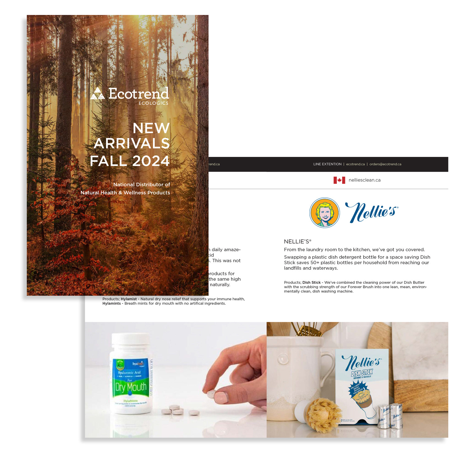
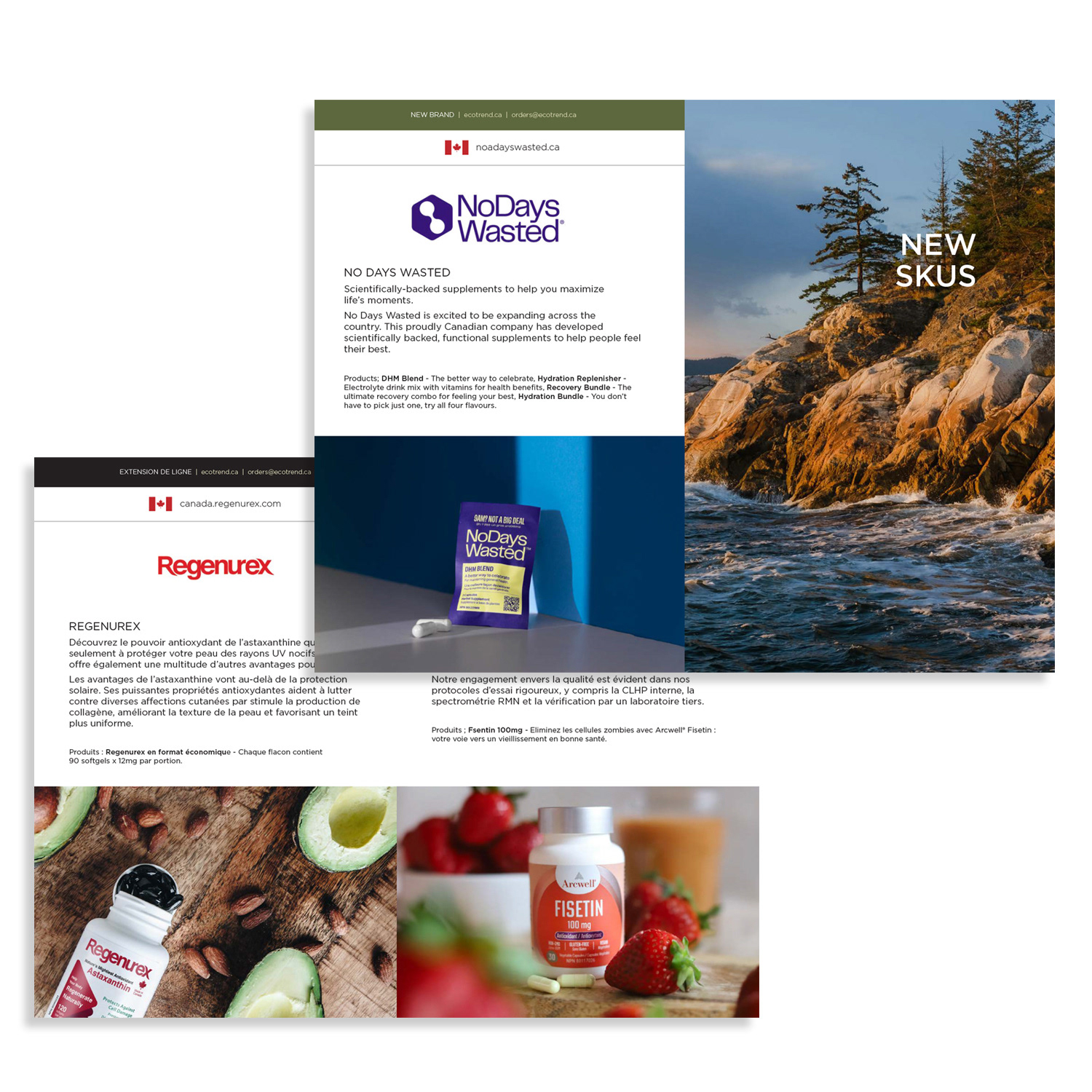
GRAPHIC DESIGN
Monthly Retail Promotions – Template System (2024)
Monthly Retail Promotions – Template System (2024)
Situation
Ecotrend produced monthly professional promotions targeting practitioners, retailers, and wellness professionals across Canada. However, the recurring nature of these campaigns required a more efficient design system that maintained high visual standards, strong brand consistency, and rapid production timelines across both print and digital formats.
Ecotrend produced monthly professional promotions targeting practitioners, retailers, and wellness professionals across Canada. However, the recurring nature of these campaigns required a more efficient design system that maintained high visual standards, strong brand consistency, and rapid production timelines across both print and digital formats.
Execution
My objective was to design a comprehensive, reusable InDesign template system that:
• Elevated the professionalism and clarity of monthly promotional materials
• Streamlined production workflows without sacrificing quality
• Ensured consistent brand alignment across all editions
• Supported both print distribution and interactive PDF sharing
Solution
I developed a modular template framework built in Adobe InDesign, incorporating smart master pages, predefined paragraph and character styles, and structured layout components.
I developed a modular template framework built in Adobe InDesign, incorporating smart master pages, predefined paragraph and character styles, and structured layout components.
Key design and workflow improvements included:
• Establishing strong visual hierarchy for clearer communication of key offers and product highlights
• Creating intuitive sectioning for improved readability and practitioner engagement
• Applying consistent brand colours, typography, and imagery standards
• Designing layouts optimized for both print output and interactive PDF distribution
• Building reusable components that enabled rapid monthly updates while preserving visual cohesion
This scalable system significantly reduced production time while maintaining premium design quality.
Result
The new template system strengthened Ecotrend’s professional presence by delivering consistently polished promotional materials each month.
The new template system strengthened Ecotrend’s professional presence by delivering consistently polished promotional materials each month.
It increased efficiency, supported higher engagement from practitioners and retailers, and contributed to sustained wholesale inquiries and long-term professional relationships within the natural health sector.

Retail Newsletter

Retail Newsletter


EMAIL DESIGN
High-Engagement Monthly Retail eNewsletter
High-Engagement Monthly Retail eNewsletter
Situation
Ecotrend needed a consistent and engaging way to communicate monthly promotions, new product launches, sustainability highlights, and trade event updates to grocery stores, health retailers, and wellness professionals across Canada. The goal was to drive wholesale traffic, strengthen retailer relationships, and maintain top-of-mind brand presence in a competitive natural health distribution market.
Ecotrend needed a consistent and engaging way to communicate monthly promotions, new product launches, sustainability highlights, and trade event updates to grocery stores, health retailers, and wellness professionals across Canada. The goal was to drive wholesale traffic, strengthen retailer relationships, and maintain top-of-mind brand presence in a competitive natural health distribution market.
Execution
My objective was to design and produce a high-performing monthly retail eNewsletter that:
• Delivered clear, compelling promotional messaging
• Increased open rates and click-through engagement
• Maintained strong brand consistency and professional polish
• Encouraged direct orders, inquiries, and event participation
• Performed seamlessly across desktop and mobile devices
Solution
I developed a clean, visually structured email template system built around strong hierarchy and scannability.
I developed a clean, visually structured email template system built around strong hierarchy and scannability.
Key execution elements included:
• Bold headlines and concise deal descriptions for quick readability
• High-resolution product imagery to increase visual engagement
• Clearly defined sections for seasonal promotions, sustainability features, and vendor spotlights
• Strong calls-to-action with embedded product links, promo codes, and event registration buttons
• Full mobile optimization and inbox performance best practices to improve deliverability and user experience
The newsletter was designed as a recurring, value-driven touchpoint that balanced sales promotion with brand storytelling.
Result
The monthly eNewsletter increased engagement, boosted wholesale traffic, and supported product awareness across Ecotrend’s retail network.
The monthly eNewsletter increased engagement, boosted wholesale traffic, and supported product awareness across Ecotrend’s retail network.
It strengthened long-term retailer relationships, encouraged repeat opens and direct inquiries, and reinforced Ecotrend’s reputation as a trusted leader in sustainable and natural health distribution.

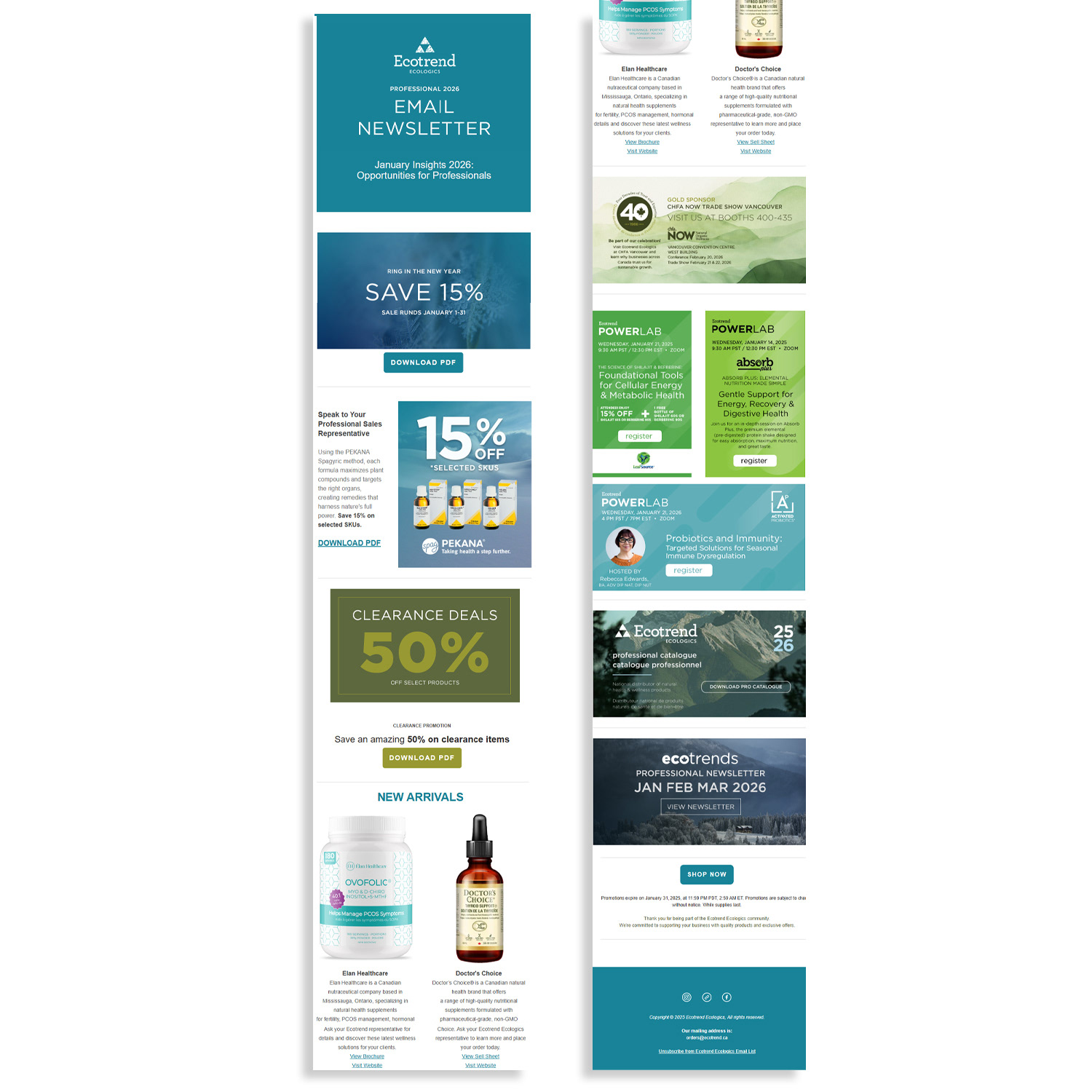
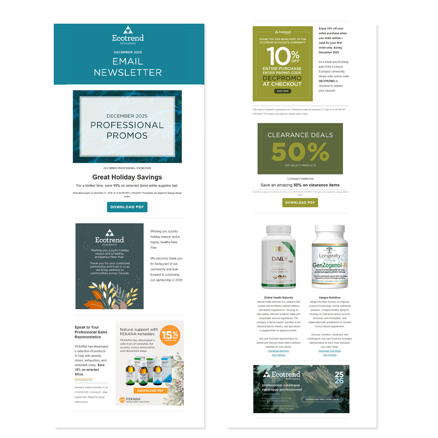
CHART DESIGN
Data Visualization & Strategic Chart Creation
Data Visualization & Strategic Chart Creation
Situation
Ecotrend regularly worked with complex datasets—including product comparisons, performance metrics, sustainability benchmarks, benefit breakdowns, and market insights—that were difficult for retailers, practitioners, and stakeholders to quickly interpret. Dense data risked overwhelming audiences and slowing decision-making.
Ecotrend regularly worked with complex datasets—including product comparisons, performance metrics, sustainability benchmarks, benefit breakdowns, and market insights—that were difficult for retailers, practitioners, and stakeholders to quickly interpret. Dense data risked overwhelming audiences and slowing decision-making.
Execution
My objective was to transform complex information into clear, visually compelling charts and data visualizations that:
• Simplified difficult data into instantly digestible insights
• Highlighted key takeaways without oversimplifying accuracy
• Reinforced brand consistency and credibility
• Functioned effectively across print, digital, and presentation formats
Solution
Using Adobe Illustrator and InDesign, I designed custom charts tailored to specific business needs and audience contexts.
Using Adobe Illustrator and InDesign, I designed custom charts tailored to specific business needs and audience contexts.
Key design strategies included:
• Applying intuitive layouts and strong visual hierarchy to guide comprehension
• Using thoughtful colour coding aligned with brand standards
• Incorporating strategic icons and concise labels to reduce cognitive load
• Ensuring precise typography and balanced spacing for clarity
• Adapting charts for multiple applications, including sales decks, product factsheets, catalogues, trade show displays, internal reports, and digital marketing assets
Each visualization was built not just for accuracy, but for clarity, persuasion, and brand alignment.
Result
The redesigned data visuals significantly improved audience comprehension and retention, accelerated decision-making, and increased engagement across professional and retail channels.
The redesigned data visuals significantly improved audience comprehension and retention, accelerated decision-making, and increased engagement across professional and retail channels.
By turning complex information into compelling visual stories, the charts strengthened credibility, supported sales conversations, and directly contributed to clearer communication of product and sustainability value propositions.
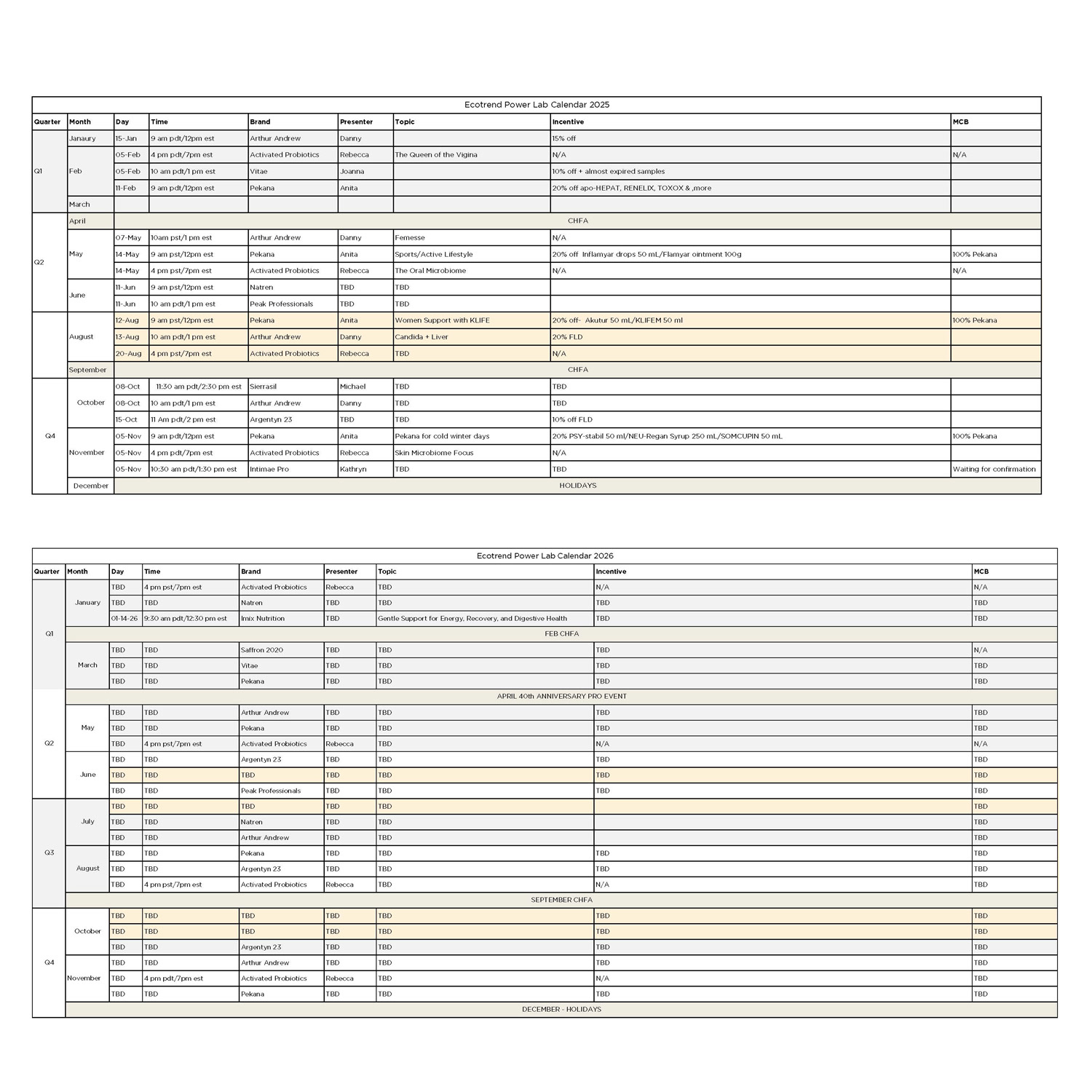

GRAPHIC DESIGN
Animated Holiday Greetings (2024 & 2025)
Animated Holiday Greetings (2024 & 2025)
Situation
Ecotrend wanted to send seasonal holiday greetings to clients, partners, and stakeholders while maintaining a professional, on-brand presence. The challenge was to create animated e-cards that delivered festive messaging without causing email compatibility issues or slow load times.
Ecotrend wanted to send seasonal holiday greetings to clients, partners, and stakeholders while maintaining a professional, on-brand presence. The challenge was to create animated e-cards that delivered festive messaging without causing email compatibility issues or slow load times.
Execution
My objective was to design lightweight, animated holiday e-cards that:
• Conveyed warmth and professionalism
• Functioned seamlessly across Outlook, webmail, and mobile devices
• Reinforced brand identity and left a positive, memorable impression
• Delivered animation and visual interest without relying on heavy files or external hosting
Solution
I developed subtle, elegant animations—such as gentle snowfall, glowing lights, and soft transitions—paired with clean typography and a festive yet restrained colour palette.
I developed subtle, elegant animations—such as gentle snowfall, glowing lights, and soft transitions—paired with clean typography and a festive yet restrained colour palette.
Key execution steps included:
• Ensuring file sizes were optimized for smooth rendering in all email clients
• Integrating the brand logo and maintaining consistent brand standards throughout
• Creating lightweight motion graphics that could be attached directly to emails without external dependencies
• Testing across desktop, mobile, and webmail platforms to guarantee flawless performance
The e-cards were designed as both visually appealing and technically reliable seasonal communications.
Result
The animated holiday greetings strengthened client and partner relationships, reinforced Ecotrend’s professional brand presence, and delivered a warm, memorable touchpoint during the holiday season.
The animated holiday greetings strengthened client and partner relationships, reinforced Ecotrend’s professional brand presence, and delivered a warm, memorable touchpoint during the holiday season.
They successfully combined motion, elegance, and brand alignment while maintaining flawless technical performance in email distribution.

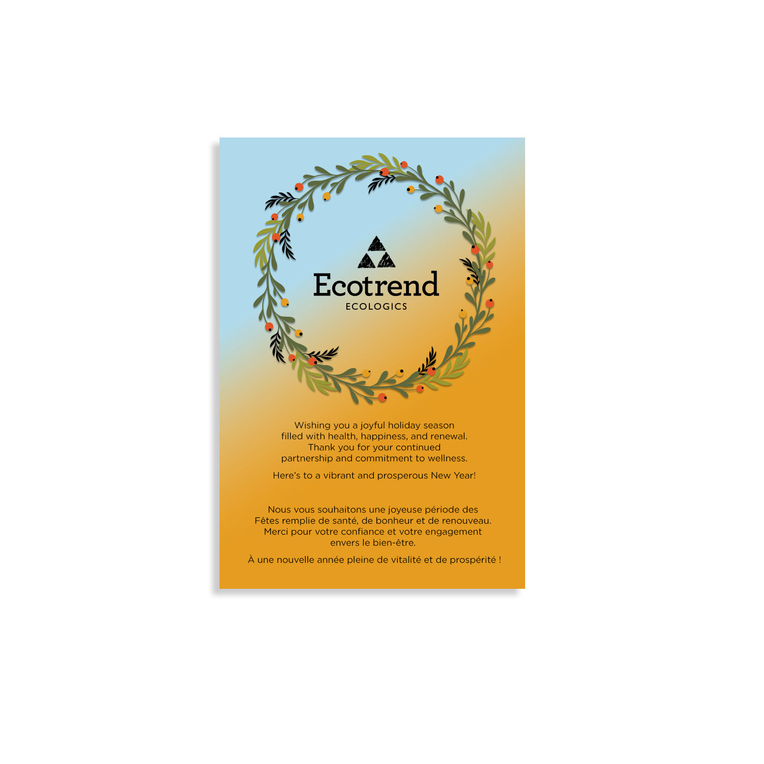
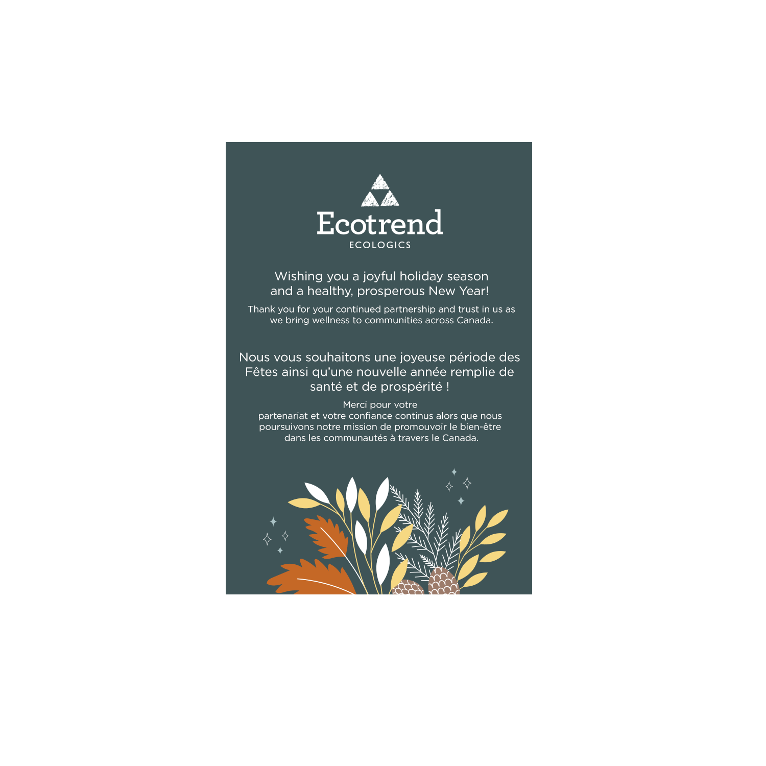
GRAPHIC DESIGN
Sticky Marketing Materials
Sticky Marketing Materials
Situation
Ecotrend Ecologics seeks cost-effective, high-impact ways to increase brand visibility through packaging and promotional materials.
Ecotrend Ecologics seeks cost-effective, high-impact ways to increase brand visibility through packaging and promotional materials.
Solution
As Marketing Art Director, my goal is to design branded assets that enhance product samples, promotional giveaways, and packaging efficiency while maintaining brand recognition and controlling costs.
As Marketing Art Director, my goal is to design branded assets that enhance product samples, promotional giveaways, and packaging efficiency while maintaining brand recognition and controlling costs.
Execution
I design branded stickers for samples and swag, creating a versatile, low-cost tool to increase brand awareness. I also develop black-only packaging tape, streamlining production and improving visibility on shipment boxes compared to previous designs
I design branded stickers for samples and swag, creating a versatile, low-cost tool to increase brand awareness. I also develop black-only packaging tape, streamlining production and improving visibility on shipment boxes compared to previous designs
Result
These initiatives boost brand recognition, provide affordable marketing solutions, and reduce packaging costs while improving operational efficiency and visual consistency across shipments and promotional materials.
These initiatives boost brand recognition, provide affordable marketing solutions, and reduce packaging costs while improving operational efficiency and visual consistency across shipments and promotional materials.
GRAPHIC DESIGN
CHFA 2026 & 40th Anniversary Campaign
CHFA 2026 & 40th Anniversary Campaign
Situation
Ecotrend Ecologics participates in the CHFA 2026 trade show, a key industry event for the natural health sector. The event coincides with Ecotrend’s 40th Anniversary, creating an opportunity to celebrate the milestone while strengthening brand visibility among retailers, vendors, and industry partners.
Ecotrend Ecologics participates in the CHFA 2026 trade show, a key industry event for the natural health sector. The event coincides with Ecotrend’s 40th Anniversary, creating an opportunity to celebrate the milestone while strengthening brand visibility among retailers, vendors, and industry partners.
Task
As Marketing Art Director, my objective is to design and oversee a cohesive multi-channel campaign that promotes Ecotrend’s presence at CHFA while integrating the company’s 40th anniversary celebration into all marketing touchpoints.
As Marketing Art Director, my objective is to design and oversee a cohesive multi-channel campaign that promotes Ecotrend’s presence at CHFA while integrating the company’s 40th anniversary celebration into all marketing touchpoints.
Action
I design a full suite of trade show marketing assets, including print ads, pull-up banners, tent cards, digital banner ads, and dedicated email campaigns. Using CHFA event graphics as a foundation, I adapt and integrate them into Ecotrend’s brand identity, creating a cohesive visual system that merges both concepts.
I design a full suite of trade show marketing assets, including print ads, pull-up banners, tent cards, digital banner ads, and dedicated email campaigns. Using CHFA event graphics as a foundation, I adapt and integrate them into Ecotrend’s brand identity, creating a cohesive visual system that merges both concepts.
I also lead and coordinate the creative team, overseeing video production, social media content, and event marketing initiatives while ensuring alignment across all materials. In addition, I collaborate with internal marketing teams to coordinate Ecotrend’s trade show presence and anniversary celebration.
Result
The campaign delivers a unified, high-impact brand presence at CHFA 2026, effectively promoting Ecotrend’s 40-year legacy while increasing engagement with retailers, vendors, and industry partners. The integrated marketing approach strengthens brand recognition and enhances the company’s visibility at one of the industry’s most important events.
The campaign delivers a unified, high-impact brand presence at CHFA 2026, effectively promoting Ecotrend’s 40-year legacy while increasing engagement with retailers, vendors, and industry partners. The integrated marketing approach strengthens brand recognition and enhances the company’s visibility at one of the industry’s most important events.
Key Skills & Expertise
Trade show marketing, campaign art direction, event branding, multi-channel campaign design, print & digital advertising, team leadership, vendor coordination, and integrated marketing for the natural health and wellness industry.
Trade show marketing, campaign art direction, event branding, multi-channel campaign design, print & digital advertising, team leadership, vendor coordination, and integrated marketing for the natural health and wellness industry.