ZE PowerGroup Inc. (Zema Global)
Team Lead & Senior Graphic Designer // 2013-2016
Team Lead & Senior Graphic Designer // 2013-2016
MARKETING LEADERSHIP & OMNI-CHANNEL DESIGN
Corporate Branding & Marketing Materials
Corporate Branding & Marketing Materials
Situation
ZE PowerGroup needed cohesive, professional marketing and branding assets to establish thought leadership in the energy and data management sector. With multiple departments and channels, the company required consistent, high-quality materials that supported sales, internal communications, and external positioning.
ZE PowerGroup needed cohesive, professional marketing and branding assets to establish thought leadership in the energy and data management sector. With multiple departments and channels, the company required consistent, high-quality materials that supported sales, internal communications, and external positioning.
Solution
Promoted to Marketing Team Lead within my first year, I led the strategy and execution of omni-channel marketing materials and corporate branding across the organization. I managed a multidisciplinary team of copywriters, developers, video editors, and external partners, and held every touchpoint to one consistent brand.
Promoted to Marketing Team Lead within my first year, I led the strategy and execution of omni-channel marketing materials and corporate branding across the organization. I managed a multidisciplinary team of copywriters, developers, video editors, and external partners, and held every touchpoint to one consistent brand.
Execution
Designed and produced a wide range of assets, including monthly magazines, factsheets, infographics, white papers, case studies, email campaigns, blog layouts, corporate stationery, intranet designs, pop-up displays, and user forum materials. I directed major campaigns, including the ZEMA User Community Launch, the Datawatch magazine, and the Lunch & Learn series. I also managed printers, suppliers, and production workflows to keep quality, consistency, and efficiency high, and maintained strict brand alignment across all touchpoints.
Designed and produced a wide range of assets, including monthly magazines, factsheets, infographics, white papers, case studies, email campaigns, blog layouts, corporate stationery, intranet designs, pop-up displays, and user forum materials. I directed major campaigns, including the ZEMA User Community Launch, the Datawatch magazine, and the Lunch & Learn series. I also managed printers, suppliers, and production workflows to keep quality, consistency, and efficiency high, and maintained strict brand alignment across all touchpoints.
Result
The work gave ZE PowerGroup a strong, unified brand presence and raised its credibility in the energy sector. The scalable systems and high-quality assets improved communication across departments, supported sales efforts, and strengthened the company’s position in energy data management.
The work gave ZE PowerGroup a strong, unified brand presence and raised its credibility in the energy sector. The scalable systems and high-quality assets improved communication across departments, supported sales efforts, and strengthened the company’s position in energy data management.

















UX/UI DESIGN
Corporate Websites & Blog Redesign
Corporate Websites & Blog Redesign
Situation
ZE PowerGroup needed its digital presence to do more than describe the company. The corporate website had to communicate complex energy and data management solutions clearly, in a competitive B2B market, while improving user experience, engagement, and marketing performance. The company also needed a content platform to increase brand visibility, establish thought leadership in the energy sector, and generate qualified leads. The existing blog and related pages lacked modern usability and engagement.
ZE PowerGroup needed its digital presence to do more than describe the company. The corporate website had to communicate complex energy and data management solutions clearly, in a competitive B2B market, while improving user experience, engagement, and marketing performance. The company also needed a content platform to increase brand visibility, establish thought leadership in the energy sector, and generate qualified leads. The existing blog and related pages lacked modern usability and engagement.
Solution
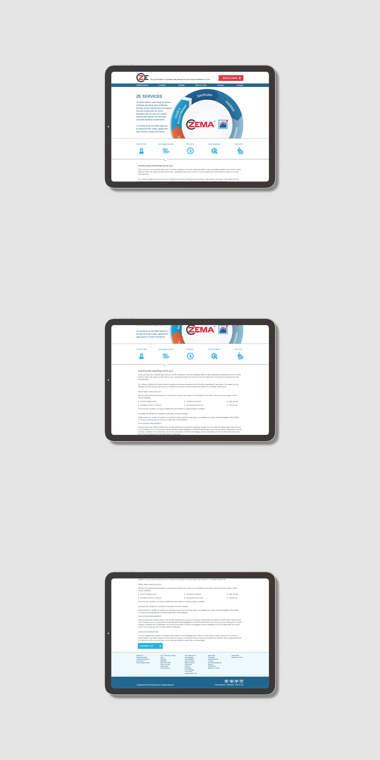
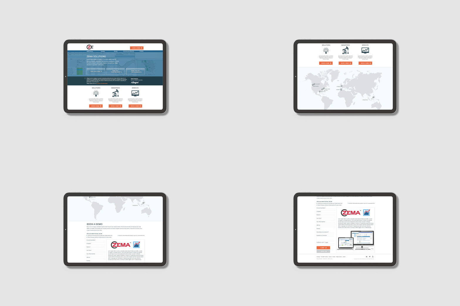
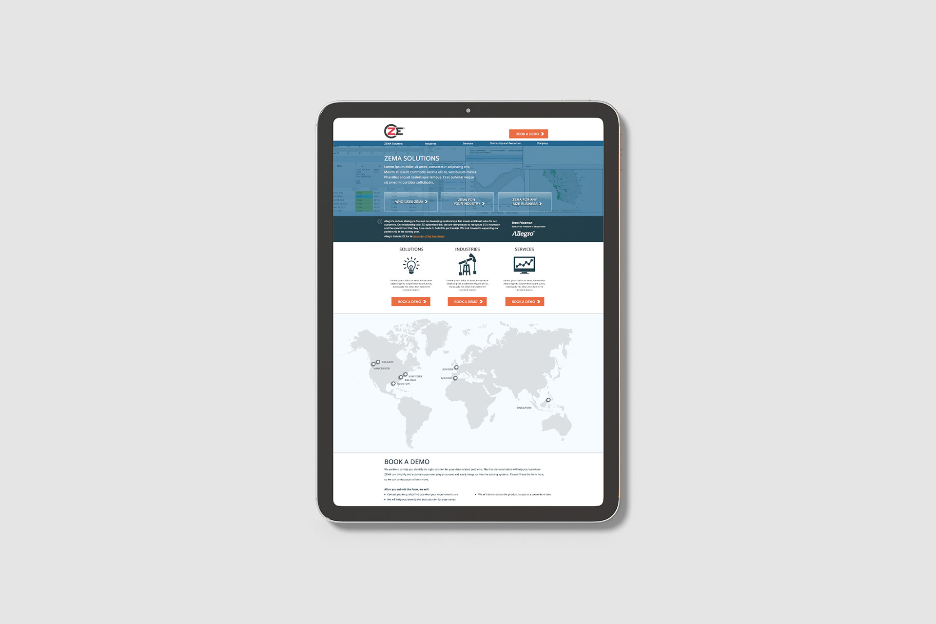
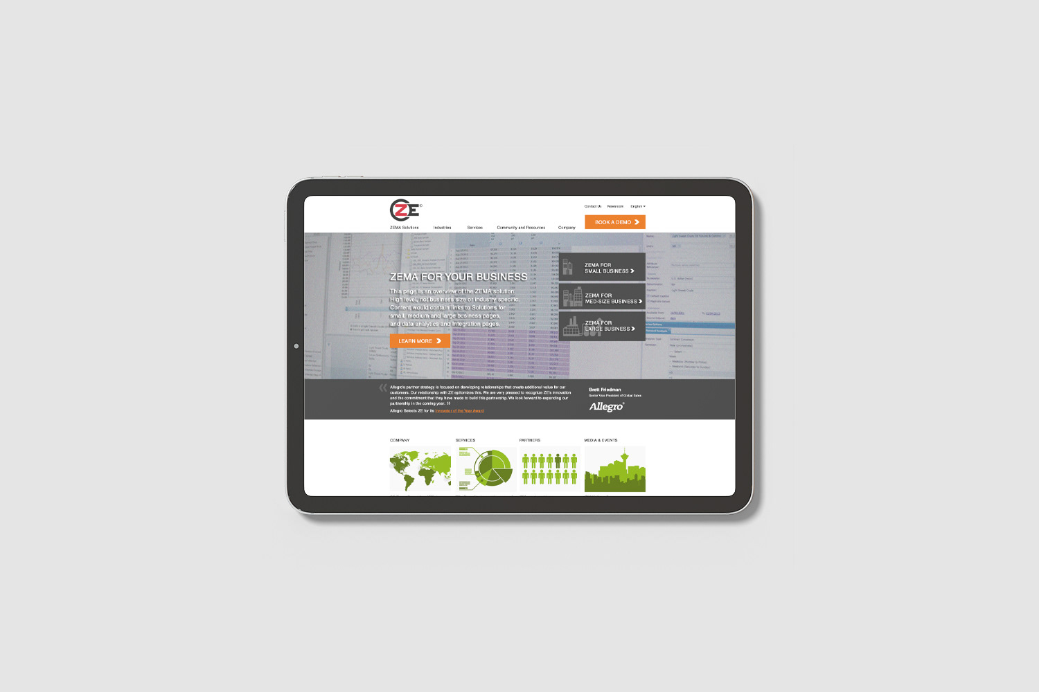
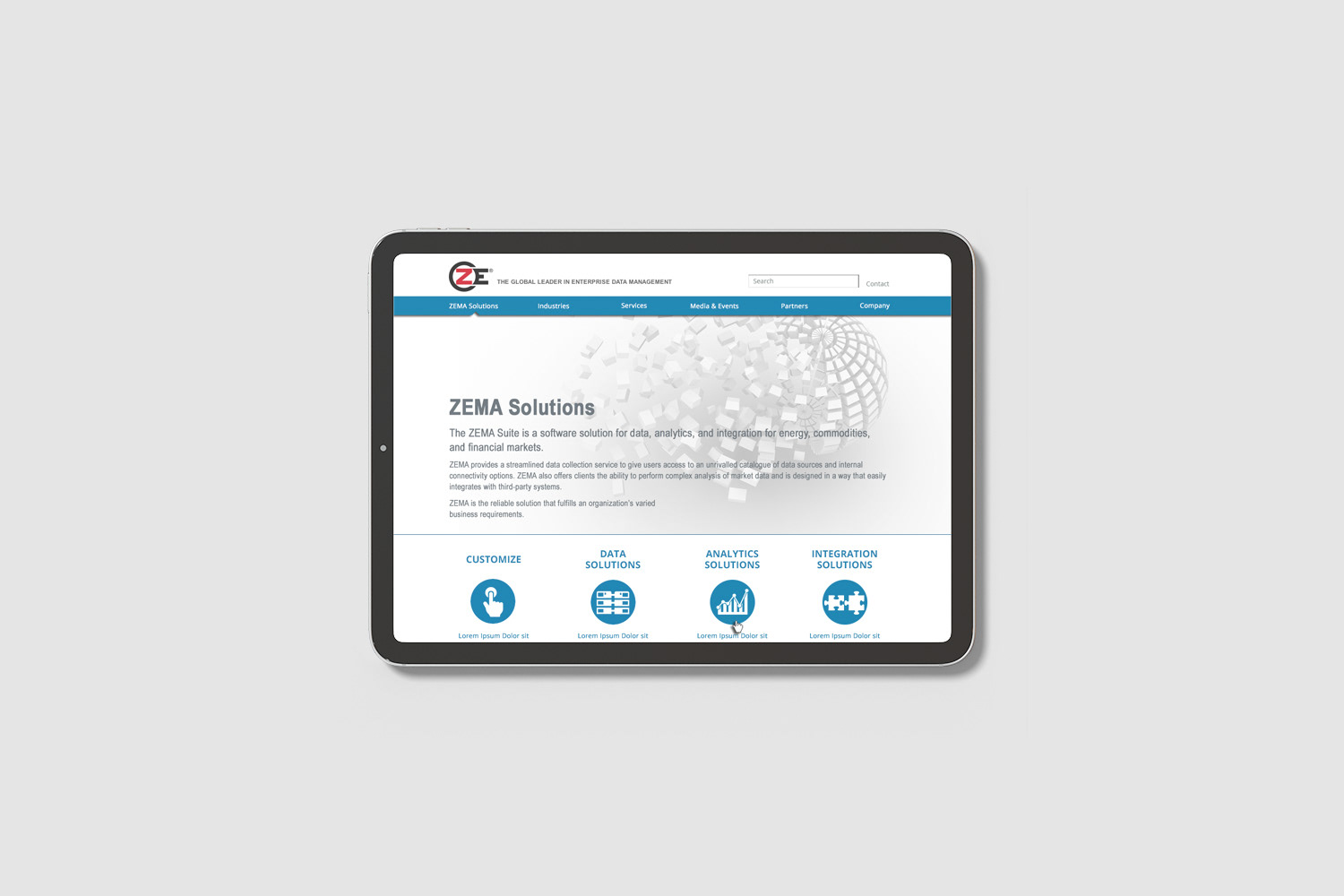
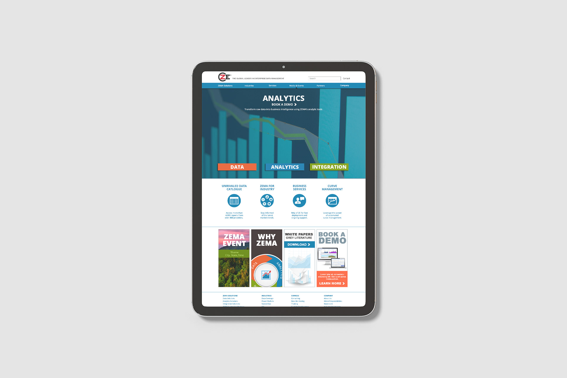
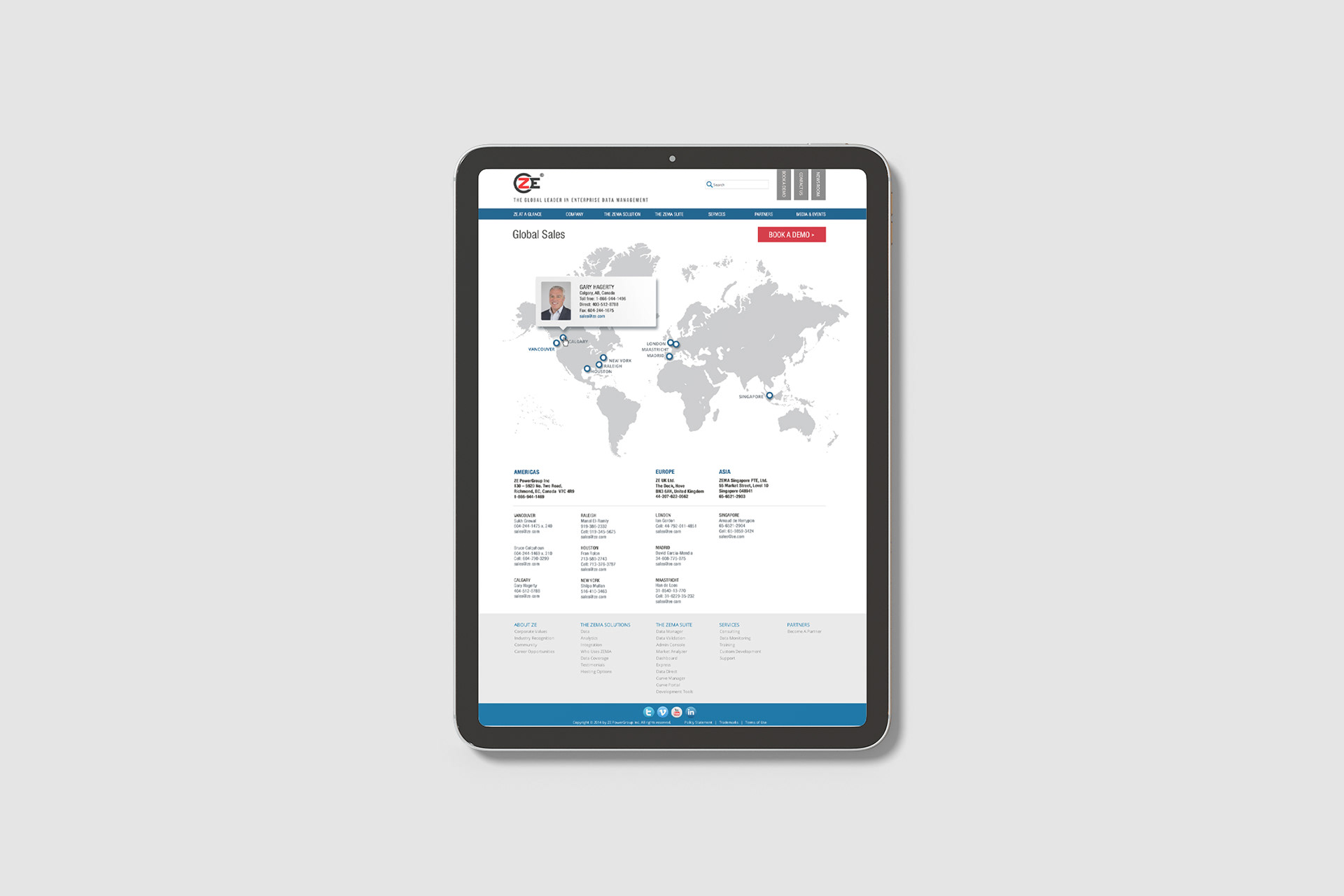
As UX/UI Designer, and later Marketing Team Lead, I led the full redesign, ongoing maintenance, and strategic evolution of the corporate website, and led the launch and optimization of the corporate blog as a key growth initiative. The goal across both was an intuitive, mobile-responsive, brand-aligned experience that worked as a marketing and sales enablement tool.
As UX/UI Designer, and later Marketing Team Lead, I led the full redesign, ongoing maintenance, and strategic evolution of the corporate website, and led the launch and optimization of the corporate blog as a key growth initiative. The goal across both was an intuitive, mobile-responsive, brand-aligned experience that worked as a marketing and sales enablement tool.
Execution
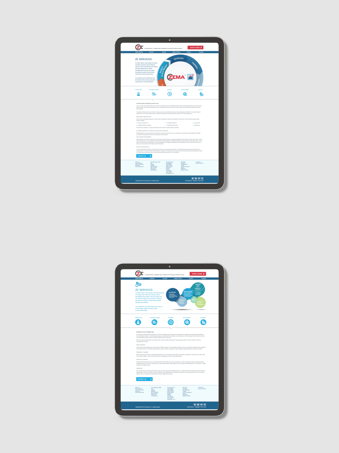
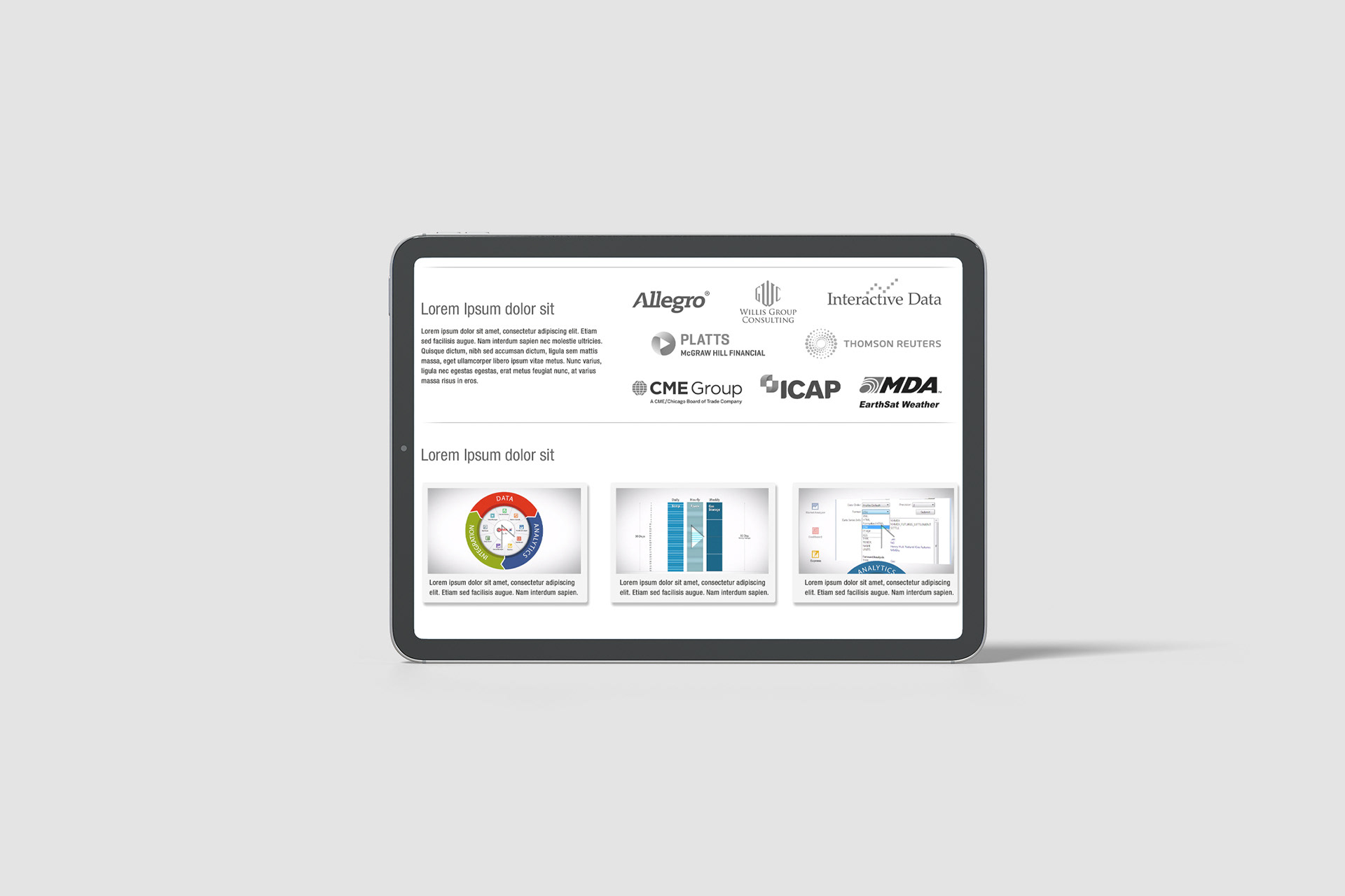
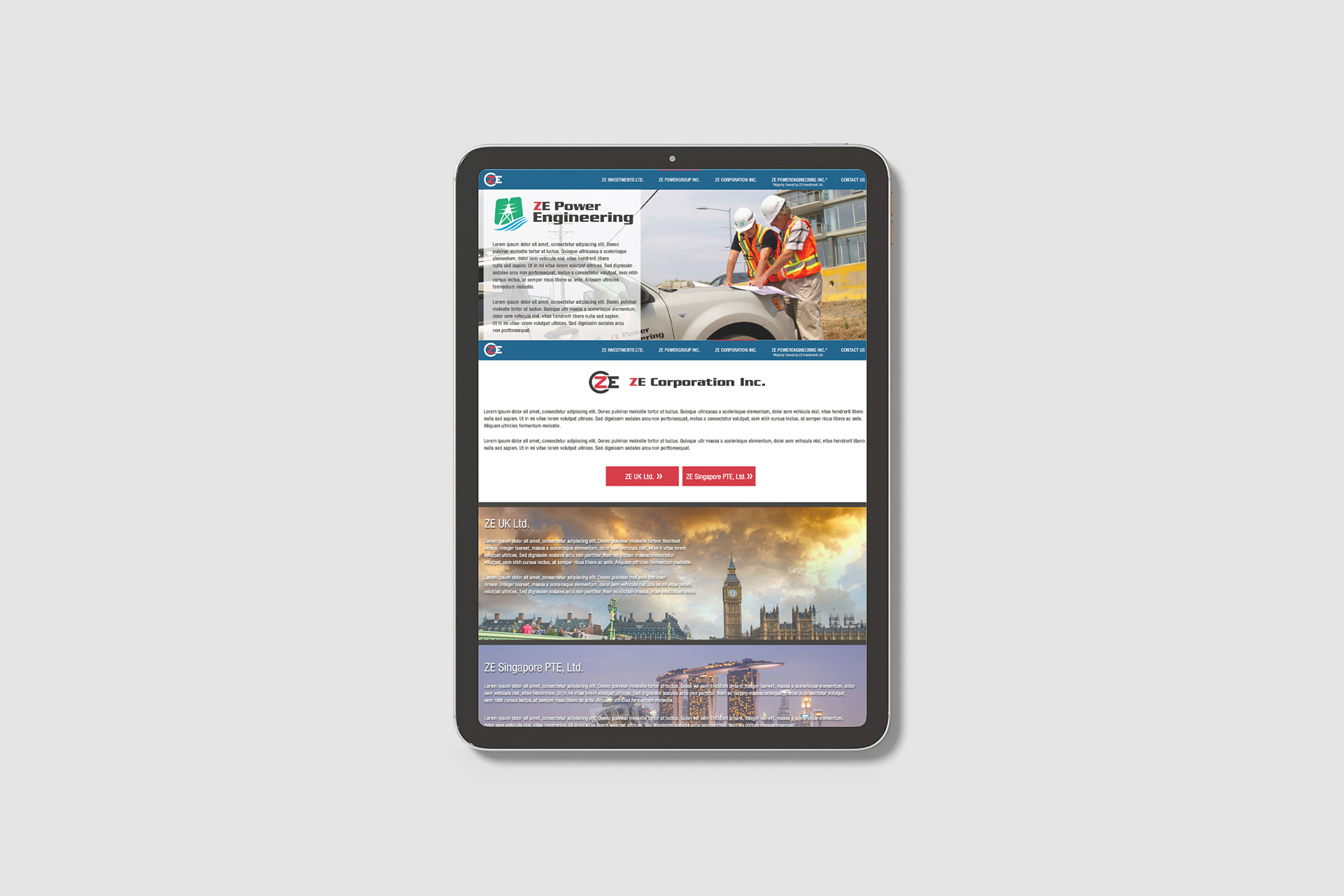
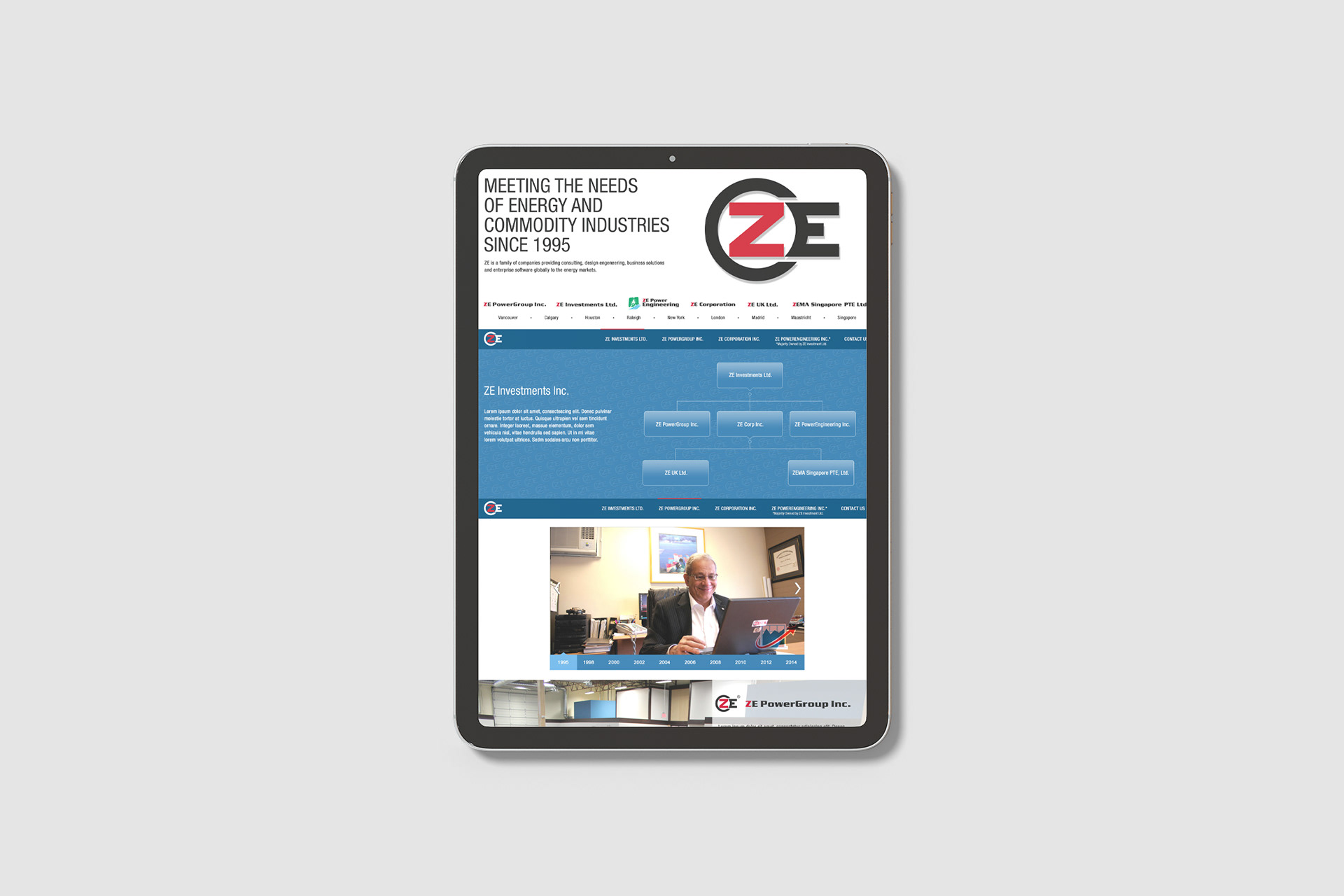
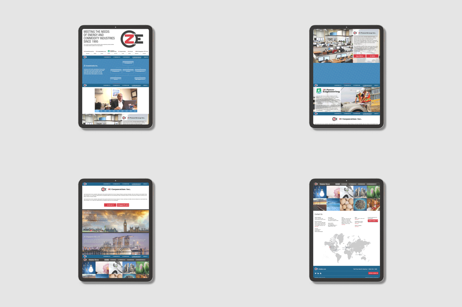
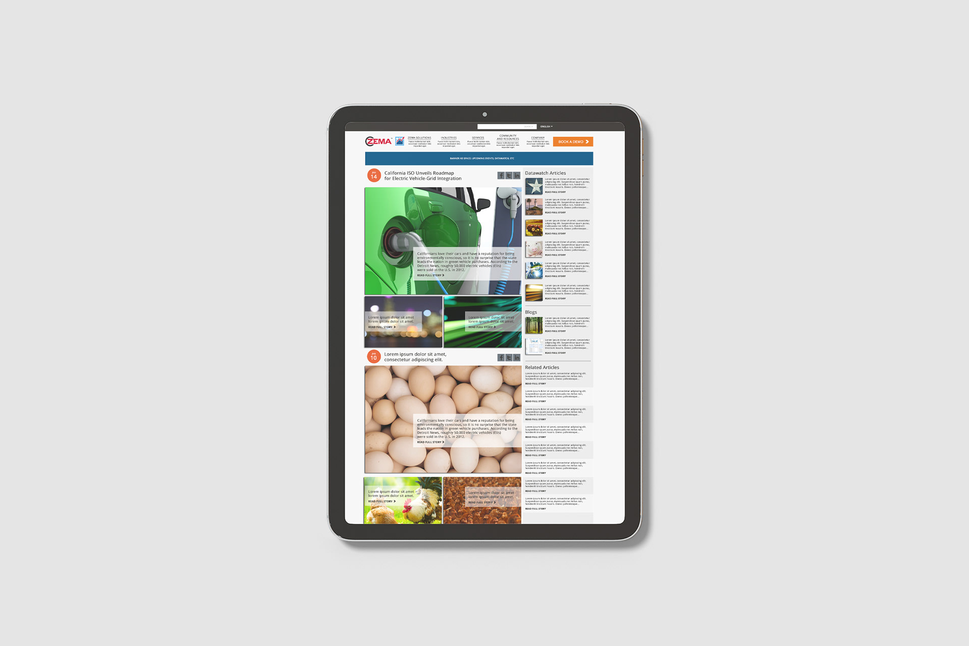
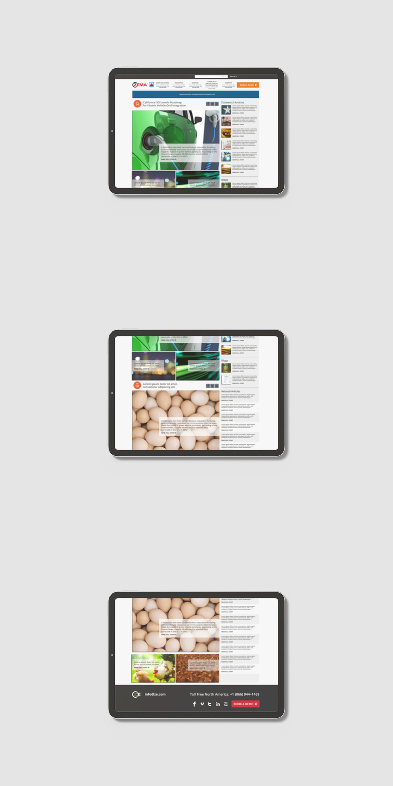
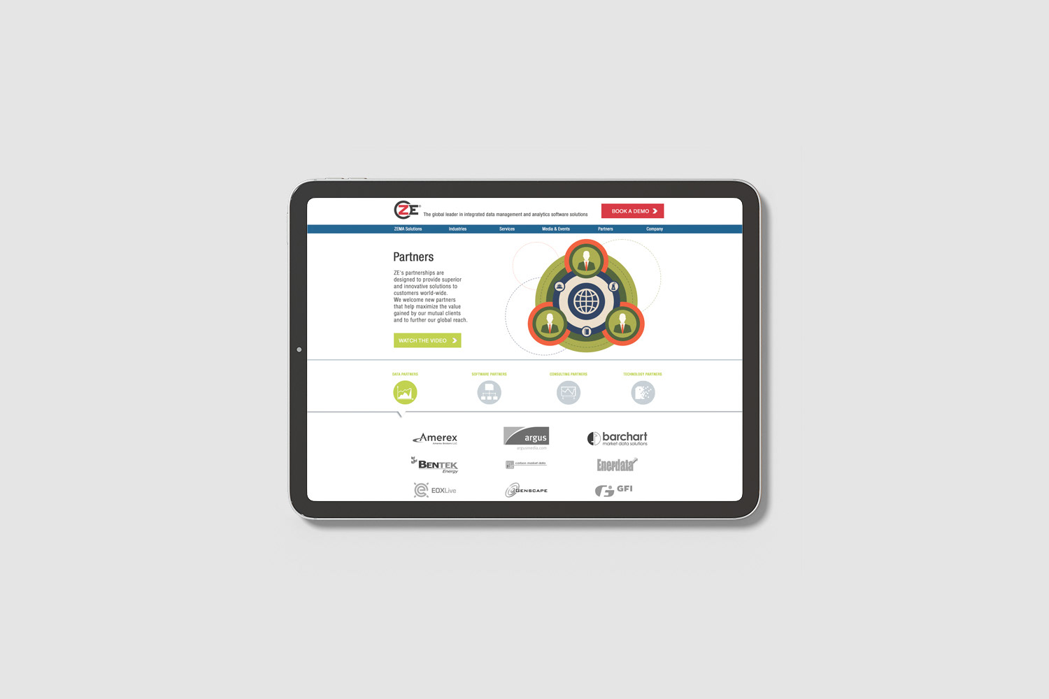
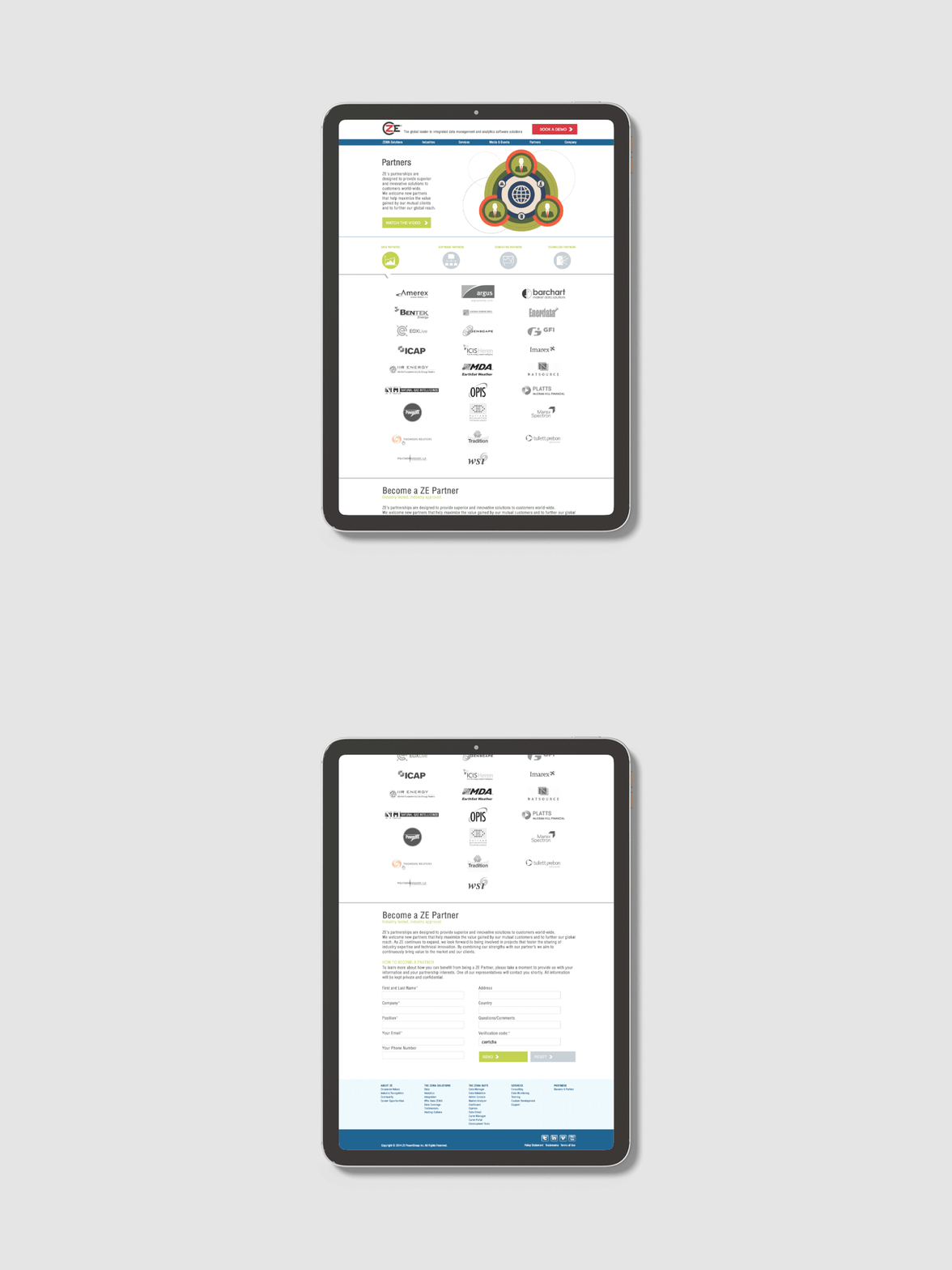
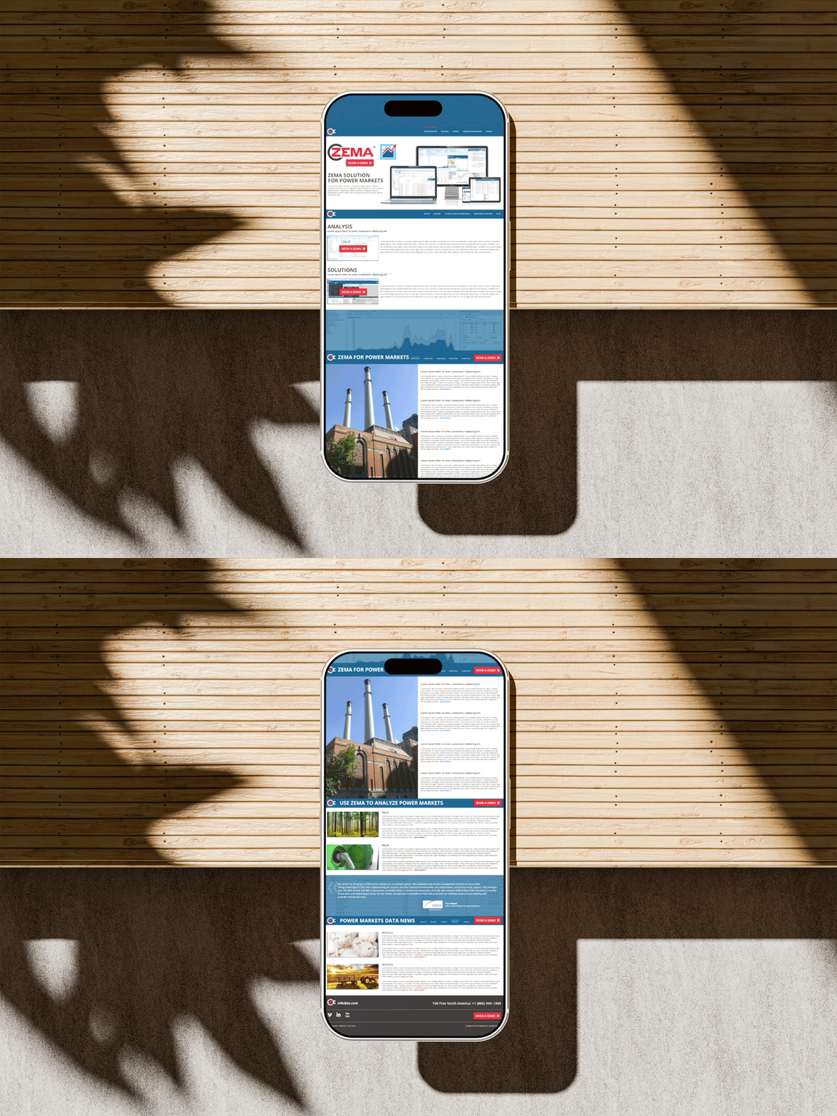
For the website, I created detailed wireframes and high-fidelity mockups in Adobe Photoshop, focusing on layout, content hierarchy, user flows, and functionality. I worked closely with developers to implement the designs accurately, and ran iterative A/B testing and stakeholder presentations to refine usability and conversion paths. I held every page to the brand while integrating supporting campaigns, including videos, weekly emails, monthly newsletters, and blog content, and oversaw regular content updates and SEO enhancements.
For the website, I created detailed wireframes and high-fidelity mockups in Adobe Photoshop, focusing on layout, content hierarchy, user flows, and functionality. I worked closely with developers to implement the designs accurately, and ran iterative A/B testing and stakeholder presentations to refine usability and conversion paths. I held every page to the brand while integrating supporting campaigns, including videos, weekly emails, monthly newsletters, and blog content, and oversaw regular content updates and SEO enhancements.
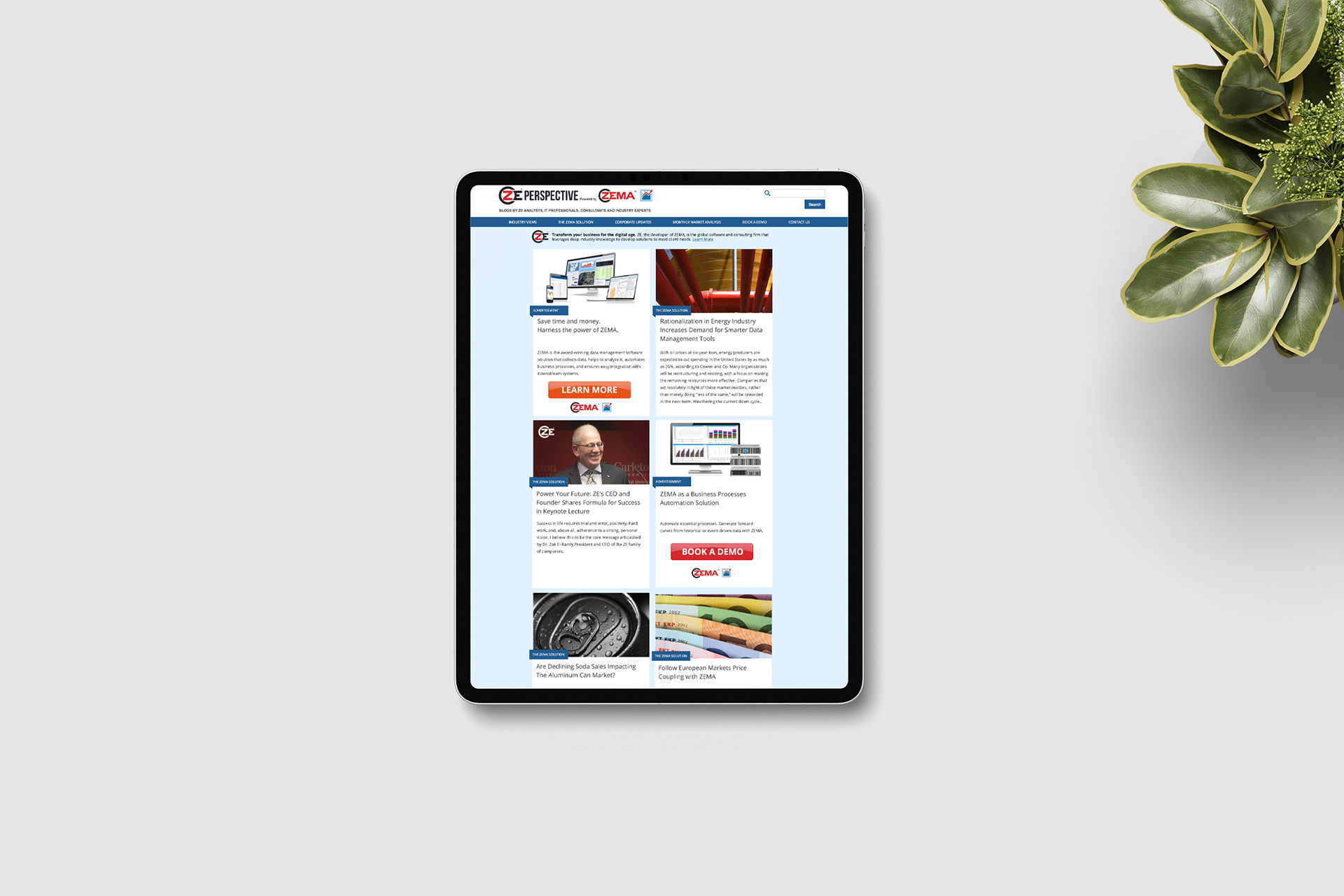
For the blog, I collaborated with the programming team to launch it and directed the redesign of key UK subpages, using an infinite-scroll experience to reduce friction and encourage deeper exploration. I also enhanced the product pages with intuitive visual cues, embedded software demonstration videos, and high-quality product imagery, with a focus on usability, accessibility, and content consumption.
Result
The redesigned website turned a functional site into a stronger marketing and sales enablement tool, improving user experience and strengthening ZE PowerGroup’s professional brand presence in the energy sector. The blog became an acquisition channel that supported sustained engagement and qualified leads, and the product page and UK subpage improvements made content easier to explore and consume.
The redesigned website turned a functional site into a stronger marketing and sales enablement tool, improving user experience and strengthening ZE PowerGroup’s professional brand presence in the energy sector. The blog became an acquisition channel that supported sustained engagement and qualified leads, and the product page and UK subpage improvements made content easier to explore and consume.














UX/UI DESIGN
Client Newsletter & Email Template System
Client Newsletter & Email Template System
Situation
ZE PowerGroup needed its email communication to do more than deliver updates. The monthly client newsletter needed a modern refresh to communicate the company’s vision, improve engagement, and strengthen brand consistency. Beyond the newsletter, the company ran email campaigns for software features, events, promotions, and updates, and those templates needed regular refreshing to keep readers engaged and stay aligned with evolving brand standards.
ZE PowerGroup needed its email communication to do more than deliver updates. The monthly client newsletter needed a modern refresh to communicate the company’s vision, improve engagement, and strengthen brand consistency. Beyond the newsletter, the company ran email campaigns for software features, events, promotions, and updates, and those templates needed regular refreshing to keep readers engaged and stay aligned with evolving brand standards.
Solution
As Marketing Team Lead, I oversaw email template strategy, design, and production. I led the redesign of the client newsletter into a more engaging, user-friendly format and built a repeatable process for keeping the campaign templates fresh, so complex information reached readers in clear, mobile-responsive emails.
As Marketing Team Lead, I oversaw email template strategy, design, and production. I led the redesign of the client newsletter into a more engaging, user-friendly format and built a repeatable process for keeping the campaign templates fresh, so complex information reached readers in clear, mobile-responsive emails.
Execution
For the newsletter, I redesigned the template in Adobe Photoshop with a fresh aesthetic, including user-friendly icons, integrated social media links, enriched imagery, and dedicated ad spaces for corporate messaging. I introduced contemporary icons and colour schemes to lift the visual appeal, and collaborated with the development team to implement it. I also contributed to broader website improvements, including infinite scrolling on select sub-pages and A/B testing to refine the user experience.
For the newsletter, I redesigned the template in Adobe Photoshop with a fresh aesthetic, including user-friendly icons, integrated social media links, enriched imagery, and dedicated ad spaces for corporate messaging. I introduced contemporary icons and colour schemes to lift the visual appeal, and collaborated with the development team to implement it. I also contributed to broader website improvements, including infinite scrolling on select sub-pages and A/B testing to refine the user experience.
For campaign emails, I redesigned and revitalized the templates multiple times a year in Adobe Photoshop, creating several design variations and presenting them to stakeholders for approval. I integrated copy from the writing team, stock photography, and ZEMA software screenshots into clean layouts, and turned complex data into digestible infographics and visuals. I updated the email specification sheets and worked with programmers on development and rigorous quality assurance.
Result
The redesigned newsletter gave clients a more professional, cohesive experience with better visual hierarchy and a clearer link to ZE’s corporate vision. The refreshed campaign templates improved visual consistency and the reader experience across sends, and the structured process made email production more efficient.
The redesigned newsletter gave clients a more professional, cohesive experience with better visual hierarchy and a clearer link to ZE’s corporate vision. The refreshed campaign templates improved visual consistency and the reader experience across sends, and the structured process made email production more efficient.


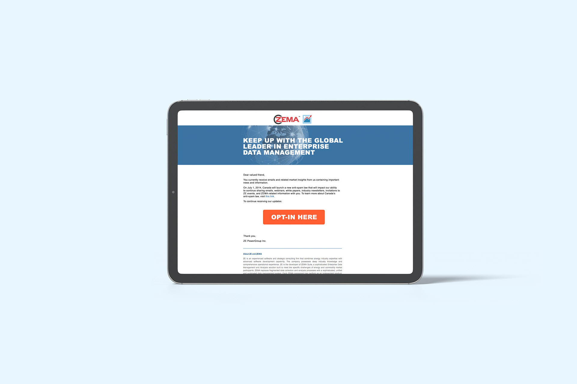


ZE Client Newsletter Email Template


CAMPAIGN DESIGN
Lunch & Learn, ZECO Launch & User Forum Campaigns
Lunch & Learn, ZECO Launch & User Forum Campaigns
Situation
ZE PowerGroup needed B2B education and event programs that nurtured leads, taught existing customers how to get more from the ZEMA enterprise software, and built awareness of the product. The Lunch & Learn series had to offer real value while promoting ZEMA in a professional, engaging way. The company also needed a comprehensive digital campaign to launch ZECO and promote its User Forum events in Toronto and Houston, driving registrations and engagement across multiple channels.
ZE PowerGroup needed B2B education and event programs that nurtured leads, taught existing customers how to get more from the ZEMA enterprise software, and built awareness of the product. The Lunch & Learn series had to offer real value while promoting ZEMA in a professional, engaging way. The company also needed a comprehensive digital campaign to launch ZECO and promote its User Forum events in Toronto and Houston, driving registrations and engagement across multiple channels.
Solution
As Team Lead and Senior Graphic Designer, I led creative direction and execution for both programs, building one cohesive educational and promotional experience around the ZEMA brand. For the launch and forums, I created an integrated multi-channel campaign that unified every digital touchpoint and supported the Sales team in promoting the events.
As Team Lead and Senior Graphic Designer, I led creative direction and execution for both programs, building one cohesive educational and promotional experience around the ZEMA brand. For the launch and forums, I created an integrated multi-channel campaign that unified every digital touchpoint and supported the Sales team in promoting the events.
Execution
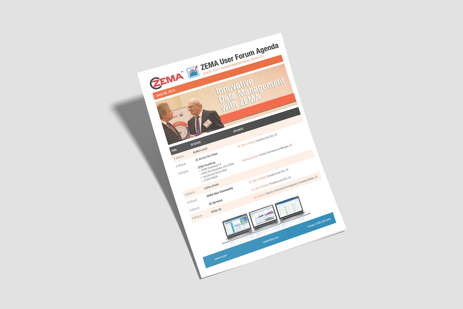
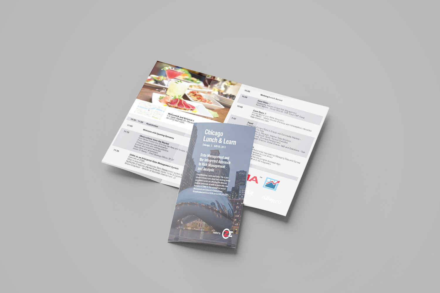
For Lunch & Learn, I designed a full suite of assets, including event agendas, custom landing pages, digital banners, speaker materials, and branded name badges. Each piece stayed consistent with brand standards and communicated complex software benefits clearly, and I worked with cross-functional teams to align the educational content with marketing and sales objectives.
For Lunch & Learn, I designed a full suite of assets, including event agendas, custom landing pages, digital banners, speaker materials, and branded name badges. Each piece stayed consistent with brand standards and communicated complex software benefits clearly, and I worked with cross-functional teams to align the educational content with marketing and sales objectives.
For the ZECO launch and User Forums, I designed dynamic creatives with strong calls-to-action for the website, email campaigns, and paid and organic social media, along with promotional materials specifically for the forum events. I worked closely with programmers on the dedicated events page, which included an intuitive calendar interface, dynamic carousels, and illustrative icons for easier navigation. Every asset followed ZE PowerGroup’s brand guidelines.
Result
The campaigns gave ZE a cohesive, professional presence across events and digital channels. The integrated assets improved the attendee experience, supported lead nurturing and client education, and strengthened brand messaging and engagement for the ZEMA software, the ZECO launch, and the User Forums.
The campaigns gave ZE a cohesive, professional presence across events and digital channels. The integrated assets improved the attendee experience, supported lead nurturing and client education, and strengthened brand messaging and engagement for the ZEMA software, the ZECO launch, and the User Forums.


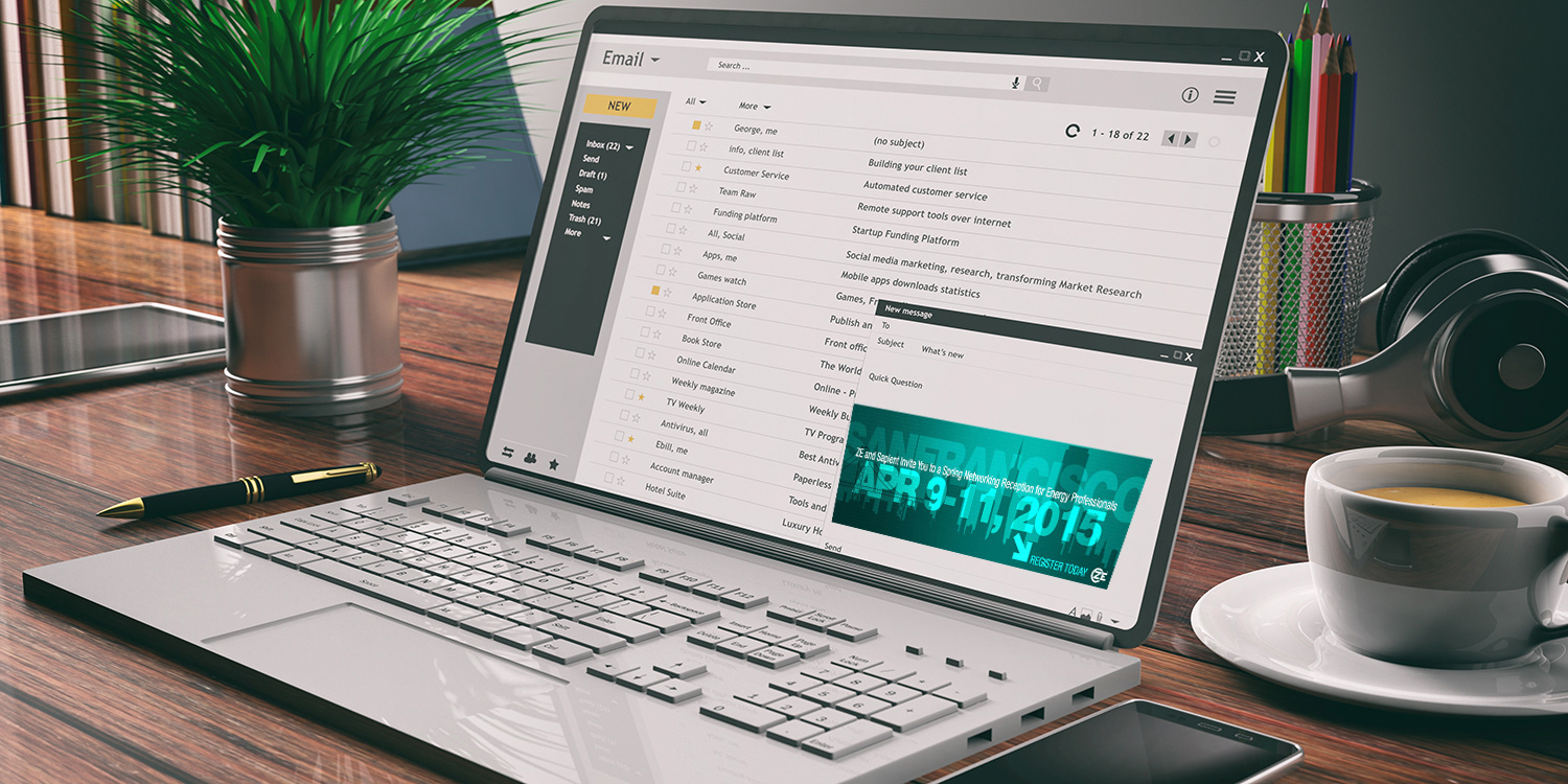

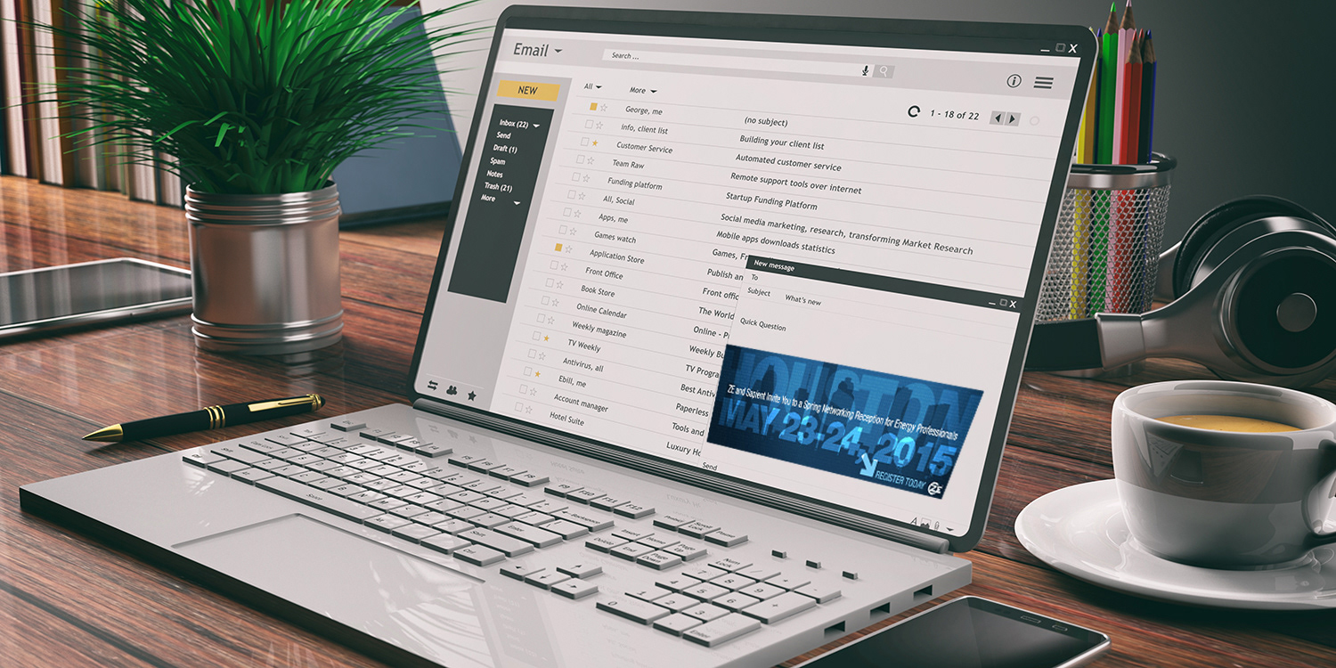

ZEMA User Forum Assets






CAMPAIGN DESIGN
Intranet Launch & Employee Spotlight Campaign
Intranet Launch & Employee Spotlight Campaign
Situation
ZE PowerGroup needed a centralized, engaging internal platform to improve employee communication, give staff easy access to important resources, and build a stronger sense of community across the organization. HR also wanted employees to actually use the new intranet, which meant the launch needed ongoing internal marketing to keep people coming back.
ZE PowerGroup needed a centralized, engaging internal platform to improve employee communication, give staff easy access to important resources, and build a stronger sense of community across the organization. HR also wanted employees to actually use the new intranet, which meant the launch needed ongoing internal marketing to keep people coming back.
Solution
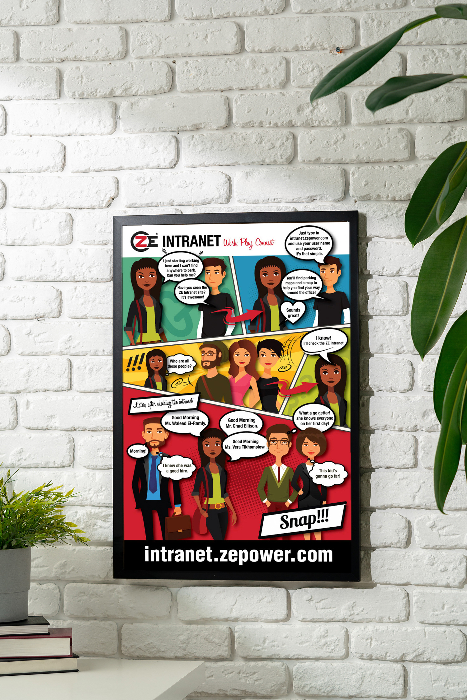
Led the design and launch of ZE’s intranet as a digital hub for employees, supported by a consistent internal marketing campaign to drive regular engagement. The centrepiece of that campaign was a monthly series of cartoon-style Employee Spotlight posters that celebrated individual staff members while pointing people to the intranet.
Led the design and launch of ZE’s intranet as a digital hub for employees, supported by a consistent internal marketing campaign to drive regular engagement. The centrepiece of that campaign was a monthly series of cartoon-style Employee Spotlight posters that celebrated individual staff members while pointing people to the intranet.
Execution
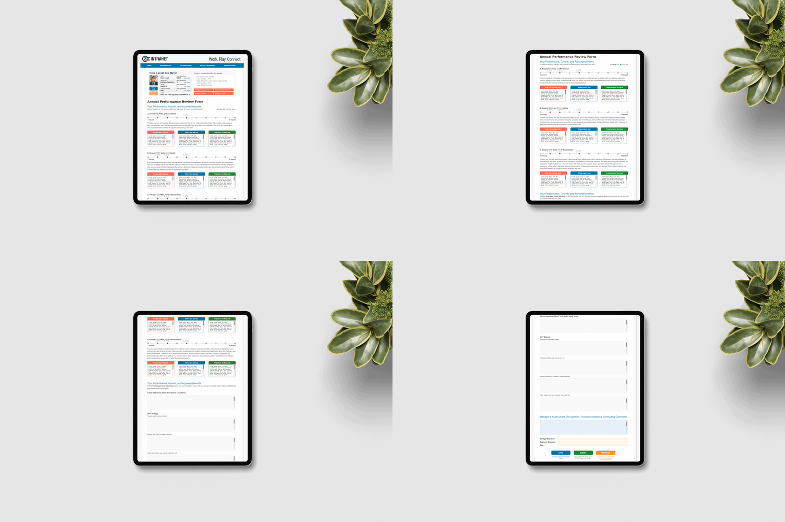
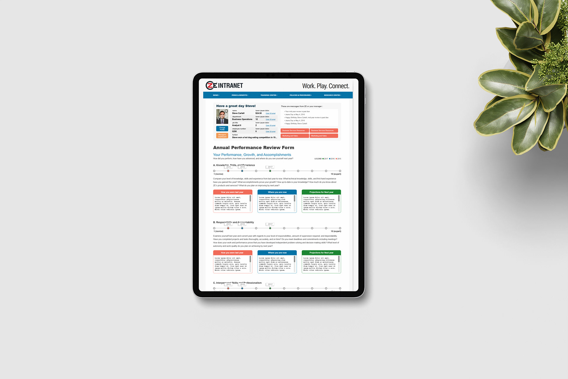
Worked with programmers to design and develop the intranet layout, creating an intuitive resource centre for company news, benefits, training, policies, templates, and canteen wallet management. I designed a bi-weekly email template in Adobe Photoshop to keep staff informed, and worked closely with copywriters and the team to keep content relevant, engaging, and on-brand.
Worked with programmers to design and develop the intranet layout, creating an intuitive resource centre for company news, benefits, training, policies, templates, and canteen wallet management. I designed a bi-weekly email template in Adobe Photoshop to keep staff informed, and worked closely with copywriters and the team to keep content relevant, engaging, and on-brand.
For the posters, I conceptualized and created each monthly Staff Spotlight in Adobe Illustrator, turning employees into fun cartoon characters in creative, relatable scenarios, with personalized stories showing how the intranet solved real challenges. I held every poster to the company brand with a light-hearted, approachable tone suited to company-wide display, and delivered print-ready files for posting throughout the office.
Result
The intranet became a central, well-used resource that improved internal communication and the employee experience. The posters grew popular and became something staff looked forward to each month, and together with the bi-weekly email they boosted engagement, recognition, and community spirit across the organization.
The intranet became a central, well-used resource that improved internal communication and the employee experience. The posters grew popular and became something staff looked forward to each month, and together with the bi-weekly email they boosted engagement, recognition, and community spirit across the organization.




PRINT DESIGN
ZEMA Software Fact Sheets: Bridging Understanding & Value
ZEMA Software Fact Sheets: Bridging Understanding & Value
Situation
ZE PowerGroup needed clear, professional fact sheets that helped potential clients quickly understand the features, benefits, and value of its complex ZEMA software applications.
ZE PowerGroup needed clear, professional fact sheets that helped potential clients quickly understand the features, benefits, and value of its complex ZEMA software applications.
Solution
Designed a series of easy-to-digest fact sheets that combined strong visual storytelling with concise technical information, so prospects could grasp what each application did without wading through dense documentation.
Designed a series of easy-to-digest fact sheets that combined strong visual storytelling with concise technical information, so prospects could grasp what each application did without wading through dense documentation.
Execution
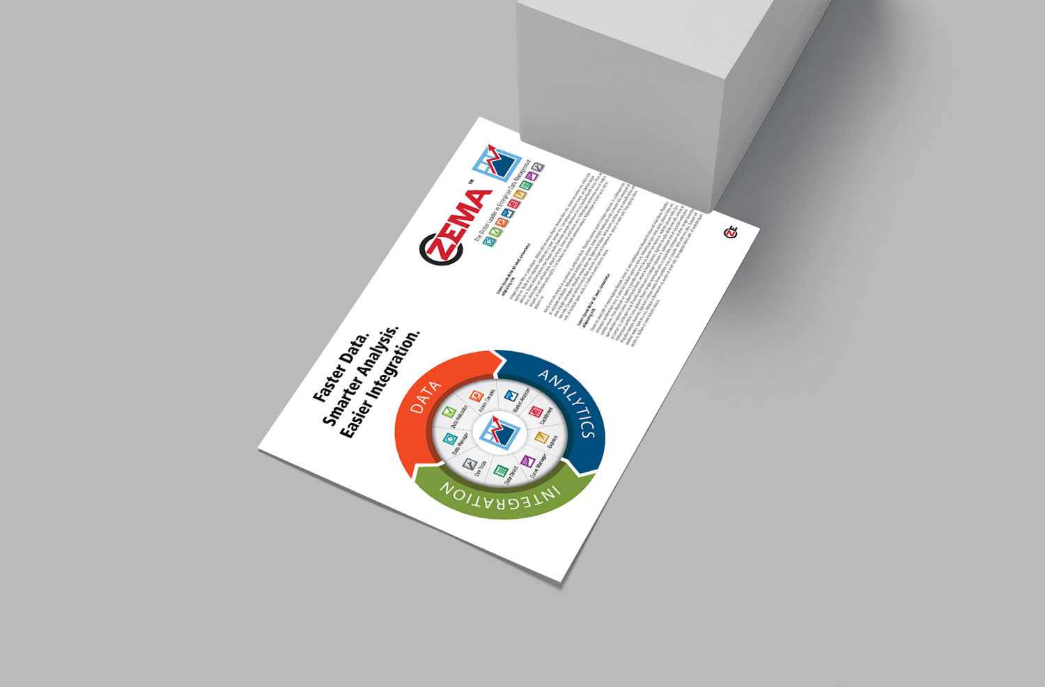
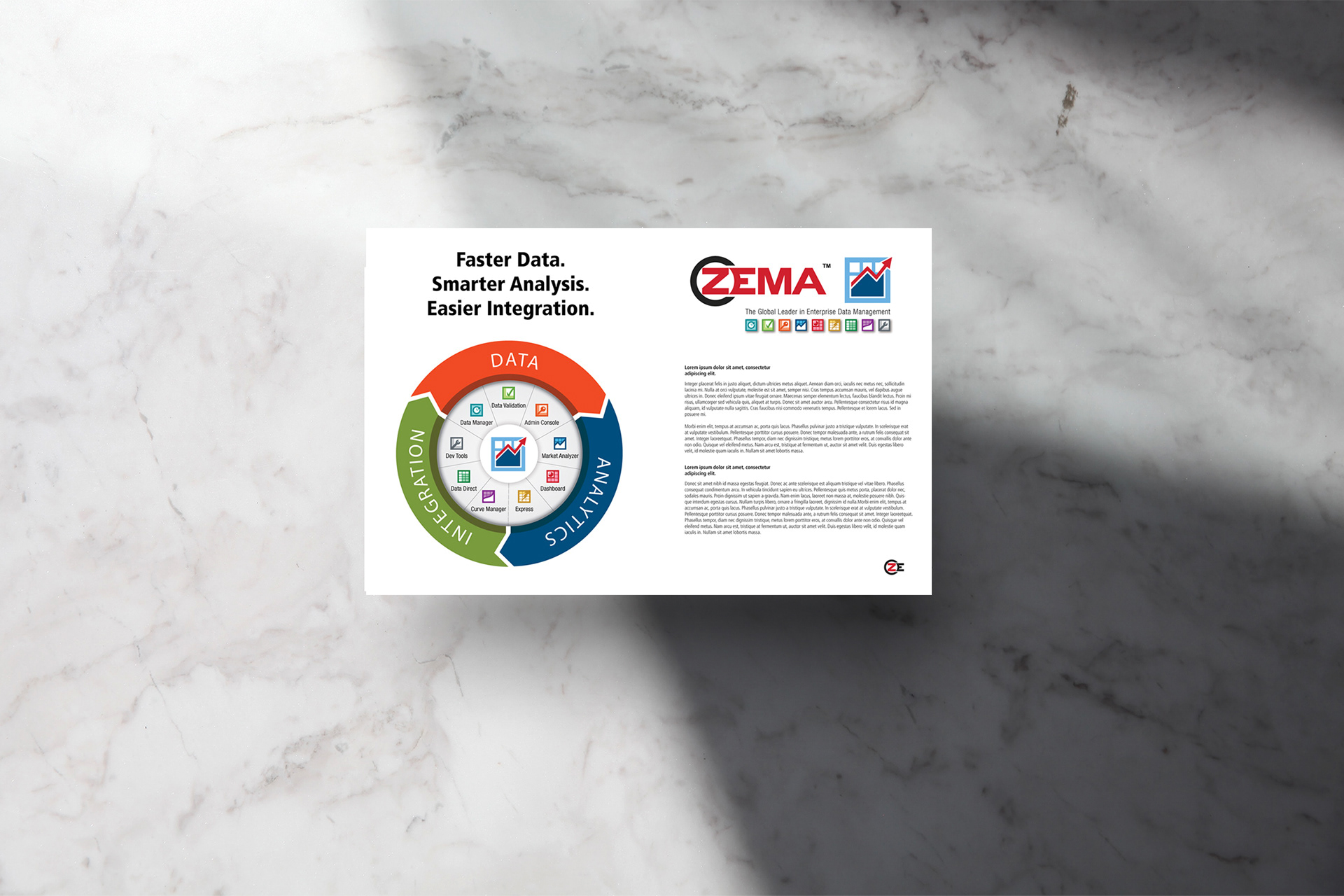
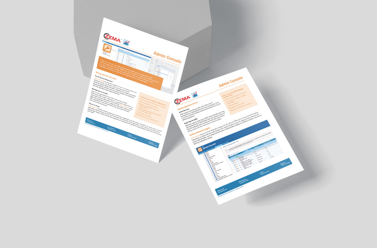
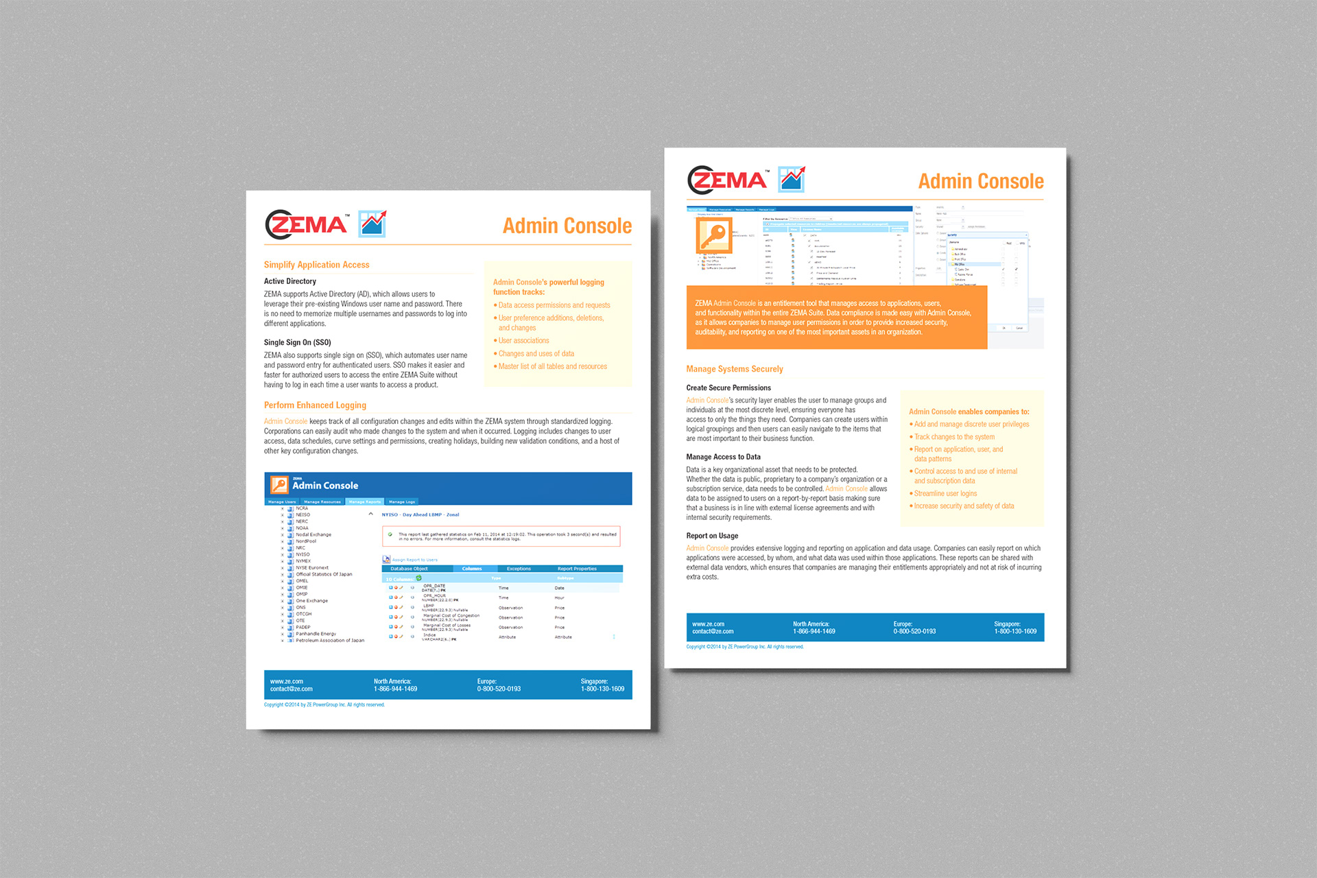
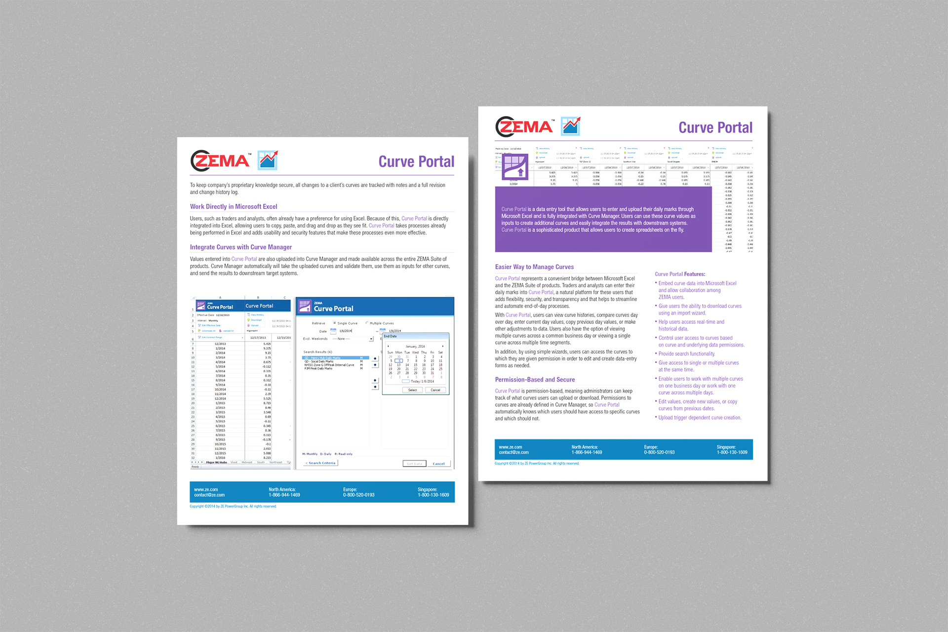
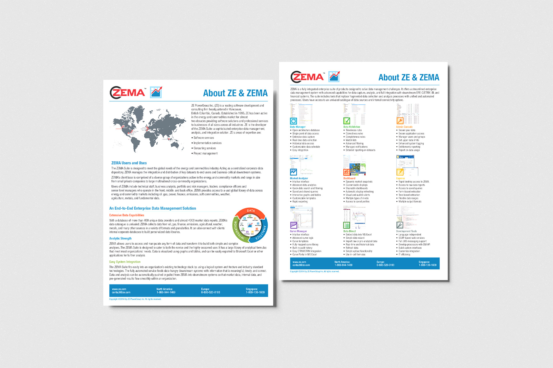
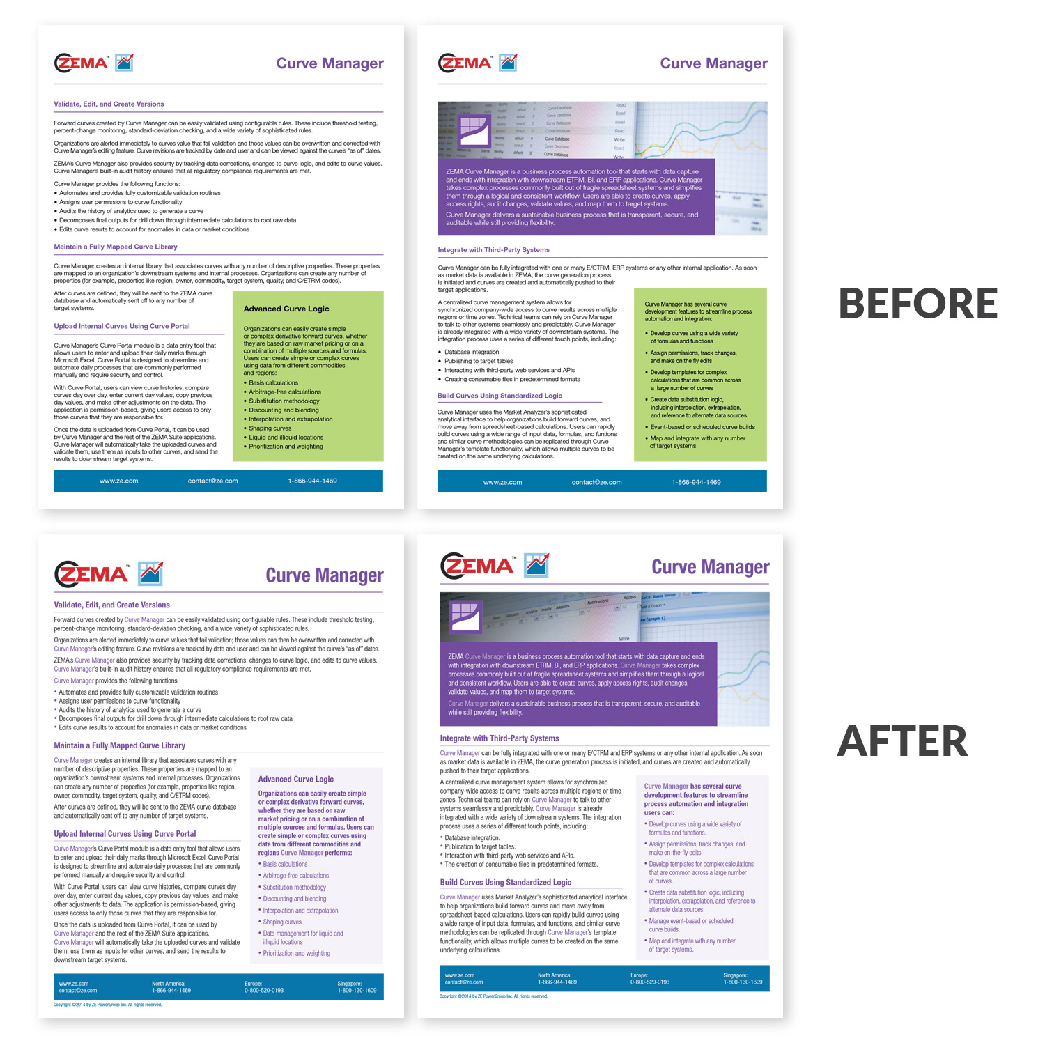
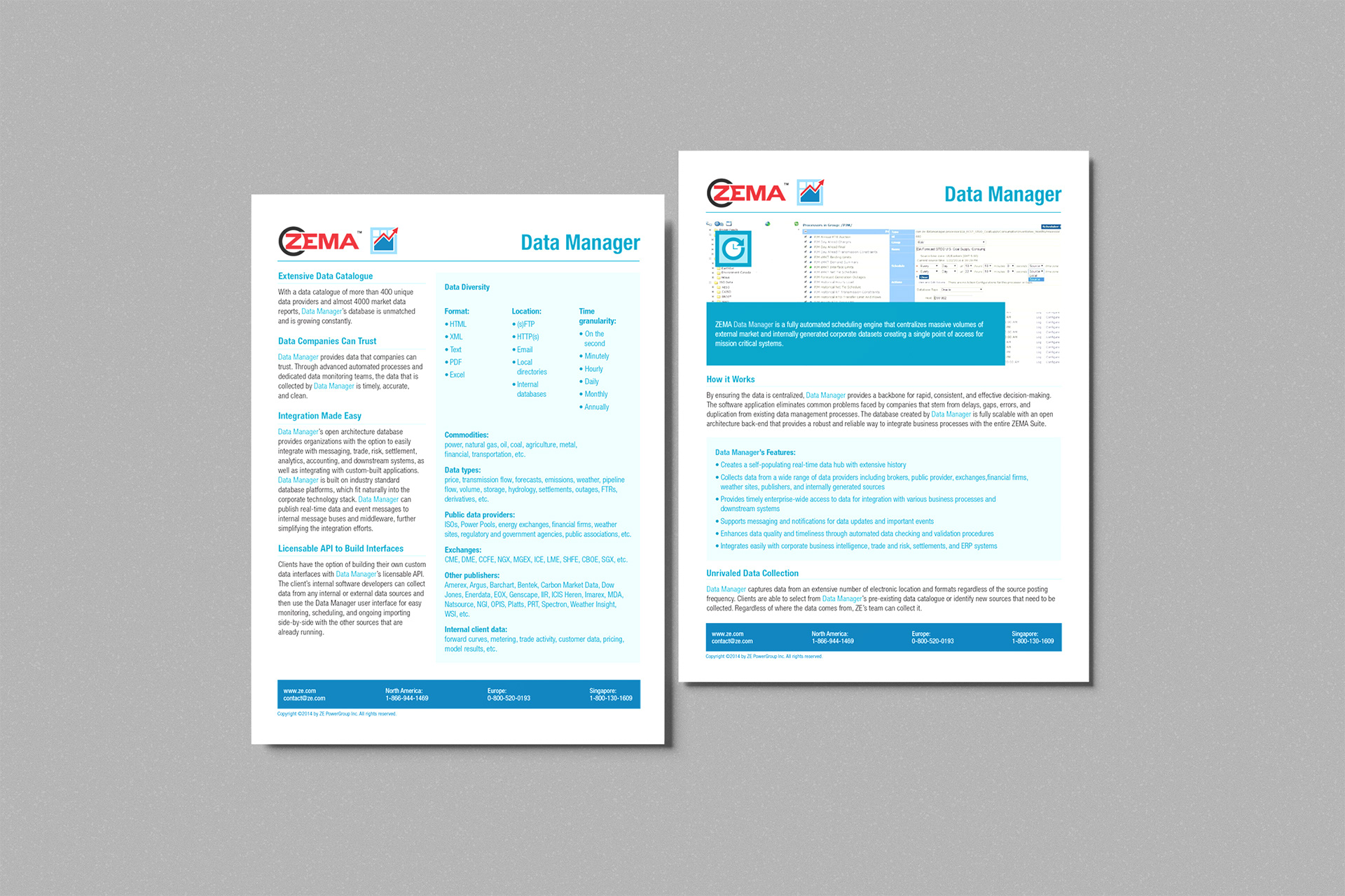
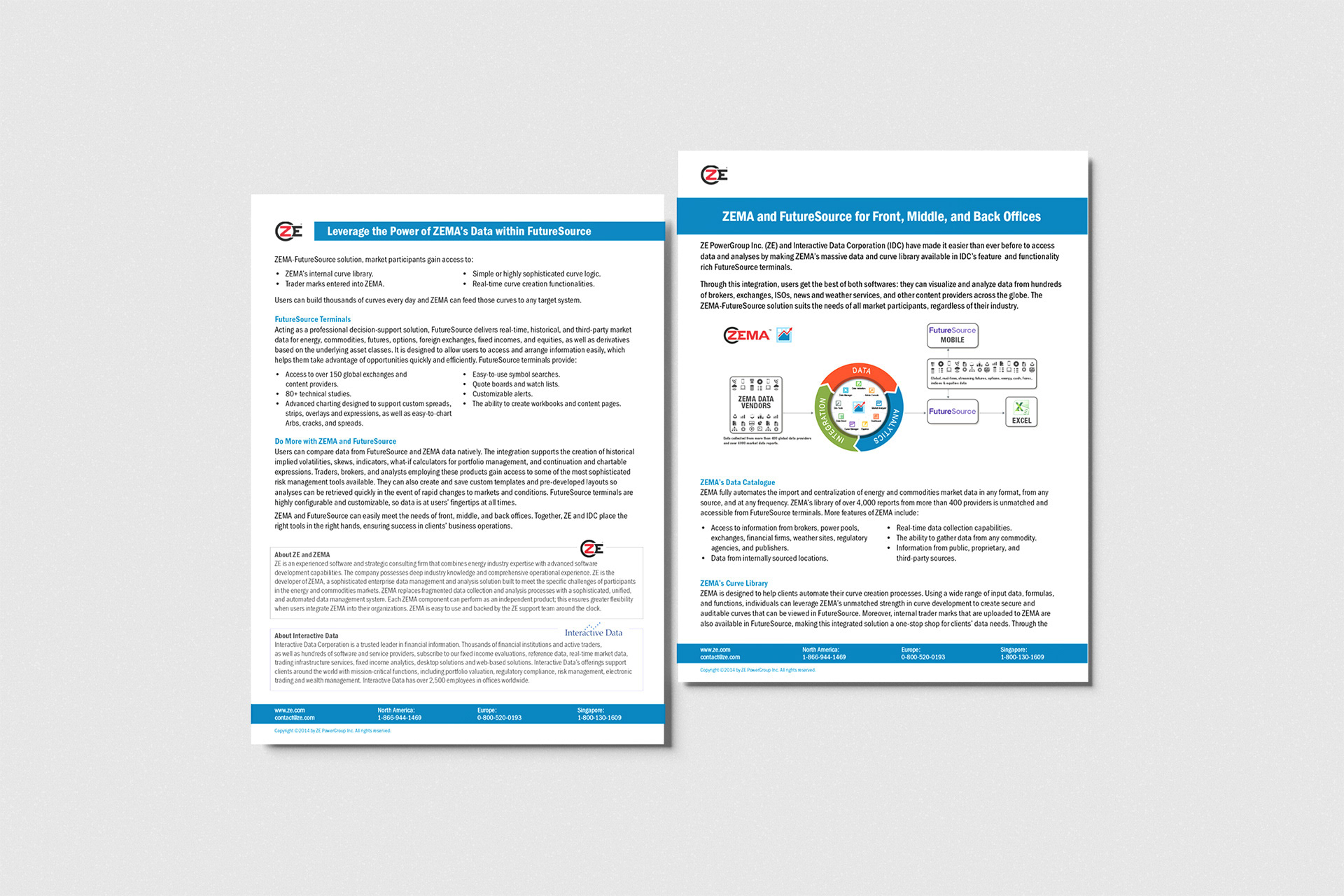
Created streamlined, two-sided fact sheets in Adobe InDesign, integrating application screenshots, data-driven tables, charts, and clear lists of key points. I delivered both high-quality printed collateral and interactive PDF versions for the corporate website, and held every piece to the brand while making complex software concepts more approachable and visually engaging.
Created streamlined, two-sided fact sheets in Adobe InDesign, integrating application screenshots, data-driven tables, charts, and clear lists of key points. I delivered both high-quality printed collateral and interactive PDF versions for the corporate website, and held every piece to the brand while making complex software concepts more approachable and visually engaging.
Result
The fact sheets gave ZE PowerGroup a polished, professional resource that helped prospects understand the software, supported sales conversations, and strengthened the company’s marketing efforts.
The fact sheets gave ZE PowerGroup a polished, professional resource that helped prospects understand the software, supported sales conversations, and strengthened the company’s marketing efforts.







INFOGRAPHIC DESIGN
Transforming Complex Data into Engaging Visuals
Transforming Complex Data into Engaging Visuals
Situation
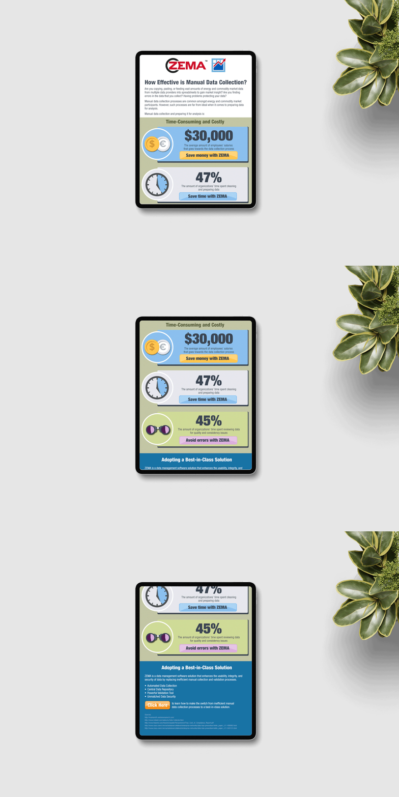
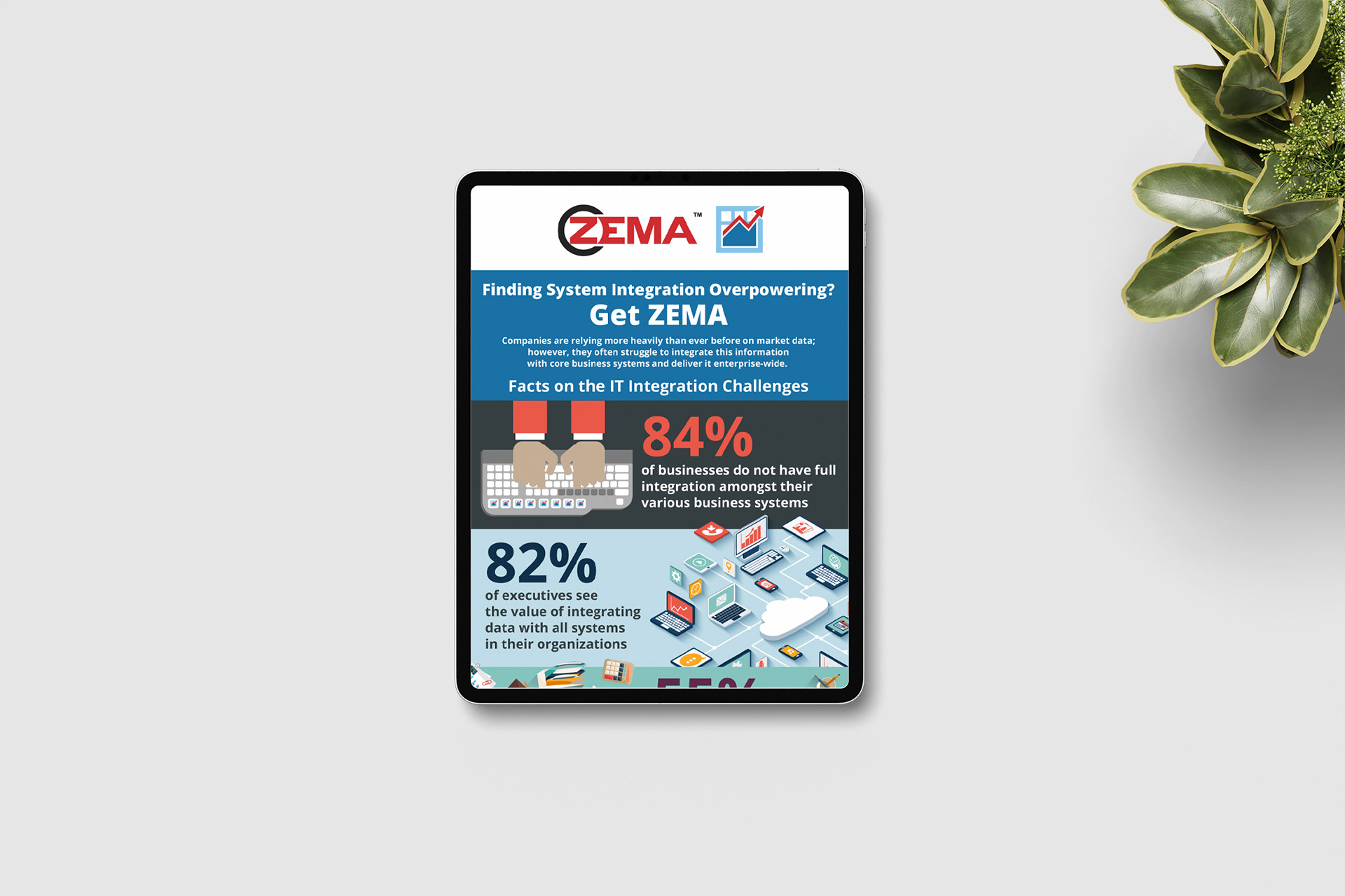
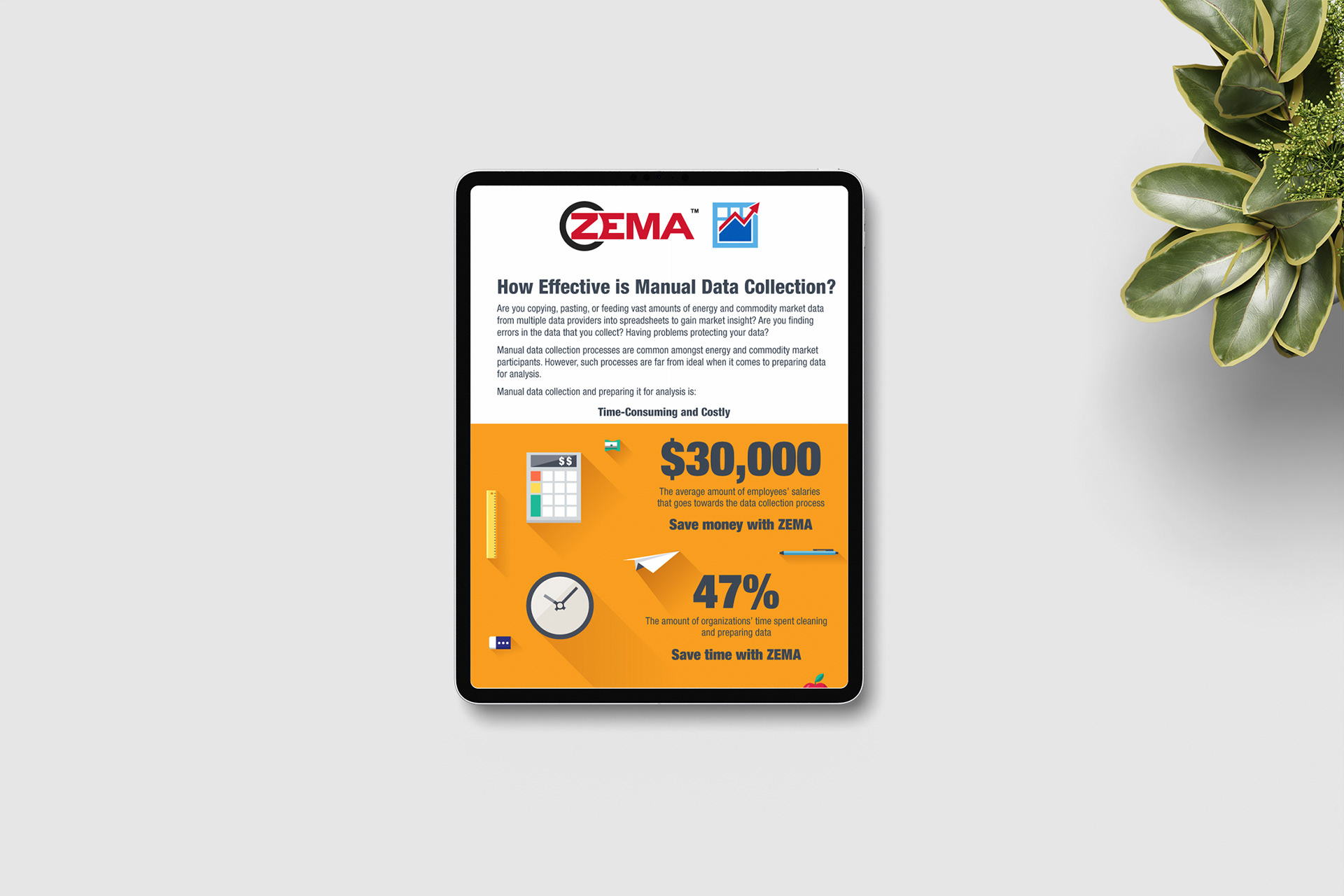
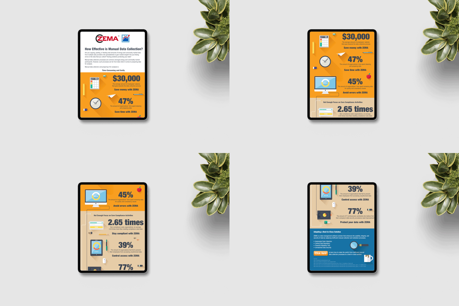
ZE PowerGroup needed to communicate complex software data, processes, and departmental information in a way that was clear, engaging, and easy to understand for both external clients and internal employees.
ZE PowerGroup needed to communicate complex software data, processes, and departmental information in a way that was clear, engaging, and easy to understand for both external clients and internal employees.
Solution
Designed a variety of infographics that turned intricate datasets and processes into visually appealing, easy-to-digest stories, built for two audiences: clients reading marketing content, and new hires learning how the company worked.
Designed a variety of infographics that turned intricate datasets and processes into visually appealing, easy-to-digest stories, built for two audiences: clients reading marketing content, and new hires learning how the company worked.
Execution
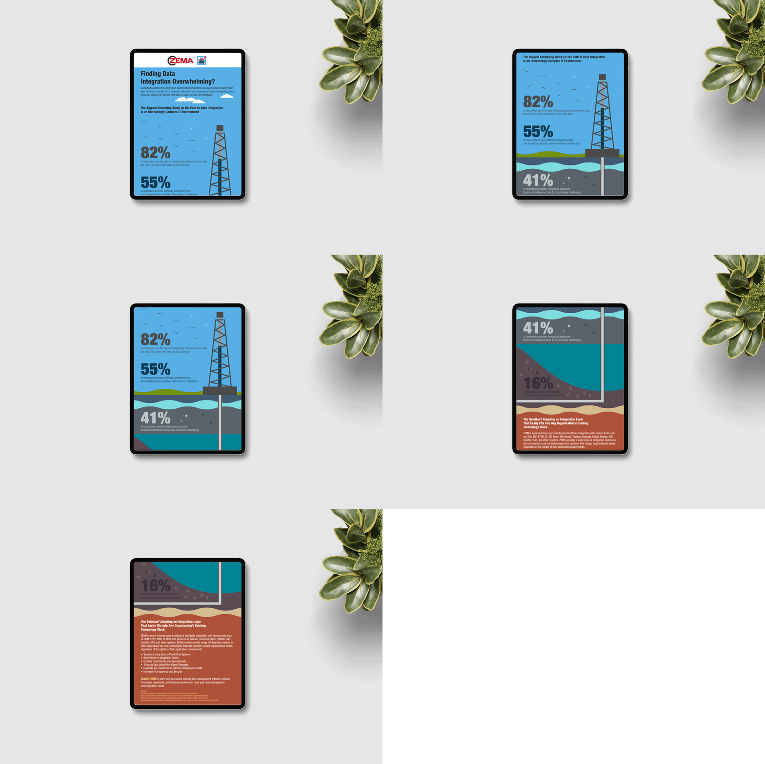
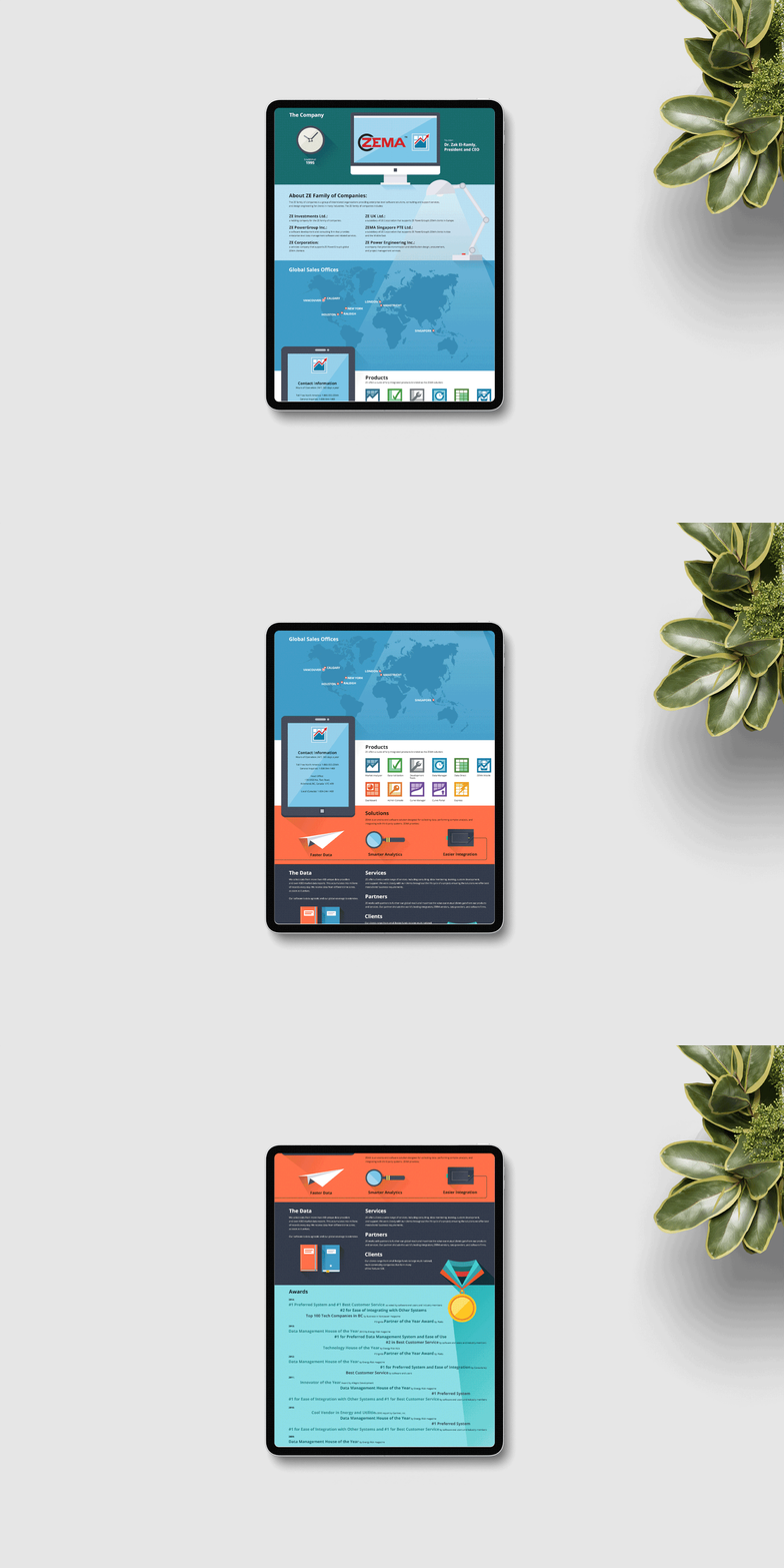
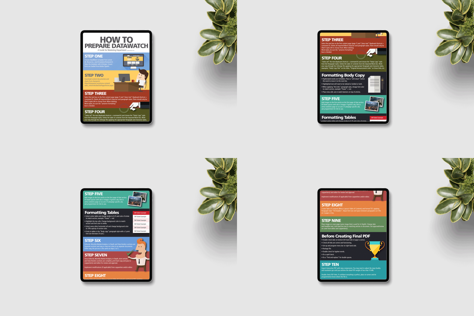
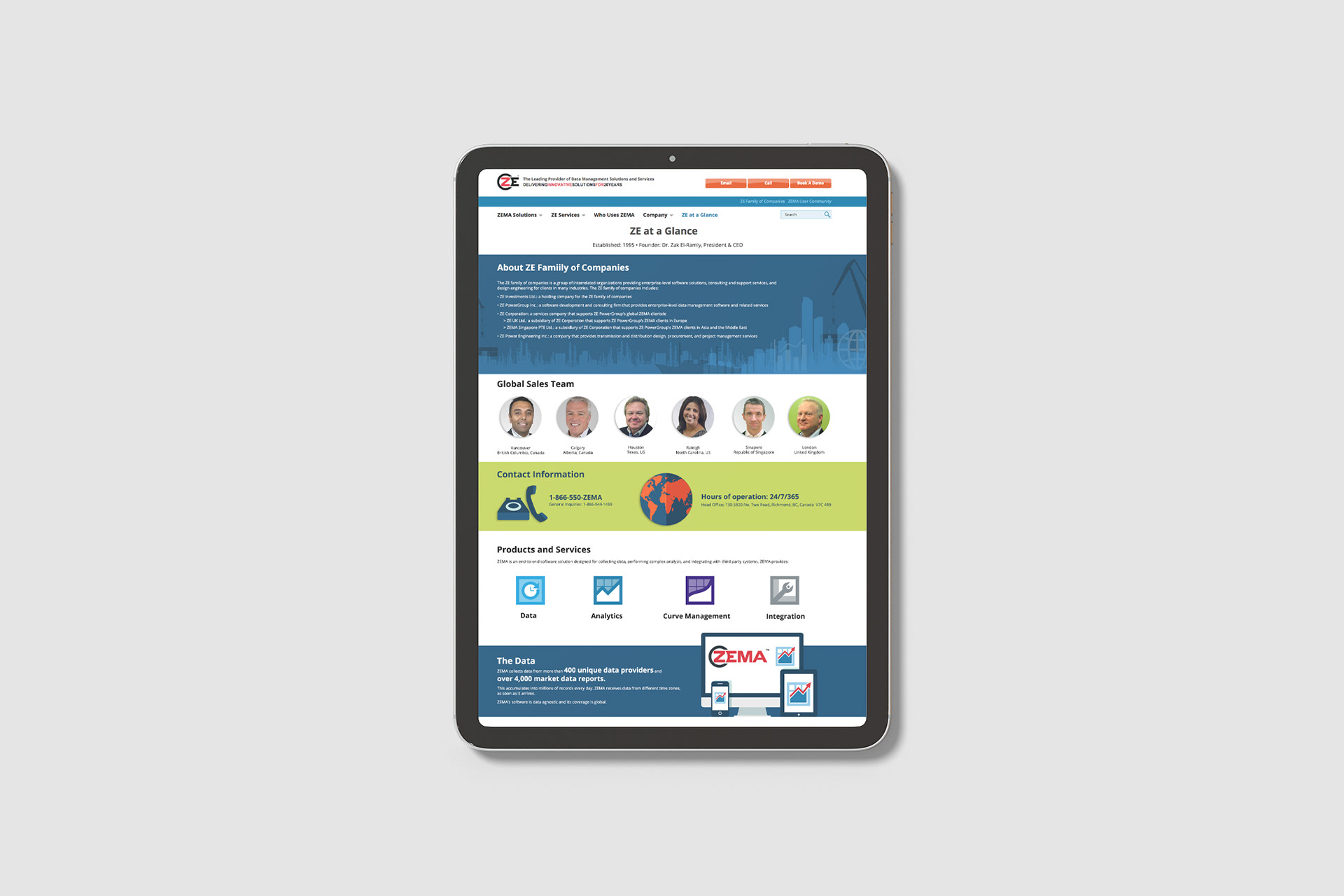
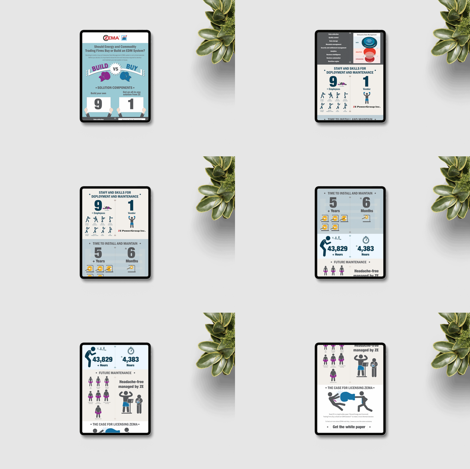
Created data-driven infographics for the corporate website and email marketing campaigns to illustrate key patterns and insights. I also developed onboarding infographics for new hires that outlined processes, responsibilities, and organizational structure. I built each piece in Adobe Illustrator with strong storytelling and brand consistency, and tailored the designs to different departments while keeping them readable and visually impactful.
Created data-driven infographics for the corporate website and email marketing campaigns to illustrate key patterns and insights. I also developed onboarding infographics for new hires that outlined processes, responsibilities, and organizational structure. I built each piece in Adobe Illustrator with strong storytelling and brand consistency, and tailored the designs to different departments while keeping them readable and visually impactful.
Result
The infographics gave ZE PowerGroup reusable assets for both client-facing marketing and internal onboarding, making complex information easier to understand and supporting clearer communication across the organization.
The infographics gave ZE PowerGroup reusable assets for both client-facing marketing and internal onboarding, making complex information easier to understand and supporting clearer communication across the organization.














PRINT DESIGN
System Manual, White Papers & Case Study Templates
System Manual, White Papers & Case Study Templates
Situation
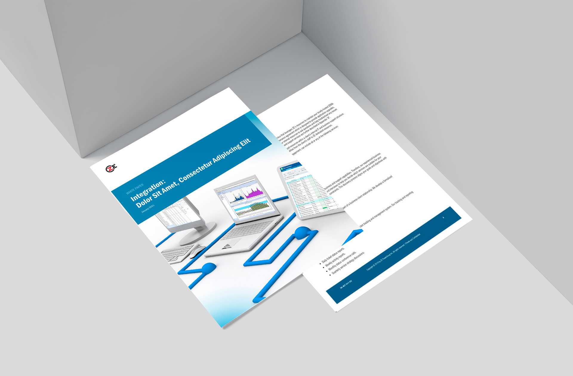
ZE PowerGroup needed clear, professional documents that organized complex technical and procedural information for both staff and clients. Internally, staff needed a central system manual that worked in print and digitally. Externally, the company needed consistent white paper and case study templates that communicated technical information while keeping a strong brand identity across print and digital channels.
ZE PowerGroup needed clear, professional documents that organized complex technical and procedural information for both staff and clients. Internally, staff needed a central system manual that worked in print and digitally. Externally, the company needed consistent white paper and case study templates that communicated technical information while keeping a strong brand identity across print and digital channels.
Solution
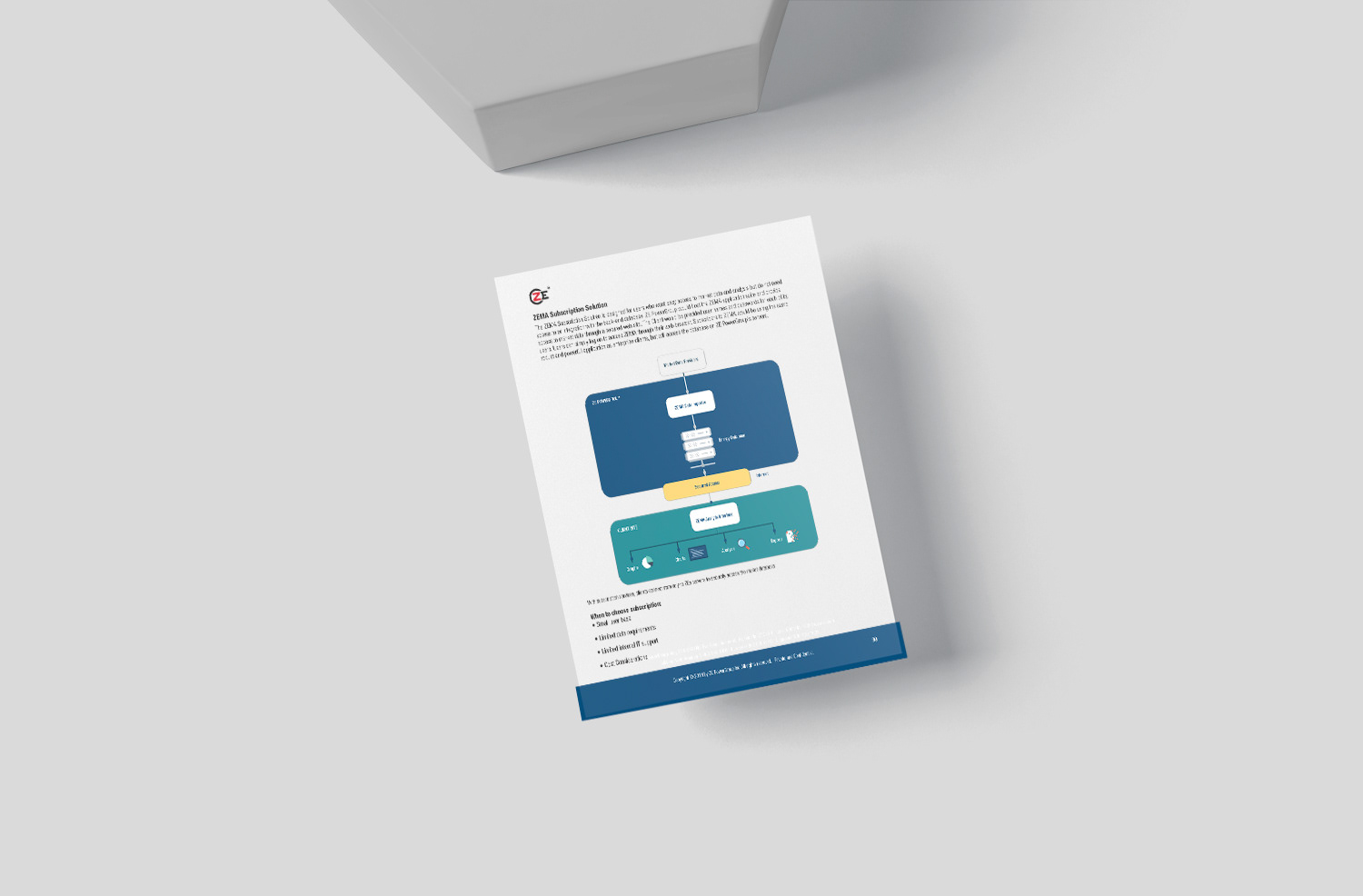
Designed and produced an 80+ page system manual that worked as both a printed reference guide and an interactive PDF. I also designed polished, reusable templates for white papers and case studies, which raised visual quality and made content production faster.
Designed and produced an 80+ page system manual that worked as both a printed reference guide and an interactive PDF. I also designed polished, reusable templates for white papers and case studies, which raised visual quality and made content production faster.
Execution
For the manual, I created a structured layout system with strong information hierarchy and intuitive navigation elements, balancing dense technical content with visual clarity and logical flow so it stayed readable in both print and interactive PDF. For the white papers and case studies, I designed layouts in Adobe InDesign optimized for readability and visual impact, built detailed custom charts in Adobe Illustrator using the corporate colour palette, and used curated stock imagery for compelling covers. I delivered print versions and downloadable PDFs for the corporate website, and held every piece to the brand with a consistent visual style throughout.
For the manual, I created a structured layout system with strong information hierarchy and intuitive navigation elements, balancing dense technical content with visual clarity and logical flow so it stayed readable in both print and interactive PDF. For the white papers and case studies, I designed layouts in Adobe InDesign optimized for readability and visual impact, built detailed custom charts in Adobe Illustrator using the corporate colour palette, and used curated stock imagery for compelling covers. I delivered print versions and downloadable PDFs for the corporate website, and held every piece to the brand with a consistent visual style throughout.
Result
The system manual gave staff a reliable, user-friendly guide to core processes and procedures. The templates improved the quality and professionalism of ZE’s thought leadership materials, and the print and digital formats gave sales and marketing teams cohesive resources for explaining complex information and supported the company’s online visibility.
The system manual gave staff a reliable, user-friendly guide to core processes and procedures. The templates improved the quality and professionalism of ZE’s thought leadership materials, and the print and digital formats gave sales and marketing teams cohesive resources for explaining complex information and supported the company’s online visibility.




ZE PowerGroup Manuals


ZE PowerGroup Manuals



PRINT DESIGN
HR Recruitment & Onboarding Materials
New Hire Packets & Employee Handbook
HR Recruitment & Onboarding Materials
New Hire Packets & Employee Handbook
Situation
ZE PowerGroup’s HR team needed professional, welcoming materials to improve the recruitment and onboarding experience for new employees, while clearly communicating company culture, policies, and procedures.
ZE PowerGroup’s HR team needed professional, welcoming materials to improve the recruitment and onboarding experience for new employees, while clearly communicating company culture, policies, and procedures.
Solution
Designed a comprehensive suite of HR resources, including new hire packets and an employee handbook, to create a positive first impression and help new staff settle in smoothly.
Designed a comprehensive suite of HR resources, including new hire packets and an employee handbook, to create a positive first impression and help new staff settle in smoothly.
Execution
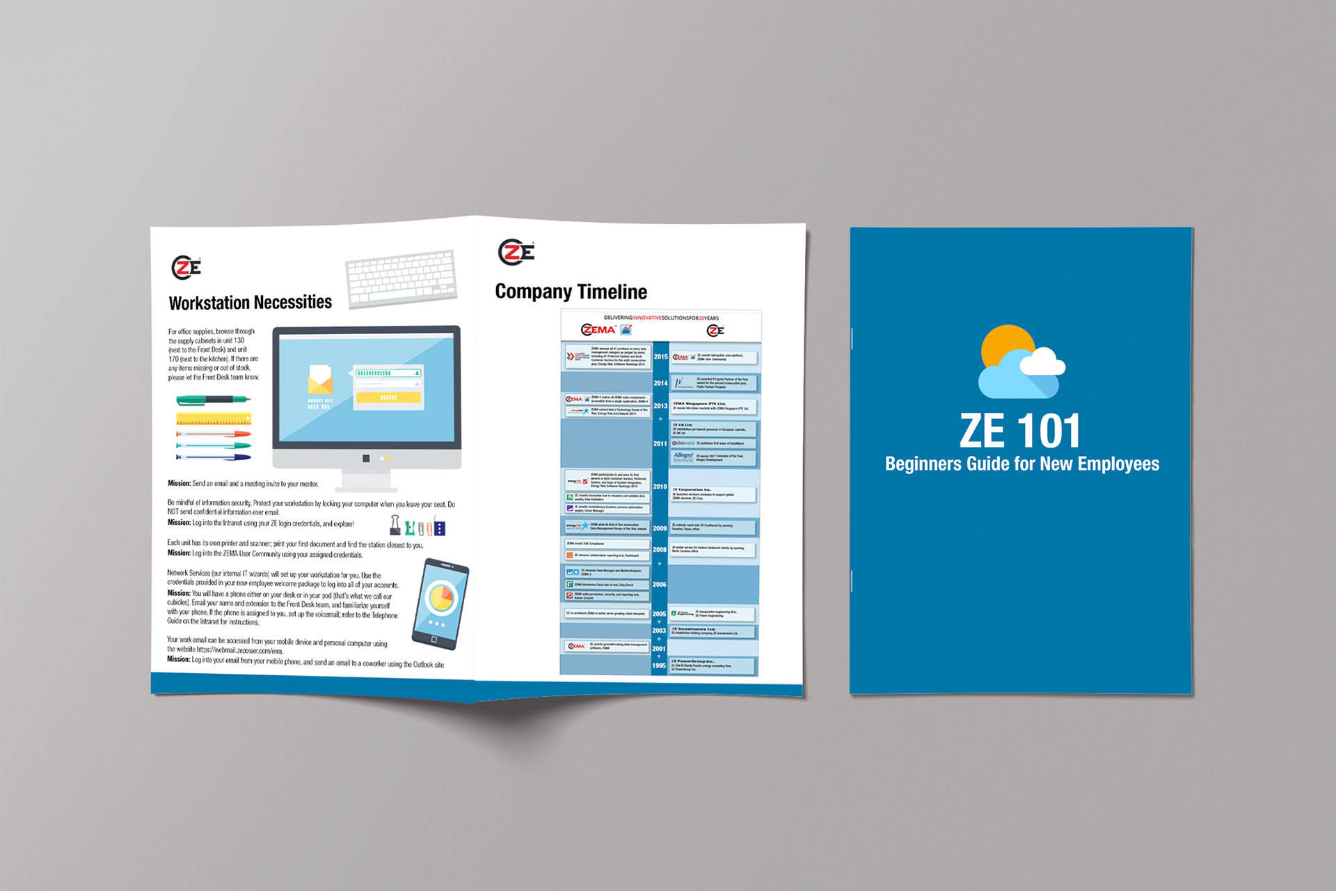
Created a detailed new hire packet featuring office maps, organizational charts, and key company insights, and designed a clear employee handbook covering policies, benefits, and procedures. I used a friendly, approachable visual tone and strong information hierarchy to keep the materials easy to read and engaging, and held everything to the brand across all collateral.
Created a detailed new hire packet featuring office maps, organizational charts, and key company insights, and designed a clear employee handbook covering policies, benefits, and procedures. I used a friendly, approachable visual tone and strong information hierarchy to keep the materials easy to read and engaging, and held everything to the brand across all collateral.
Result
The materials gave HR professional, welcoming tools that supported smoother onboarding and reinforced ZE PowerGroup’s culture and values from a new hire’s first day.
The materials gave HR professional, welcoming tools that supported smoother onboarding and reinforced ZE PowerGroup’s culture and values from a new hire’s first day.
Examples
Review PDF here
Review PDF here




CAMPAIGN DESIGN
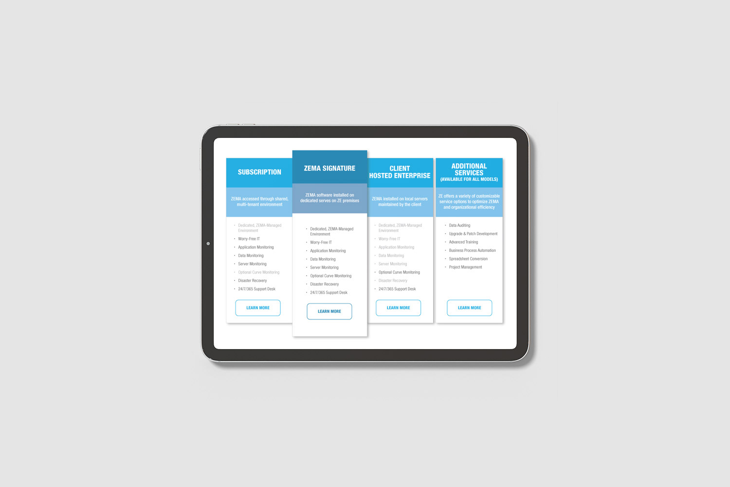
ZE Mobile Launch
Sleek Mobile Software Campaign
ZE Mobile Launch
Sleek Mobile Software Campaign
Situation
ZE PowerGroup was launching its new mobile software application and needed a cohesive, professional visual campaign to introduce it, while staying aligned with the existing software suite and the overall brand identity.
ZE PowerGroup was launching its new mobile software application and needed a cohesive, professional visual campaign to introduce it, while staying aligned with the existing software suite and the overall brand identity.
Solution
Led the creative direction and design for the ZE Mobile launch, delivering a unified suite of marketing assets that presented the new mobile solution with a modern, sleek look.
Led the creative direction and design for the ZE Mobile launch, delivering a unified suite of marketing assets that presented the new mobile solution with a modern, sleek look.
Execution
Designed fact sheets highlighting the app’s key features and benefits, and created a custom mobile app icon that fit seamlessly with the visual language of the existing ZE software. I also developed dynamic banner ad campaigns and handbills for multi-channel promotion. Using Adobe Illustrator and Photoshop, I refined software elements into engaging, consistent mobile graphics across all digital touchpoints.
Designed fact sheets highlighting the app’s key features and benefits, and created a custom mobile app icon that fit seamlessly with the visual language of the existing ZE software. I also developed dynamic banner ad campaigns and handbills for multi-channel promotion. Using Adobe Illustrator and Photoshop, I refined software elements into engaging, consistent mobile graphics across all digital touchpoints.
Result
The launch gave ZE Mobile a polished, cohesive introduction. The unified visual system strengthened brand consistency and communicated the value of the new app clearly to users and stakeholders.
The launch gave ZE Mobile a polished, cohesive introduction. The unified visual system strengthened brand consistency and communicated the value of the new app clearly to users and stakeholders.
Examples
View ZEMA Mobile Factsheet
View ZEMA Mobile Factsheet


ZE Mobile Launch




PRINT DESIGN
Immersive Pop-Up Displays & Event Banners
Trade Shows, Conferences & Office Branding
Immersive Pop-Up Displays & Event Banners
Trade Shows, Conferences & Office Branding
Situation
ZE PowerGroup needed visually impactful pop-up displays and banners to strengthen its brand presence at trade shows, conferences, and corporate events, as well as inside the office.
ZE PowerGroup needed visually impactful pop-up displays and banners to strengthen its brand presence at trade shows, conferences, and corporate events, as well as inside the office.
Solution
Designed and managed a full range of high-quality display solutions that raised brand visibility and created memorable experiences at both external events and internal spaces.
Designed and managed a full range of high-quality display solutions that raised brand visibility and created memorable experiences at both external events and internal spaces.
Execution
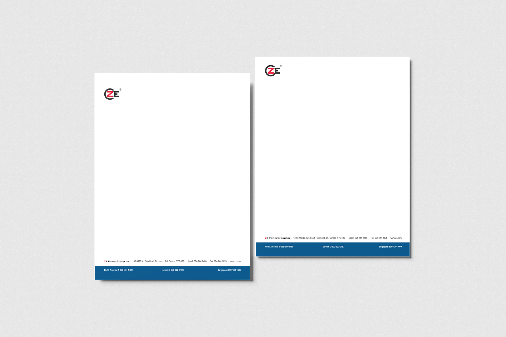
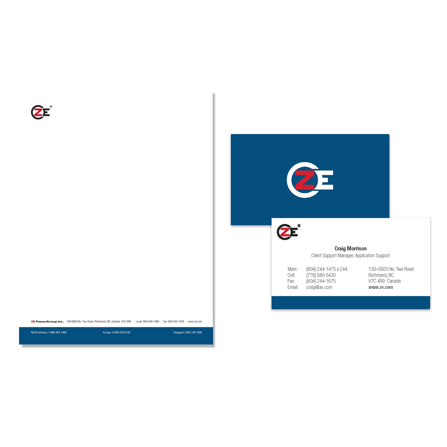
Led the entire process, from concept development through design, production, and quality control. I created pop-up displays and large-format banners tailored to different event types and office use, balancing creative design with practical, durable production standards, and held every piece to the brand with strong visual impact.
Led the entire process, from concept development through design, production, and quality control. I created pop-up displays and large-format banners tailored to different event types and office use, balancing creative design with practical, durable production standards, and held every piece to the brand with strong visual impact.
Result
The displays and banners gave ZE PowerGroup a consistent, professional presence at events and in the office year-round, reinforcing brand recognition for clients, partners, and employees.
The displays and banners gave ZE PowerGroup a consistent, professional presence at events and in the office year-round, reinforcing brand recognition for clients, partners, and employees.



CAMPAIGN DESIGN
ZEMA User Forum Campaign
Omni-Channel Event Marketing & Collateral
ZEMA User Forum Campaign
Omni-Channel Event Marketing & Collateral
Situation
ZE PowerGroup needed a comprehensive campaign to promote its annual ZEMA User Forum, a key event for energy, commodities, and data analytics professionals. The campaign had to drive attendance and reinforce the company’s brand leadership.
ZE PowerGroup needed a comprehensive campaign to promote its annual ZEMA User Forum, a key event for energy, commodities, and data analytics professionals. The campaign had to drive attendance and reinforce the company’s brand leadership.
Solution
As Senior Graphic Designer, I led full creative direction and production of an integrated omni-channel campaign that combined digital marketing with premium print and on-site collateral.
As Senior Graphic Designer, I led full creative direction and production of an integrated omni-channel campaign that combined digital marketing with premium print and on-site collateral.
Execution
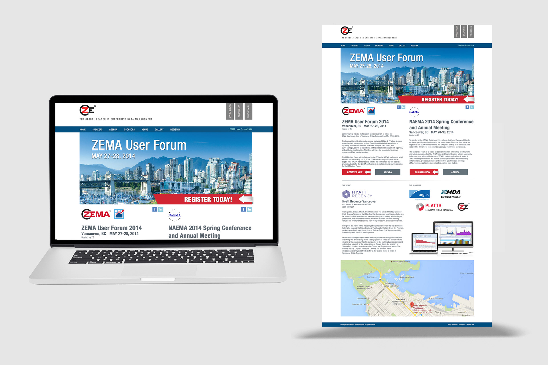
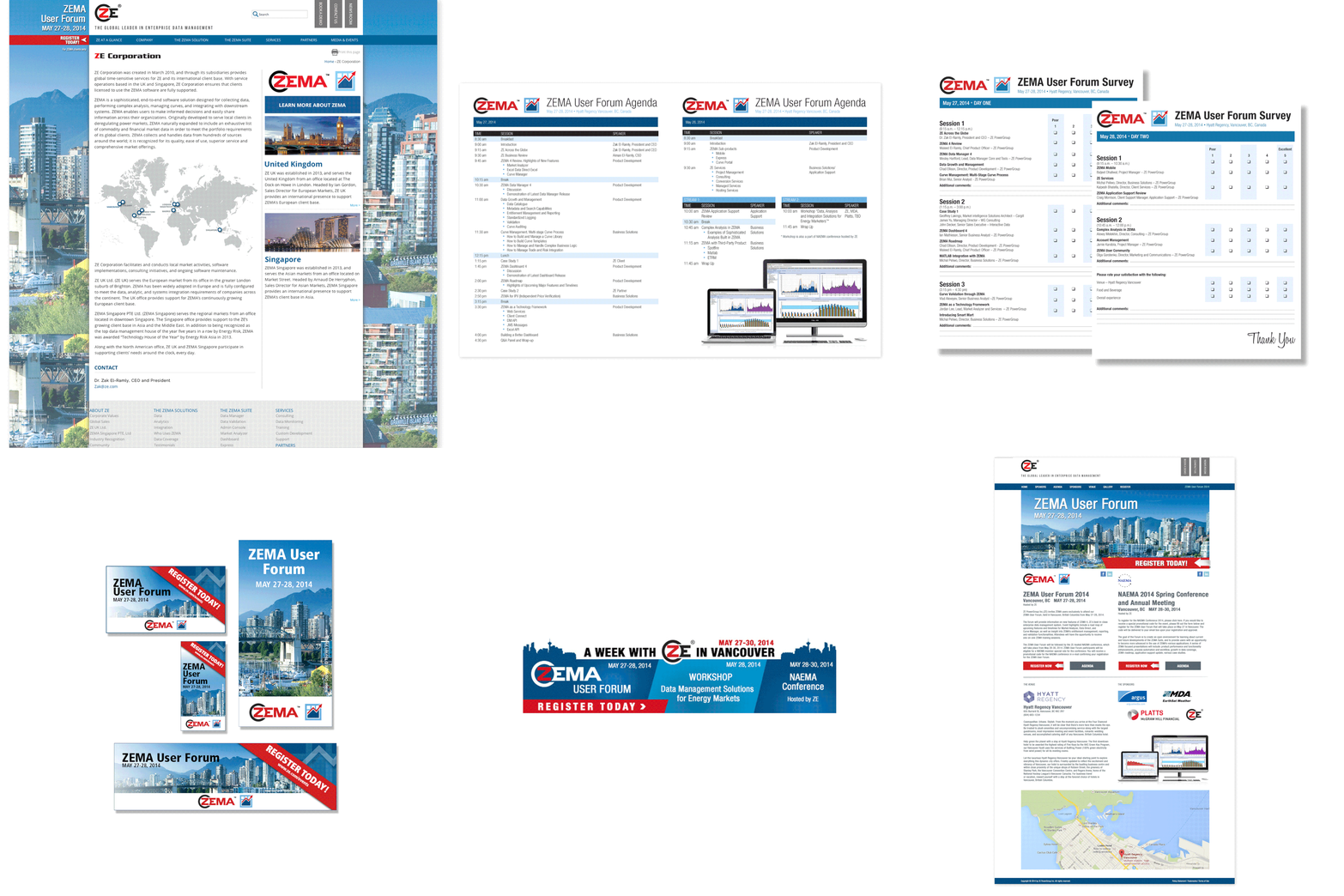
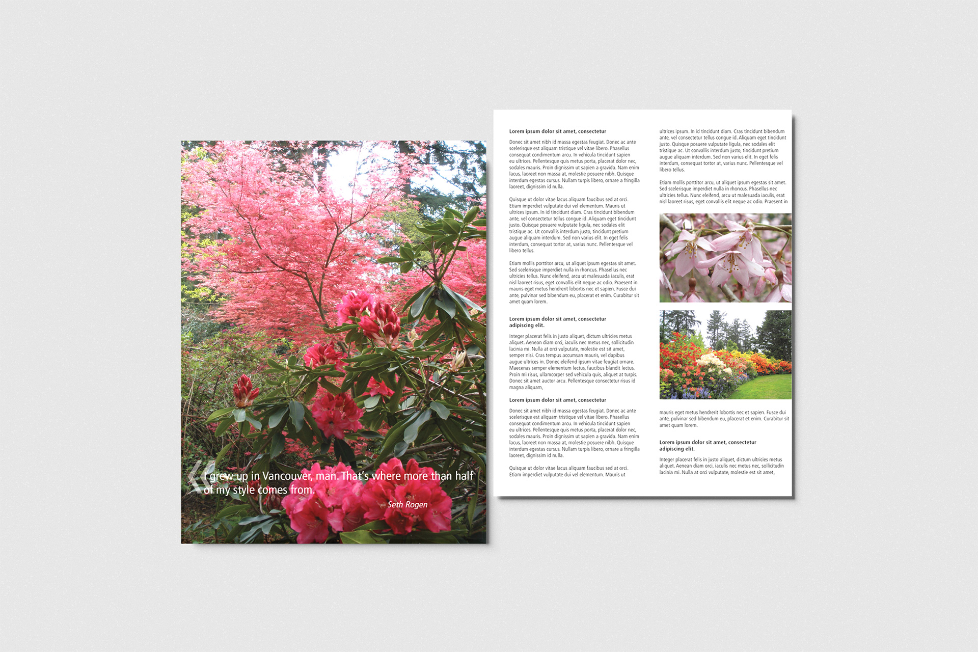
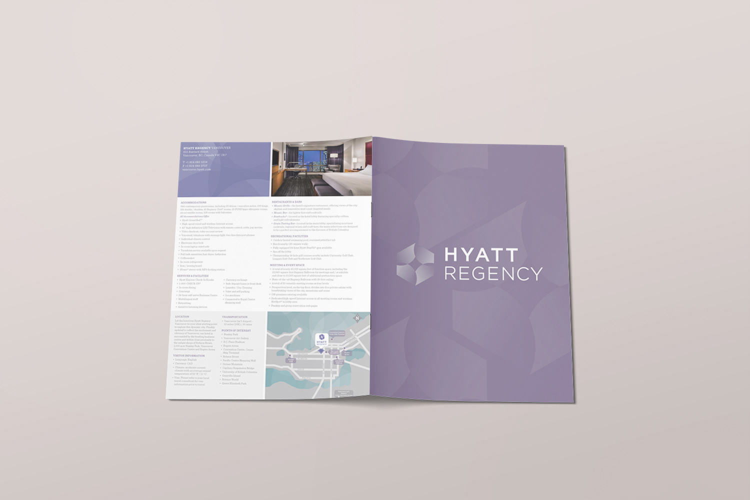
Built a cohesive strategy across email nurture sequences, landing pages, dynamic banners, and countdown assets. For print, I designed direct mailers, handbills, and a magazine-style brochure showcasing Vancouver as the host city. I produced the complete set of on-site materials, including name tags, agendas, speaker bios, surveys, and large-format pop-up banners, and curated premium welcome packages for attendees featuring the Vancouver-themed brochure. I also managed quality control, vendor relationships, and production to keep the execution consistent and professional.
Built a cohesive strategy across email nurture sequences, landing pages, dynamic banners, and countdown assets. For print, I designed direct mailers, handbills, and a magazine-style brochure showcasing Vancouver as the host city. I produced the complete set of on-site materials, including name tags, agendas, speaker bios, surveys, and large-format pop-up banners, and curated premium welcome packages for attendees featuring the Vancouver-themed brochure. I also managed quality control, vendor relationships, and production to keep the execution consistent and professional.
Result
The campaign built anticipation for the forum and gave attendees a polished, memorable experience from first email to welcome package. It strengthened ZE PowerGroup’s reputation in the energy and commodities sector and raised the overall quality of the ZEMA User Forum.
The campaign built anticipation for the forum and gave attendees a polished, memorable experience from first email to welcome package. It strengthened ZE PowerGroup’s reputation in the energy and commodities sector and raised the overall quality of the ZEMA User Forum.









CAMPAIGN DESIGN
Corporate Campaigns & Visual Communication
ZE Software + Interactive Data / FutureSource Merger
Corporate Campaigns & Visual Communication
ZE Software + Interactive Data / FutureSource Merger
Situation
During the strategic merger of ZE Software with Interactive Data/FutureSource, the company needed a comprehensive internal and external communication campaign. It had to explain the integration clearly, raise employee awareness, engage clients, and drive stakeholder participation.
During the strategic merger of ZE Software with Interactive Data/FutureSource, the company needed a comprehensive internal and external communication campaign. It had to explain the integration clearly, raise employee awareness, engage clients, and drive stakeholder participation.
Solution
As Team Lead, I spearheaded the creative direction and execution of an integrated omni-channel campaign built on educational events, digital assets, and clear visual communication to support a smooth merger rollout.
As Team Lead, I spearheaded the creative direction and execution of an integrated omni-channel campaign built on educational events, digital assets, and clear visual communication to support a smooth merger rollout.
Execution
Designed and ran a Lunch & Learn program and a webinar series to educate employees and clients. I worked with the programming team to build a dedicated landing page optimized for email campaigns and registrations, and developed email campaigns with live countdowns and strong calls-to-action. I created a custom merger graphic used across the homepage carousel, banner ads, and promotional materials, and designed web banners promoting the events on the corporate website and partner platforms. Using Adobe Illustrator and Photoshop, I also produced detailed charts, infographics, a one-page factsheet in print and digital, and a comprehensive white paper.
Designed and ran a Lunch & Learn program and a webinar series to educate employees and clients. I worked with the programming team to build a dedicated landing page optimized for email campaigns and registrations, and developed email campaigns with live countdowns and strong calls-to-action. I created a custom merger graphic used across the homepage carousel, banner ads, and promotional materials, and designed web banners promoting the events on the corporate website and partner platforms. Using Adobe Illustrator and Photoshop, I also produced detailed charts, infographics, a one-page factsheet in print and digital, and a comprehensive white paper.
Result
The campaign explained complex merger details clearly to employees, clients, and stakeholders, and supported internal alignment and external participation. The cohesive visual strategy strengthened brand integration and kept communication professional and consistent throughout the transition.
The campaign explained complex merger details clearly to employees, clients, and stakeholders, and supported internal alignment and external participation. The cohesive visual strategy strengthened brand integration and kept communication professional and consistent throughout the transition.
Examples
GARP Webinar Recording
GARP Webinar Recording


CAMPAIGN DESIGN
ZEMA User Community Campaign
Community Building & Engagement Initiative
ZEMA User Community Campaign
Community Building & Engagement Initiative
Situation
ZE PowerGroup needed a comprehensive campaign to launch and grow the ZEMA User Community, a hub where users could find resources, connect with peers, and deepen their knowledge of the software.
ZE PowerGroup needed a comprehensive campaign to launch and grow the ZEMA User Community, a hub where users could find resources, connect with peers, and deepen their knowledge of the software.
Solution
As Team Lead, I spearheaded the creative strategy and execution of the ZEMA Community campaign, blending digital, print, and educational elements to encourage engagement and long-term user loyalty.
As Team Lead, I spearheaded the creative strategy and execution of the ZEMA Community campaign, blending digital, print, and educational elements to encourage engagement and long-term user loyalty.
Execution
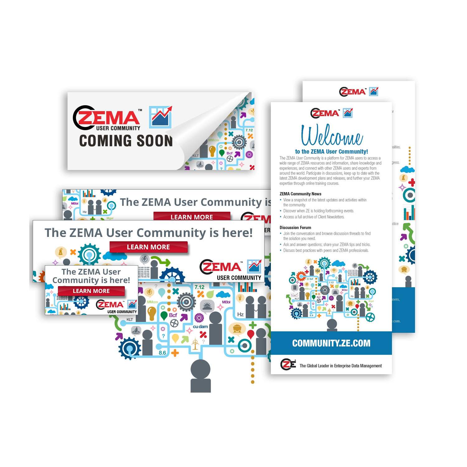
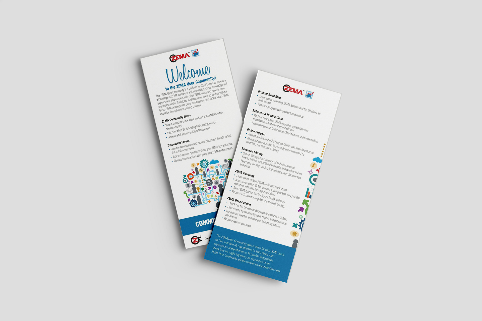
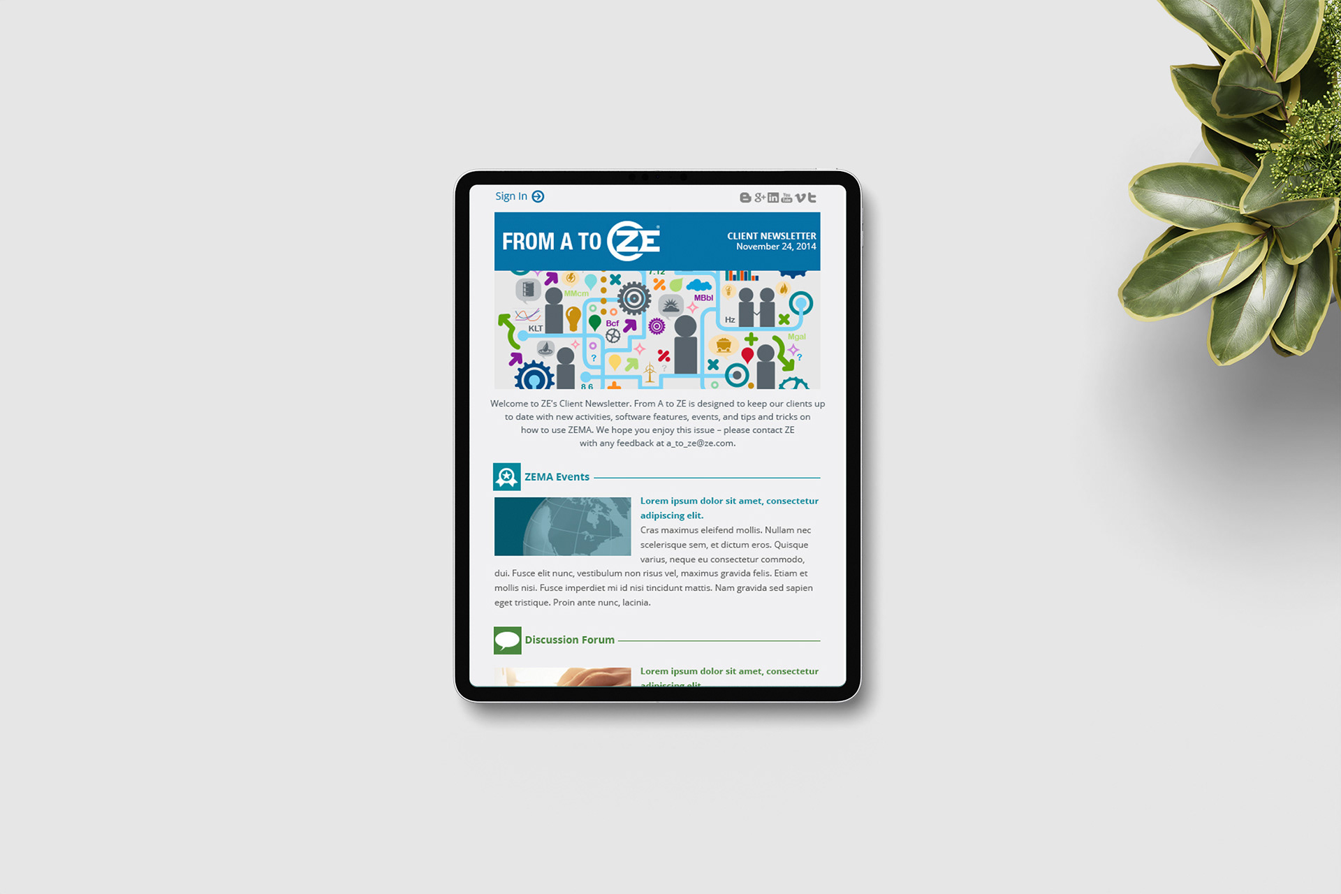
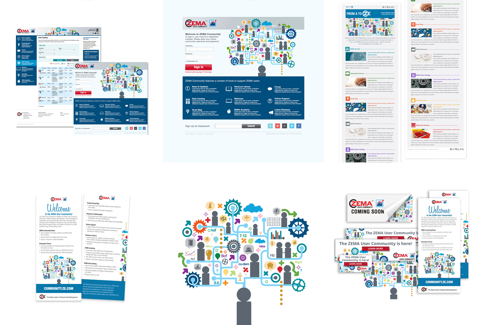
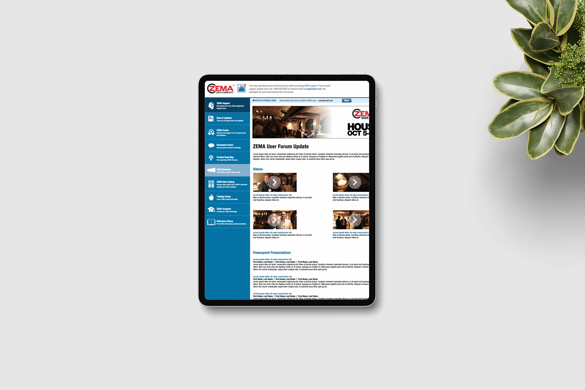
Designed a central infographic that anchored all of the campaign’s marketing materials. I worked with programmers to develop the community website, which included interactive catalogs, a resource library, webinars, online support, and a discussion forum. To promote the launch, I created print handbills and direct mail postcards, and I developed a series of email templates, including monthly newsletters and frequent touch-points, to keep communication consistent. I also designed pathways within the community that guided users toward an educational portal where they could earn proficiency certificates.
Designed a central infographic that anchored all of the campaign’s marketing materials. I worked with programmers to develop the community website, which included interactive catalogs, a resource library, webinars, online support, and a discussion forum. To promote the launch, I created print handbills and direct mail postcards, and I developed a series of email templates, including monthly newsletters and frequent touch-points, to keep communication consistent. I also designed pathways within the community that guided users toward an educational portal where they could earn proficiency certificates.
Result
The campaign launched the ZEMA User Community as a cohesive, multi-channel ecosystem that supported ongoing education and strengthened client relationships through consistent branding and communication.
The campaign launched the ZEMA User Community as a cohesive, multi-channel ecosystem that supported ongoing education and strengthened client relationships through consistent branding and communication.








BRANDING & ICON DESIGN
Icon System, ZEMA Mobile App Icon & 20-Year Anniversary Logo
Icon System, ZEMA Mobile App Icon & 20-Year Anniversary Logo
Situation
ZE PowerGroup needed its visual identity to hold together across software, mobile, web, and marketing. Its software platforms, website, and collateral needed a cohesive set of custom icons to improve navigation and keep visuals consistent. The ZEMA software needed a recognizable app icon that kept the brand consistent while performing in mobile app stores and other digital environments. The company also wanted to mark its 20-year milestone with a refreshed logo that honoured its heritage while projecting a modern, forward-thinking image in the energy and data management sector.
ZE PowerGroup needed its visual identity to hold together across software, mobile, web, and marketing. Its software platforms, website, and collateral needed a cohesive set of custom icons to improve navigation and keep visuals consistent. The ZEMA software needed a recognizable app icon that kept the brand consistent while performing in mobile app stores and other digital environments. The company also wanted to mark its 20-year milestone with a refreshed logo that honoured its heritage while projecting a modern, forward-thinking image in the energy and data management sector.
Solution
Designed three connected pieces of the brand: a custom icon system, a mobile app icon reinterpreted from the existing ZEMA logo, and an updated ZE PowerGroup logo that balanced tradition with contemporary design. Each one stayed true to the established identity while making it clearer, more versatile, and better suited to the places it needed to appear.
Designed three connected pieces of the brand: a custom icon system, a mobile app icon reinterpreted from the existing ZEMA logo, and an updated ZE PowerGroup logo that balanced tradition with contemporary design. Each one stayed true to the established identity while making it clearer, more versatile, and better suited to the places it needed to appear.
Execution
For the icon system, I created a complete set of icons that reflected ZE’s professional yet approachable aesthetic, keeping style, line weight, and proportion consistent so they worked together across digital interfaces and collateral. I focused on clarity, simplicity, and immediate recognition, and delivered icons optimized for both web and software applications.
For the icon system, I created a complete set of icons that reflected ZE’s professional yet approachable aesthetic, keeping style, line weight, and proportion consistent so they worked together across digital interfaces and collateral. I focused on clarity, simplicity, and immediate recognition, and delivered icons optimized for both web and software applications.
For the app icon, I adapted core elements of the ZEMA logo into a clean, scalable icon built for small screens. I applied mobile design principles so it stayed clear and recognizable at various resolutions, and delivered a versatile asset suited to app stores and other digital touchpoints.
For the anniversary logo, I refined typography, proportions, and details to modernize the mark while preserving its core identity. I selected updated colour schemes and made strategic adjustments to improve clarity and versatility, then checked that the new logo performed across digital platforms, print materials, and marketing collateral.
Result
The three pieces gave ZE a consistent visual language across software, mobile, and marketing. The icons made complex tools easier to navigate, the app icon gave ZEMA an instantly recognizable presence on mobile, and the refreshed logo became a central visual asset for the 20-year anniversary celebrations, reflecting the company’s evolution and industry leadership.
The three pieces gave ZE a consistent visual language across software, mobile, and marketing. The icons made complex tools easier to navigate, the app icon gave ZEMA an instantly recognizable presence on mobile, and the refreshed logo became a central visual asset for the 20-year anniversary celebrations, reflecting the company’s evolution and industry leadership.