THE PROJECTS
Omni-channel Marketing Materials & Corporate Branding Strategies
Seamless Marketing, Timeless Branding
Omni-channel Marketing Materials & Corporate Branding Strategies
Seamless Marketing, Timeless Branding
As an experienced designer specializing in omni-channel marketing and corporate branding, I create impactful, results-driven visual strategies that unify brand presence across digital, print, social, email, packaging, and experiential channels. With a proven ability to foster collaboration across diverse teams (working closely with developers, copywriters, marketers, and stakeholders) I navigate complex challenges to deliver innovative, cohesive solutions that enhance audience engagement, build trust, and drive measurable business outcomes.
My approach combines strategic mindset with creative leadership, ensuring every asset (from website banners and interactive PDFs to brochures, trade show displays, and sales collateral) aligns seamlessly with the brand’s core identity while optimizing for performance, scalability, and audience resonance. Committed to continuous growth and team empowerment, I deliver excellence in execution, turning brand vision into timeless, high-impact experiences that strengthen market positioning and deliver lasting value.
This body of work demonstrates expertise in omni-channel brand strategy, corporate branding systems, multi-platform marketing collateral, visual identity & consistency, cross-functional creative leadership, results-driven design, audience engagement visuals, and strategic graphic design for retail, wellness, e-commerce, and B2B brands.
BRANDING DESIGN
Logo & Business Card Creation
Premium Branding for a Canadian Cannabis Company
Logo & Business Card Creation
Premium Branding for a Canadian Cannabis Company
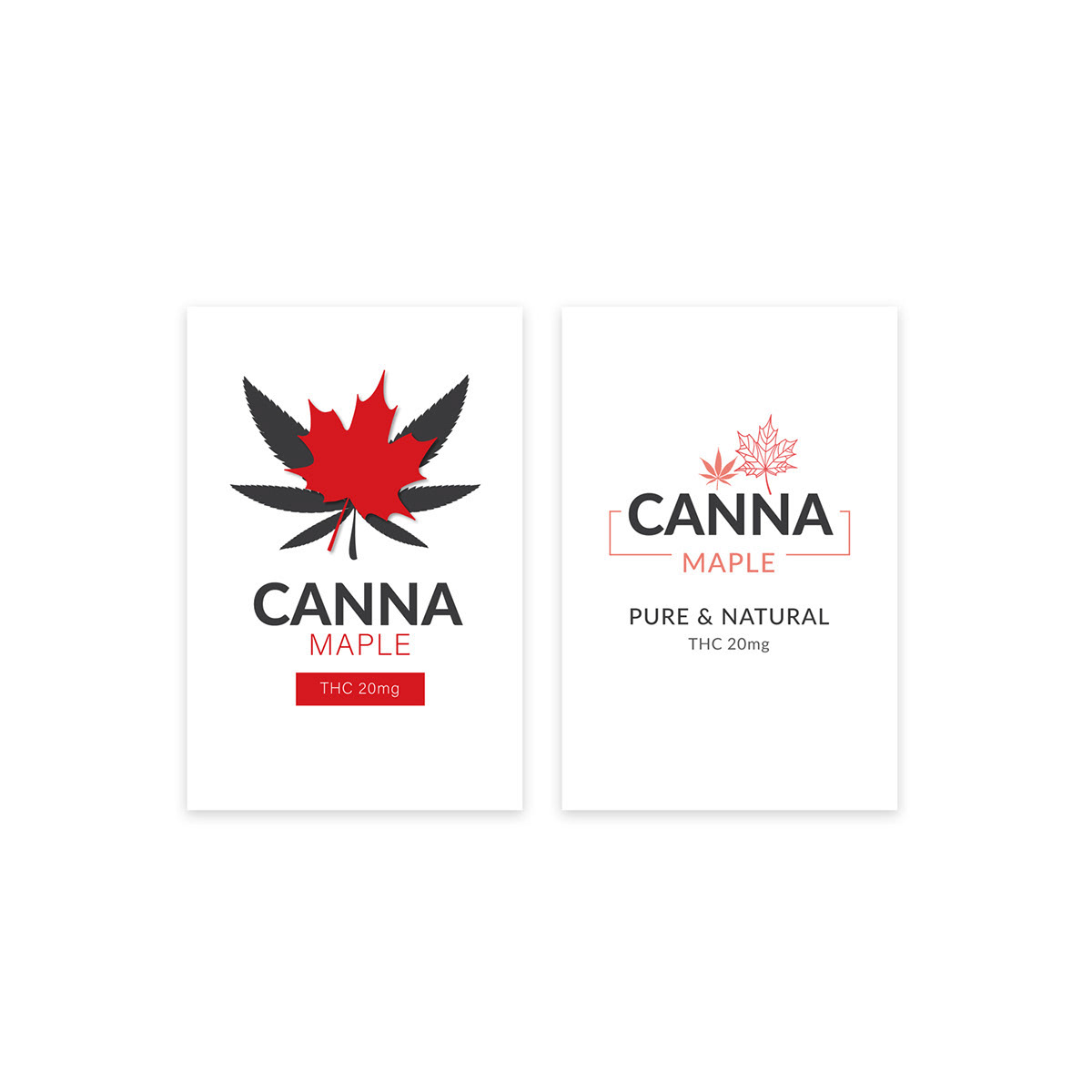
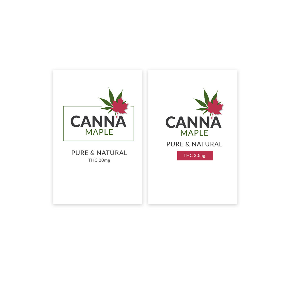
Utilizing Adobe Illustrator, I designed a distinctive logo for a Canadian cannabis company that seamlessly blended a uniquely Canadian aesthetic with the essence of the brand, creating a strong, memorable visual identity that stands out in a competitive market. Through multiple carefully curated logo variations, I presented options that captured attention, sparked curiosity, and delivered a lasting impression, ultimately aligning with stakeholder vision while establishing immediate brand recognition and credibility.
To reinforce brand consistency and extend the identity into professional touchpoints, I designed a complementary business card that integrated the finalized logo, typography, colour palette, and subtle cannabis-inspired motifs. This visually compelling asset serves as both a sophisticated introduction and a powerful marketing tool, encouraging deeper client engagement, networking, and ongoing brand presence in the regulated cannabis industry.
This project demonstrates expertise in cannabis brand logo design, Canadian-inspired visual identity, logo variation development, business card branding, Adobe Illustrator mastery, regulated industry compliance, premium print collateral, and strategic graphic design for emerging wellness, lifestyle, and cannabis brands.
UX/UI DESIGN
Email Template & Web Design
Seamless, Mobile-Optimized Experiences
Email Template & Web Design
Seamless, Mobile-Optimized Experiences
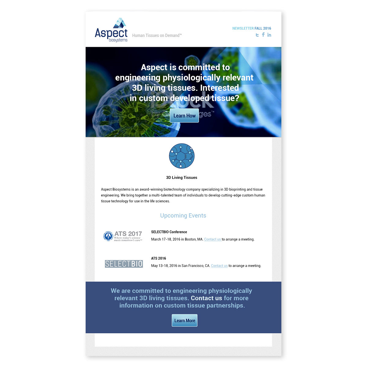
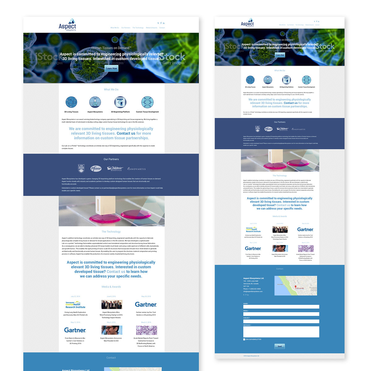
In partnership with Aspect Biosystems, a pioneering leader in bio-printed tissue therapy affiliated with UBC, I led the design and development of a modern email template and website refresh that strengthened their digital presence and professional credibility. Working closely with their team, I helped define clear marketing objectives, integrated analytics for performance tracking, and ensured every element aligned with the brand’s innovative, science-driven identity.
For the email newsletter, I curated industry-relevant imagery, redesigned custom icons, and crafted a visually compelling, mobile-optimized layout that balanced clean typography, strategic hierarchy, and strong calls-to-action, effectively communicating groundbreaking advancements in regenerative medicine to key stakeholders, investors, and partners while boosting engagement and open rates.
The website redesign focused on seamless user experience, responsive layouts, intuitive navigation, and high-impact visuals that highlighted Aspect’s cutting-edge bio-printing technology and research milestones. This cohesive digital ecosystem reinforced the brand’s authority in the life sciences space, enhanced stakeholder trust, and positioned Aspect Biosystems as a forward-thinking leader in tissue engineering and therapeutic innovation.
This project demonstrates expertise in email template design, mobile-optimized newsletter production, website UX/UI refresh, brand-consistent digital assets, scientific & healthcare marketing visuals, analytics-integrated strategy, custom icon creation, and strategic graphic design for biotech, bio-printing, and research-driven brands.
BRANDING DESIGN
Logo & Business Card Design
Distinctive Logo & Strategic Business Cards
Logo & Business Card Design
Distinctive Logo & Strategic Business Cards
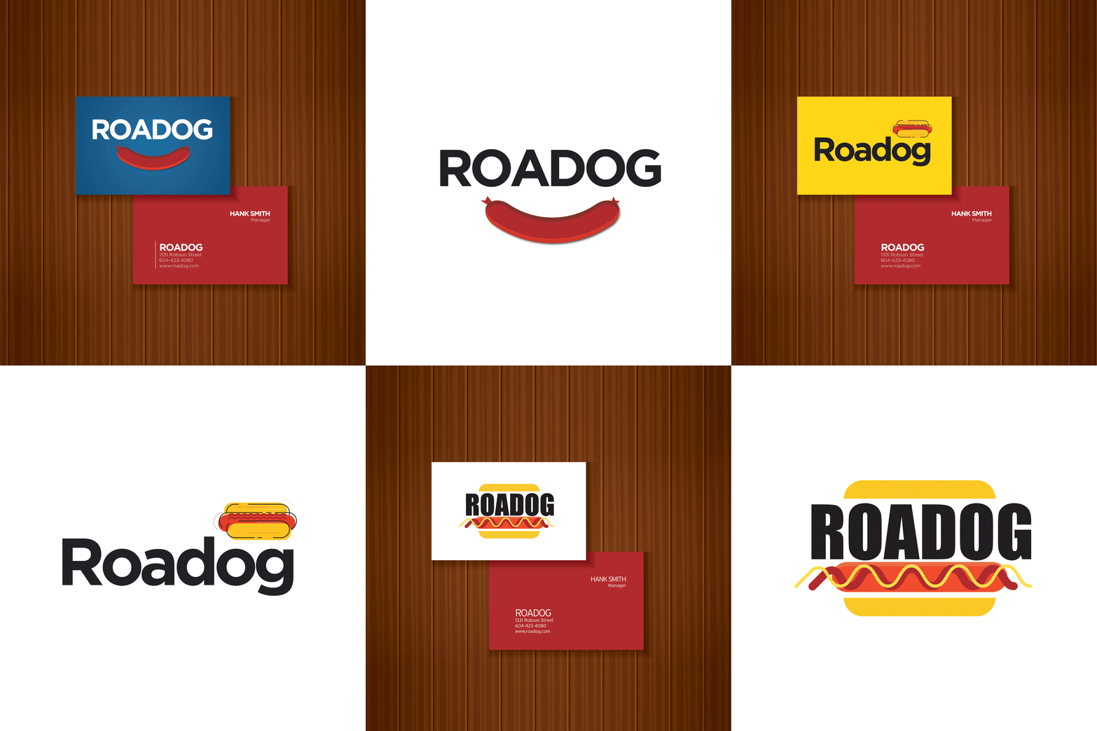
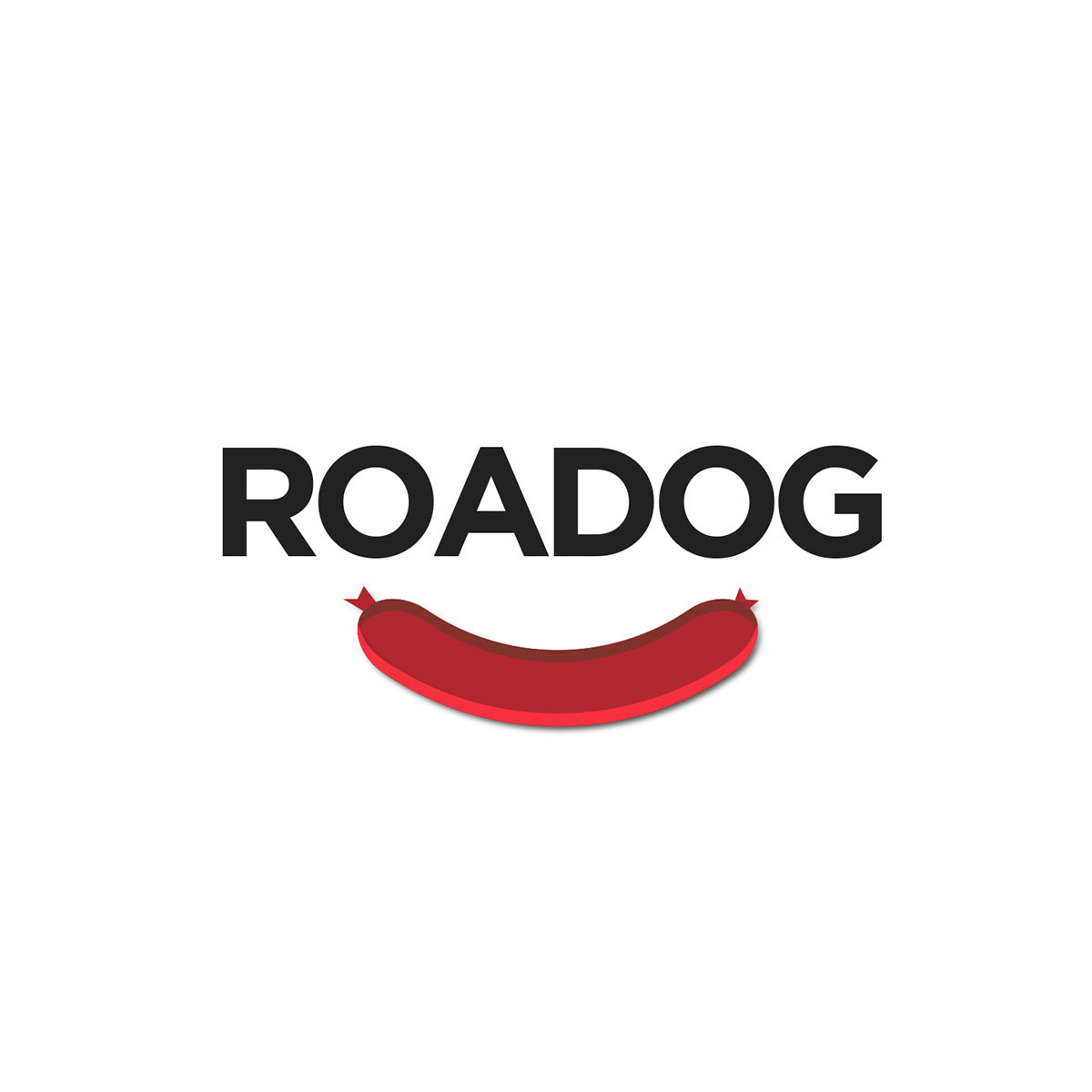
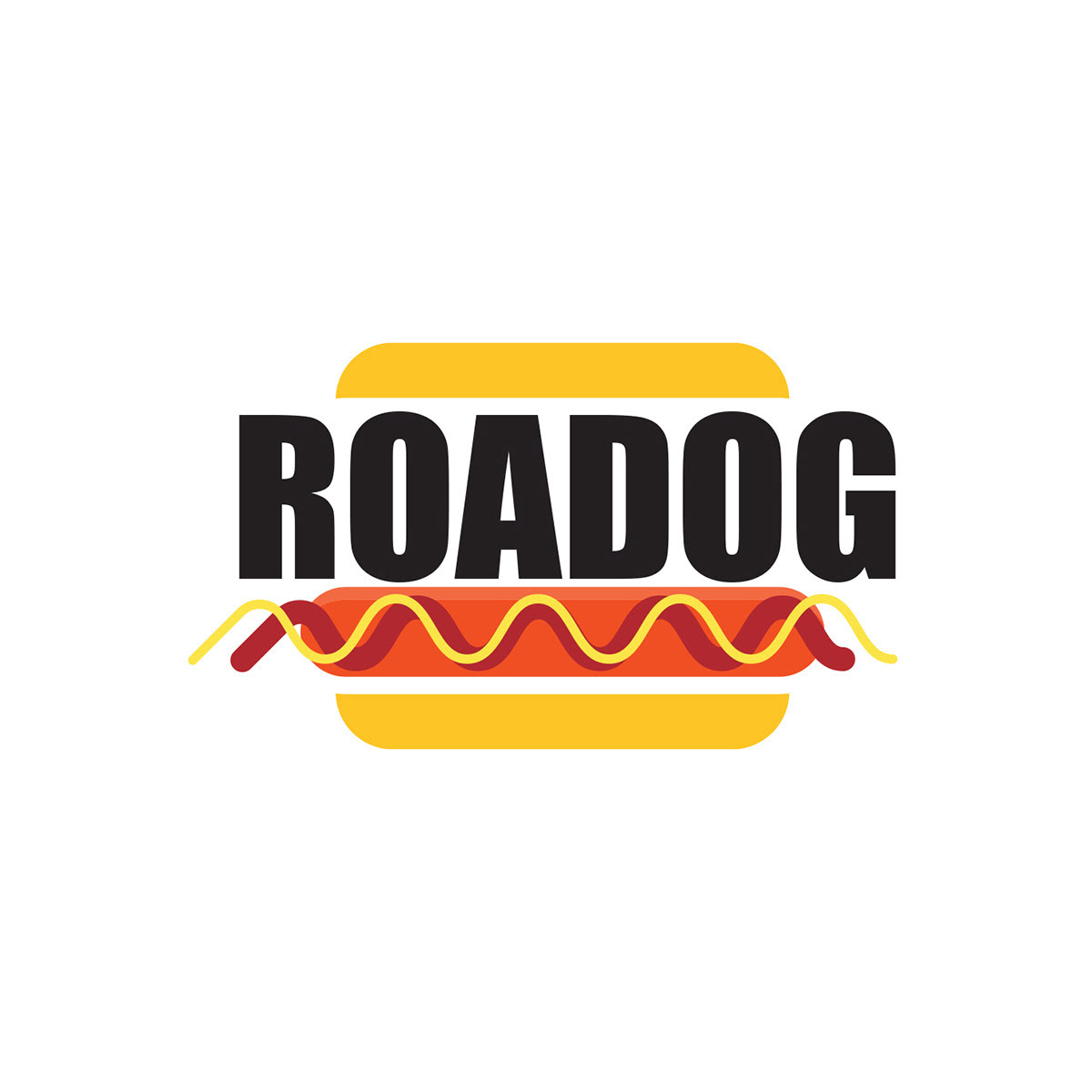
Using Adobe Illustrator, I designed a distinctive logo for the restaurant that creatively incorporates an icon symbolizing its signature dish (the hot dog) creating an instantly recognizable and memorable visual identity. I selected a clean, impactful font paired with a vibrant, complementary colour palette that evokes energy, appetite, and fun while ensuring strong brand recognition and shelf appeal in a competitive food service market.
To extend the brand’s reach and foster customer engagement, I also crafted professional business cards that serve as powerful marketing tools. These cards integrate essential contact details, URLs, and social handles in a polished layout that encourages reconnection, reservations, and repeat visits, turning every exchange into a direct opportunity for conversions and loyalty.
This cohesive logo and stationery system not only reinforces the restaurant’s unique personality but also increases visibility, builds instant trust, and drives measurable growth in a fast-paced dining landscape.
This project demonstrates expertise in restaurant logo design, hot dog icon integration, vibrant brand colour palette, business card marketing collateral, Adobe Illustrator branding, high-engagement visual identity, food & hospitality branding, and strategic graphic design for retail and restaurant brands.
UX/UI DESIGN
Figma Gaming Visuals
Dreamseeker Drift Landing Page & Social Media Campaign
Figma Gaming Visuals
Dreamseeker Drift Landing Page & Social Media Campaign
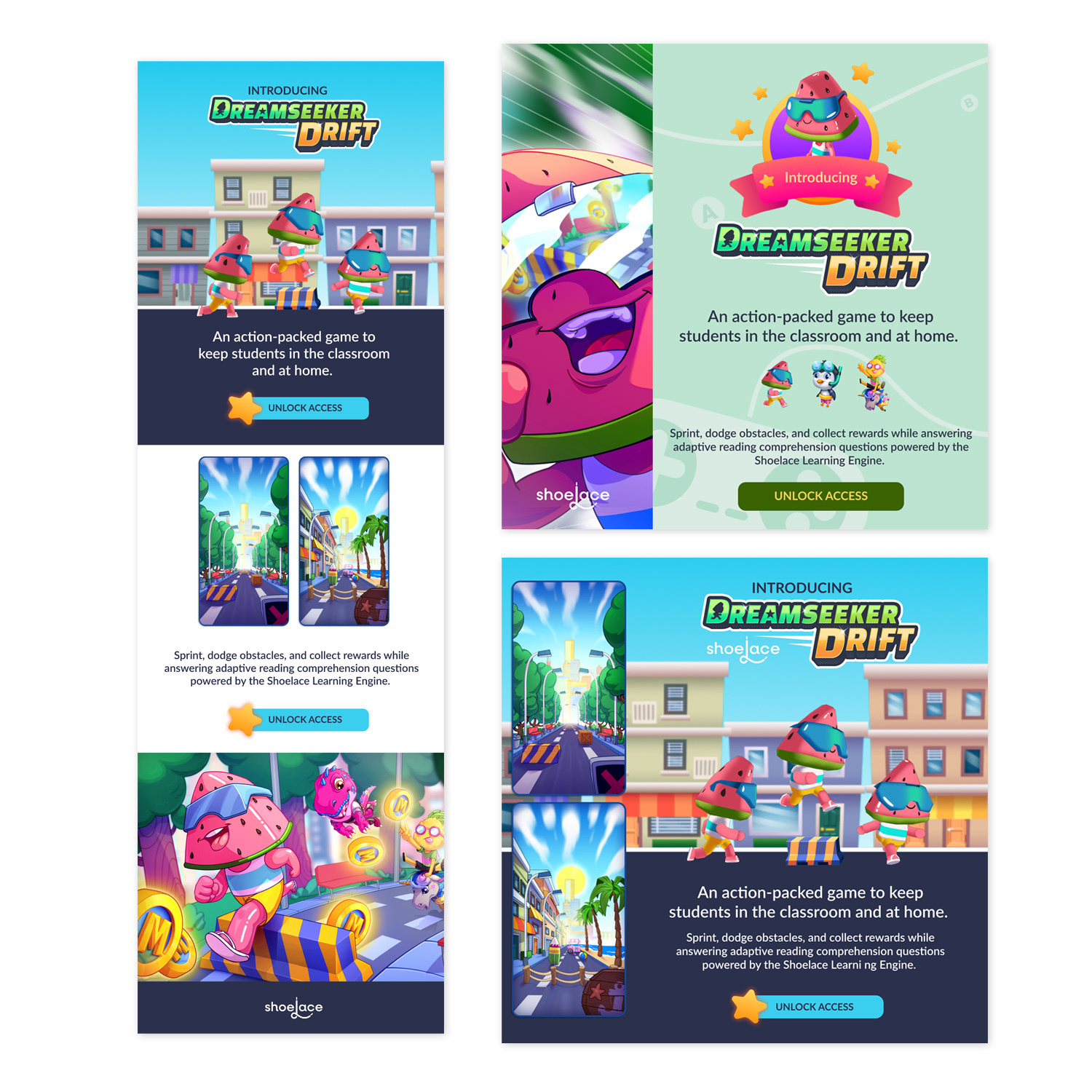
Using Figma, I designed functional and visually compelling digital assets for Dreamseeker Drift, an educational video game that balances intuitive navigation with strong aesthetic appeal to captivate children and young adults. My role encompassed creating a dedicated landing page optimized for user engagement and conversion, alongside a full suite of static marketing materials for a targeted social media campaign to drive awareness, excitement, and participation around the game’s launch.
Leveraging provided graphics, I developed a focused email campaign featuring strategic calls-to-action (CTAs) that maximized clarity, relevance, and click-through potential—ensuring seamless integration with the landing page and social efforts. The cohesive visual system emphasized playful yet educational themes, vibrant colour palettes, and user-centric layouts that communicated the game’s value proposition instantly, fostering curiosity and long-term engagement in the competitive gaming and edutainment market.
This project demonstrates expertise in Figma gaming design, educational video game marketing, landing page UX/UI, social media campaign visuals, strategic email CTAs, children & young adult targeting, brand-consistent digital assets, and high-engagement creative for edutainment, kids gaming, and interactive learning brands.
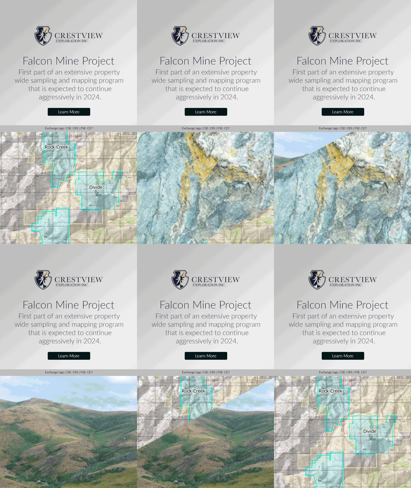
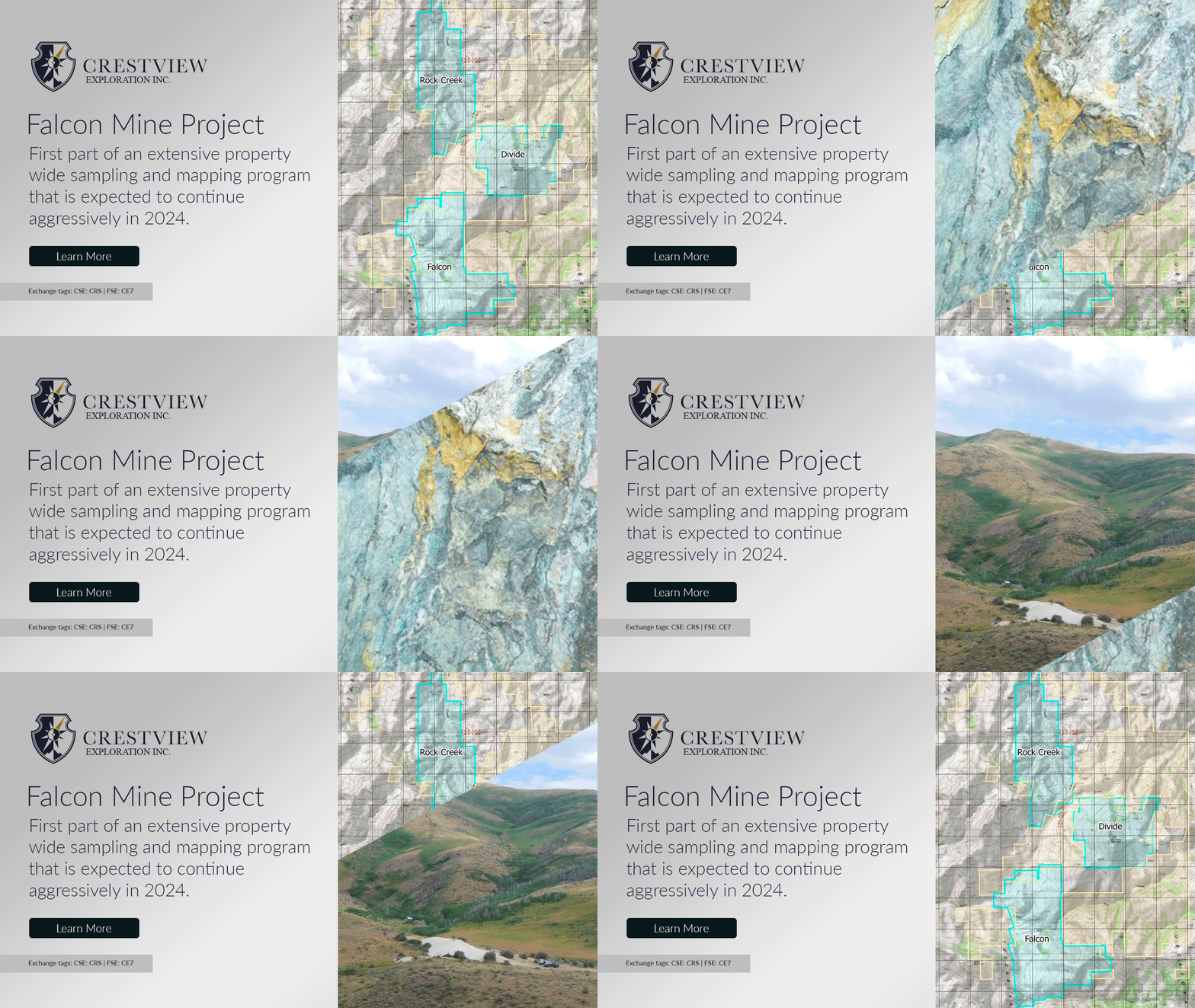
I enhanced Crestview Exploration’s digital presence by designing a series of animated social media graphics that captured immediate attention, significantly increased engagement, and reinforced a strong, recognizable brand identity in the competitive exploration sector. These dynamic visuals (featuring smooth motion, strategic transitions, bold typography, and on-brand imagery) became a cornerstone of the company’s marketing strategy, transforming its online channels into a compelling, high-energy platform that stood out in feeds and drove meaningful audience interaction.
By strategically blending creativity with technical precision, I developed animations that not only captivated viewers but also deepened the brand’s connection with its digital community, communicating innovation, reliability, and forward-thinking leadership with every scroll. The result was a cohesive, animated content ecosystem that positioned Crestview Exploration as a trailblazer in the industry, amplifying visibility, fostering community loyalty, and generating greater market impact through consistent, high-performance social storytelling.
This project demonstrates expertise in animated social media graphics, digital brand storytelling, high-engagement motion design, brand identity reinforcement, exploration & mining marketing visuals, social media campaign assets, performance-driven animations, and strategic graphic design for B2B, natural resources, and technical industry brands.
SOCIAL MEDIA DESIGN
Canva-Powered Instagram Content
High-Engagement Social Media Visuals
Canva-Powered Instagram Content
High-Engagement Social Media Visuals
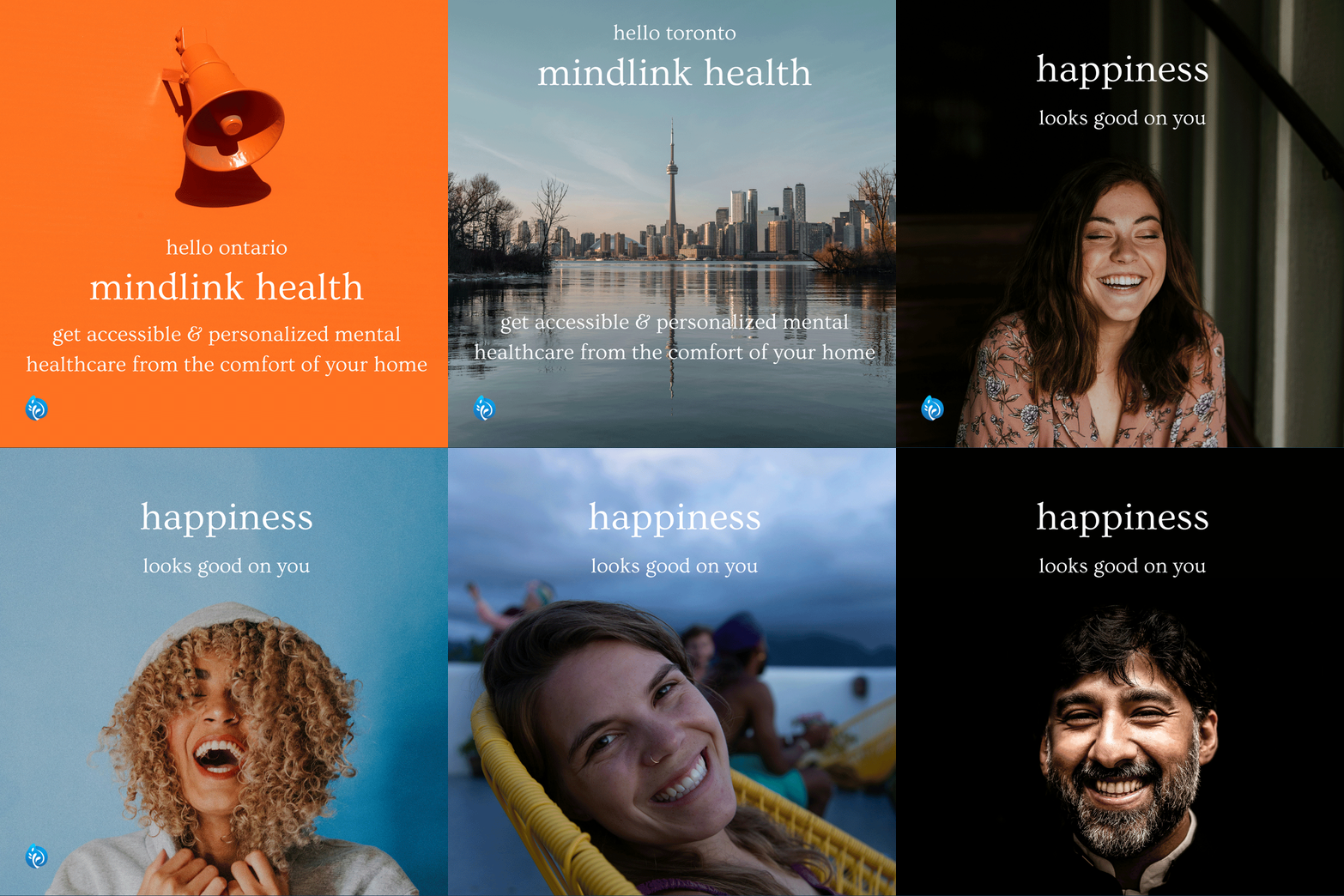
Using Canva, I created a diverse series of high-impact Instagram graphics for Mindlink, transforming the brand’s social presence into a dynamic, attention-grabbing digital experience that consistently drives engagement and follower growth. These visuals—posts, Stories, Reels thumbnails, and carousels—were strategically designed to capture attention instantly with bold typography, vibrant yet on-brand colour palettes, clean layouts, and energetic compositions that perfectly embodied Mindlink’s vibrant personality.
Each graphic was crafted to spark interaction: compelling calls-to-action, relatable lifestyle imagery, and scroll-stopping design elements that encouraged likes, comments, shares, saves, and direct messages. The result was a cohesive, lively feed that not only elevated online visibility but also turned passive scrollers into active community members, strengthening brand recall and loyalty in a crowded digital space.
This project demonstrates expertise in Instagram graphic design, Canva social media content, high-engagement visual assets, brand-consistent Instagram aesthetics, feed curation & storytelling, scroll-stopping graphics, Reels & Stories templates, and strategic social media design for lifestyle, wellness, tech, and consumer brands.

UX/UI DESIGN
Landing Page & Pop-up Design
Driving Clicks, Upsells & Conversions
Landing Page & Pop-up Design
Driving Clicks, Upsells & Conversions
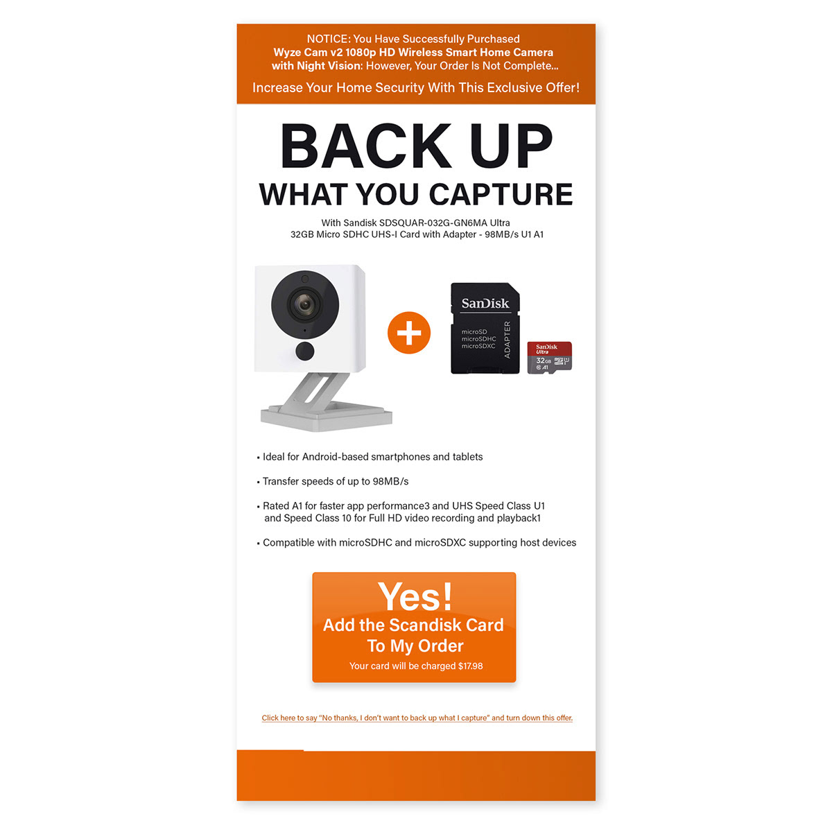
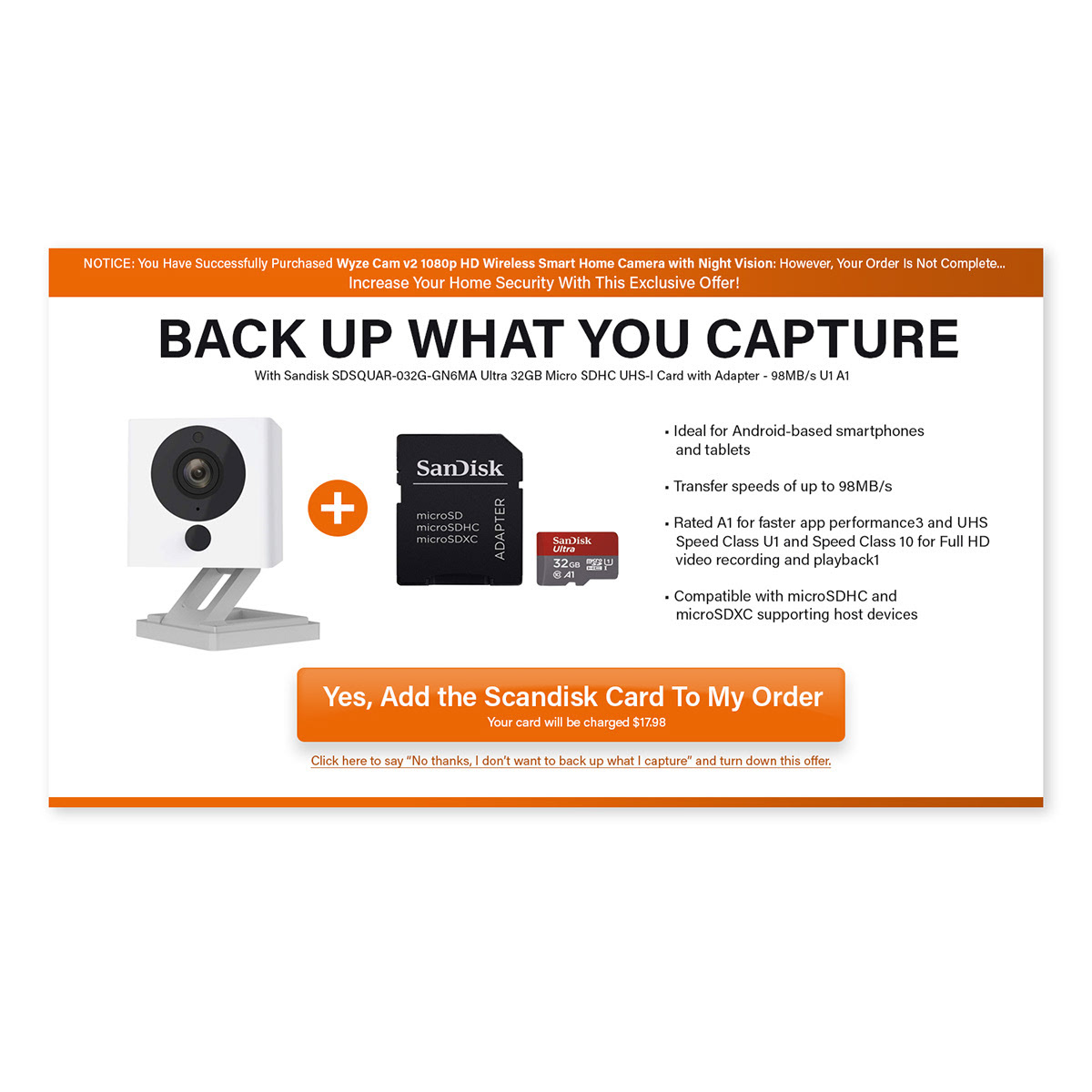
I developed a streamlined pop-up paired with a specialized landing page designed to maximize revenue, meticulously monitoring key metrics such as open rates, click-through rates, and conversion rates to continuously refine performance. The landing page focused on a flagship product, strategically presenting upsell opportunities enriched with actionable insights, benefit-driven copy, and persuasive visuals that guided users toward purchase with clarity and urgency.
By integrating dynamic content elements, powerful calls-to-action, and distinctively captivating graphics, both the pop-up and exit-intent landing page functioned as compelling, high-conversion touchpoints. The pop-up captured attention at optimal moments, while the landing page delivered a focused, frictionless experience that boosted engagement, nurtured leads, and significantly increased sales.
This dual-asset strategy balanced aesthetic appeal with data-driven optimization, ensuring a seamless, user-friendly journey that enhanced overall campaign success and reinforced the brand’s commitment to delivering value.
This project demonstrates expertise in landing page design, pop-up & exit-intent optimization, revenue-focused UX/UI, conversion rate enhancement, dynamic content & CTA strategy, A/B testing & metrics tracking, upsell integration, and strategic visual design for e-commerce, DTC, wellness, and high-conversion brands.
BRANDING DESIGN
Logo & Business Card Design
Handcrafted Knitted Socks Brand Identity
Logo & Business Card Design
Handcrafted Knitted Socks Brand Identity
Collaborating closely with a talented small business owner specializing in handcrafted knitted socks, I curated a distinctive brand identity perfectly tailored for her Etsy store and broader online presence. After presenting a curated range of logo options, we selected the winning design and established comprehensive brand guidelines that encapsulated the brand’s warm, artisanal essence, ensuring a consistent, recognizable visual language across every platform and touchpoint.
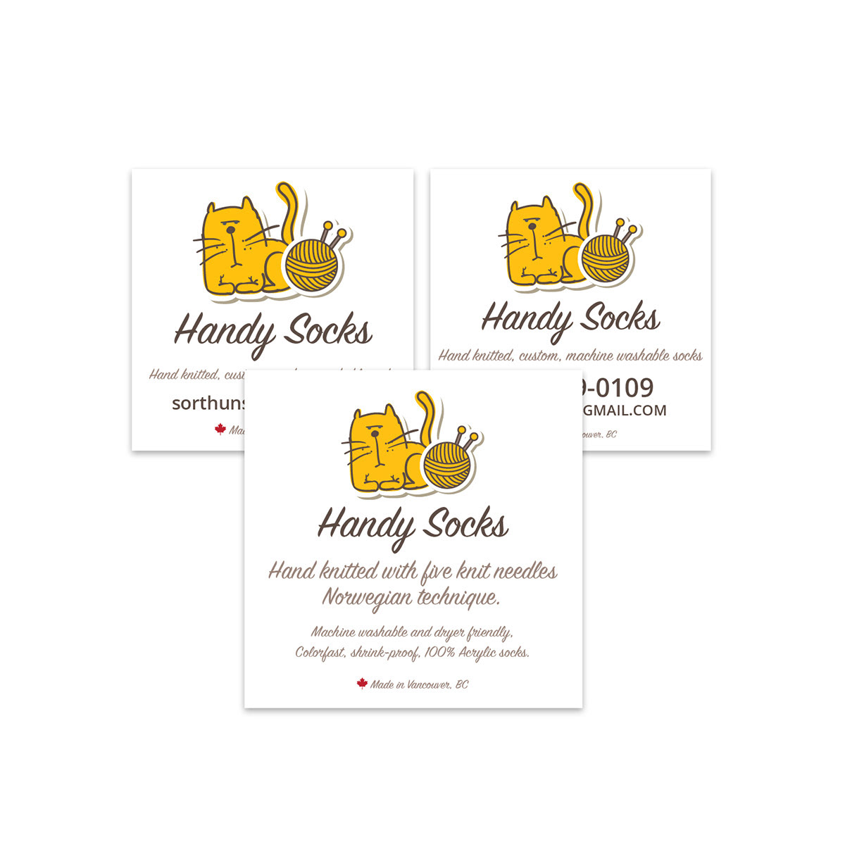
I orchestrated the complete marketing ecosystem, setting up her Etsy store, WordPress website, and various social media channels with cohesive branding. I meticulously crafted premium business cards, stickers, handbills, hang-tags, and digital banners that translated her unique craftsmanship into a compelling, market-ready presence, driving customer trust, engagement, and sales in the competitive handmade goods space.
This holistic approach created a seamless, unified brand landscape that not only looked beautiful but also performed strategically, turning casual browsers into loyal buyers and positioning the brand for long-term success in the artisan retail market.
This project demonstrates expertise in handmade brand identity design, Etsy & WordPress branding, logo variation & guideline creation, business card & packaging collateral, multi-channel marketing ecosystem, artisanal visual storytelling, small business branding, and strategic graphic design for artisan, lifestyle, and e-commerce brands.
UX/UI DESIGN
Logo, Email Campaign & Landing Page
Anti-Aging Serum Branding, Email Campaign & Landing Page
Logo, Email Campaign & Landing Page
Anti-Aging Serum Branding, Email Campaign & Landing Page
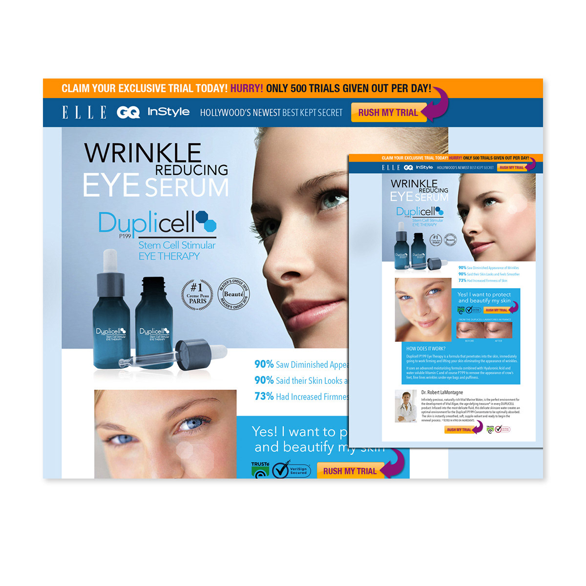
I developed the complete branding strategy and launch assets for an innovative anti-aging serum infused with cutting-edge stem-cell technology, promising visible skin rejuvenation and advanced cellular renewal. To position the product as a premium, science-backed solution in the competitive beauty market, I selected a sophisticated pharmaceutical-inspired blue palette that conveyed trust, purity, and clinical efficacy while differentiating the brand from traditional cosmetics.
I curated and presented a series of captivating logo designs that seamlessly integrated scientific motifs with elegant, modern typography—creating a distinctive, memorable identity that resonated strongly with stakeholders and set the foundation for a credible, high-end brand presence. Building on this foundation, I orchestrated a targeted email campaign and a dedicated landing page, meticulously tracking key metrics including open rates, click-through rates, and conversions to ensure data-driven optimization and maximum performance.
The landing page prioritized actionable content, robust calls-to-action, dynamic visuals, and seamless user flow to convert visitors into buyers, while the email series delivered personalized, high-engagement messaging that nurtured leads and reinforced the product’s transformative benefits. By weaving together dynamic content, compelling storytelling, and consistent branding across both channels, I created a cohesive, immersive experience that elevated the serum’s market positioning and drove measurable sales growth.
This project demonstrates expertise in anti-aging skincare branding, stem-cell technology product launch, logo design & visual identity, pharmaceutical-inspired blue palette, targeted email campaign design, conversion-optimized landing pages, data-driven metrics tracking, multi-channel marketing assets, and strategic graphic design for beauty, wellness, and science-backed consumer brands.
PRINT DESIGN
Print Posters
Cost-Effective Signage for Apartment Complex COVID-19 Safety Messaging
Print Posters
Cost-Effective Signage for Apartment Complex COVID-19 Safety Messaging
Collaborating closely with the client, I designed a series of impactful print posters for an apartment complex in Vancouver, B.C., using Adobe Illustrator to deliver clean, professional visuals that captured immediate attention and promoted specific resident behaviours. By opting for a sophisticated grayscale palette, I minimized printing expenses while maintaining striking contrast, sharp typography, and clear messaging—ensuring the posters were both budget-friendly and highly effective in high-traffic common areas.
During the COVID-19 pandemic, these posters played a crucial role in conveying vital safety information—such as mask-wearing, physical distancing, hand hygiene, and capacity limits—tailored specifically to the focused audience of residents and visitors. The designs prioritized readability from a distance, simple yet authoritative icons, and reassuring yet urgent tone, helping maintain compliance, protect community health, and reinforce the property management’s commitment to resident well-being.
This project demonstrated my ability to blend creativity with practicality, producing exceptional signage that achieved strong visual impact, supported public health initiatives, and elevated the overall resident experience—all while adhering to cost constraints and tight timelines.
This work showcases expertise in signage & poster design, grayscale print production, apartment complex marketing, COVID-19 safety communication, high-visibility common-area graphics, cost-effective large-format printing, behavioural & informational signage, and strategic graphic design for property management, residential, and public health sectors.