Flair Airlines
Freelance Senior Graphic Designer // 2024
Freelance Senior Graphic Designer // 2024
CAMPAIGN DESIGN
"Flair Savings Counter" Campaign
Omni-Channel Branding & Marketing Assets
"Flair Savings Counter" Campaign
Omni-Channel Branding & Marketing Assets
Situation
Flair Airlines needed a cohesive, high-impact campaign to drive awareness and conversions for its low-cost offerings. The campaign needed a memorable visual identity and assets that clearly communicated value and savings, while staying consistent across digital and physical touchpoints. That meant on-site and in-inbox banners that would hold up across recurring promotions without causing campaign fatigue, platform-specific social ads built for different formats, and an outdoor billboard that could be read at highway speed.
Flair Airlines needed a cohesive, high-impact campaign to drive awareness and conversions for its low-cost offerings. The campaign needed a memorable visual identity and assets that clearly communicated value and savings, while staying consistent across digital and physical touchpoints. That meant on-site and in-inbox banners that would hold up across recurring promotions without causing campaign fatigue, platform-specific social ads built for different formats, and an outdoor billboard that could be read at highway speed.
Solution
As Freelance Senior Graphic Designer, I developed the “Flair Savings Counter” campaign concept and delivered a full suite of omni-channel assets around one distinctive, energetic visual identity. The identity centred on a custom campaign logo and the airline’s circular logo motif, which I adapted for each channel, from animation on the website to a watermark in email and social to a bold statement on the billboard. I worked closely with project managers and the Art Director to keep the work aligned and high quality.
As Freelance Senior Graphic Designer, I developed the “Flair Savings Counter” campaign concept and delivered a full suite of omni-channel assets around one distinctive, energetic visual identity. The identity centred on a custom campaign logo and the airline’s circular logo motif, which I adapted for each channel, from animation on the website to a watermark in email and social to a bold statement on the billboard. I worked closely with project managers and the Art Director to keep the work aligned and high quality.
Execution
Designed a custom campaign logo that replaced the letter “s” with dollar signs, conveying savings and brand energy at a glance. I ran market research to define buyer personas and inform design decisions, then assembled a PowerPoint presentation showing the campaign vision, creative rationale, and data-driven approach, along with a proposal covering the strategic rationale, engagement potential, and fit with business goals.
Designed a custom campaign logo that replaced the letter “s” with dollar signs, conveying savings and brand energy at a glance. I ran market research to define buyer personas and inform design decisions, then assembled a PowerPoint presentation showing the campaign vision, creative rationale, and data-driven approach, along with a proposal covering the strategic rationale, engagement potential, and fit with business goals.
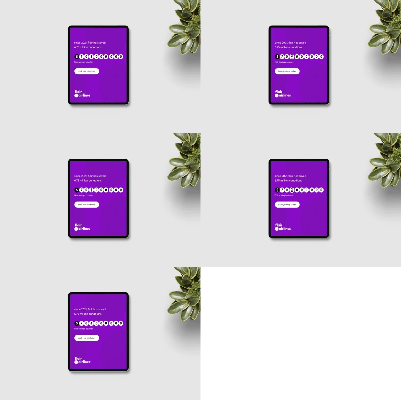
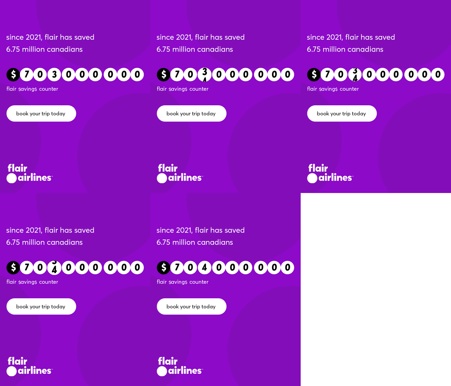
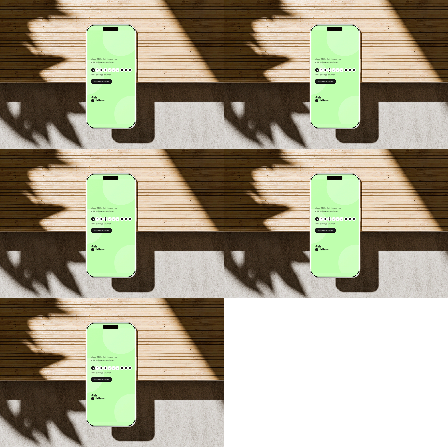
For the website, I designed B2C visuals and animated banners built around the circular logo motif, with smooth transitions and purposeful motion that conveyed energy and savings, optimized for desktop and mobile. For email, I repurposed the same motif as a subtle background watermark that added visual interest without overwhelming the promotional message. I adapted the “Flair Savings Counter” branding with a colour scheme that harmonized with Flair’s signature purple, and designed the full banner series to vary across campaign waves, preventing visual fatigue while holding to the brand guidelines for colour, typography, and aesthetic.
For social, I created platform-optimized animated banner ads for Instagram, Facebook, TikTok, LinkedIn, and Twitter/X, respecting each platform’s size, aspect ratio, format, and performance requirements. Each used smooth transitions, clear calls-to-action, and subtle logo watermarks with consistent typography and colour, and loaded quickly with premium quality on mobile.
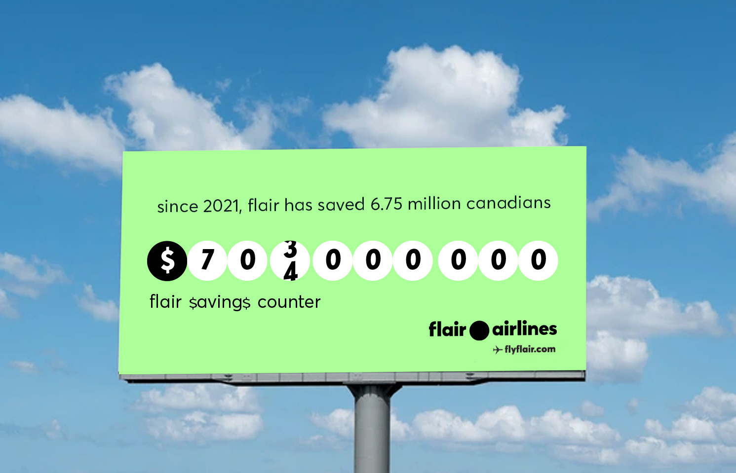
For outdoor, I adapted the logo for a 14' x 48' static billboard in Flair’s signature corporate lime green, using bold typography, precise spacing, high-contrast composition, and strategic negative space so it stayed legible at highway speeds while matching the digital and social campaign.
Result
The campaign gave Flair a distinctive, unified identity that carried from billboards to inboxes to social feeds, reinforcing the savings message and positioning the airline as smart and value-driven. The logo motif and adaptive branding kept the work recognizable across campaign waves, and the consistent, platform-specific approach supported brand recall, online interaction, and conversions across digital and physical channels.
The campaign gave Flair a distinctive, unified identity that carried from billboards to inboxes to social feeds, reinforcing the savings message and positioning the airline as smart and value-driven. The logo motif and adaptive branding kept the work recognizable across campaign waves, and the consistent, platform-specific approach supported brand recall, online interaction, and conversions across digital and physical channels.