Colour Energy stands as the destination for colour and aura products, services, education, as well as wellness & energy-enhancing colour therapy solutions.
Context
Work on behalf of Colour Energy as Senior Graphic Designer, 2016-2018
Work on behalf of Colour Energy as Senior Graphic Designer, 2016-2018
Contributions
Shopify & Wordpress Websites
Managed & Created Assets for Social Media Channels
White Labelling Materials
Yearly 100+ Page Catalog
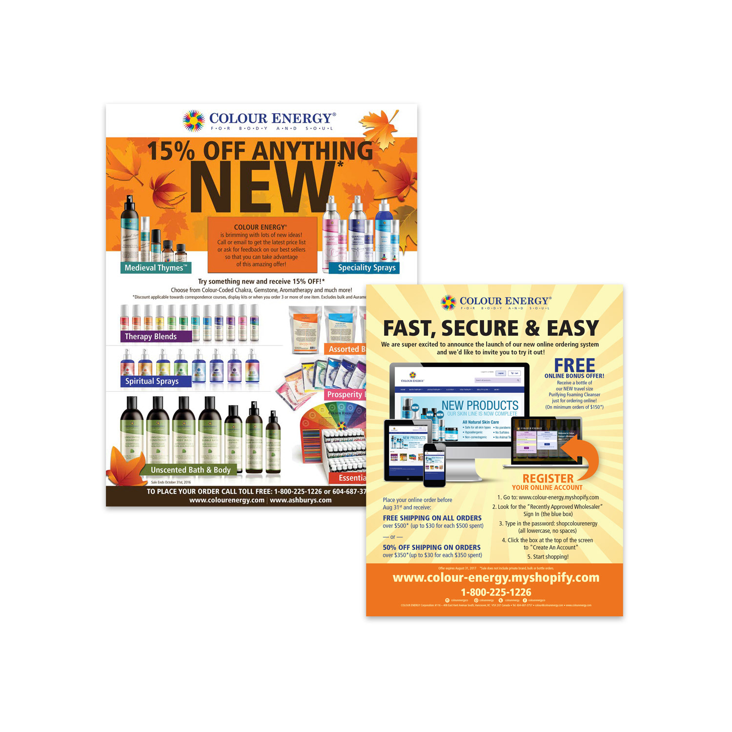
Monthly Omni-channel Campaigns
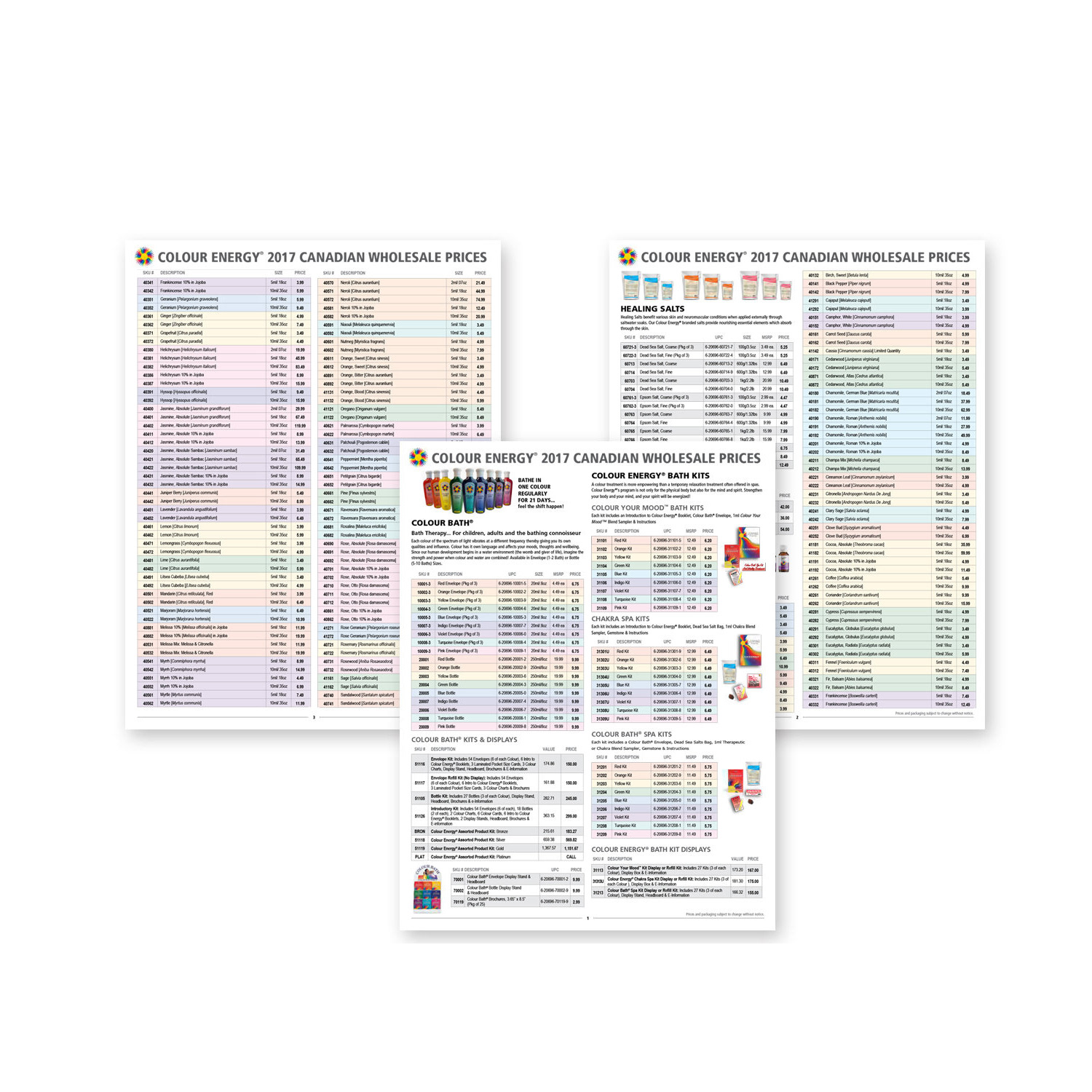
Maintained Price-lists for Canadian & US Markets
Packaging & Logos
Shopify & Wordpress Websites
Managed & Created Assets for Social Media Channels
White Labelling Materials
Yearly 100+ Page Catalog
Monthly Omni-channel Campaigns
Maintained Price-lists for Canadian & US Markets
Packaging & Logos
Collaborators
Owner & Sales Manager
Owner & Sales Manager
THE PROJECT
Colour Energy Omni-Channel Marketing
Comprehensive B2B & B2C Creative
Colour Energy Omni-Channel Marketing
Comprehensive B2B & B2C Creative
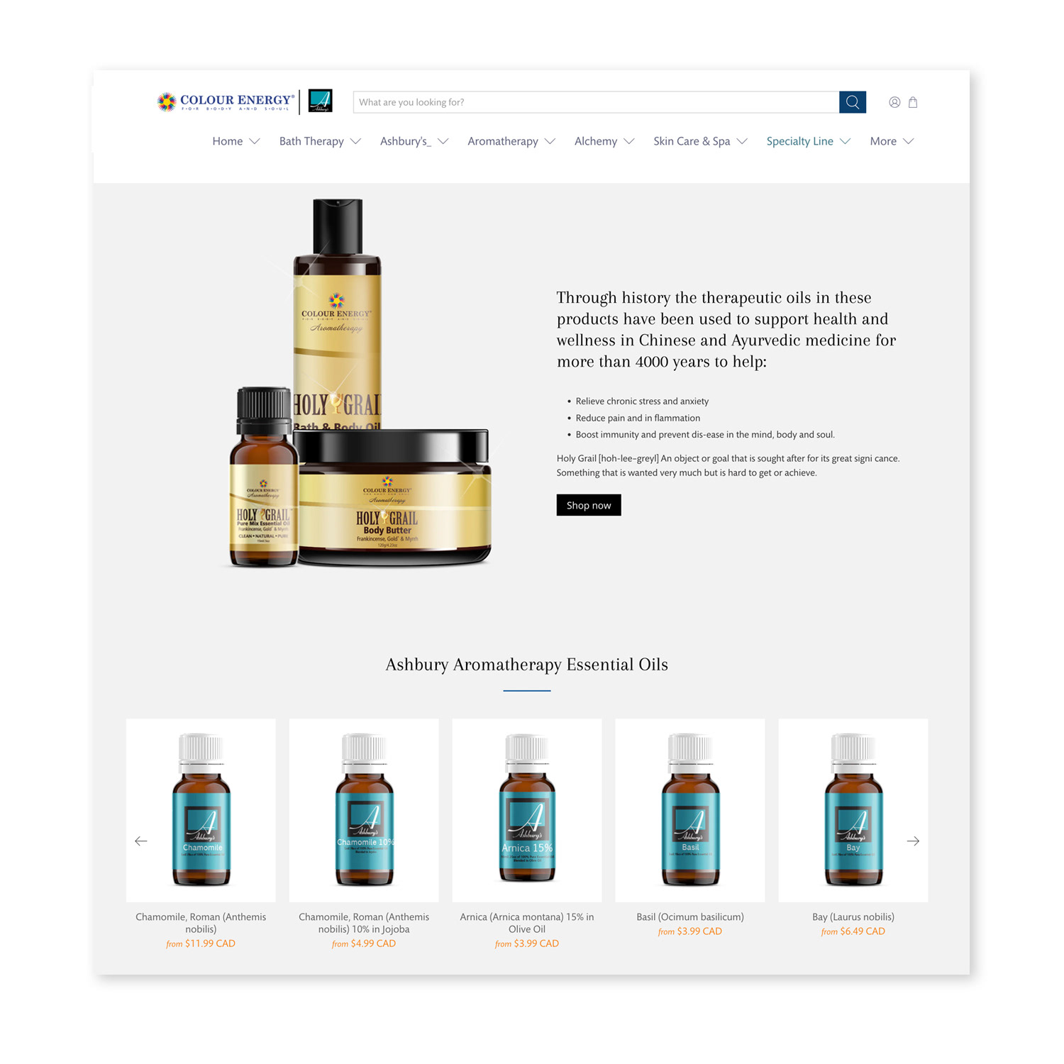
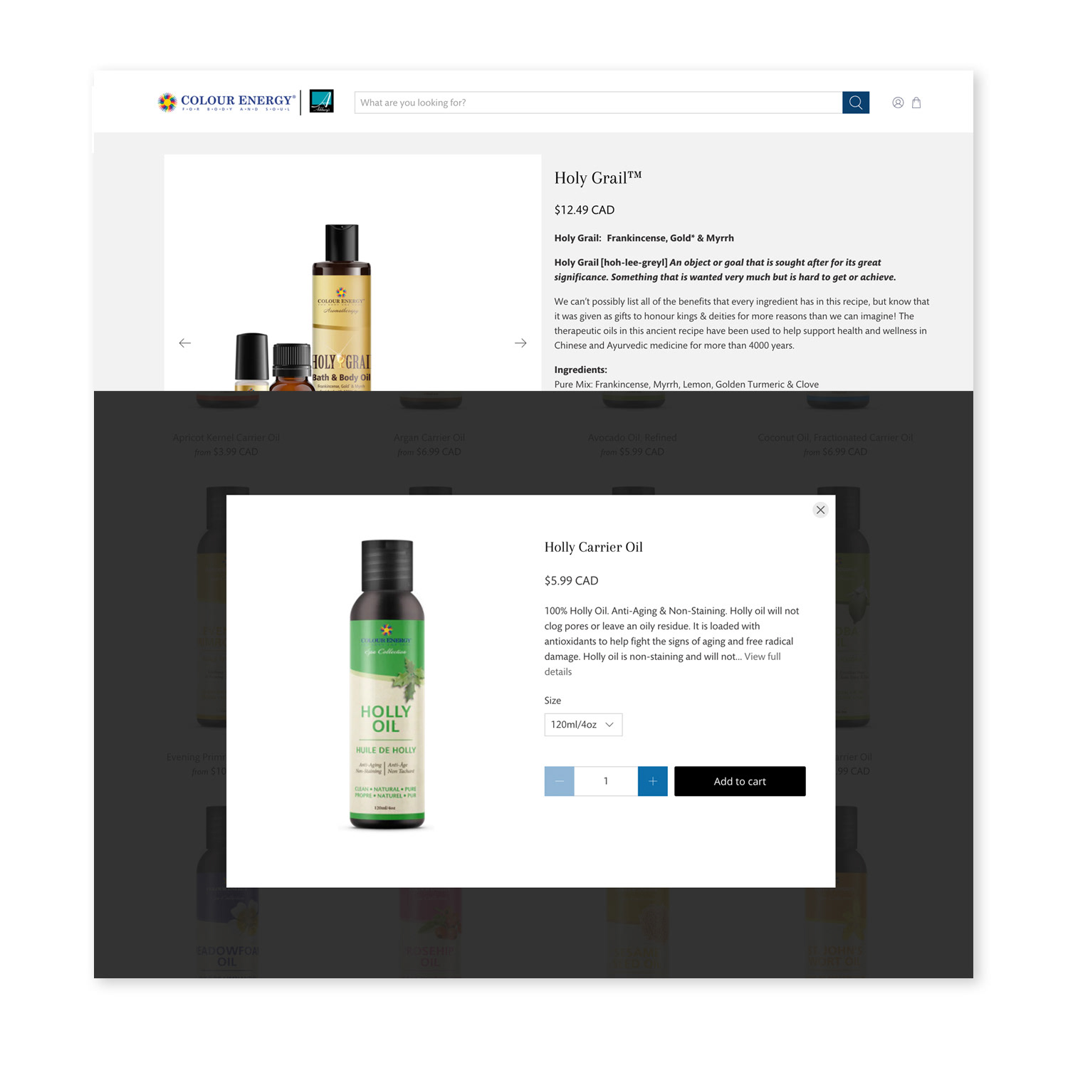
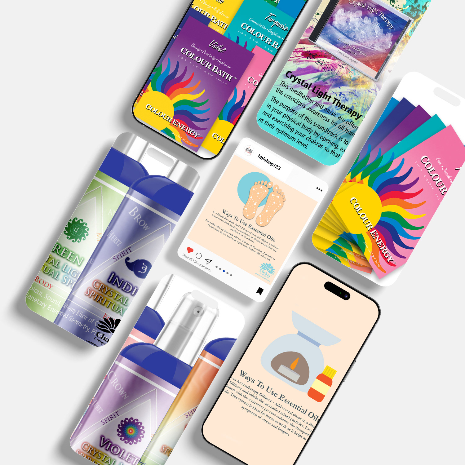
Based on-site in Vancouver, I partnered closely with Colour Energy to elevate six wellness brands—including Gaia Garden, Ashbury’s Aromatherapy, and The Chakra Company—through a full-spectrum omni-channel marketing overhaul. Using Shopify and WordPress, I built and managed four high-performing, user-friendly websites featuring clean layouts, seamless navigation, bold calls-to-action, and intuitive product experiences that consistently turned browsers into buyers.
Beyond digital, I led the creation of cohesive B2B and B2C marketing assets: eye-catching email campaigns, seasonal catalogs, price lists, premium product packaging, labels, handbills, drop-box displays, and targeted social media content. I also fuelled five brands with scroll-stopping posts and ads, resulting in a 250% surge in Facebook engagement, 105% higher post reach, 150% more page likes, and a 400% increase in video views. From pixels to print, every asset reinforced brand consistency, strengthened emotional connection, and delivered measurable growth across channels.
This integrated approach showcased my ability to blend strategic vision, creative execution, and data-driven refinement to drive brand love, customer loyalty, and significant revenue uplift in the competitive wellness and natural health market.
This project highlights expertise in omni-channel wellness marketing, Shopify & WordPress website design, B2B/B2C packaging & print collateral, email campaign production, social media content & ads, multi-brand creative management, high-engagement visual storytelling, and results-oriented graphic design for health, beauty, aromatherapy, and natural products brands.
UX/UI DESIGN
Website Design & E-Commerce Development
Revenue-Generating Shops
Website Design & E-Commerce Development
Revenue-Generating Shops
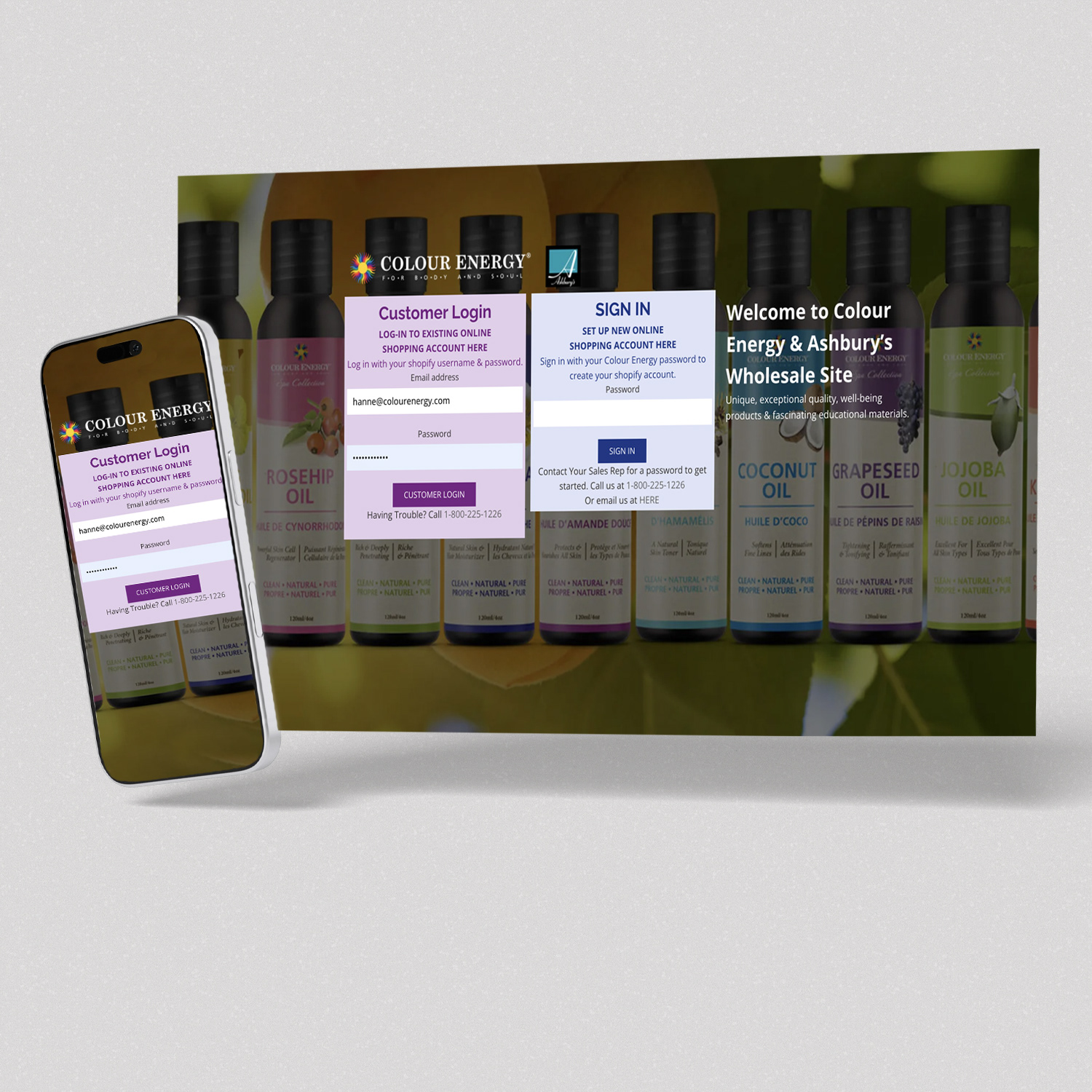
Situation
Colour Energy needed a cohesive family of modern, high-performing e-commerce websites to support both wholesale and direct-to-consumer sales. The existing sites lacked strong user experience, consistent branding, and conversion optimization, resulting in missed revenue opportunities in the competitive wellness and energy healing market.
Colour Energy needed a cohesive family of modern, high-performing e-commerce websites to support both wholesale and direct-to-consumer sales. The existing sites lacked strong user experience, consistent branding, and conversion optimization, resulting in missed revenue opportunities in the competitive wellness and energy healing market.
Execution
As Lead UX/UI Designer and Developer, I designed, built, and managed four e-commerce websites (including colourenergyshop.com) on Shopify and WordPress. Starting with user-focused wireframes, I created fully responsive, conversion-driven designs featuring:
As Lead UX/UI Designer and Developer, I designed, built, and managed four e-commerce websites (including colourenergyshop.com) on Shopify and WordPress. Starting with user-focused wireframes, I created fully responsive, conversion-driven designs featuring:
• Intuitive navigation and smart content hierarchy
• Robust search functionality and streamlined checkout flows
• Strategic product promotion zones
• Seamless recurring payment integration (PayPal, credit card, debit) with accounting sync
• Robust search functionality and streamlined checkout flows
• Strategic product promotion zones
• Seamless recurring payment integration (PayPal, credit card, debit) with accounting sync
I also handled full product catalogue setup — loading hundreds of SKUs with custom Photoshop mock-ups, SEO-optimized descriptions, alt tags, and clean file structures.
Result
The new websites deliver fast, luxurious, and highly accessible shopping experiences that turn visitors into confident, repeat buyers. They significantly improved traffic, conversion rates, and customer loyalty while making back-end management simple for the internal team. The redesign successfully elevated the entire Colour Energy brand family and drove measurable revenue growth in the holistic health market.
The new websites deliver fast, luxurious, and highly accessible shopping experiences that turn visitors into confident, repeat buyers. They significantly improved traffic, conversion rates, and customer loyalty while making back-end management simple for the internal team. The redesign successfully elevated the entire Colour Energy brand family and drove measurable revenue growth in the holistic health market.
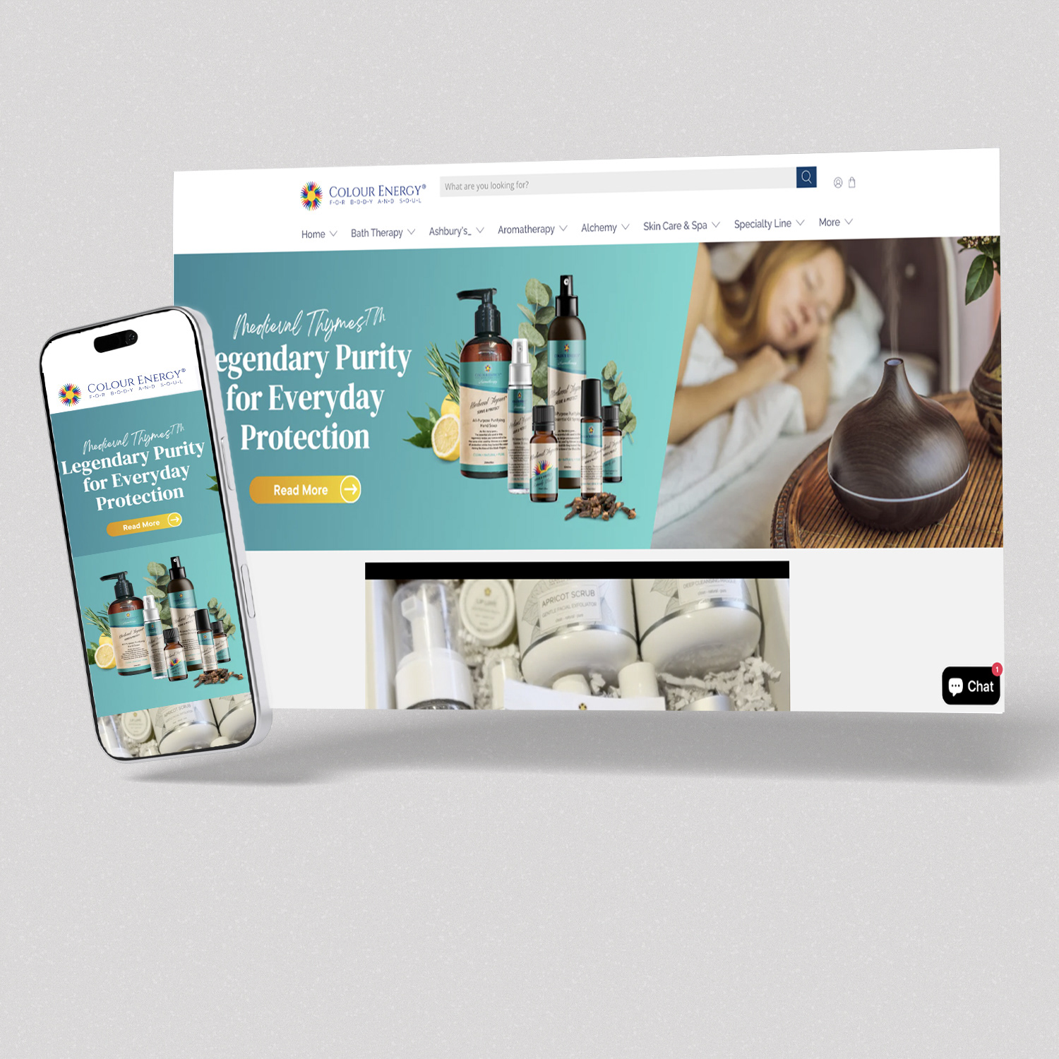
Colour Energy Shopify Site
Colour Energy Shopify Site
Colour Energy Shopify Site
SOCIAL MEDIA DESIGN & GROWTH
Unified Visual Strategy Across Five Platforms
Unified Visual Strategy Across Five Platforms
Situation
The brand needed a cohesive and high-performing social media presence to stand out in the competitive lifestyle and wellness space. With inconsistent visuals and fragmented content across platforms, they were struggling to capture attention, build community, and drive traffic to their online stores.
The brand needed a cohesive and high-performing social media presence to stand out in the competitive lifestyle and wellness space. With inconsistent visuals and fragmented content across platforms, they were struggling to capture attention, build community, and drive traffic to their online stores.
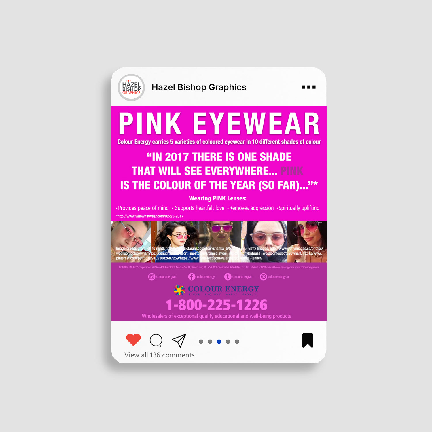
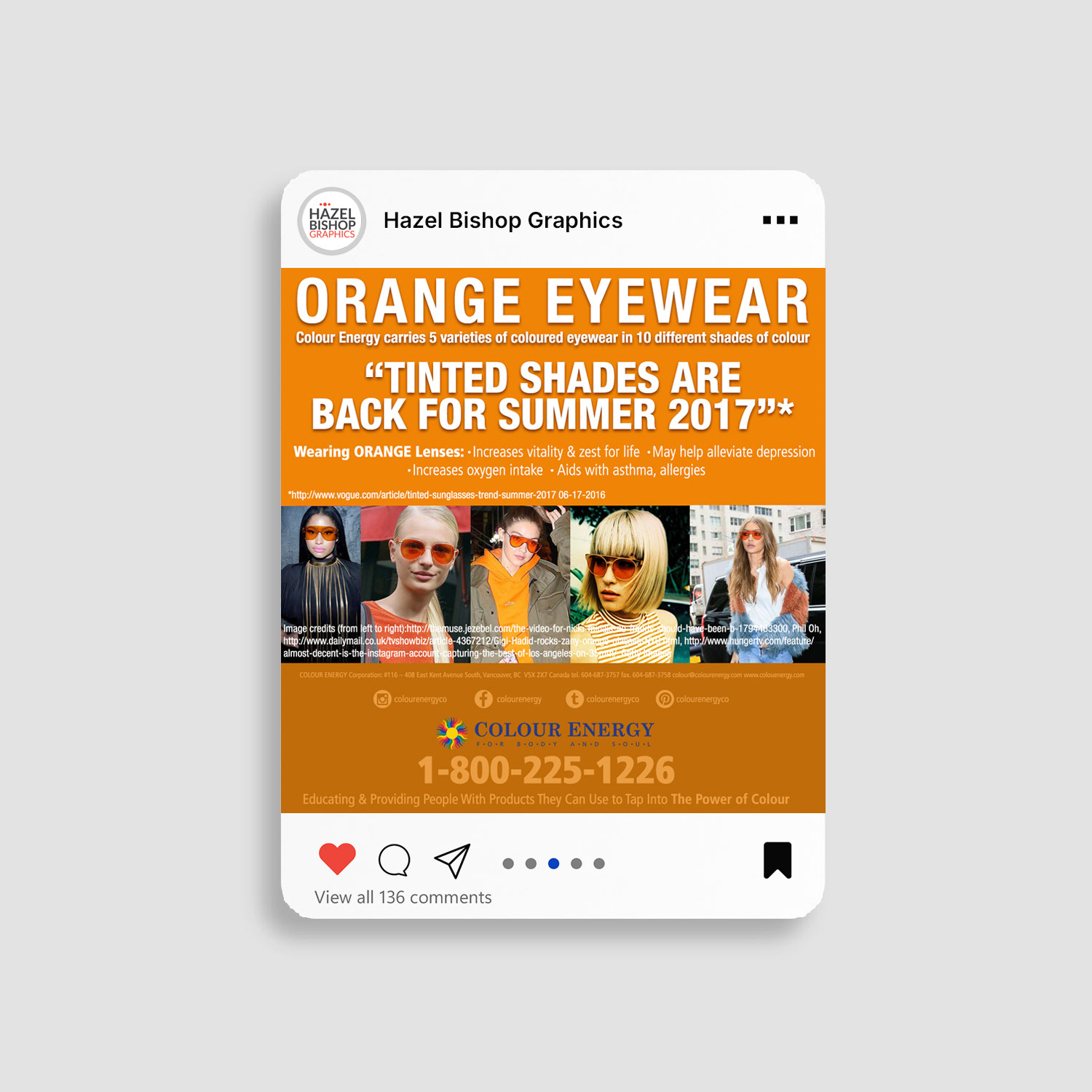
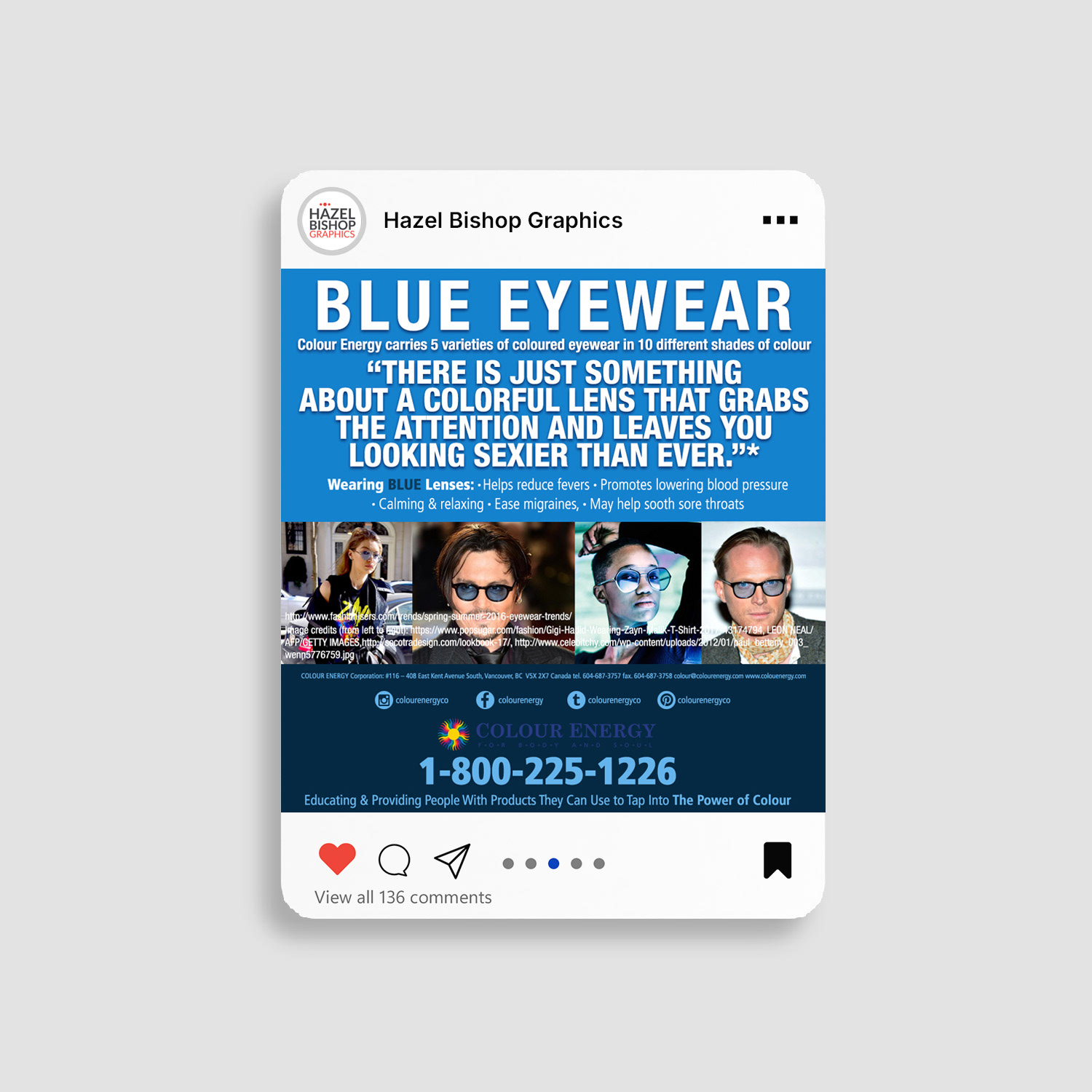
Execution I developed and executed a comprehensive social media playbook across five platforms (Instagram, Facebook, LinkedIn, Pinterest, and TikTok). This included:
• Launching fully optimized profiles and designing on-brand cover banners for every required dimension
• Creating thumb-stopping static posts, fluid animations, carousels, Stories, and Reels
• Maintaining strict brand consistency while delivering bold, strategic creative that told the brand story and showcased products
I combined strategic organic content with targeted paid advertising to maximize reach and engagement. Result The unified visual strategy delivered explosive growth:
• 250% increase in Facebook engagement
• 105% higher post reach
• 150% more page likes
• 400% surge in video views
• 250% increase in Facebook engagement
• 105% higher post reach
• 150% more page likes
• 400% surge in video views
The campaigns significantly strengthened brand presence, drove measurable sales growth, and built long-term customer loyalty through consistent, high-impact storytelling.
This work demonstrates strong expertise in multi-platform social media design, brand-consistent content creation, carousel & Reel production, paid social advertising, and results-driven creative direction for lifestyle, wellness, and e-commerce brands.
PRINT DESIGN
Colour Energy Wholesale Catalogue
Annual 100+ Page Print & Interactive Design
Annual 100+ Page Print & Interactive Design
Situation
Colour Energy needed a powerful, premium sales tool to support their wholesale channel across North America. Their existing catalogue lacked consistency, visual impact, and ease of use, making it difficult for distributors and retailers to browse products effectively and place orders with confidence.
Colour Energy needed a powerful, premium sales tool to support their wholesale channel across North America. Their existing catalogue lacked consistency, visual impact, and ease of use, making it difficult for distributors and retailers to browse products effectively and place orders with confidence.
Execution
I single-handedly led the complete strategy, design, and production of the annual 100+ page wholesale catalogue. This included:
• Establishing strong brand consistency, refined typography, and elegant layout systems
• Curating and designing compelling product presentations with strategic visual hierarchy
• Managing full print production — from printer negotiations and cost optimization to quality control and on-time delivery
• Creating a fully interactive digital version with clickable table of contents, internal hyperlinks, searchable text, and responsive formatting
The catalogue was designed to function as both a tactile, high-end print piece and a practical, user-friendly digital sales tool.
Result
The catalogue became Colour Energy’s most valuable wholesale asset — mailed directly to key buyers and used daily by the sales team. It significantly strengthened distributor relationships, increased wholesale orders, and reinforced the brand’s premium positioning in the natural health and wellness market. The dual-format approach (premium print + interactive PDF) extended reach while maintaining a luxurious brand experience year after year.
The catalogue became Colour Energy’s most valuable wholesale asset — mailed directly to key buyers and used daily by the sales team. It significantly strengthened distributor relationships, increased wholesale orders, and reinforced the brand’s premium positioning in the natural health and wellness market. The dual-format approach (premium print + interactive PDF) extended reach while maintaining a luxurious brand experience year after year.
PRINT DESIGN
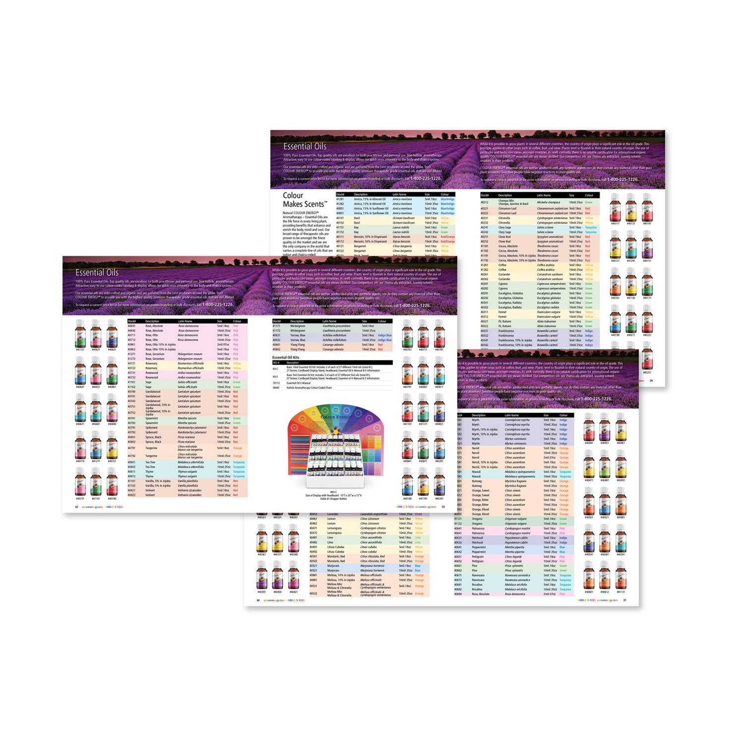
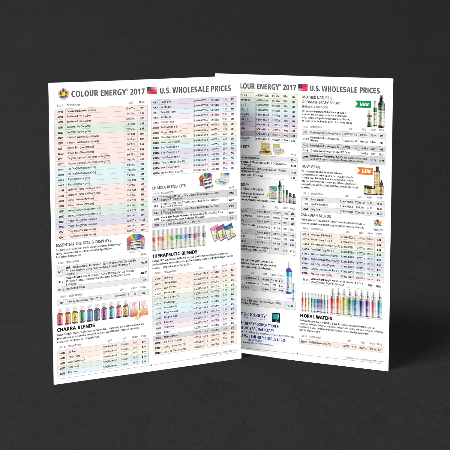
Custom Price Lists for Essential Oils & Aromatherapy
Flexible, Brand-Consistent Pricing Tools
Custom Price Lists for Essential Oils & Aromatherapy
Flexible, Brand-Consistent Pricing Tools
I designed and produced three razor-sharp, standalone price lists (one in Canadian dollars, one in US dollars, and a dedicated edition for Ashbury’s Aromatherapy) deliberately separated from the main catalogue to avoid the volatility of essential oil pricing. This strategic approach gave the sales team instant flexibility: wholesale tiers, retail pricing, and custom rates for key accounts could be updated and reprinted in hours instead of weeks, protecting margins and enabling fast market response without disrupting the core product catalogue.
Printed in-house for maximum speed, control, and cost efficiency, the lists featured clean typography, clear visual hierarchy, on-brand colour coding, and concise layouts that made pricing effortless to read, simple to email, and impossible to misquote. The result was a powerful set of sales tools that kept orders flowing smoothly, reduced pricing errors, and maintained premium brand presentation even amid fluctuating commodity costs.
This project highlights expertise in custom price list design, bilingual or multi-currency print collateral, essential oil & aromatherapy marketing, rapid-response pricing tools, in-house print production, brand-consistent pricing materials, sales enablement graphics, and strategic print design for wholesale, retail, and natural health brands.
PRINT DESIGN
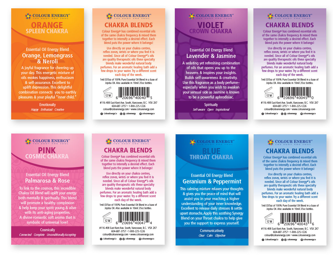
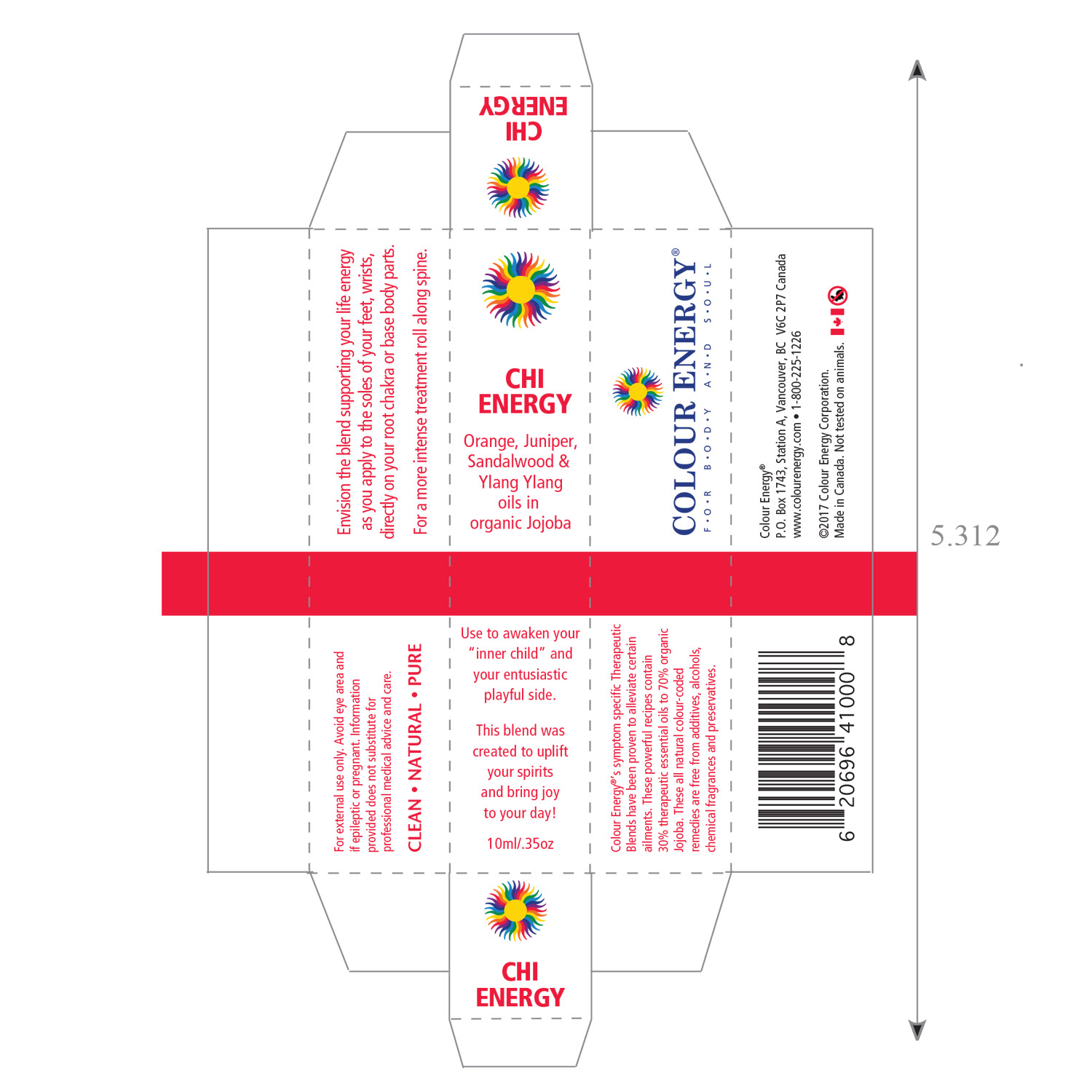
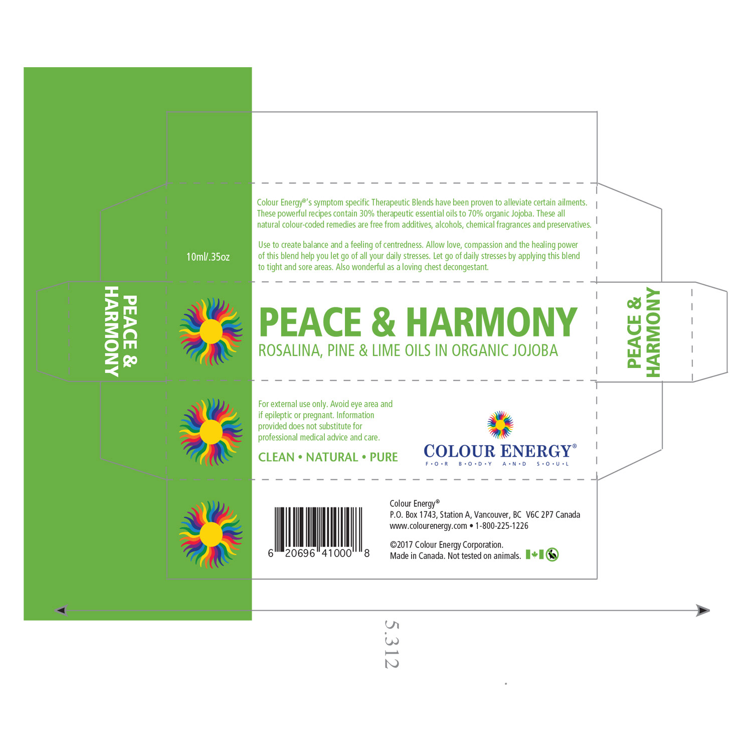
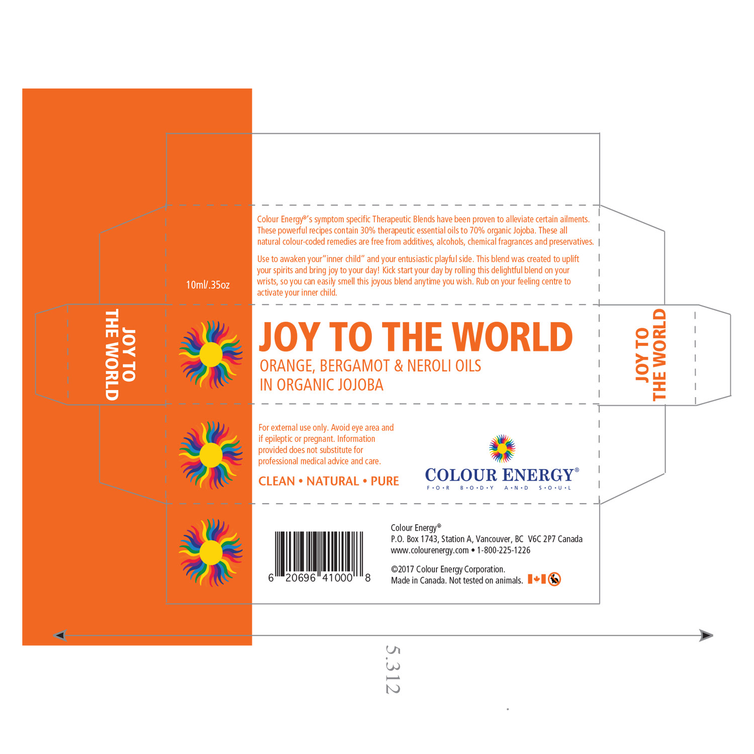
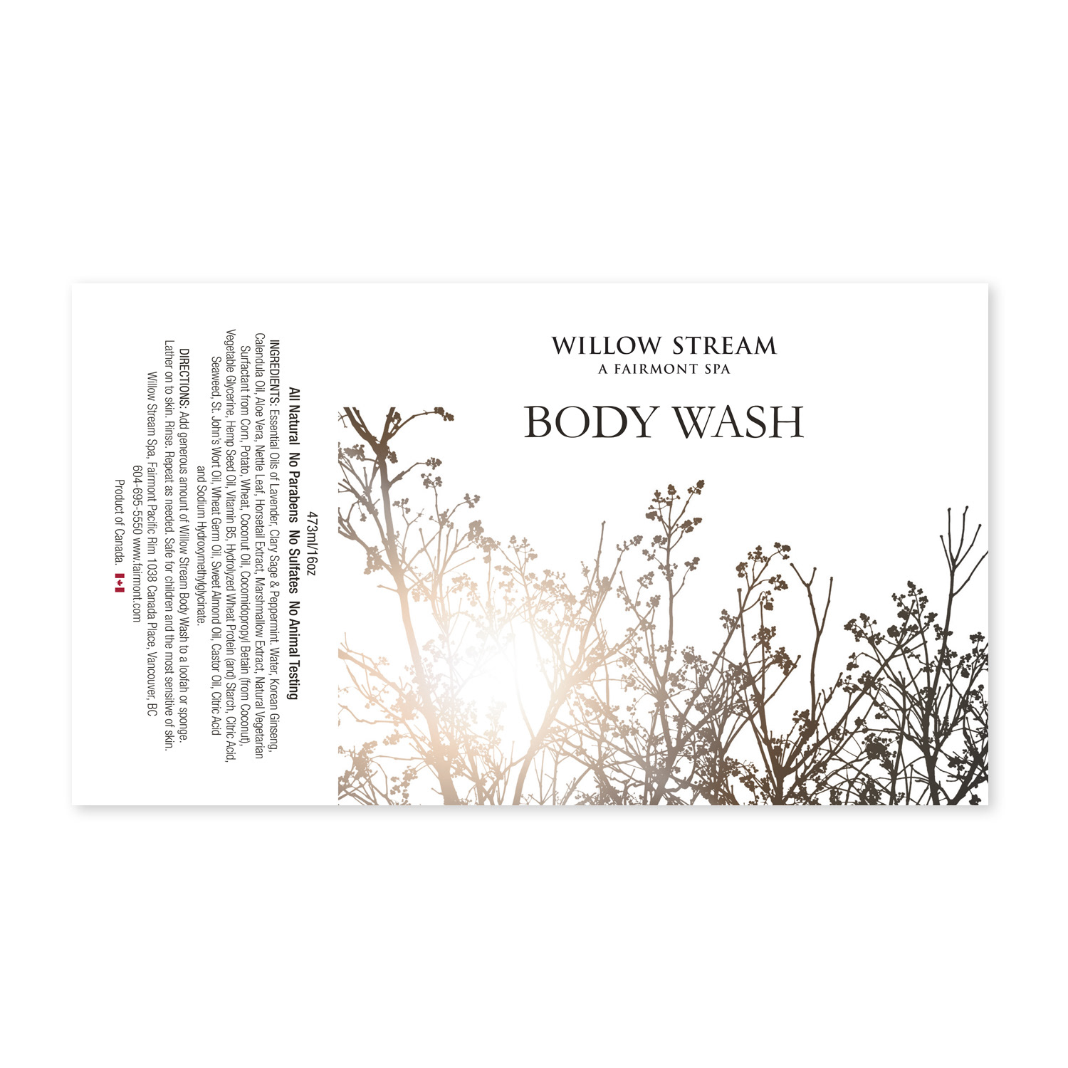
Labeling Excellence for Holistic & All-Natural Products
Distinctive Visual Identities for Colour Energy’s Diverse Wellness Lineup
Labeling Excellence for Holistic & All-Natural Products
Distinctive Visual Identities for Colour Energy’s Diverse Wellness Lineup
I designed an extensive range of corporate product labels and inserts for the Colour Energy brand, encompassing a diverse lineup of holistic, all-natural wellness products. Each label was meticulously crafted to deliver a unique, compelling visual identity that resonated deeply with customers while maintaining strict brand consistency across the entire portfolio.
Working within established guidelines, I balanced essential regulatory information, ingredient transparency, usage instructions, and key benefits with elegant typography, harmonious colour palettes, high-quality imagery, and strategic layout choices that elevated perceived value and shelf appeal. The result was a cohesive yet individualized labeling system that not only met compliance standards but also reinforced Colour Energy’s position as a trusted leader in natural health and energy healing products.
This project demonstrates expertise in corporate product label design, holistic wellness labeling, all-natural product packaging, brand-consistent label systems, regulatory-compliant graphics, visual identity differentiation, print production for retail labels, and strategic graphic design for health, wellness, and natural consumer goods brands.
Colour Energy Packaging
Colour Energy Packaging
PRINT DESIGN
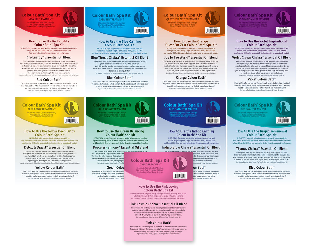
Tailored Packaging Solutions
Captivating Design for Essential Oils & Premium Products
Tailored Packaging Solutions
Captivating Design for Essential Oils & Premium Products
In my role as lead packaging designer, I spearheaded the creation of tailored packaging solutions for new product introductions, with a primary focus on delivering captivating initial impact and heightened customer interaction. I invested meticulous attention in designing box art, labels, and structural elements that balanced stunning visual allure with essential protective attributes (particularly addressing the vulnerability of essential oils to light, temperature fluctuations, and environmental factors) ensuring product integrity from production to consumer hands.
Working in close partnership with printers and distributors, I crafted packaging that seamlessly safeguarded contents while eloquently conveying the product's intrinsic value through premium finishes, strategic colour palettes, elegant typography, and clear hierarchy of information. This harmonious integration of consumer-focused aesthetics, operational efficiency, and functional design consistently produced packaging that aligned with brand aspirations, exceeded consumer expectations, and strengthened market positioning in the competitive wellness and natural products space.
The result was packaging that not only protected but also persuaded—turning first glances into lasting impressions, driving shelf appeal, and contributing to increased sales and brand loyalty through thoughtful, high-performance design.
This project demonstrates expertise in packaging design for essential oils, premium product packaging, protective packaging solutions, visual & functional balance, print production collaboration, brand-aligned packaging artwork, new product launch collateral, and strategic graphic design for wellness, health, and consumer goods brands.


PRINT DESIGN
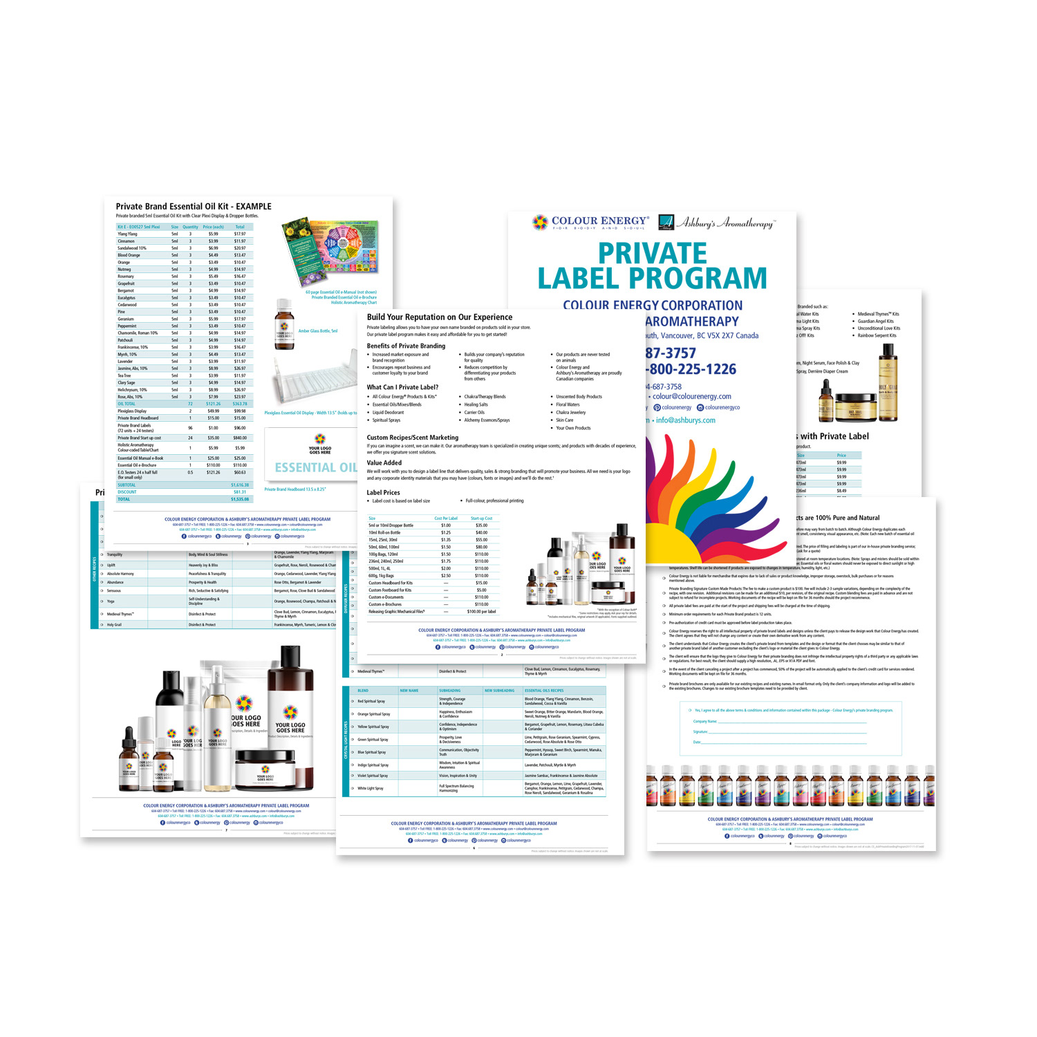
White-Labelling Mastery
Comprehensive Branding & Marketing for Esoteric Wellness Clients
White-Labelling Mastery
Comprehensive Branding & Marketing for Esoteric Wellness Clients
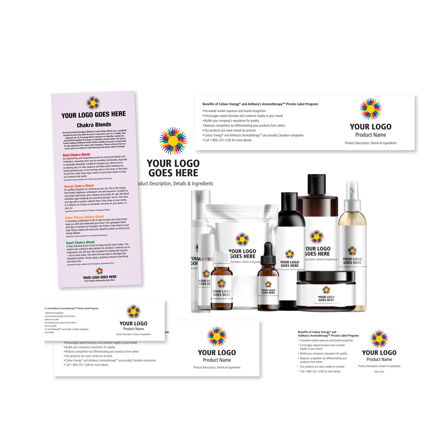
At Colour Energy, we lead the esoteric wellness sector in white-labelling excellence, delivering seamless, high-quality solutions that empower clients with diverse needs and preferences. Our commitment to innovation and precision shines through in the coordination of extensive marketing campaigns and meticulous oversight of product production, ensuring every white-labelled offering reflects uncompromising standards while aligning perfectly with each client’s brand vision.
Beyond product creation, we equip sales teams with powerful tools to communicate value effectively. This includes crafting detailed, comprehensive reports that highlight benefits, advantages, and ROI potential, alongside captivating product mock-ups that allow clients to visualize the transformative impact of the offerings in their own markets. These assets are designed with strategic clarity to inspire confidence, facilitate decision-making, and accelerate partnerships.
We go further by developing a complete arsenal of sales support materials (custom brochures, presentations, digital collateral, and promotional resources) that serve as invaluable aids for client engagement, education, and conversion. This holistic approach ensures our white-labelling partners receive not only exceptional products but also the strategic marketing backbone needed to thrive, reinforcing Colour Energy’s position as the trusted leader in premium, turnkey wellness solutions.
This work demonstrates expertise in white-labelling packaging design, esoteric wellness branding, custom sales asset creation, product mock-up development, B2B marketing collateral, comprehensive client reports, multi-channel brand consistency, and strategic graphic design for private label, natural health, and wellness brands.
Colour Energy White Label Program
Colour Energy White Label Program
PRINT DESIGN
Packaging, Labels & Branding for Esoteric Wellness Clients
Transforming Production & Marketing
Packaging, Labels & Branding for Esoteric Wellness Clients
Transforming Production & Marketing
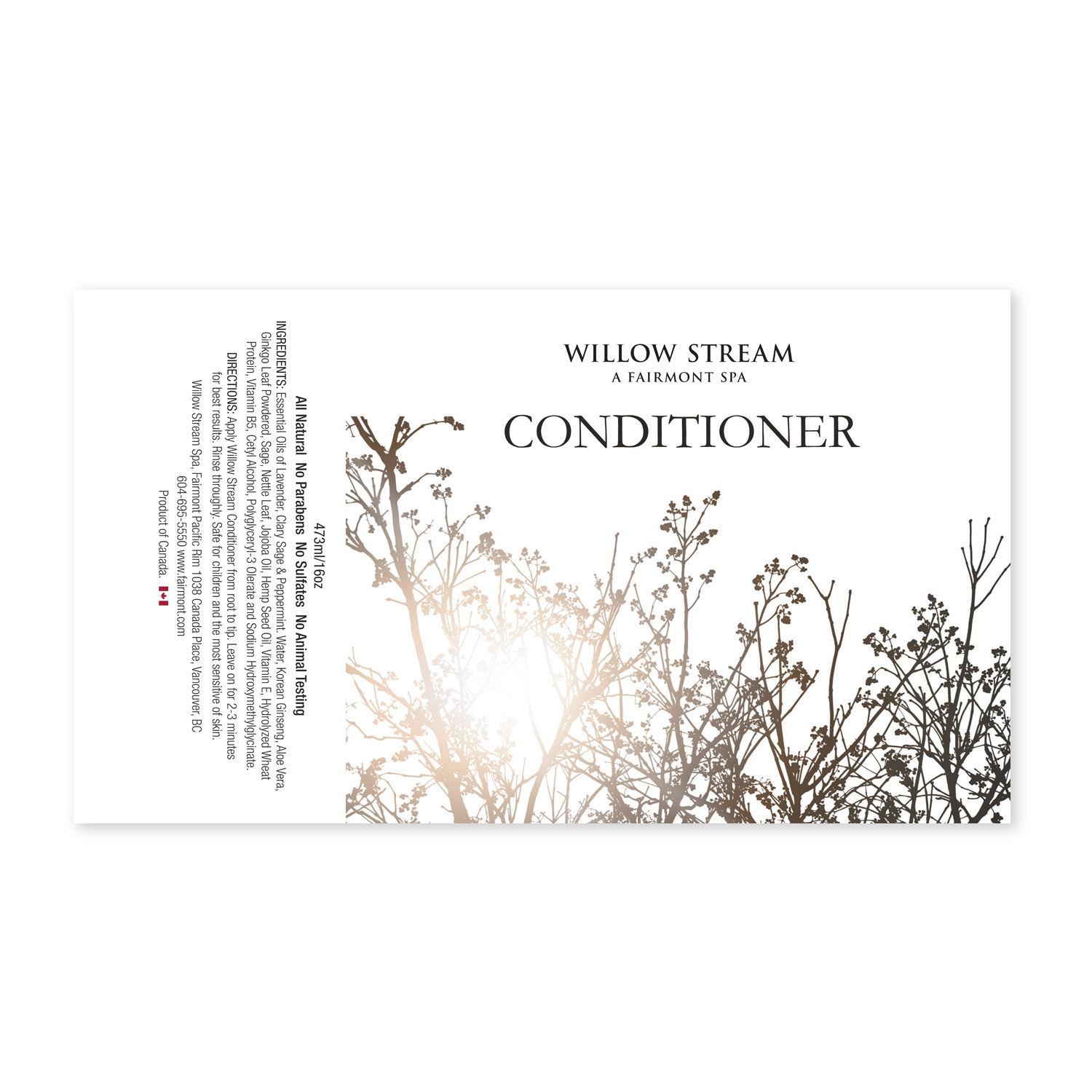
Colour Energy leads the esoteric wellness sector in white-labelling excellence, delivering end-to-end solutions that allow diverse clients (spas, tanning salons, hotels, yoga studios, health stores, and spiritual practitioners) to offer premium products under their own distinct branding. We orchestrate comprehensive marketing campaigns and manage full product production, culminating in finished goods that appear entirely custom-created for the client, complete with their name, logo, and unique identity.
On select projects, I spearheaded the logo and branding design process from concept through stakeholder presentation, then seamlessly integrated approved elements across packaging, labels, and marketing materials. Using Adobe Illustrator, I crafted bespoke product labels and packaging that established strong, professional brand identities while remaining cost-effective and sales-driving. Every design maintained meticulous font coordination, colour accuracy, visual harmony, and regulatory compliance, ensuring flawless execution that reinforced client differentiation and boosted market performance.
This white-labelling approach not only provided clients with high-quality, ready-to-sell products but also delivered a complete illusion of authentic ownership, strengthening their brand presence, customer trust, and revenue potential in the competitive wellness industry.
This body of work demonstrates expertise in white-labelling packaging design, custom branding & logo integration, esoteric wellness product development, bespoke label & packaging production, multi-client brand adaptation, Adobe Illustrator for private label, stakeholder-ready branding concepts, and strategic graphic solutions for spas, salons, hotels, yoga studios, health stores, and spiritual brands.
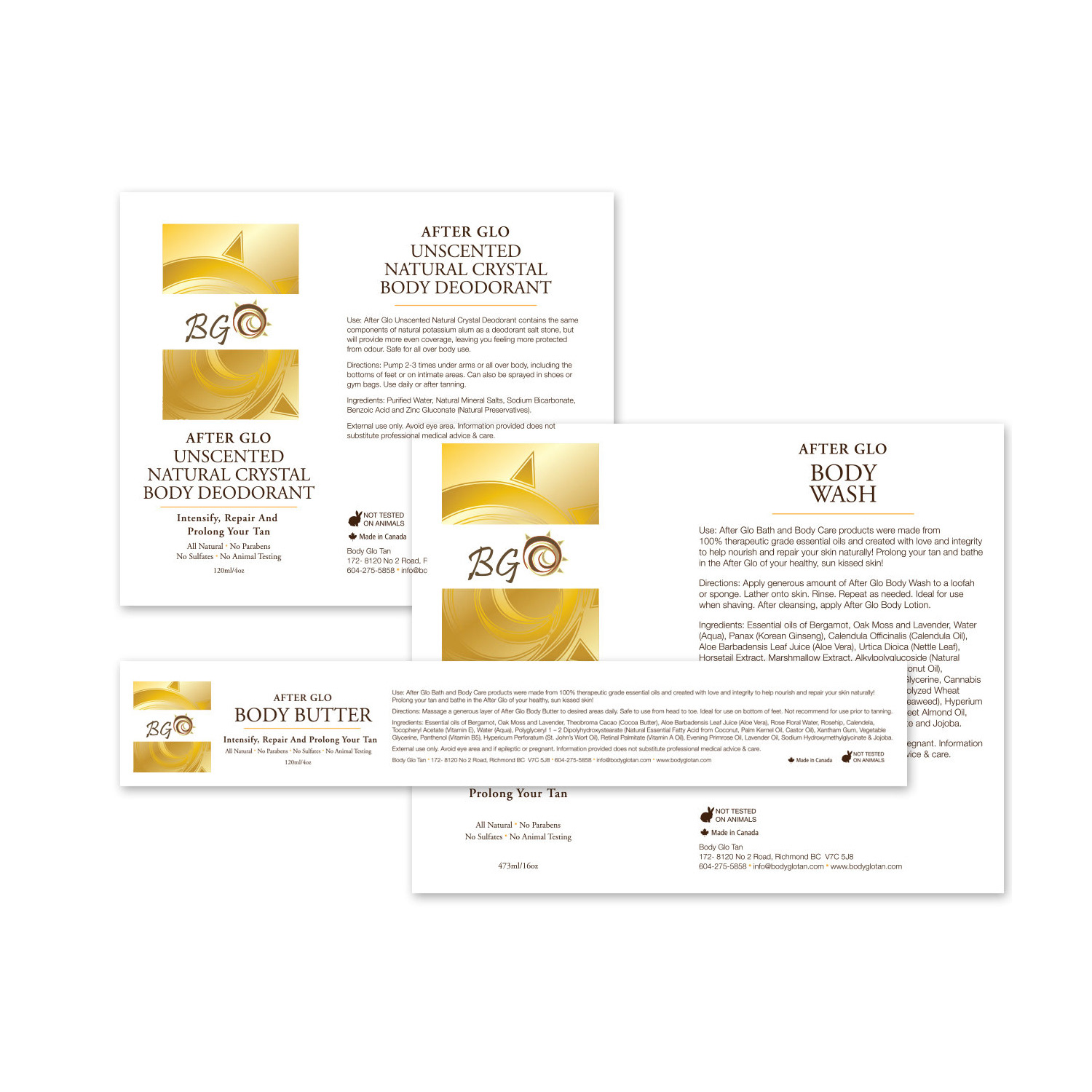
White Label Example
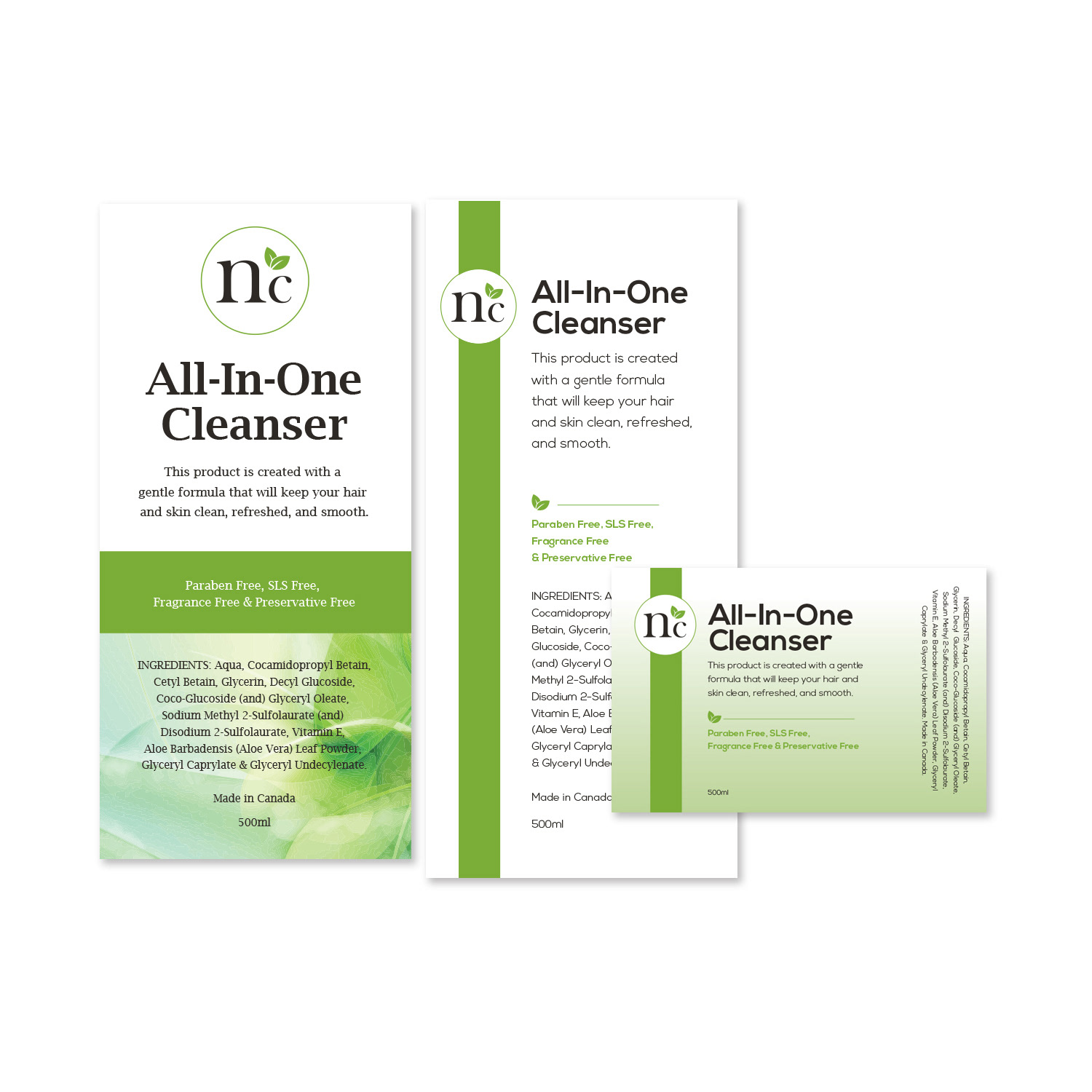
White Label Example
CAMPAIGN DESIGN
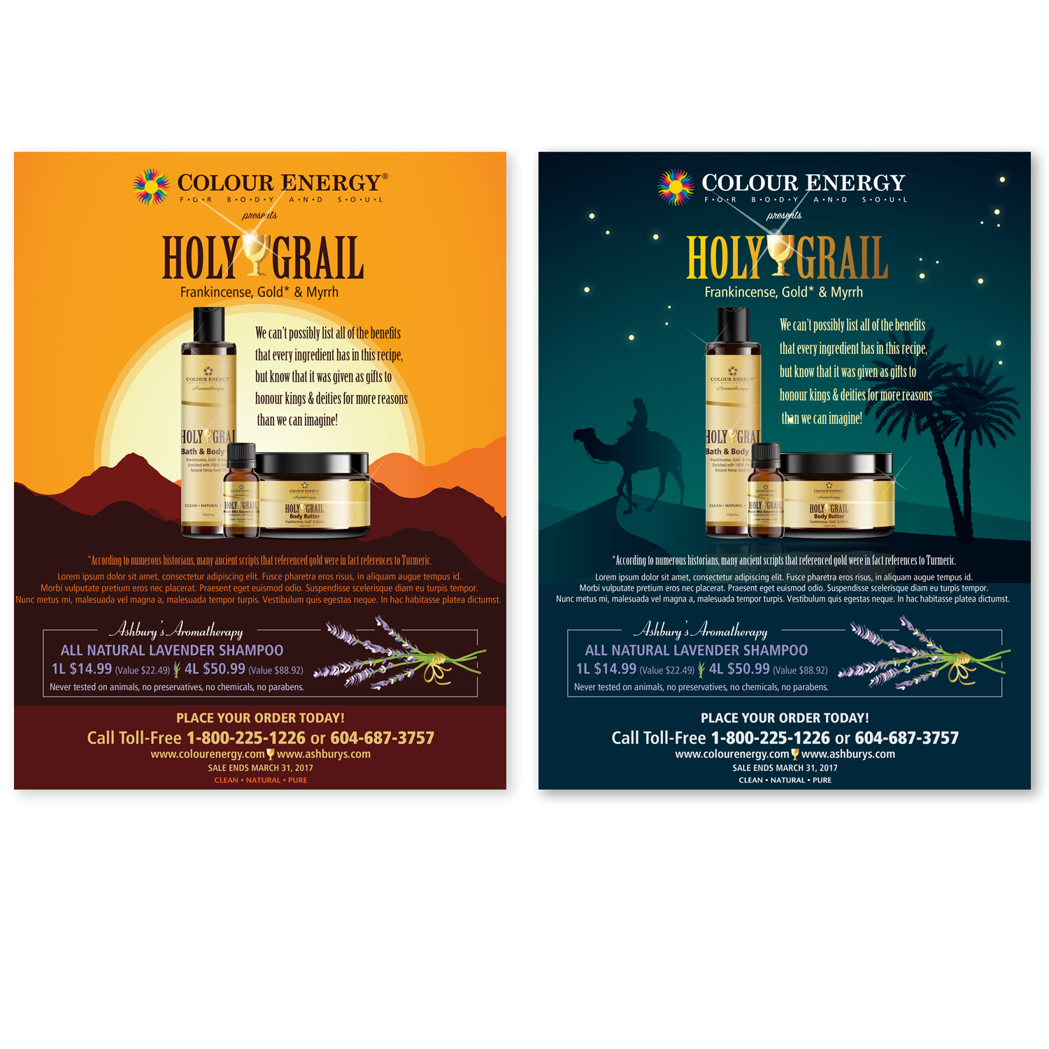
Holy Grail Product Launch
Branding & Omni-Channel Campaign Design
Holy Grail Product Launch
Branding & Omni-Channel Campaign Design
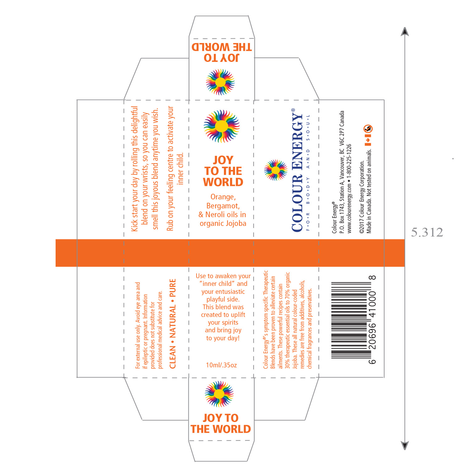
At Colour Energy, I led the branding and creative direction for the launch of the premium “Holy Grail” product line (a harmonious essential oil blend of Frankincense, Turmeric, and Myrrh) translating the client’s vision into a distinctive, opulent identity that stood out in the competitive wellness market. As Senior Graphic Designer and Art Director, I meticulously selected a resonant font that captured the product’s sacred, timeless essence and introduced a luxurious gold leafing effect on labels, adding sophistication and memorable tactile appeal that elevated perceived value and reinforced brand prestige.
My contributions spanned the full launch ecosystem: designing the primary logo, custom icons, product labels, box inserts, posters, handbills, dedicated email campaigns, website assets, product mock-ups, and social media content. Every element was thoughtfully harmonized to create a cohesive, visually striking presentation that communicated purity, potency, and spiritual heritage while driving customer excitement and sales.
I strategically positioned the “Holy Grail” line in the monthly corporate newsletter for subscriber spotlighting and featured a prominent full-page advertisement in the corporate catalogue to highlight its benefits and allure. This integrated, multi-channel approach ensured maximum visibility, consistent messaging, and powerful brand storytelling from digital to print, resulting in a successful launch that strengthened market positioning and customer loyalty.
This project showcases expertise in product launch branding, luxury essential oil packaging, gold leaf label design, full-spectrum campaign creative, multi-channel marketing assets, logo & icon development, wellness product promotion, corporate catalogue & newsletter integration, and strategic art direction for premium health, beauty, and esoteric brands.
CAMPAIGN DESIGN
Mother Nature Aromatherapy
Brand Identity & Product Launch Campaign
Mother Nature Aromatherapy
Brand Identity & Product Launch Campaign
For Colour Energy’s latest product launch, I spearheaded the complete brand identity transformation of the former “Buzz-off” into the new Mother Nature Aromatherapy line, an essential oil blend crafted to naturally repel insects. As Senior Graphic Designer, I developed attention-grabbing logo concepts that delivered a powerful, nature-inspired first impression during stakeholder reviews, ensuring the final selection perfectly captured the product’s outdoor, protective, and premium essence.
The chosen logo was complemented by a custom icon featuring a stylized tree, symbolizing harmony with nature and seamless alignment with the brand name “Mother Nature.” I then designed bespoke product labels that prioritized strong brand distinction, professional polish, and cost-effective production, balancing essential information, regulatory compliance, appealing visuals, and clear hierarchy to drive sales growth and shelf appeal in the competitive natural insect repellent market.
This strategic rebranding elevated the product from generic to memorable, reinforcing Colour Energy’s leadership in authentic, plant-based wellness while creating a cohesive, market-ready identity that resonated with health-conscious consumers seeking safe, effective outdoor protection.
This project demonstrates expertise in product rebranding, essential oil label design, insect repellent packaging, logo & icon creation, brand identity transformation, stakeholder presentation concepts, cost-effective premium labeling, and strategic graphic design for wellness, natural health, and outdoor lifestyle brands.

CAMPAIGN DESIGN
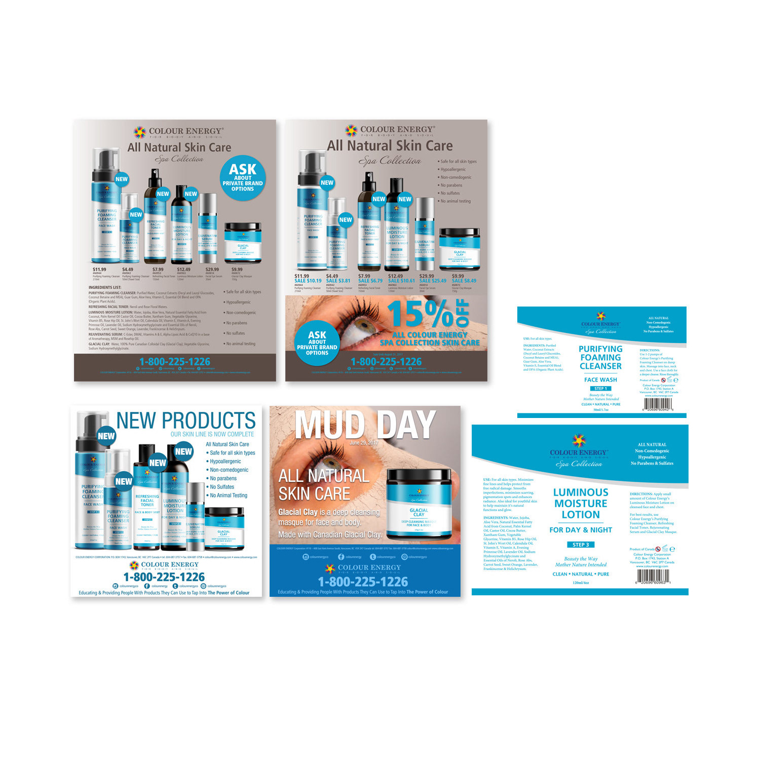
Colour Energy Skincare Debut
Branding, Packaging & Omni-Channel Launch Campaign
Colour Energy Skincare Debut
Branding, Packaging & Omni-Channel Launch Campaign
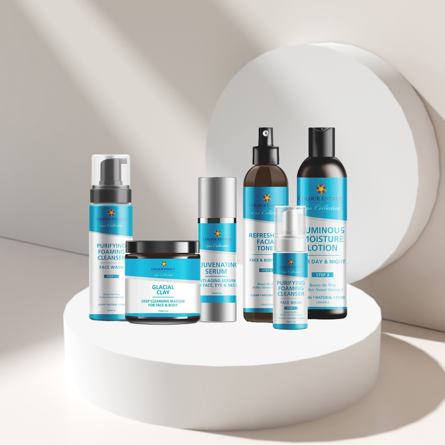
As Graphic Designer and Art Director, I spearheaded the branding and packaging for Colour Energy’s debut skincare line, creating a fresh, cohesive visual identity that instantly communicated vitality, purity, and premium wellness. I deliberately selected a vibrant blue colour scheme to evoke freshness and trust, then meticulously designed custom product labels that balanced professionalism, affordability, and striking shelf appeal—significantly contributing to sales growth while establishing a distinctive brand presence in the competitive natural skincare market.
Beyond labels, I extended the brand across every touchpoint: protective box inserts, posters, handbills, dedicated email campaigns, and social media assets. For the All-Natural Skincare launch, I prioritized packaging that safeguarded sensitive essential oils against light and temperature fluctuations, combining aesthetic elegance with functional integrity so products arrive in perfect condition while looking luxurious. Recognizing the need for fresh marketing energy, I revamped promotional materials while preserving the core brand essence, producing dynamic flyers that doubled as drop-box inserts, reinforcing messaging inside every shipment and creating memorable unboxing moments that enhanced customer experience and loyalty.
To maximize social media impact without straining budget, I created diverse assets using innovative 3D packaging renderings. By merging accurate 3D models with Photoshop-crafted artwork, I produced lifelike product mock-ups that seamlessly integrated into posts, stories, and ads—delivering photorealistic presentation that boosted engagement, educated followers, and drove traffic to online and retail channels.
This comprehensive launch demonstrated my ability to fuse creative vision, strategic thinking, and technical precision, delivering a unified brand rollout that elevated Colour Energy’s skincare line, strengthened market positioning, and delivered measurable results in sales, visibility, and customer connection.
This project highlights expertise in skincare product branding, custom label & packaging design, vibrant blue identity systems, protective essential oil packaging, 3D product mock-ups, drop-box flyer integration, omni-channel launch campaigns, social media asset creation, and strategic graphic design for wellness, natural beauty, and premium retail brands.
CAMPAIGN DESIGN
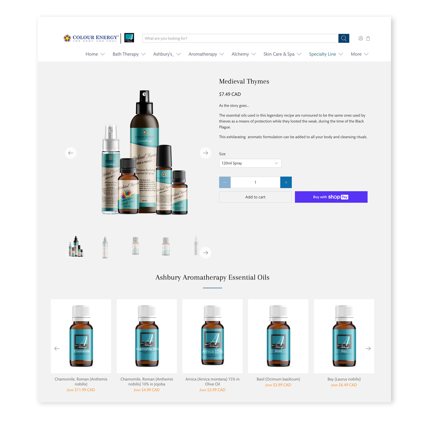
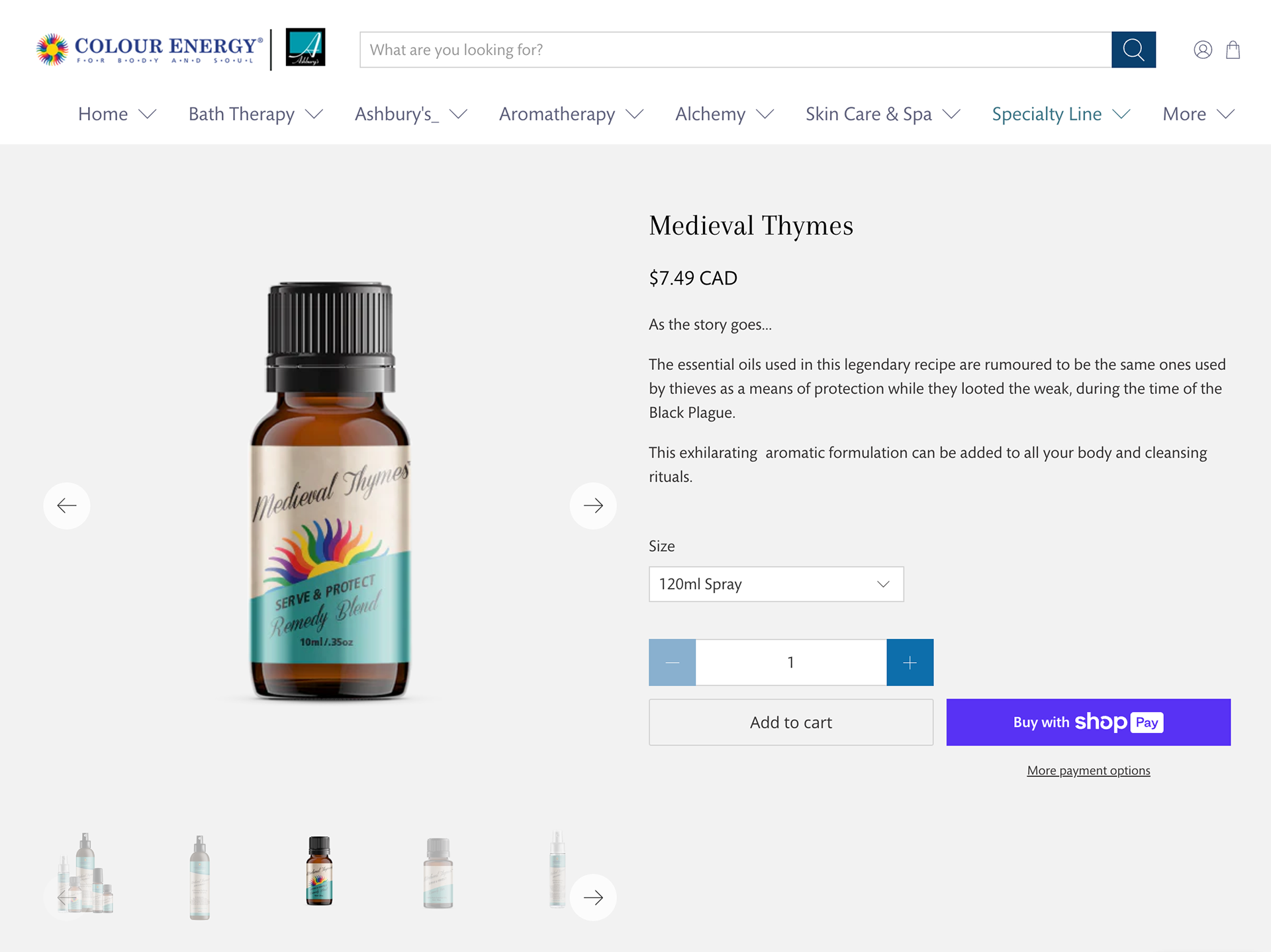
Medieval Thymes Initiative
Full-Suite Branding & Launch Campaign for Disinfectant Essential Oil Blend
Medieval Thymes Initiative
Full-Suite Branding & Launch Campaign for Disinfectant Essential Oil Blend
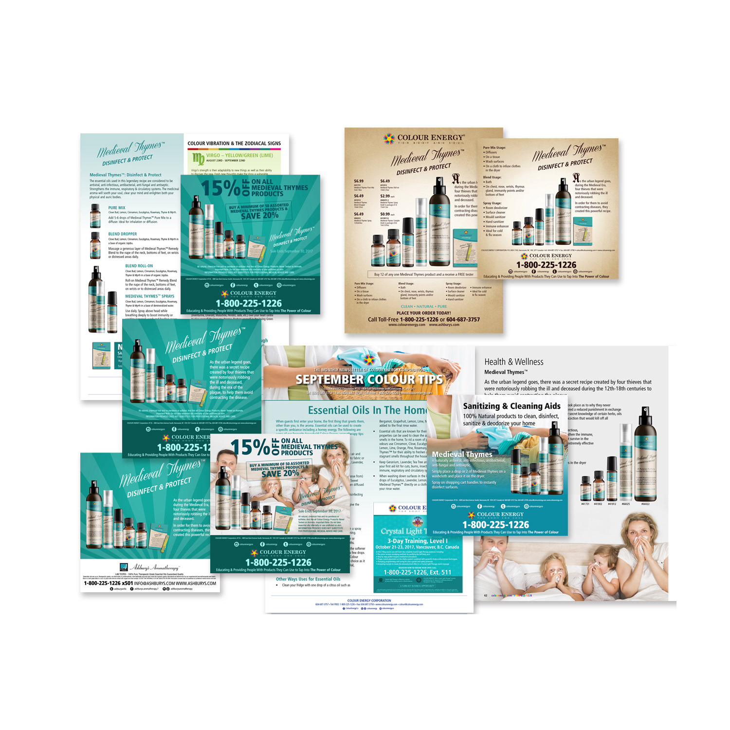
Colour Energy unveiled “Medieval Thymes,” a powerful, natural essential oil blend formulated to disinfect surfaces safely and effectively. As a key contributor to the product launch, I orchestrated the creation of a complete suite of branding and marketing assets designed to introduce the line with maximum visibility, trust, and sales impact across all channels.
I crafted custom product labels, box inserts, posters, handbills, dedicated email campaigns, website banners and hero visuals, photorealistic product mock-ups, and a full array of engaging social media posts—each element meticulously aligned with the brand’s premium wellness identity while emphasizing the product’s efficacy, natural ingredients, and historical inspiration. To amplify reach and internal momentum, I spotlighted the Medieval Thymes line in the monthly corporate newsletter and curated prominent catalogue updates, ensuring consistent messaging and strong visibility for distributors, retailers, and direct customers.
This integrated, multi-touchpoint campaign delivered a cohesive launch experience that educated audiences, built immediate credibility, and drove adoption in the growing natural cleaning and wellness category.
This project demonstrates expertise in product launch campaign design, essential oil branding, custom label & packaging production, omni-channel marketing assets, email & newsletter integration, website hero visuals, social media launch content, product mock-up creation, and strategic graphic design for natural health, wellness, and household product brands.
VISUAL DESIGN
Colour Energy Monthly Newsletter
Amplifying Colour Energy's Corporate Vision & Objectives
Colour Energy Monthly Newsletter
Amplifying Colour Energy's Corporate Vision & Objectives
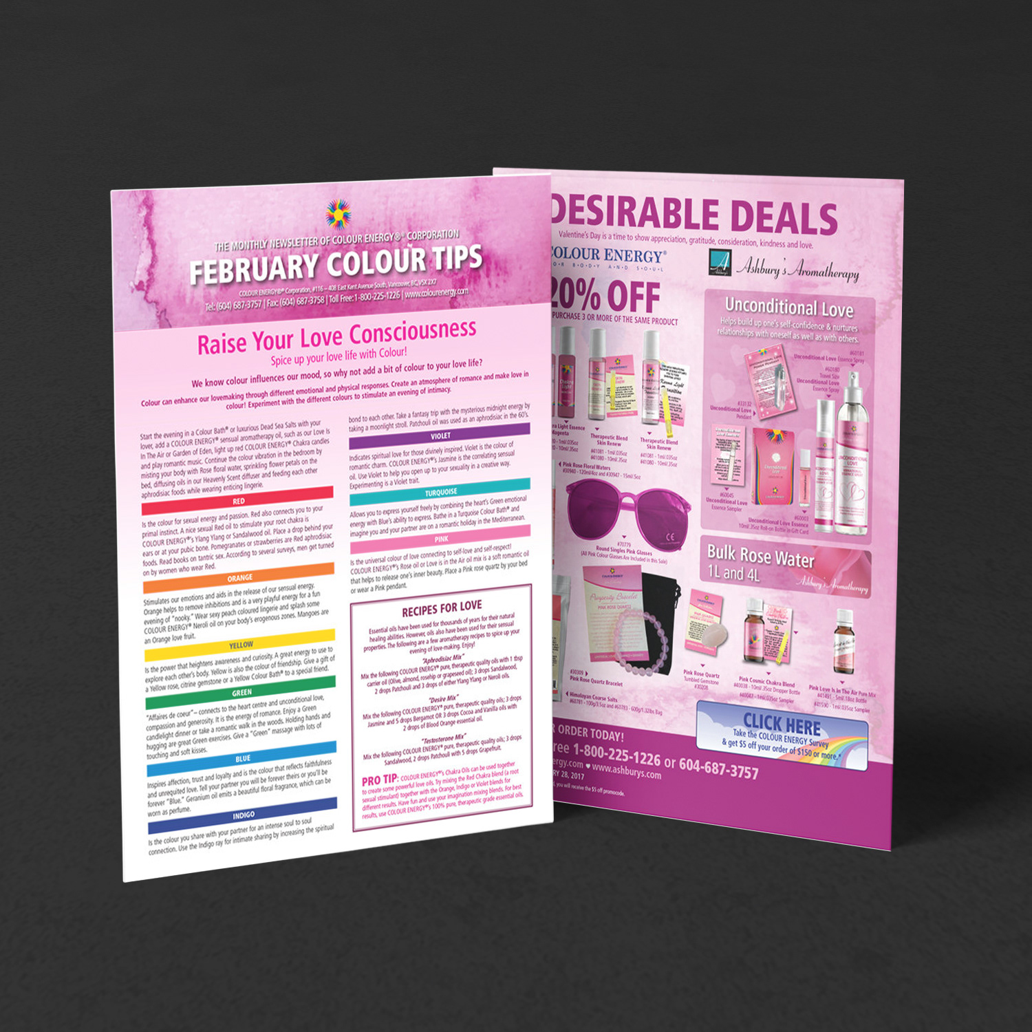
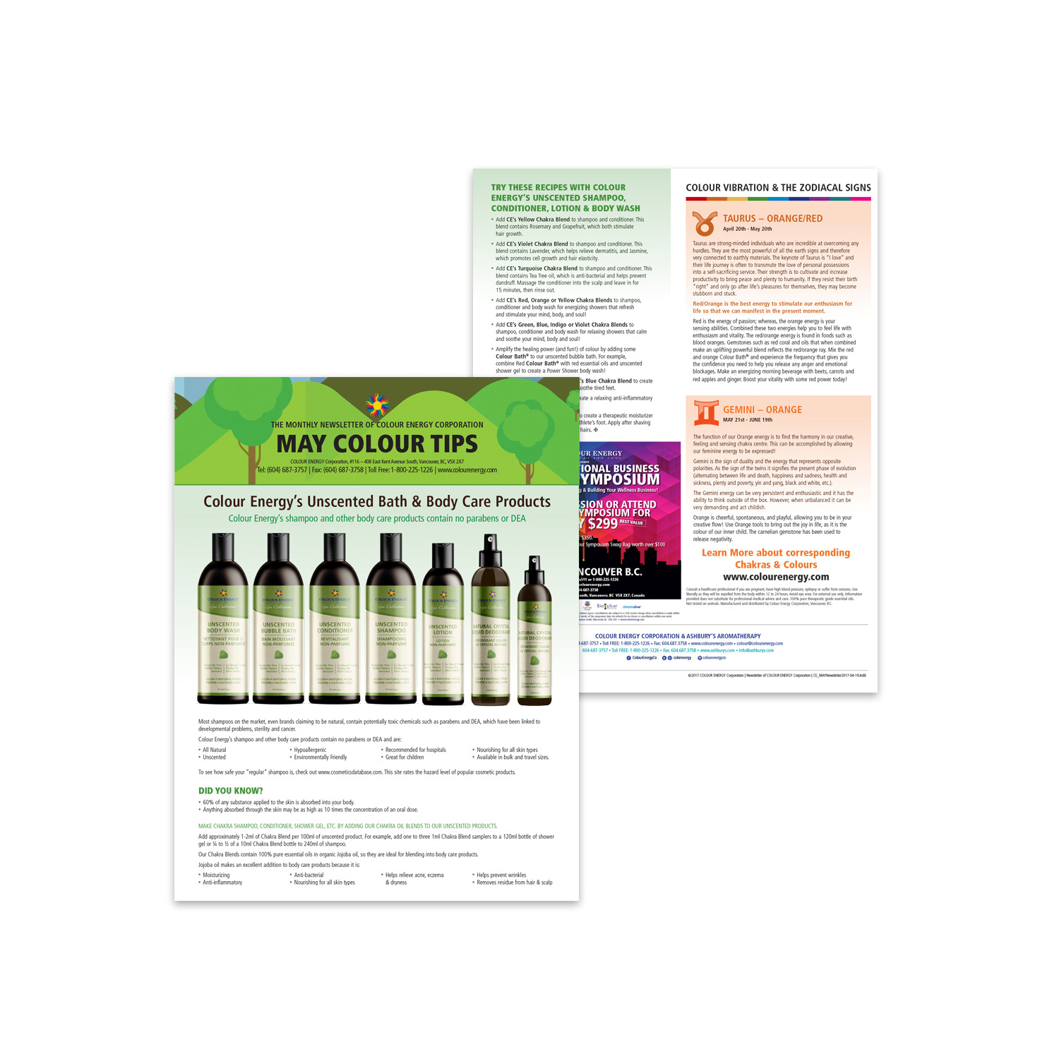
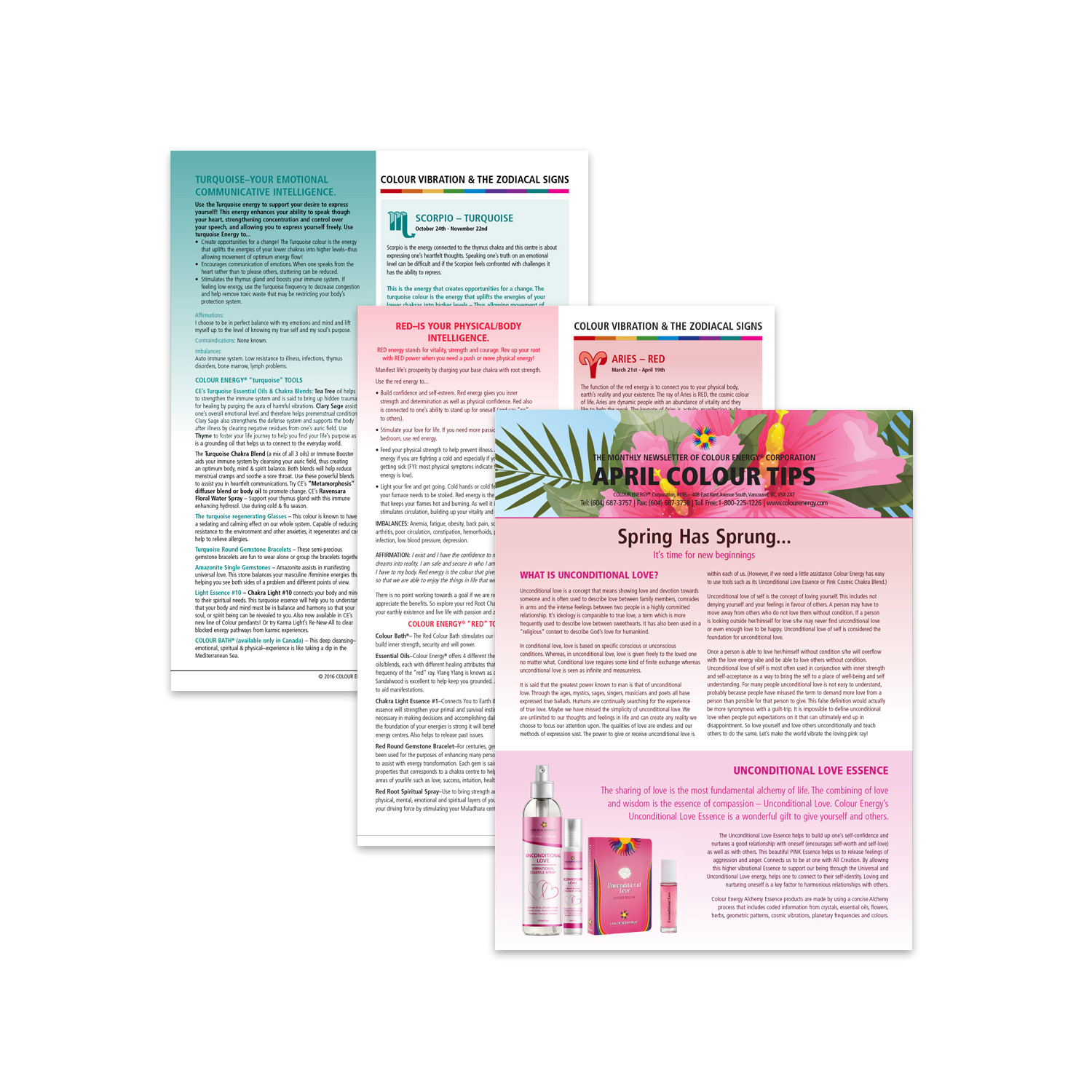
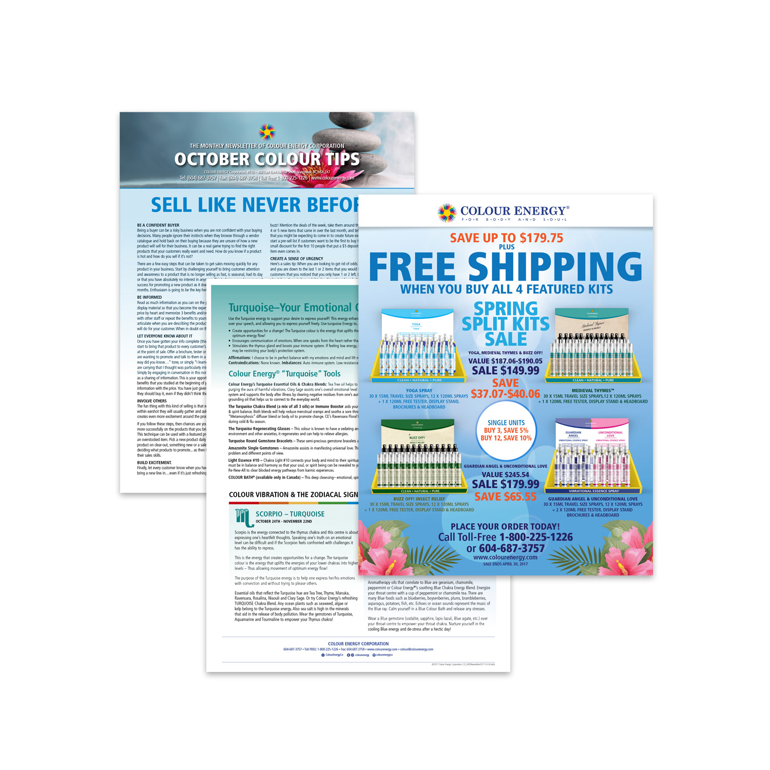
I revitalized Colour Energy’s monthly client newsletter, transforming both the digital email and print editions into visually refreshed, highly engaging assets that amplified the company’s corporate vision and objectives. The redesign featured intuitive navigation icons, prominent social media links, enriched high-quality imagery, and dedicated ad spaces that spotlighted key initiatives, new products, and seasonal promotions, creating a cohesive, professional experience that reinforced brand authority and encouraged repeat readership.
Using Adobe InDesign, I overhauled the print newsletter template with contemporary elements, including strategic iconography, refined color palettes, and streamlined layouts that balanced readability with visual impact. The print edition served a dual purpose: as a tangible drop-box insert for clients and as a fully interactive PDF hosted on the website, complete with clickable links, bookmarks, and responsive formatting for seamless digital access.
Drawing inspiration from each month’s newsletter content, I conceptualized and designed corresponding social media assets (featuring monthly horoscopes, promotional campaigns, and new product unveilings) that maintained perfect brand consistency while driving cross-channel traffic, engagement, and sales.
This integrated print-to-digital and social strategy not only elevated the corporate newsletter but also strengthened Colour Energy’s position as a thought leader in the wellness and energy healing space, fostering deeper client relationships and measurable growth.
This work showcases expertise in monthly newsletter design, bilingual or corporate print production, interactive PDF newsletter creation, email & print template redesign, social media asset adaptation, brand-consistent omni-channel marketing, visual hierarchy & iconography, and strategic graphic design for wellness, natural health, and lifestyle brands.
PRINT DESIGN
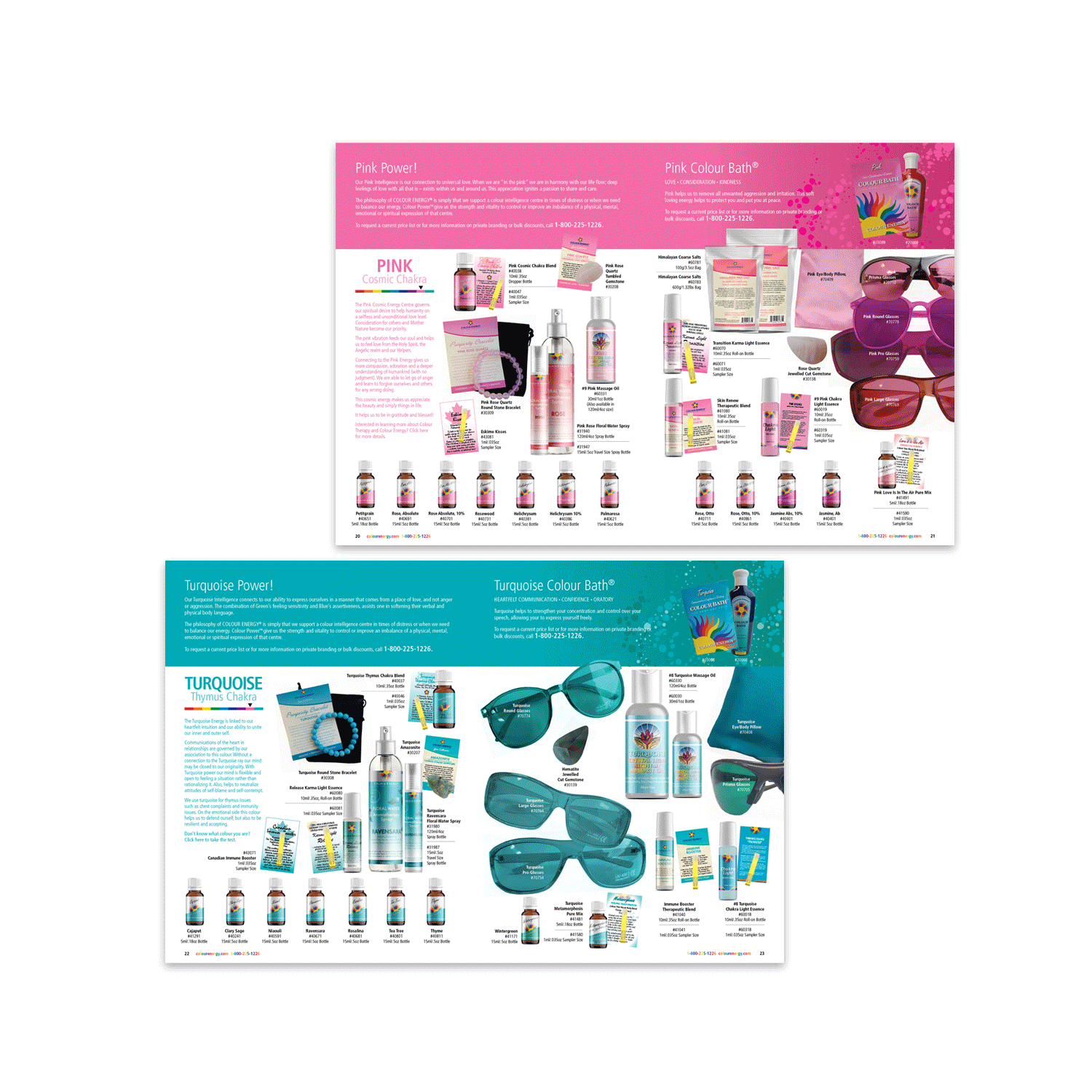
Informative Double-Sided Factsheets
Highlighting Holistic Benefits, Print & Downloadable PDFs for Wholesale & Retail Impact
Informative Double-Sided Factsheets
Highlighting Holistic Benefits, Print & Downloadable PDFs for Wholesale & Retail Impact
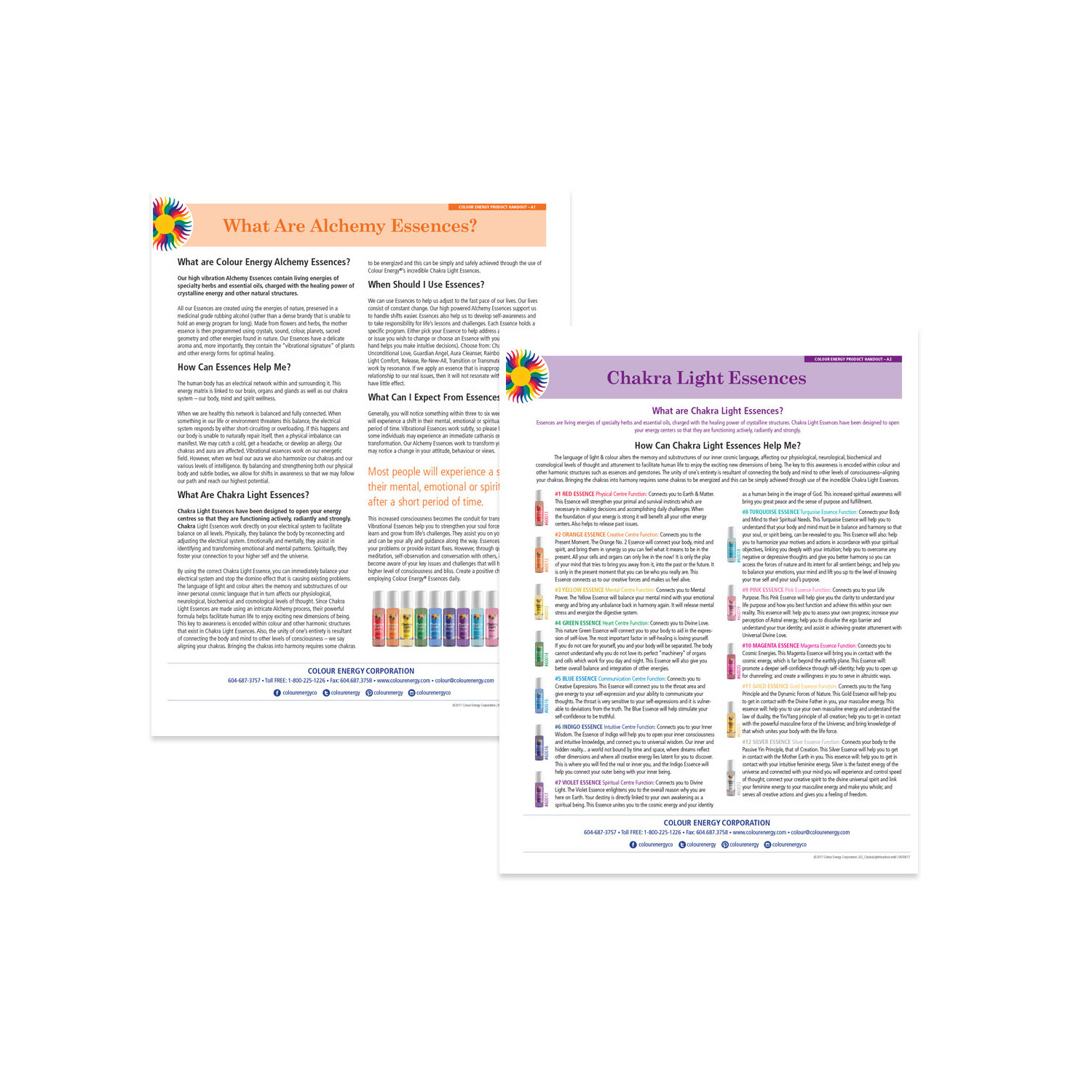
At Colour Energy, I led the monthly creation of compelling product factsheets and promotional assets that aligned perfectly with the brand’s mission to empower holistic well-being through the transformative power of colour for body, mind, and spirit. Using Adobe InDesign, I designed concise, double-sided factsheets for every product in the lineup, delivering clear, in-depth insights into their unique benefits, applications, ingredients, and energetic properties while prioritizing readability, visual impact, and brand consistency.
Each factsheet featured thoughtfully structured content enhanced by photorealistic product mock-ups, intuitive tables, charts, bullet points, and high-quality imagery, making complex wellness information instantly accessible and engaging. These materials were produced as premium physical drop-box inserts for firsthand client experiences and as optimized downloadable PDFs hosted on the wholesaler platform, ensuring seamless accessibility for retailers, practitioners, and end-users across North America.
This integrated print-to-digital approach not only educated audiences and reinforced Colour Energy’s authority in the esoteric wellness space but also supported sales growth, strengthened retailer relationships, and drove repeat engagement through consistent, high-value monthly campaigns.
This work demonstrates expertise in product factsheet design, wellness & holistic marketing collateral, double-sided print & PDF production, Adobe InDesign for educational materials, product mock-up integration, wholesale promotional assets, monthly campaign coordination, and strategic graphic design for natural health, energy healing, and specialty wellness brands.

PRINT DESIGN
7-Foot Chakra Reference Poster
Vibrant Lotus Chakra Artwork with Custom Packaging for Holistic Wellness & Energy Balance
7-Foot Chakra Reference Poster
Vibrant Lotus Chakra Artwork with Custom Packaging for Holistic Wellness & Energy Balance
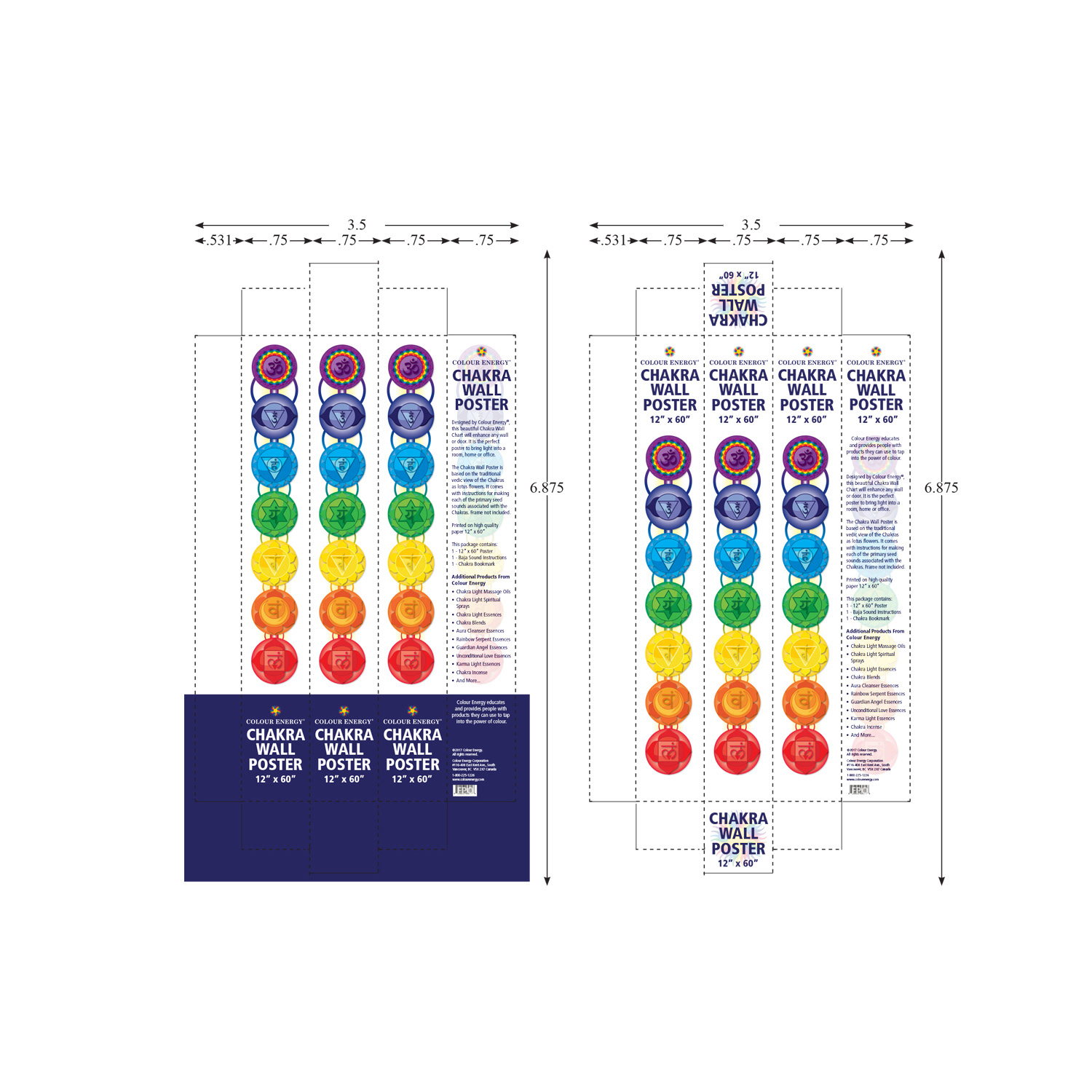
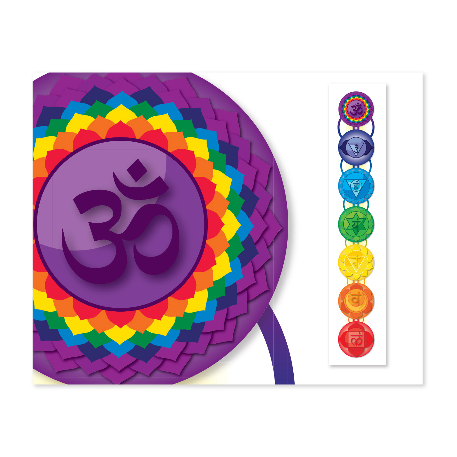
At Colour Energy, I independently designed and produced a stunning 7-foot chakra reference poster, a visual masterpiece that serves as both an artistic centerpiece and a practical guide to harmonizing the body’s seven energy centres: Crown, Brow, Throat, Heart, Solar Plexus, Sacral, and Root. Leveraging deep expertise in layout design, typography, colour theory, and symbolic representation, I created intricate lotus flower illustrations interwoven with precise chakra symbolism, using vibrant yet balanced palettes that evoke vitality, healing, and spiritual alignment.
The project demanded meticulous project management to meet tight deadlines with minimal supervision, blending creative vision with technical precision in Adobe Illustrator and InDesign. Every element was thoughtfully crafted to captivate viewers while promoting holistic well-being, health, and happiness, transforming complex esoteric concepts into an accessible, inspiring reference tool for practitioners, studios, retailers, and wellness enthusiasts.
I also designed complementary packaging that elevated the unboxing experience, ensuring the poster arrived protected, presented premium, and reinforced the brand’s commitment to quality and authenticity. This large-format print piece and its packaging delivered a complete, immersive experience that not only enhanced market presence but also empowered users on their personal wellness journeys.
This project demonstrates expertise in large-format chakra poster design, symbolic & spiritual illustration, holistic wellness branding, custom packaging production, independent project management, high-resolution print excellence, energy centre visual storytelling, and strategic graphic design for esoteric, natural health, and wellness brands.
PRINT DESIGN
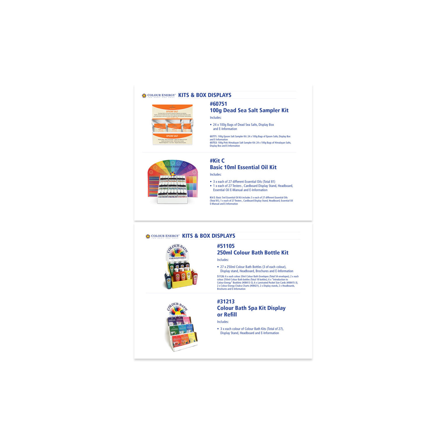
Product Creation & Packaging Design
Visual Excellence Across Wellness Portfolio
Product Creation & Packaging Design
Visual Excellence Across Wellness Portfolio
As a pivotal contributor to multiple product launches at Colour Energy and its family of brands, I led the creative direction and end-to-end development of bespoke packaging solutions that captivated consumers while safeguarding the integrity of delicate products like essential oils. My expertise encompassed designing distinctive box art, precision labels, protective structures, and functional inserts, balancing visual allure with practical preservation against light, temperature, and handling, ensuring every package reinforced premium quality and brand trust from production to unboxing.
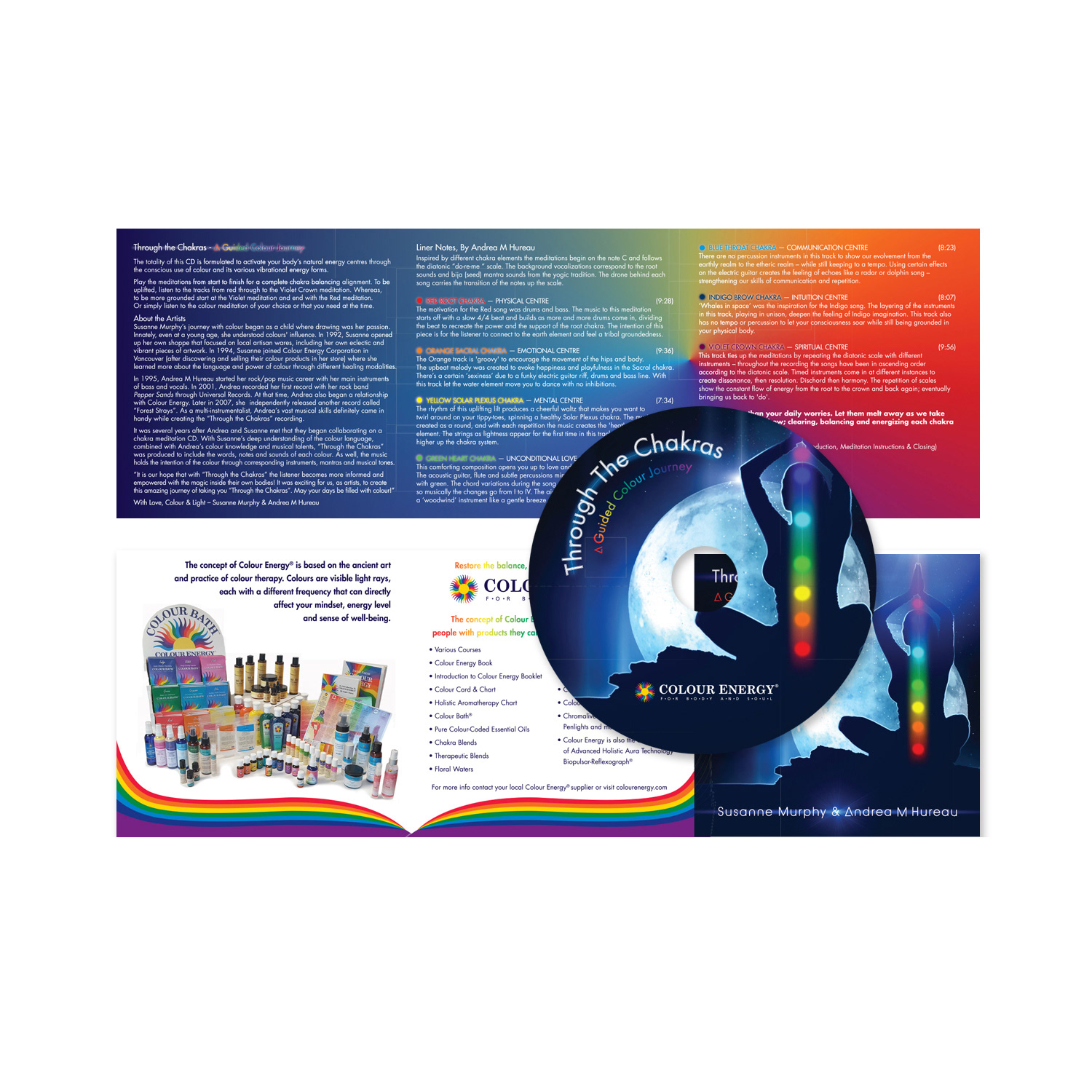
Expanding into complementary mediums, I curated captivating CD labels and sleeves for the owners’ musical ventures, maintaining unwavering brand consistency and delivering high-quality, professional visuals that aligned perfectly with the wellness ethos. I also spearheaded the innovative design of a large-format chakra poster, complete with distinctive protective packaging, further demonstrating my ability to create impactful, educational visual solutions across diverse formats.
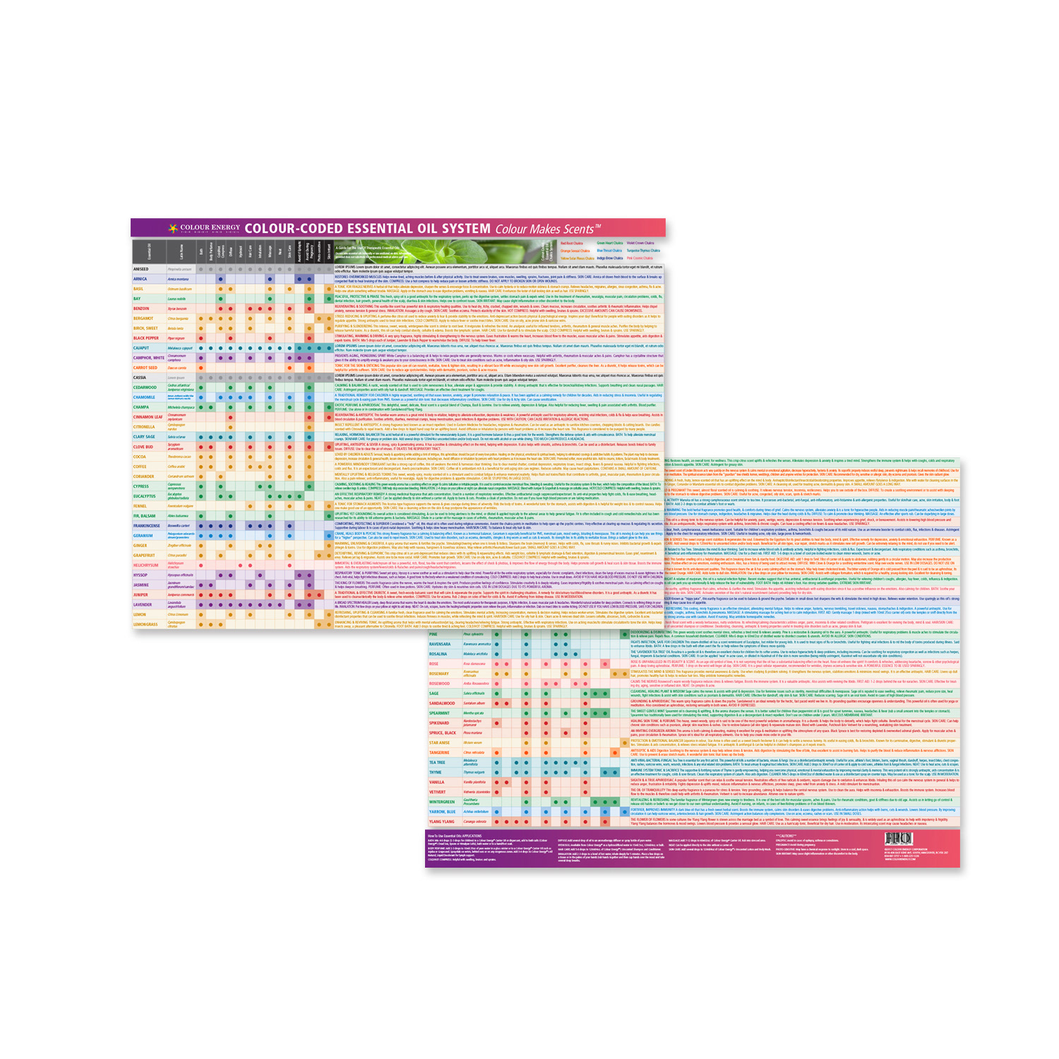
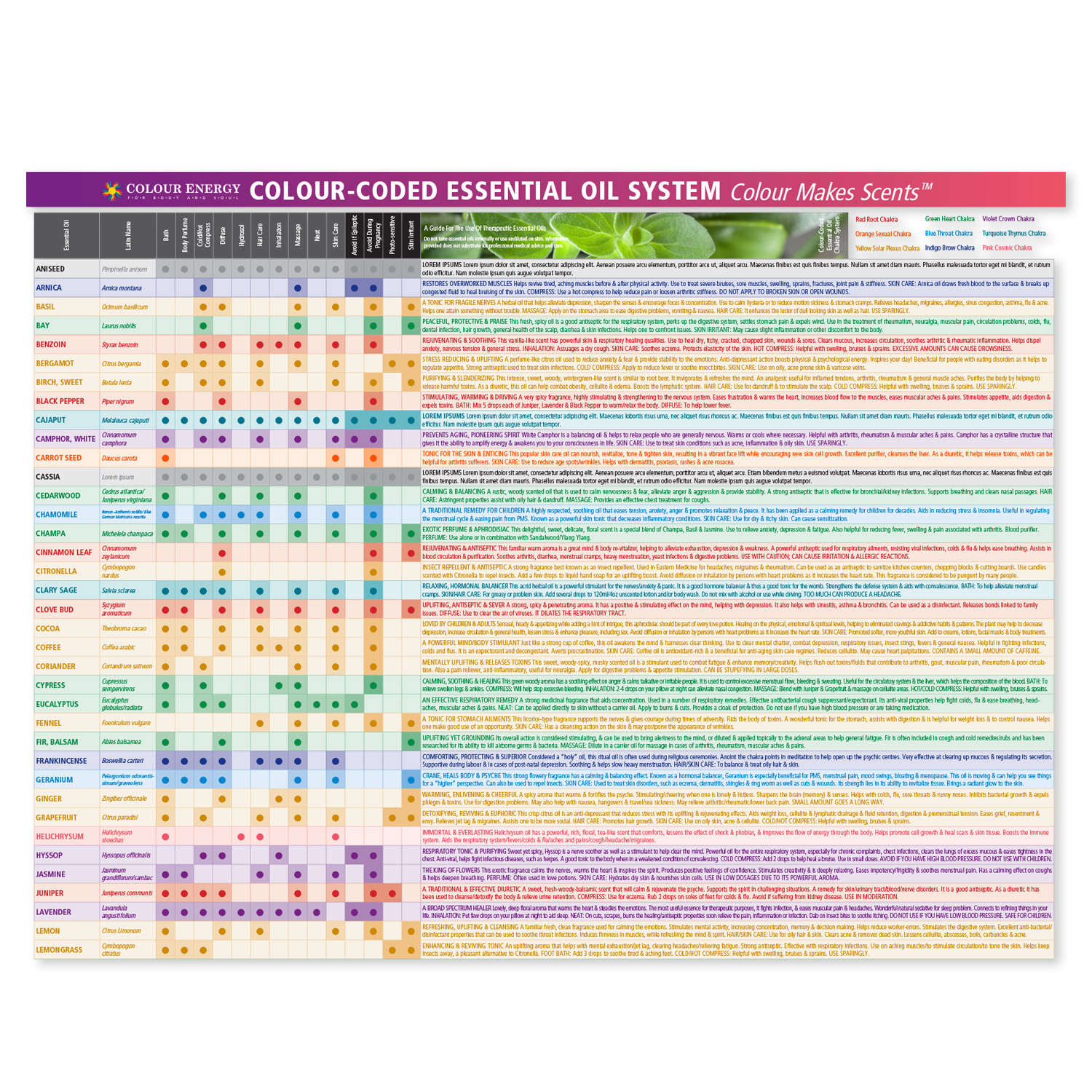
A standout achievement was the creation of a double-sided benefit chart using Adobe Illustrator, meticulously illustrating the myriad advantages of essential oils with clear, engaging visuals. I oversaw file preparation for flawless printing and nurtured a strong relationship with the printer to ensure superior output. The chart became a highly sought-after item on The Chakra Company’s website, proving my capacity to produce informative, visually appealing content that resonates with audiences and drives demand.
This body of work showcases expertise in custom packaging design, essential oil preservation solutions, product label & box art creation, chakra & wellness illustration, CD label & sleeve design, double-sided benefit chart production, print-ready file preparation, brand-consistent multi-format assets, and strategic graphic design for natural health, wellness, and esoteric product brands.
Colour Energy Chart
Colour Energy Chart
SOCIAL MEDIA DESIGN
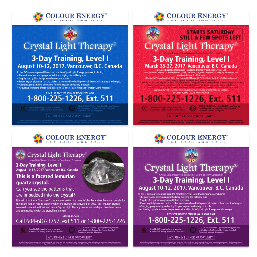
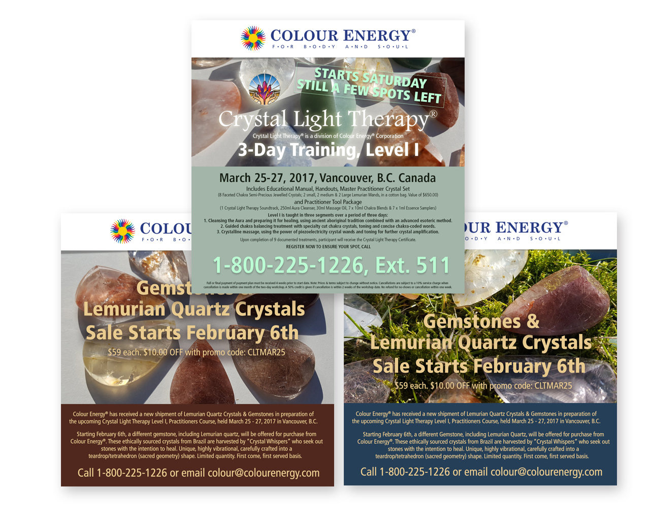
Crystal Light Therapy Marketing
Social Media & Visual Campaign Design
Crystal Light Therapy Marketing
Social Media & Visual Campaign Design
As Art Director for Colour Energy, I spearheaded the marketing initiatives for Crystal Light Therapy, a certified professional course focused on holistic healing and personal transformation through coloured light therapy. I crafted a compelling visual narrative across social media channels that authentically communicated the course’s essence—empowering individuals with knowledge, tools, and techniques for profound wellness and growth—while driving awareness, curiosity, and en-rollment.
I curated a cohesive brand identity for the program, selecting evocative imagery, harmonious colour palettes, and design elements that captured its serene, transformative, and spiritually aligned nature. This extended to creating high-impact social media posts, Stories, Reels, carousel content, and supporting promotional materials, all meticulously integrated to evoke wonder, trust, and aspiration in the target audience of holistic practitioners, wellness enthusiasts, and healing professionals.
Through close collaboration with the creative team, I ensured every visual aligned with the brand’s premium positioning and the course’s educational depth, blending artistic sensitivity with strategic messaging to make the content not only seen but deeply felt. My attention to detail, aesthetic vision, and ability to weave storytelling into every graphic played a crucial role in enhancing engagement, building anticipation, and positioning Crystal Light Therapy as a must-have certification in the growing field of energy healing and colour therapy.
This project demonstrates expertise in social media campaign design, art direction for wellness education, holistic & transformative visual storytelling, brand identity curation, multi-platform content creation, engagement-driven graphics, Crystal Light Therapy marketing, and strategic creative direction for certified courses, energy healing, and natural wellness brands.
SOCIAL MEDIA DESIGN
Targeted Social Campaigns
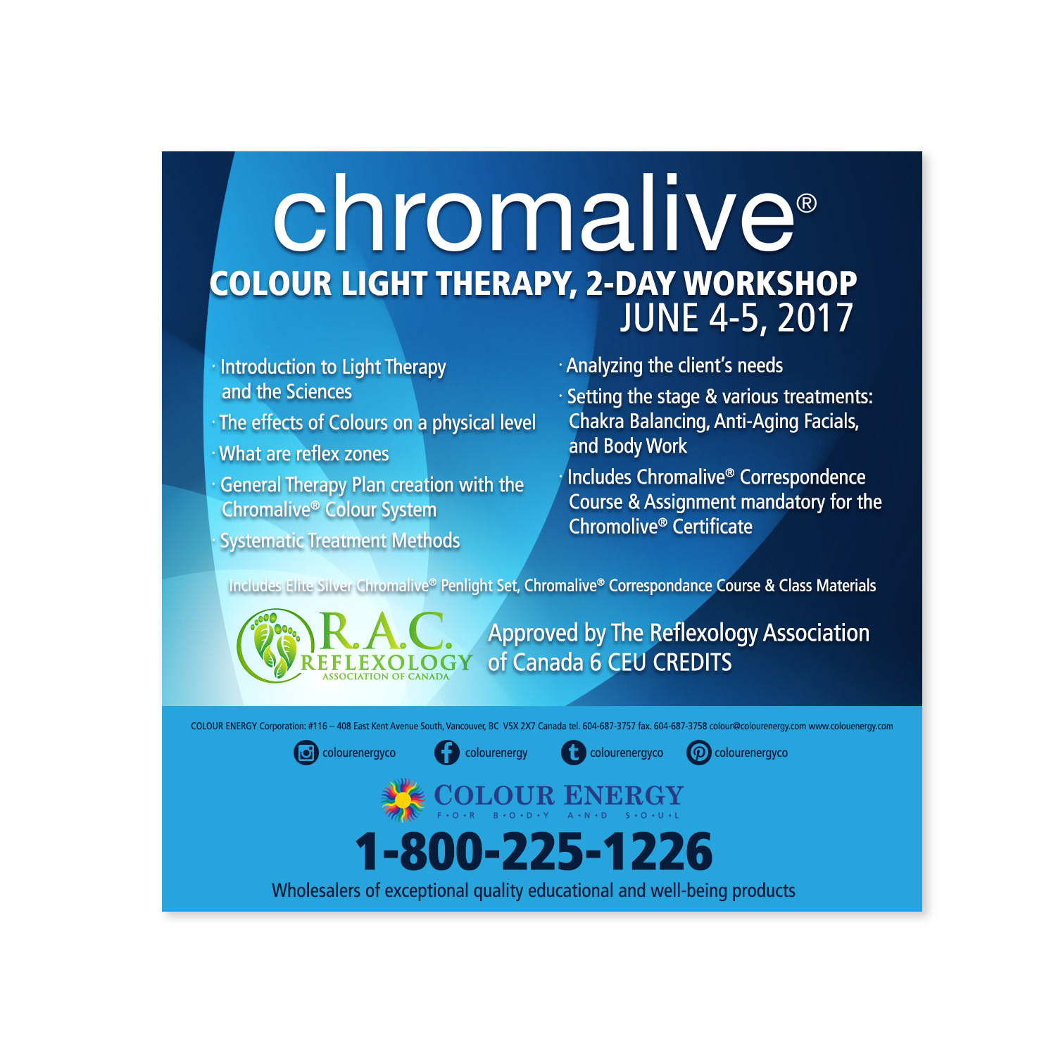
Chromalive Colour Light Therapy
Targeted Social Campaigns
Chromalive Colour Light Therapy
As lead designer for Colour Energy’s Chromalive Colour Light Therapy program, I took full ownership of the comprehensive marketing strategy, focusing on targeted social media campaigns and promotional assets to showcase this specialized, transformative course held at our Vancouver head office. The program, proudly certified by the Canadian Reflexology Association and offering participants 5–6 CEU credits, positions itself as a credible, high-value educational experience in the fields of colour light therapy, holistic healing, and professional development.
I crafted visually compelling social media content (posts, carousels, Stories, Reels, and ads) that authentically communicated the course’s healing potential, scientific foundation, practical applications, and certification benefits. Every asset aligned with the brand’s premium wellness aesthetic while emphasizing the program’s exclusivity, hands-on learning, and career-enhancing value to attract reflexologists, therapists, wellness practitioners, and holistic health professionals.
This strategic visual narrative not only amplified awareness and en-rollment but also reinforced Colour Energy’s authority in colour therapy education, driving engagement, inquiries, and registrations through consistent, trust-building design across platforms.
This project demonstrates expertise in social media campaign design, wellness education marketing, Chromalive Colour Light Therapy promotion, CEU-certified course advertising, targeted professional audience creatives, holistic healing visual storytelling, reflexology & therapy branding, and strategic graphic design for specialized training programs and natural health brands.

CAMPAIGN DESIGN
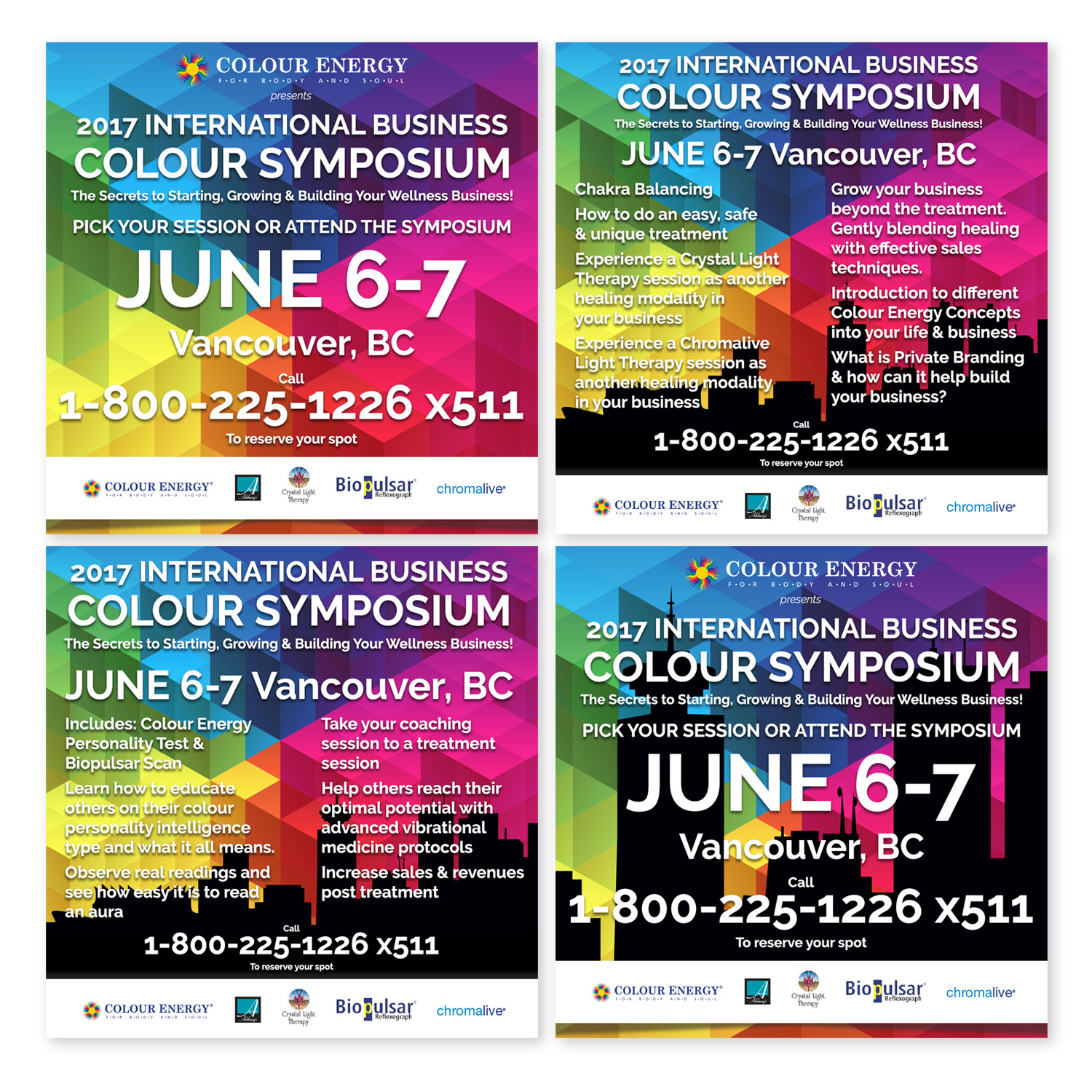
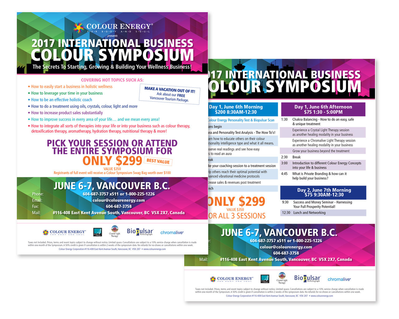
Colour Energy's Colour Symposium
Targeted Social Media & Promotional Campaign
Colour Energy's Colour Symposium
Targeted Social Media & Promotional Campaign
I led the full marketing strategy for Colour Energy's Colour Symposium, a transformative week-long event offering immersive, hands-on experiences in Crystal Light Therapy, Biopulsar, Chromalive, and other cutting-edge facets of holistic medicine and energy healing. Through targeted social media campaigns, strategic promotions, and cohesive visual content, I built anticipation, educated prospective attendees, and positioned the symposium as the ultimate platform for professional development and personal transformation in the wellness space.
The campaign focused on enticing participants to invest in the comprehensive lesson plans, certification pathways, and associated Colour Energy products—highlighting the event’s unique blend of theory, practical application, and direct access to expert-led sessions. I crafted engaging posts, Stories, Reels, carousels, and ads that showcased testimonials, course previews, behind-the-scenes glimpses, and clear value propositions, all aligned with the brand’s premium, authentic aesthetic to foster trust and inspire action.
This multi-channel approach successfully generated strong interest, increased registrations, and reinforced Colour Energy’s leadership in holistic education, empowering attendees with life-changing knowledge and tools while driving product sales and long-term client relationships.
This project demonstrates expertise in event marketing campaigns, social media promotion for wellness education, holistic medicine & energy healing branding, Crystal Light Therapy & Chromalive marketing, targeted enrollment creatives, immersive course advertising, multi-platform digital strategy, and results-oriented graphic design for professional training, certification programs, and natural health brands.
PRINT DESIGN
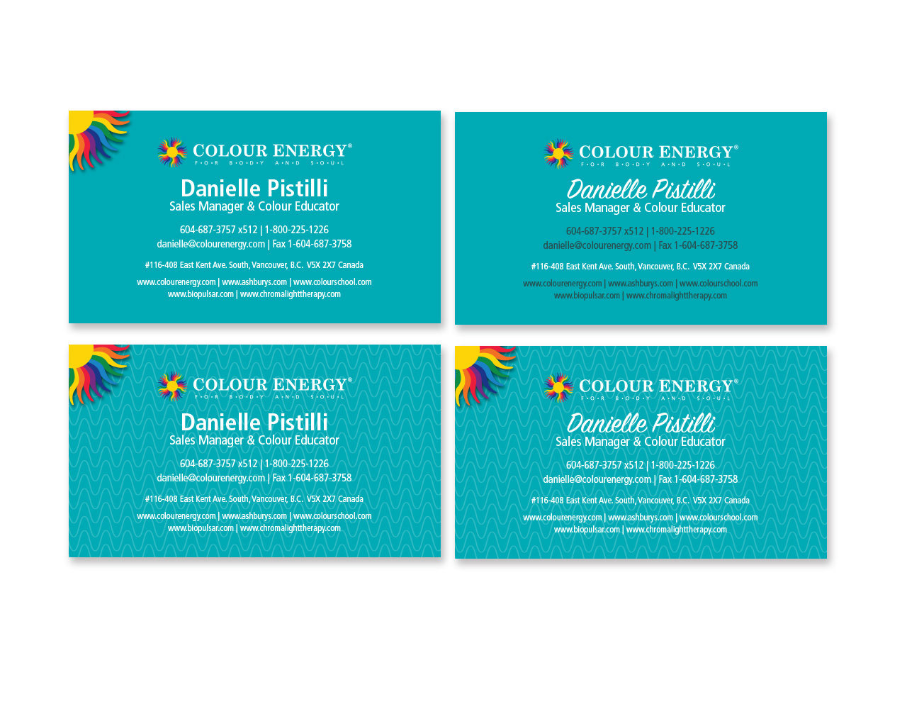
Corporate Stationery Design
Premium Letterheads, Envelopes & Business Cards
Corporate Stationery Design
Premium Letterheads, Envelopes & Business Cards
I meticulously designed premium corporate stationery, including letterheads, envelopes, and business cards, that radiated sophistication, professionalism, and unwavering attention to detail. Far beyond mere paper and ink, these bespoke materials became powerful symbols of the company’s commitment to excellence, serving as silent ambassadors that conveyed trust, quality, and refinement before a single word was exchanged.
Each piece was crafted with precision, featuring elegant typography, harmonious color palettes, subtle textures, and flawless brand alignment to ensure a cohesive, luxurious feel. The stationery not only elevated the brand’s overall image but also played a pivotal role in attracting prospective clients, nurturing enduring partnerships, and sparking genuine interest in the company’s offerings through every mailed letter, handed card, or presented envelope.
This thoughtful, high-end approach to print stationery reinforced a lasting first impression, strengthened professional credibility, and contributed to long-term business relationships in competitive industries.
This project demonstrates expertise in corporate stationery design, premium letterhead & envelope production, business card branding, brand-consistent print collateral, luxury tactile materials, professional identity systems, client-facing marketing assets, and strategic graphic design for corporate, financial, wellness, and professional services brands.
VISUAL DESIGN
Cost-Effective Photorealistic Visuals
3D Renderings & Photoshop Integration for Premium E-Commerce Product Presentation
Cost-Effective Photorealistic Visuals
3D Renderings & Photoshop Integration for Premium E-Commerce Product Presentation
Employing innovative and budget-conscious techniques, I created lifelike product mock-ups as a powerful alternative to traditional photo studio sessions, delivering stunning, high-resolution visuals that seamlessly integrated into our e-commerce website and marketing materials. By combining purchased 3D packaging renderings with meticulously designed artwork in Adobe Photoshop, I achieved photorealistic results (complete with accurate lighting, shadows, textures, reflections, and precise alignment) that showcased products in their most compelling, professional light.
These mock-ups not only elevated online product presentation with premium, consistent imagery but also provided a cost-effective solution that saved significant resources while maintaining exceptional quality. The renderings served as versatile assets across website listings, social media, email campaigns, and sales collateral, enhancing perceived value, building customer confidence, and contributing to stronger engagement and conversions in a competitive retail environment.
This approach highlights expertise in product mock-up design, 3D packaging rendering, photorealistic Photoshop compositing, cost-effective e-commerce visuals, lifelike product presentation, packaging artwork integration, high-resolution digital assets, and strategic graphic design for retail, wellness, food, beverage, and consumer brands.

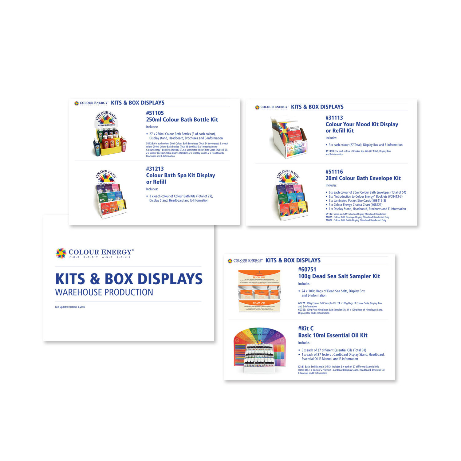
PRESENTATION DESIGN
Visually Engaging Slides
Transforming Complex Product Kits & Displays into Compelling, Client-Focused Narratives
Visually Engaging Slides
Transforming Complex Product Kits & Displays into Compelling, Client-Focused Narratives
Utilizing advanced design skills in Microsoft PowerPoint, I meticulously crafted visually engaging presentations that served as powerful tools to showcase Colour Energy’s extensive array of product kits, displays, and wellness offerings. These presentations played a pivotal role in captivating the attention of potential clients, wholesale partners, and internal teams, facilitating deep, comprehensive understanding of the products’ features, benefits, applications, and unique value propositions.
Through carefully chosen layouts, high-quality visuals, strategic infographics, clear typography, consistent brand-aligned colour palettes, and concise yet impactful explanations, I transformed complex product information into accessible, memorable content. This thoughtful structure not only highlighted key selling points and use cases but also fostered stronger connections, sparked genuine interest, and supported successful sales conversations and onboarding processes.
The presentations delivered a professional, polished experience that reinforced the brand’s commitment to excellence in holistic wellness, ultimately contributing to increased engagement, trust, and conversions in a competitive market.
This work demonstrates expertise in PowerPoint presentation design, product showcase slides, wellness & retail presentation graphics, visual storytelling for sales, client & employee onboarding decks, infographic & data integration, brand-consistent slide layouts, and strategic graphic design for corporate, training, and marketing environments.
CAMPAIGN DESIGN
The Chakra Company Corporate Marketing
Social Media, Website & Product Visuals
The Chakra Company Corporate Marketing
Social Media, Website & Product Visuals
During my tenure with Colour Energy, I spearheaded the establishment and ongoing management of The Chakra Company’s social media channels, successfully positioning it as the dynamic retail arm showcasing the full spectrum of Colour Energy’s expansive holistic wellness product range. I conceptualized and executed innovative visual strategies that mirrored the wholesale brand’s premium identity while driving consumer engagement, building community, and converting followers into loyal retail customers.
To optimize resources and elevate online presentation, I developed cost-effective product mock-ups using advanced 3D rendering techniques as a practical alternative to traditional photo studio sessions. These lifelike visuals were seamlessly integrated into the website, enriching product pages with high-resolution, professional displays that enhanced appeal, built trust, and supported higher conversion rates without straining budgets.
I also revitalized the website by incorporating custom HTML elements, blending 3D renderings with high-resolution photography, and employing light-box techniques to capture and showcase new product arrivals. This refresh created a vibrant, engaging digital experience that kept the platform fresh, visually compelling, and aligned with The Chakra Company’s mission of making holistic wellness accessible and inspiring to everyday consumers.
This multi-faceted work highlights expertise in retail social media management, product mock-up creation, 3D rendering & website integration, brand-consistent e-commerce visuals, light-box product photography, HTML-enhanced site design, holistic wellness marketing, and strategic graphic design for consumer-facing wellness and retail brands.
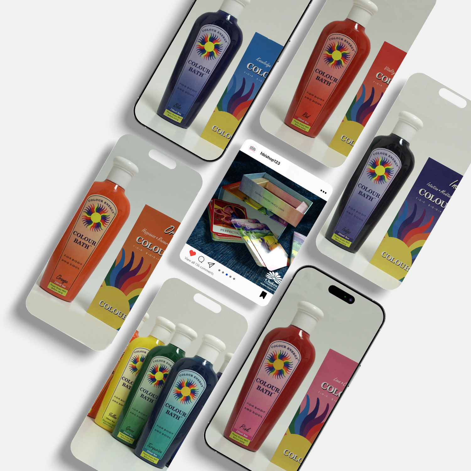
SOCIAL MEDIA DESIGN
The Chakra Company Social Media Channel
Visual Storytelling & Brand Engagement
The Chakra Company Social Media Channel
Visual Storytelling & Brand Engagement
Embracing the core essence of The Chakra Company, I meticulously crafted captivating and innovative social media visuals that resonated deeply with wellness enthusiasts, holistic practitioners, and conscious consumers. By weaving together compelling narratives, authentic imagery, and thoughtful design elements, I elevated engagement metrics—boosting likes, comments, shares, saves, and overall interaction, as followers navigated their feeds and immersed themselves in the brand’s stories.
These curated visuals not only spotlighted our extensive range of chakra-aligned products but also authentically conveyed the brand’s ethos of balance, healing, and spiritual empowerment. Through consistent aesthetics, strategic use of colour symbolism, intuitive layouts, and purposeful content sequencing, the social media channel fostered genuine connections, strengthened community loyalty, and amplified The Chakra Company’s digital presence as a trusted authority in the holistic wellness space.
This ongoing work demonstrates expertise in social media visual design, brand storytelling on platforms, high-engagement content creation, chakra & wellness branding, immersive feed curation, audience resonance visuals, product highlight graphics, and strategic graphic design for natural health, spiritual, and lifestyle brands.
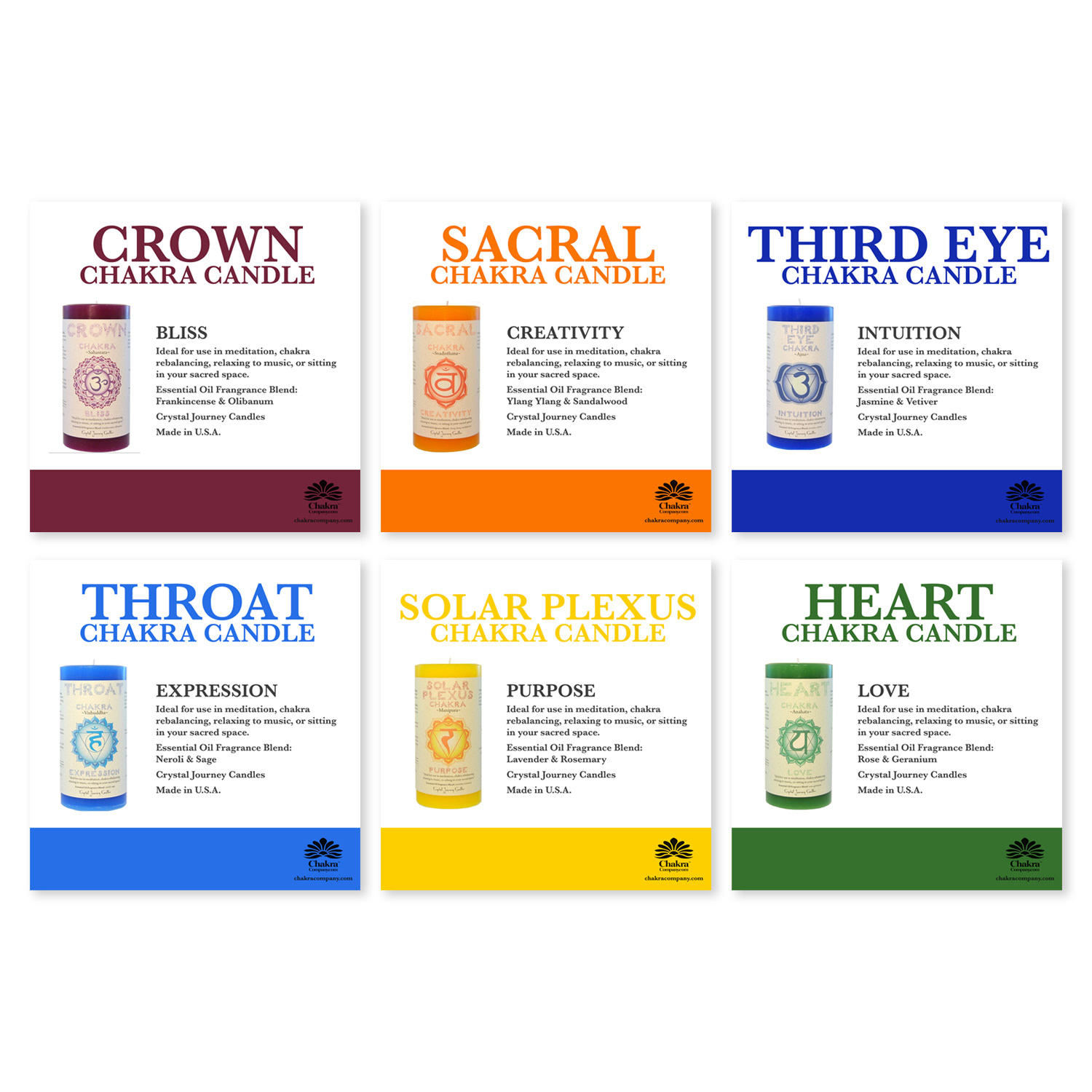
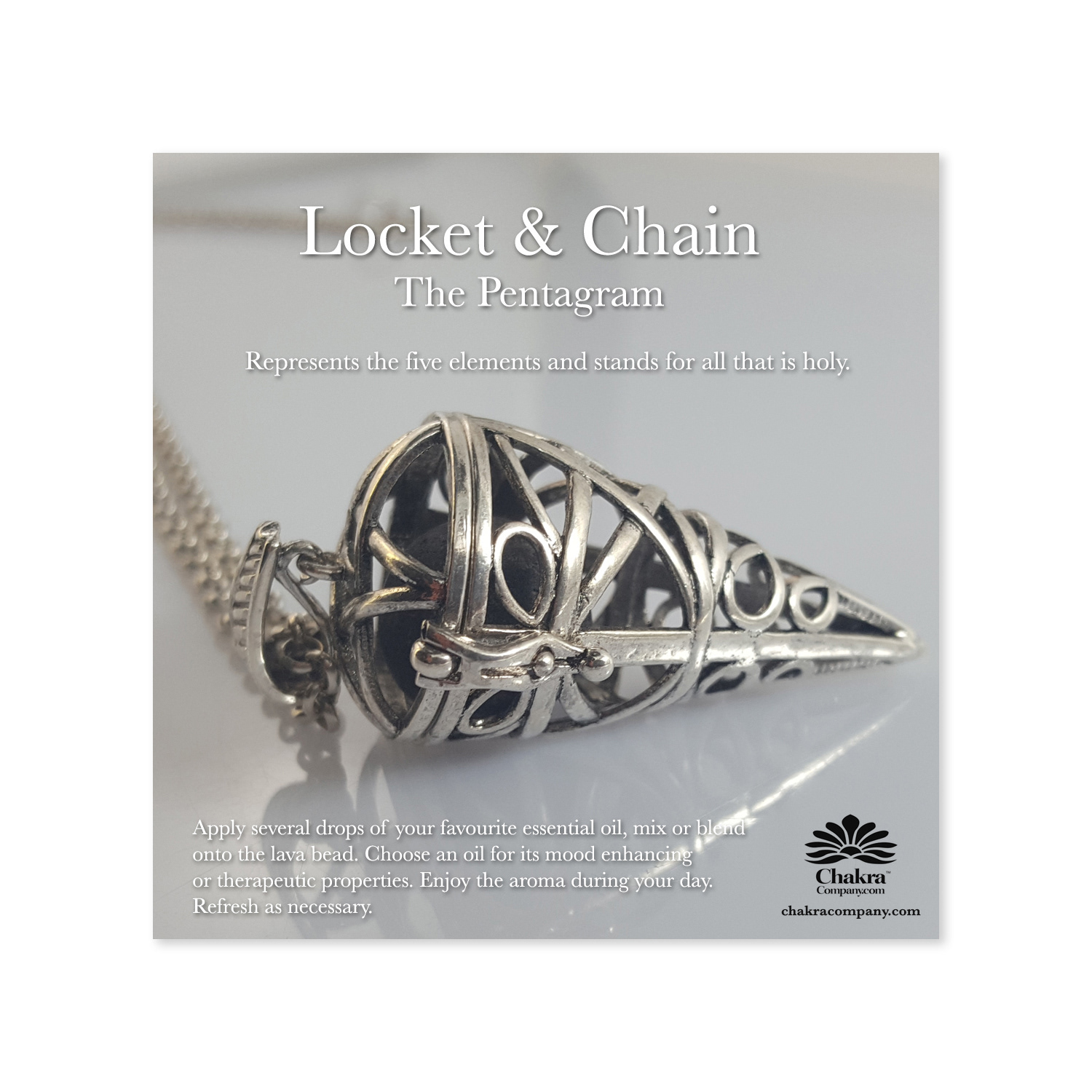
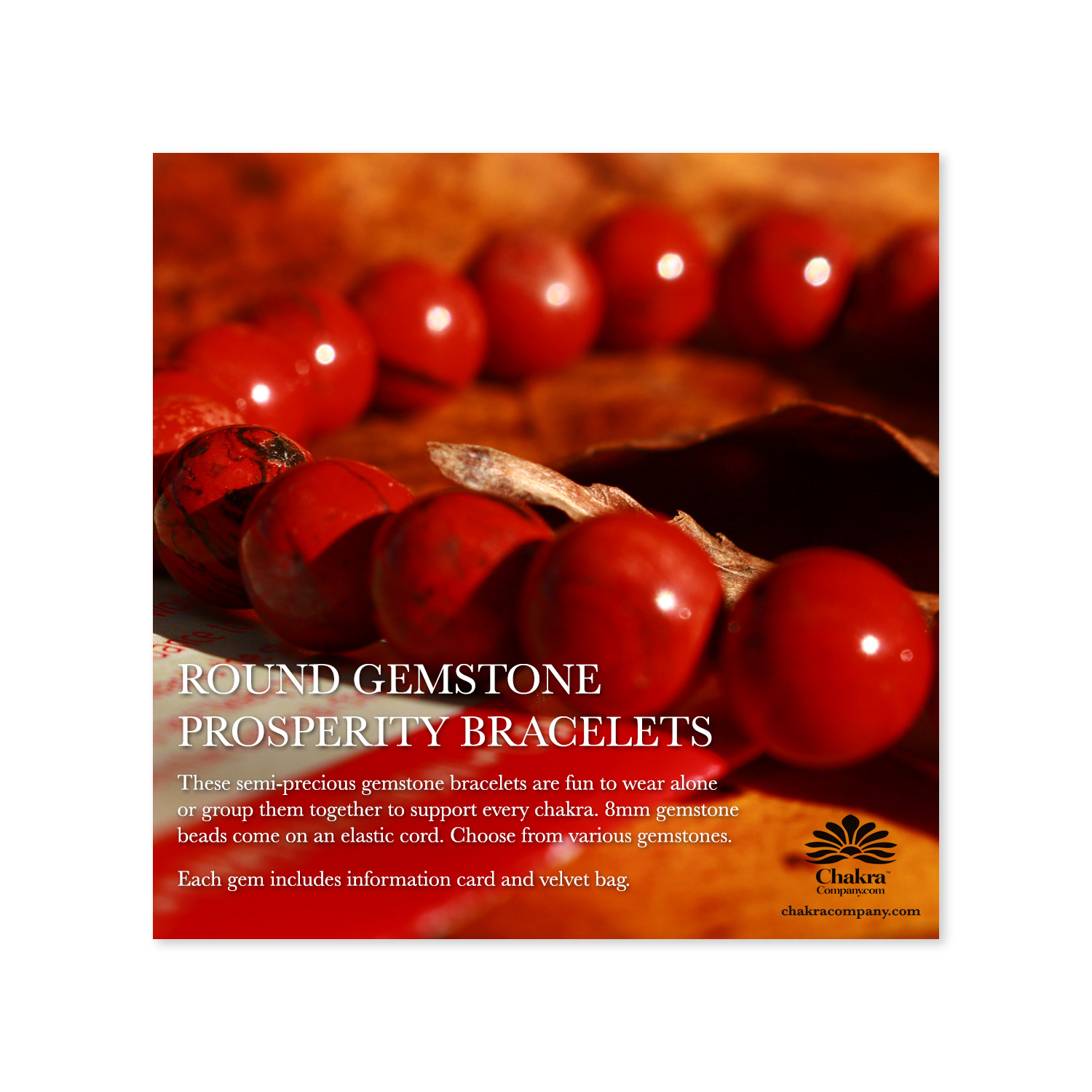
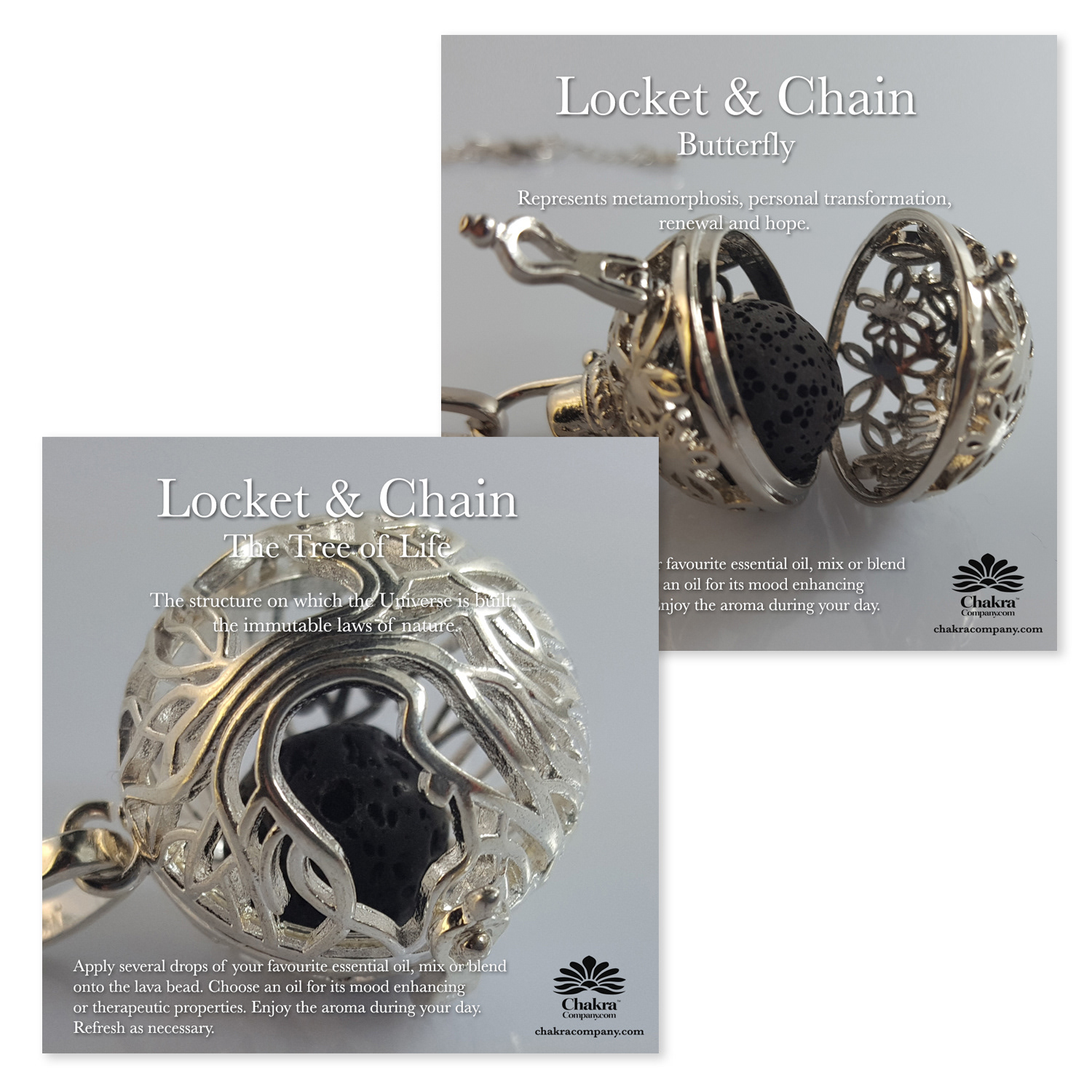
The Chakra Company Social Media Post
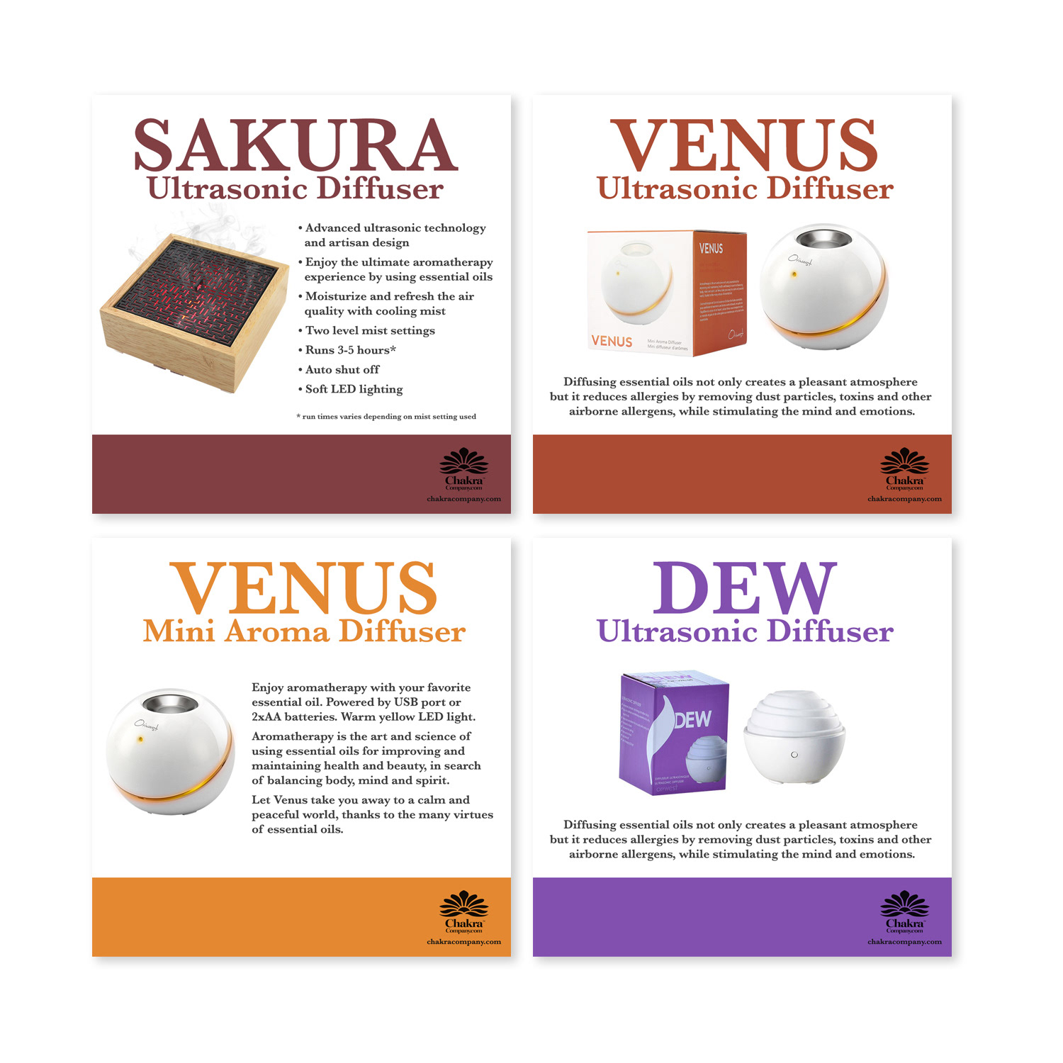
The Chakra Company Social Media Post
PHOTOGRAPHY
In-House Product Photography
Professional Light-Box Captures
In-House Product Photography
Professional Light-Box Captures
Utilizing a professional light-box setup, I meticulously captured high-quality, studio-grade photographs of products, ensuring perfect lighting, sharp detail, accurate colour reproduction, and clean backgrounds that highlighted every feature and texture. These images served as essential brand assets, seamlessly integrated into social media posts, website product pages, email campaigns, catalogues, brochures, and other digital and print marketing materials.
By controlling every aspect of the shoot—from composition and angles to exposure and post-production retouching—I delivered consistent, polished visuals that elevated the overall brand presentation, strengthened product appeal, and boosted customer engagement across all channels. This in-house approach provided cost-effective flexibility, rapid turnaround, and complete creative control, resulting in imagery that authentically conveyed quality, craftsmanship, and the premium essence of the products.
This work demonstrates expertise in in-house product photography, light-box studio setup, high-resolution e-commerce imagery, brand-consistent product shots, multi-channel visual assets, photo retouching & colour accuracy, wellness & retail product photography, and strategic visual storytelling for consumer goods, health, and lifestyle brands.
The Chakra Company Social Media Post