GOVERNMENT COMMUNICATION DESIGN
Environmental Assessment Office & Provincial Health Officer B.C. Ministry of Environment and Climate Change Strategy
Environmental Assessment Office & Provincial Health Officer B.C. Ministry of Environment and Climate Change Strategy
Situation
The Environmental Assessment Office (EAO) and the Provincial Health Officer required clear, professional, and compliant visual materials to communicate complex regulatory processes and critical public health information to diverse audiences, including Indigenous communities, government partners, and the public. During the COVID-19 pandemic, there was an urgent need for authoritative, easy-to-understand posters for government facilities across British Columbia.
The Environmental Assessment Office (EAO) and the Provincial Health Officer required clear, professional, and compliant visual materials to communicate complex regulatory processes and critical public health information to diverse audiences, including Indigenous communities, government partners, and the public. During the COVID-19 pandemic, there was an urgent need for authoritative, easy-to-understand posters for government facilities across British Columbia.
Solution
As Lead Designer for Hazel Bishop Graphics, I designed high-impact communication assets that simplified complex information while strictly adhering to provincial brand guidelines and maintaining public trust.
As Lead Designer for Hazel Bishop Graphics, I designed high-impact communication assets that simplified complex information while strictly adhering to provincial brand guidelines and maintaining public trust.
Execution
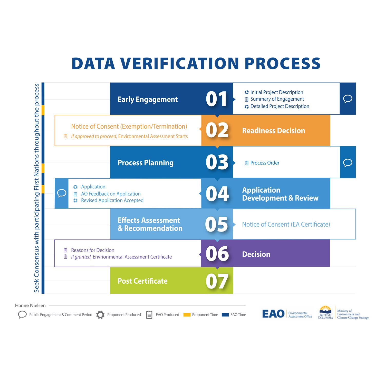
Data Verification Process Chart: Transformed a dense, technical process into a clean, colour-coded, easy-to-follow visual using intuitive icons, clear flow structure, and the official provincial colour palette.
Data Verification Process Chart: Transformed a dense, technical process into a clean, colour-coded, easy-to-follow visual using intuitive icons, clear flow structure, and the official provincial colour palette.
Public Health Posters: Created a series of calm, authoritative print posters for high-traffic government facilities, featuring reassuring typography, simple icons, carefully selected colours, and concise messaging based on the Provincial Health Officer’s directives.
Ensured all materials were suitable for both print and digital use while maintaining full compliance with government standards.
Result
The redesigned process chart dramatically improved readability and public understanding of the environmental assessment process. The COVID-19 public health posters provided clear, consistent guidance to staff and visitors across British Columbia, contributing to safer government environments. Both projects strengthened trust in provincial communications and demonstrated effective visual simplification of complex regulatory and health information.
The redesigned process chart dramatically improved readability and public understanding of the environmental assessment process. The COVID-19 public health posters provided clear, consistent guidance to staff and visitors across British Columbia, contributing to safer government environments. Both projects strengthened trust in provincial communications and demonstrated effective visual simplification of complex regulatory and health information.
PRINT DESIGN
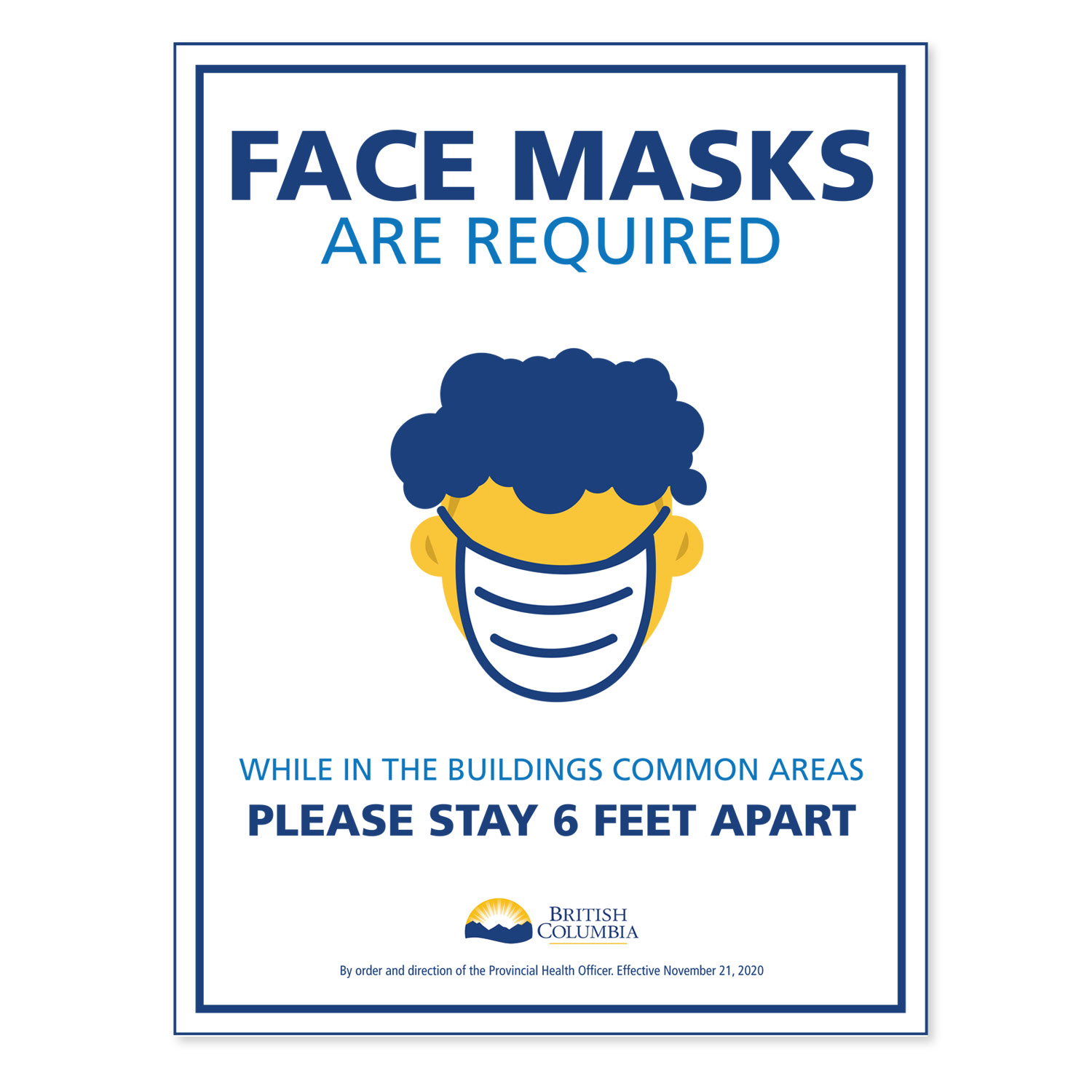
Compliant Public Health Posters COVID-19 Safety Campaign for B.C. Government Facilities
Compliant Public Health Posters COVID-19 Safety Campaign for B.C. Government Facilities
Situation
During the height of the COVID-19 pandemic, the Provincial Health Officer and the B.C. Government needed clear, authoritative, and visually consistent public health posters to promote safety protocols in high-traffic government facilities across the province.
During the height of the COVID-19 pandemic, the Provincial Health Officer and the B.C. Government needed clear, authoritative, and visually consistent public health posters to promote safety protocols in high-traffic government facilities across the province.
Solution
I designed a series of impactful public health posters that communicated essential safety guidelines in a calm, professional, and highly readable manner while strictly adhering to provincial branding standards.
I designed a series of impactful public health posters that communicated essential safety guidelines in a calm, professional, and highly readable manner while strictly adhering to provincial branding standards.
Execution
• Created multiple poster designs in Adobe Illustrator, following the official BC Government Branding Style Guide for typography, colour palette, logo usage, and tone.
• Focused on essential messaging including mask-wearing, physical distancing, hand hygiene, symptom reporting, and capacity limits.
• Used simple yet powerful icons, high-contrast layouts, and reassuring aesthetics optimized for visibility from a distance.
• Tailored the visuals for different audiences (staff, visitors, and the general public) while maintaining consistency across all government facilities.
Result
The posters provided clear, trustworthy guidance that helped reduce transmission risk in government buildings. They reinforced official public health messaging, maintained strong brand compliance, and served as an effective visual tool in supporting province-wide safety efforts during a critical period.
The posters provided clear, trustworthy guidance that helped reduce transmission risk in government buildings. They reinforced official public health messaging, maintained strong brand compliance, and served as an effective visual tool in supporting province-wide safety efforts during a critical period.