Flair People
Lead Designer // 2019
Lead Designer // 2019
THE PROJECT
Branding & Website Refresh
Crafting Impactful Identities, Reimagining Success
Branding & Website Refresh
Crafting Impactful Identities, Reimagining Success
Situation
Flair People, a dynamic provider of event staff for half marathons, world championships, beer tents, music concerts, and promotional tours across the UK, needed a rebranding strategy to better reflect the company's vision and ambitions.
Flair People, a dynamic provider of event staff for half marathons, world championships, beer tents, music concerts, and promotional tours across the UK, needed a rebranding strategy to better reflect the company's vision and ambitions.
Solution
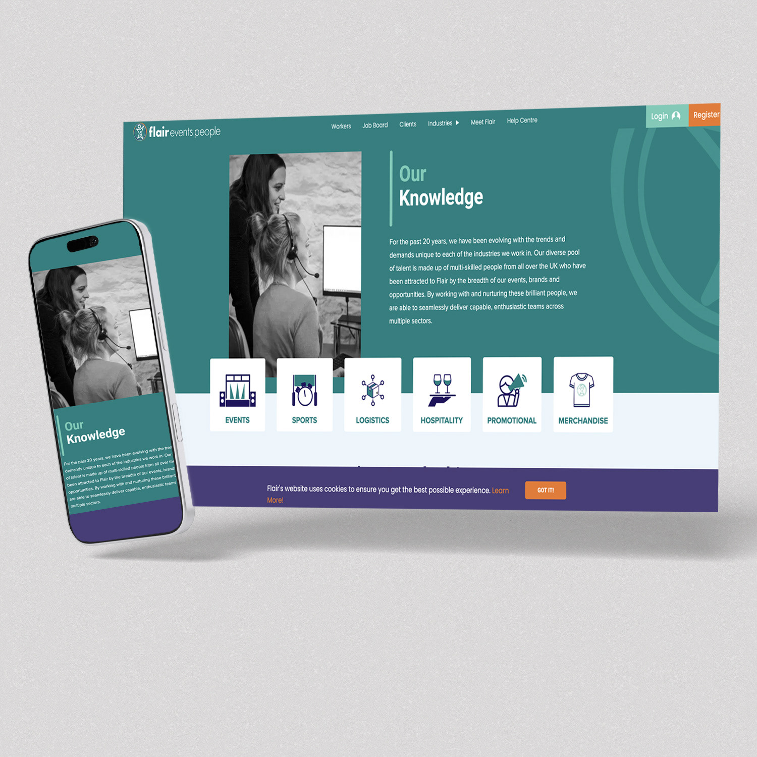
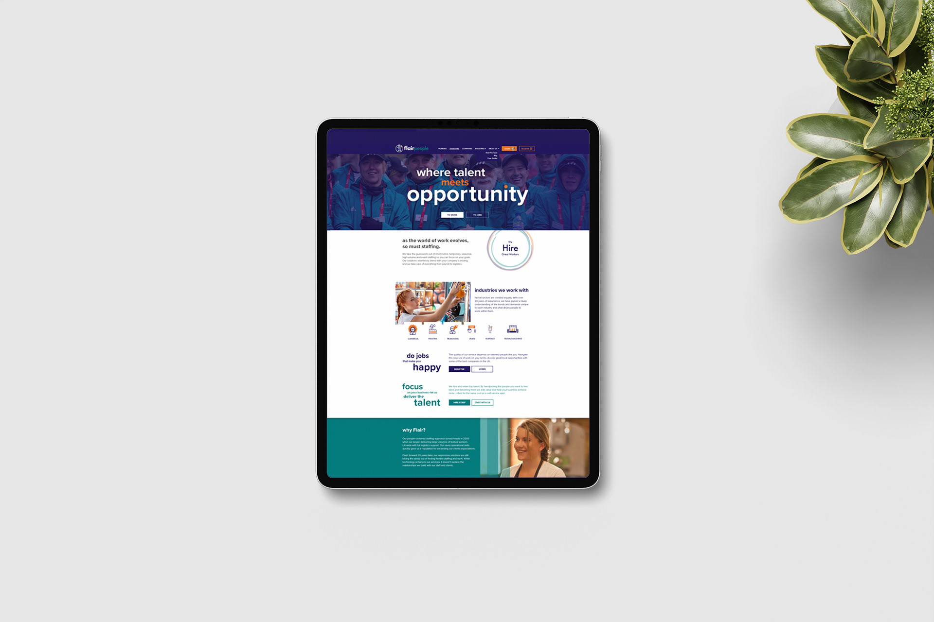
Working closely with the client, I shaped and refined Flair People's visual identity to match her vision, delivering a comprehensive rebrand that included a modernized logo, a detailed brand style guide, custom icons, email templates, HTML signatures, and website layouts, all executed in Figma.
Working closely with the client, I shaped and refined Flair People's visual identity to match her vision, delivering a comprehensive rebrand that included a modernized logo, a detailed brand style guide, custom icons, email templates, HTML signatures, and website layouts, all executed in Figma.
Execution
Built the new logo on the "person icon" from the company's predecessor mark, introducing a new font, a vibrant colour scheme, and various circle graphics to bring the client's vision to life. I carried that refreshed identity through every supporting asset, from custom icons to email templates and HTML signatures, and into a full website redesign, finalizing a cohesive look and feel across every touchpoint.
Built the new logo on the "person icon" from the company's predecessor mark, introducing a new font, a vibrant colour scheme, and various circle graphics to bring the client's vision to life. I carried that refreshed identity through every supporting asset, from custom icons to email templates and HTML signatures, and into a full website redesign, finalizing a cohesive look and feel across every touchpoint.
Result
A modernized, cohesive brand identity that carried through web, email, and everyday communications, giving Flair People a consistent, professional presence across every touchpoint.
A modernized, cohesive brand identity that carried through web, email, and everyday communications, giving Flair People a consistent, professional presence across every touchpoint.






BRANDING DESIGN
Logo Refresh & Brand Style Guide
Shaping Visual Excellence, Guiding Brand Identity
Logo Refresh & Brand Style Guide
Shaping Visual Excellence, Guiding Brand Identity
Situation
Building on the existing identity, Flair People wanted a logo refresh that still felt familiar to their audience, paired with clear guidelines to keep the brand consistent across every platform.
Building on the existing identity, Flair People wanted a logo refresh that still felt familiar to their audience, paired with clear guidelines to keep the brand consistent across every platform.
Solution
Revitalized the logo by integrating the iconic "person" element from the original mark, introducing a circle graphic element and strategically placing the typography, then developed a comprehensive brand style guide to support it.
Revitalized the logo by integrating the iconic "person" element from the original mark, introducing a circle graphic element and strategically placing the typography, then developed a comprehensive brand style guide to support it.
Execution
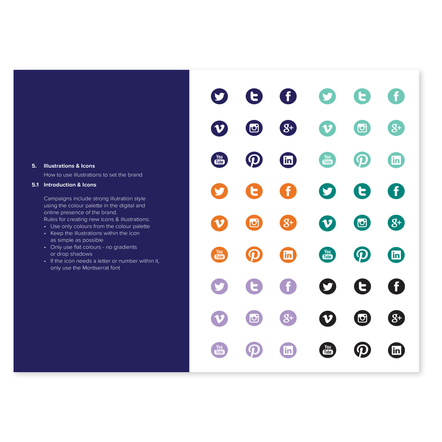
Once the revised logo was approved, I developed a brand style guide detailing fonts, typography, colour palette, icons, and design elements, serving as the rulebook that defined the brand's cohesive look and feel.
Once the revised logo was approved, I developed a brand style guide detailing fonts, typography, colour palette, icons, and design elements, serving as the rulebook that defined the brand's cohesive look and feel.
Result
Gave Flair People a recognizable brand identity that could be applied seamlessly across every platform.
View brand guideline
Gave Flair People a recognizable brand identity that could be applied seamlessly across every platform.
View brand guideline


Brand Style Guide


Brand Style Guide

ICON, ILLUSTRATION & CHART DESIGN
Simplified Graphical Representation
Simplifying Messages, Sparking Action
Simplified Graphical Representation
Simplifying Messages, Sparking Action
Situation
Flair People's website and email campaigns had to present a lot of information in limited space. Text-heavy layouts made it harder for visitors and candidates to understand the services on offer, find their way around, and grasp the value of a flexible staffing partner.
Flair People's website and email campaigns had to present a lot of information in limited space. Text-heavy layouts made it harder for visitors and candidates to understand the services on offer, find their way around, and grasp the value of a flexible staffing partner.
Solution
Using my digital illustration skills, I developed a custom visual toolkit of icons, original vector illustrations, and charts that replaced text-heavy elements with clear, recognizable visuals, each built to convey a specific meaning or prompt a specific action.
Using my digital illustration skills, I developed a custom visual toolkit of icons, original vector illustrations, and charts that replaced text-heavy elements with clear, recognizable visuals, each built to convey a specific meaning or prompt a specific action.
Execution
Designed a custom icon series, tailored so each of the industries Flair People serves was represented distinctly and intuitive at a glance, supporting seamless navigation across the site. I also created original vector illustrations for the email templates, using a bold, flat style and the brand's teal, purple, and orange palette to bring each message to life, such as a bartender scene for hospitality staffing. For the charts, I turned a core selling point into a single visual: an animated graph of a client's staffing needs over time, showing Flair People's staff covering the peaks above the client's own baseline team, so the service was understood in seconds.
Designed a custom icon series, tailored so each of the industries Flair People serves was represented distinctly and intuitive at a glance, supporting seamless navigation across the site. I also created original vector illustrations for the email templates, using a bold, flat style and the brand's teal, purple, and orange palette to bring each message to life, such as a bartender scene for hospitality staffing. For the charts, I turned a core selling point into a single visual: an animated graph of a client's staffing needs over time, showing Flair People's staff covering the peaks above the client's own baseline team, so the service was understood in seconds.
Result
Streamlined comprehension and navigation, gave the email campaigns a distinctive, on-brand visual personality, and let visitors grasp messages and take action faster.
Streamlined comprehension and navigation, gave the email campaigns a distinctive, on-brand visual personality, and let visitors grasp messages and take action faster.





HTML DESIGN
Email Signatures & Email Templates
Seamless Signatures, Everywhere You Go
Email Signatures & Email Templates
Seamless Signatures, Everywhere You Go
Situation
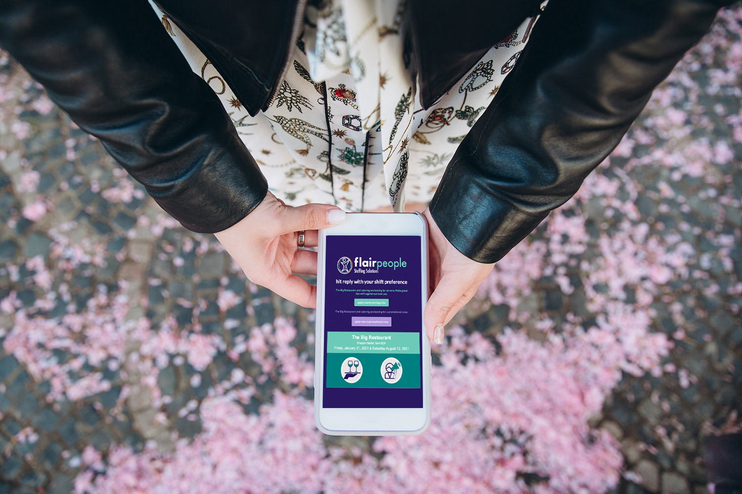
Flair People needed email signatures that elevated the company's professional image and encouraged engagement from every message sent. It also needed a way to reach its database of potential employees with new openings and encourage them to apply, using templates that team members could update themselves without a designer.
Flair People needed email signatures that elevated the company's professional image and encouraged engagement from every message sent. It also needed a way to reach its database of potential employees with new openings and encourage them to apply, using templates that team members could update themselves without a designer.
Solution
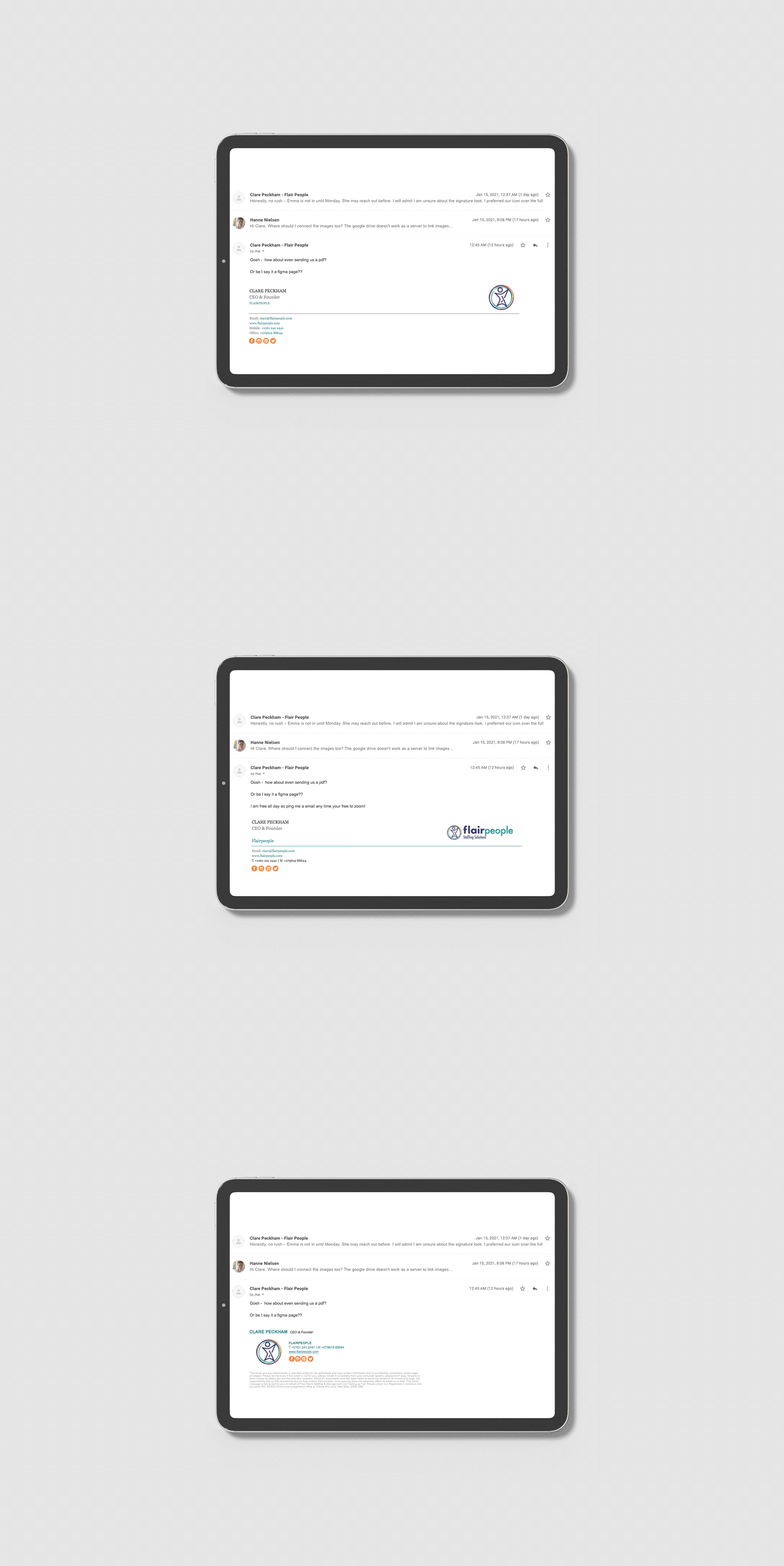
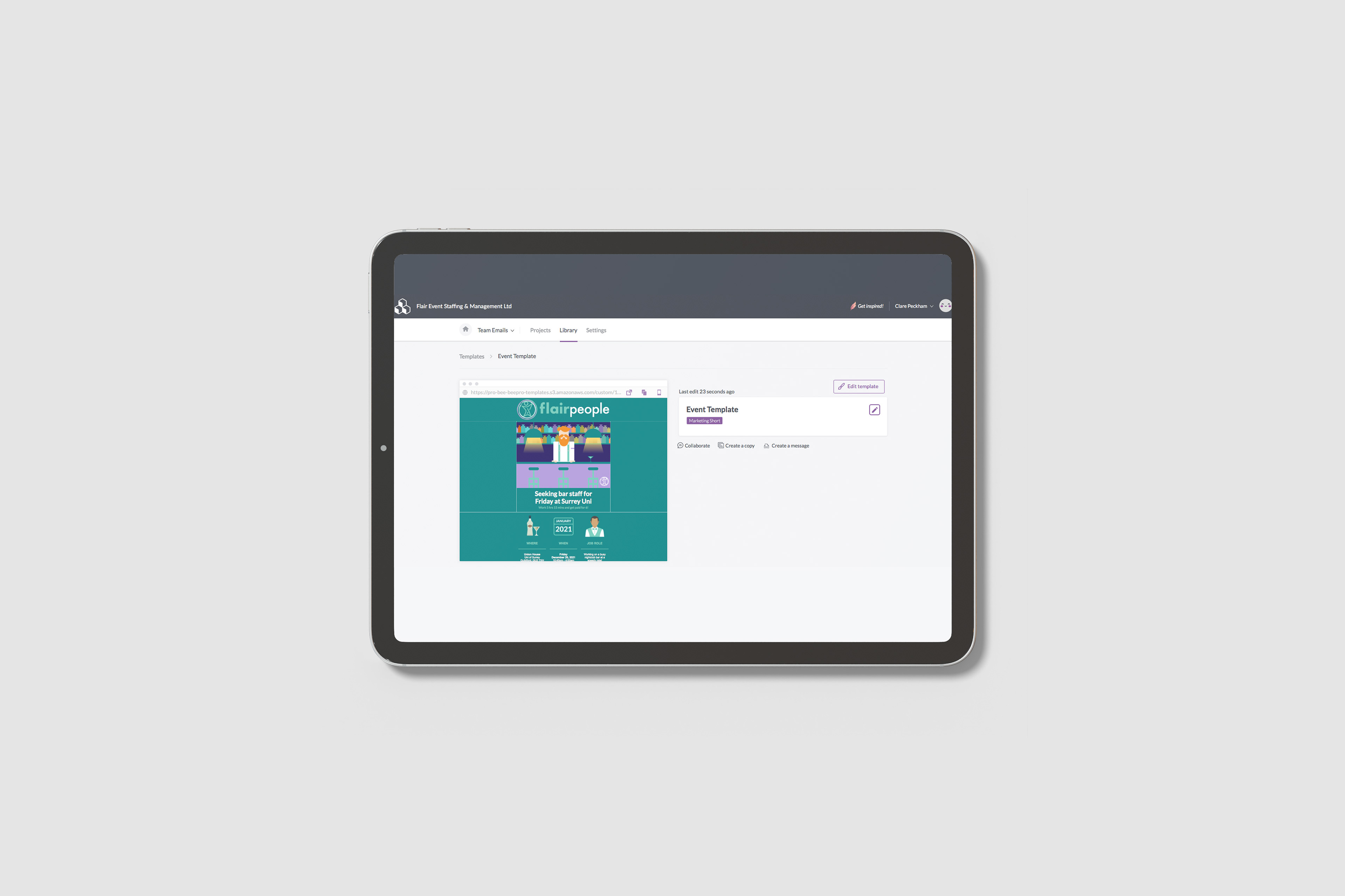
Using HTML and CSS, I crafted bespoke email signatures that combined interactive links, icons, and brand-specific colours, built to feel like a small piece of the website rather than a flat graphic. I also built Mailchimp email templates designed for the team to update on their own.
Using HTML and CSS, I crafted bespoke email signatures that combined interactive links, icons, and brand-specific colours, built to feel like a small piece of the website rather than a flat graphic. I also built Mailchimp email templates designed for the team to update on their own.
Execution
Optimized the signatures for performance by compressing the designs for faster loading without sacrificing quality. I made them fully responsive and tested them across a variety of devices and email clients, so the display stayed consistent and the brand stayed intact wherever they were opened. For the email campaigns, I created on-brand Mailchimp templates that other team members could edit, so job openings could go out quickly without a design bottleneck.
Optimized the signatures for performance by compressing the designs for faster loading without sacrificing quality. I made them fully responsive and tested them across a variety of devices and email clients, so the display stayed consistent and the brand stayed intact wherever they were opened. For the email campaigns, I created on-brand Mailchimp templates that other team members could edit, so job openings could go out quickly without a design bottleneck.
Result
Professional, interactive signatures that strengthened brand consistency and supported engagement in every email. The templates let the team keep candidates informed about new openings and encouraged them to apply.
Professional, interactive signatures that strengthened brand consistency and supported engagement in every email. The templates let the team keep candidates informed about new openings and encouraged them to apply.