DoMatcha
Marketing Art Director // 2024–2026
Marketing Art Director // 2024–2026
Situation
DōMatcha offers authentic, stone-ground Japanese green tea products and accessories. The company seeks to drive inventory reorders and in-store demos for grocery retailers and natural health buyers across North America while maintaining a premium, consistent brand identity.
DōMatcha offers authentic, stone-ground Japanese green tea products and accessories. The company seeks to drive inventory reorders and in-store demos for grocery retailers and natural health buyers across North America while maintaining a premium, consistent brand identity.
Solution
As Marketing Art Director, I lead the design of B2B email campaigns, digital assets, and brand visuals, ensuring all materials support retailer engagement, product education, and measurable sales outcomes.
As Marketing Art Director, I lead the design of B2B email campaigns, digital assets, and brand visuals, ensuring all materials support retailer engagement, product education, and measurable sales outcomes.
Execution
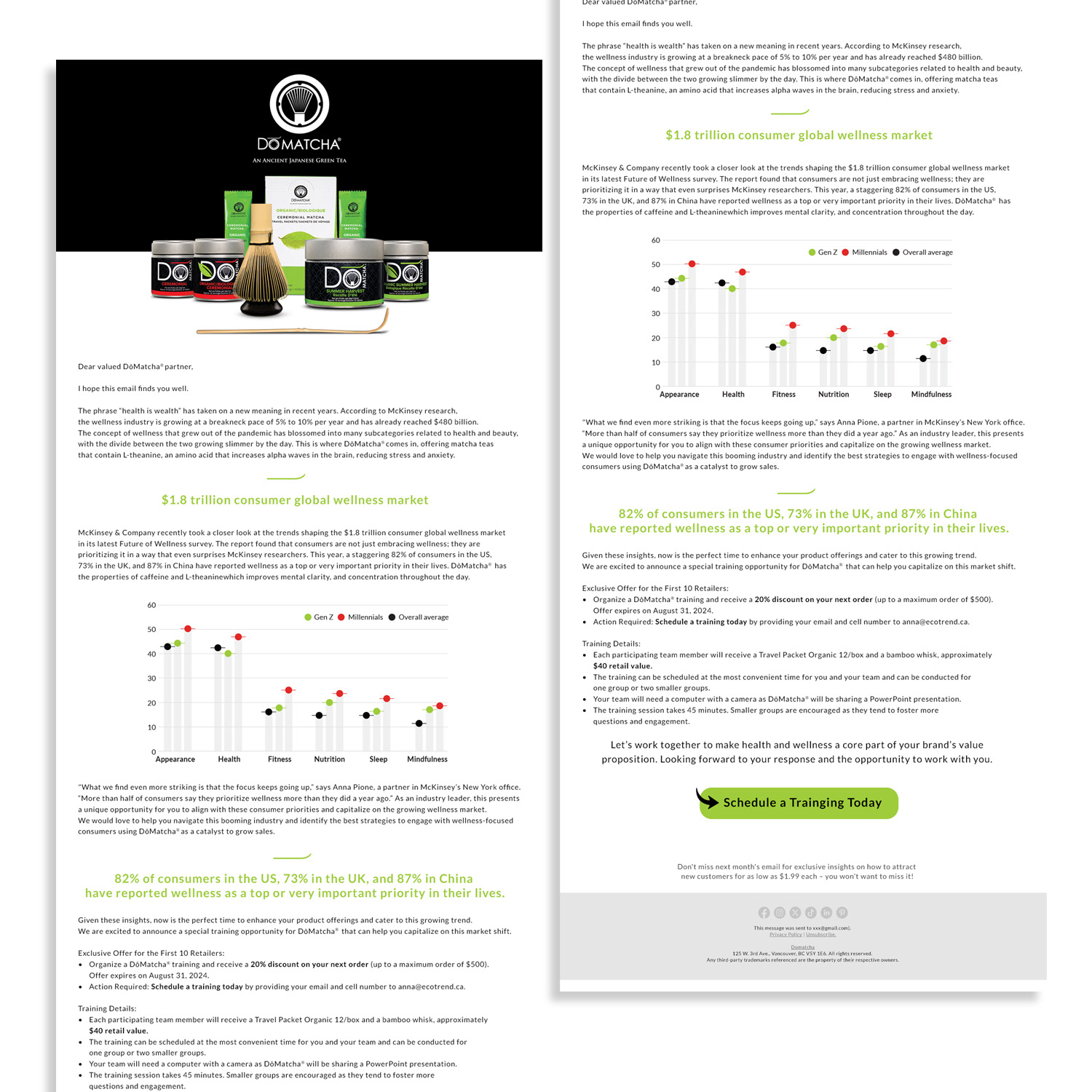
I design high-impact monthly email campaigns with animated modules, interactive charts, bold product visuals, and strategic calls-to-action. Layouts prioritize readability, aesthetics, and cross-device usability, with continuous optimization informed by engagement metrics, consumer demand insights, and site analytics.
I design high-impact monthly email campaigns with animated modules, interactive charts, bold product visuals, and strategic calls-to-action. Layouts prioritize readability, aesthetics, and cross-device usability, with continuous optimization informed by engagement metrics, consumer demand insights, and site analytics.
I also create graphics, icons, and illustrations for websites, social media, advertisements, and other digital materials, ensuring consistent adherence to DōMatcha’s brand guidelines. I collaborate closely with marketing managers, content creators, programmers, and designers to refine campaigns and digital experiences.
Result
These campaigns boost retailer engagement, increase inventory reorders, and secure in-store demo bookings while maintaining DōMatcha’s premium brand presence. Open rates, click-throughs, and conversions improve month over month, solidifying the company’s position as a leader in specialty tea and wellness products.
These campaigns boost retailer engagement, increase inventory reorders, and secure in-store demo bookings while maintaining DōMatcha’s premium brand presence. Open rates, click-throughs, and conversions improve month over month, solidifying the company’s position as a leader in specialty tea and wellness products.
Key Skills & Expertise
B2B email campaign design, animated email production, interactive chart integration, data-informed optimization, retail trade marketing, motion graphics, and brand-consistent digital asset creation.
B2B email campaign design, animated email production, interactive chart integration, data-informed optimization, retail trade marketing, motion graphics, and brand-consistent digital asset creation.
OOH ADVERTISING
Gardiner Expressway Digital Billboard
Gardiner Expressway Digital Billboard
Situation
DōMatcha aims to increase brand awareness and elevate its premium ceremonial matcha presence in Toronto’s high-traffic urban market.
DōMatcha aims to increase brand awareness and elevate its premium ceremonial matcha presence in Toronto’s high-traffic urban market.
Solution
As Marketing Art Director, I am responsible for designing a large-format digital billboard that captures attention, communicates brand values, and drives traffic to retail partners and the online store.
As Marketing Art Director, I am responsible for designing a large-format digital billboard that captures attention, communicates brand values, and drives traffic to retail partners and the online store.
Execution
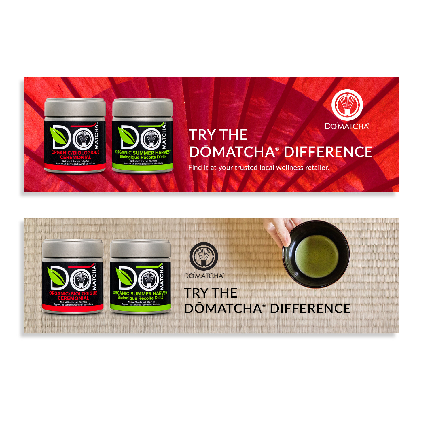
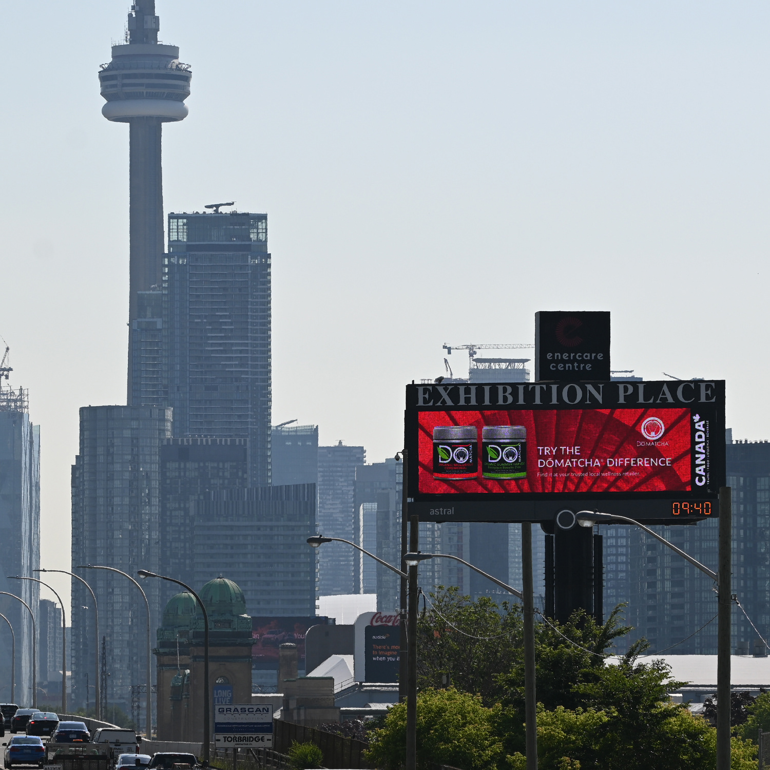
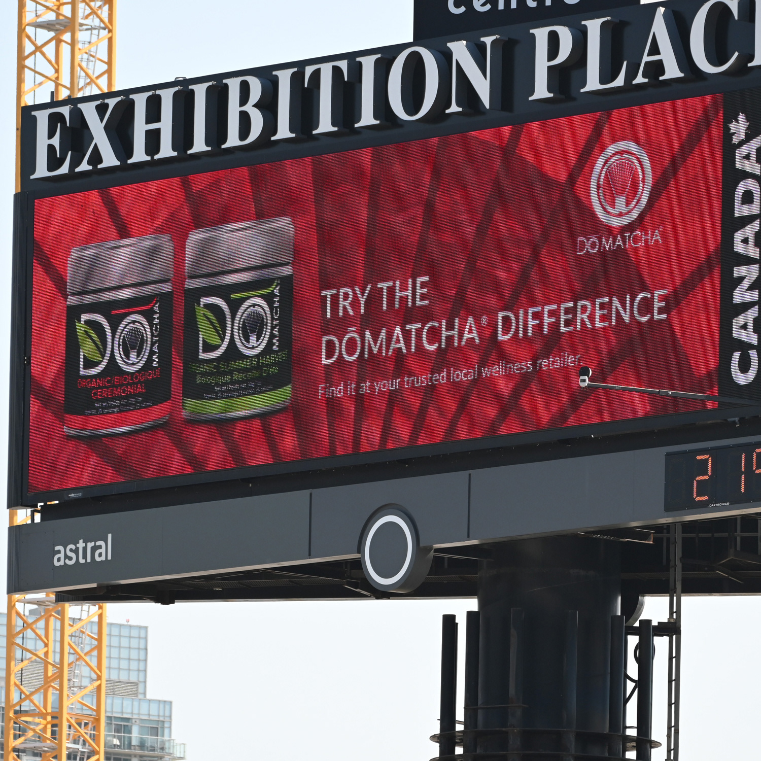
I design a 14' x 48' digital billboard featuring a vibrant red Japanese paper umbrella as the hero image, symbolizing tradition, elegance, and cultural authenticity. I integrate premium matcha product imagery, clean minimalist typography, and bold messaging to communicate quality, purity, and exclusivity. The layout and color contrast are optimized for maximum visibility at highway speeds, ensuring the design stands out against the Toronto skyline.
I design a 14' x 48' digital billboard featuring a vibrant red Japanese paper umbrella as the hero image, symbolizing tradition, elegance, and cultural authenticity. I integrate premium matcha product imagery, clean minimalist typography, and bold messaging to communicate quality, purity, and exclusivity. The layout and color contrast are optimized for maximum visibility at highway speeds, ensuring the design stands out against the Toronto skyline.
Result
The billboard generates high brand recall and consumer interest, reinforcing DōMatcha’s positioning as the premium choice in ceremonial matcha. Its strategic placement and eye-catching cultural storytelling drive awareness, curiosity, and increased traffic to both retail partners and the DōMatcha online store.
The billboard generates high brand recall and consumer interest, reinforcing DōMatcha’s positioning as the premium choice in ceremonial matcha. Its strategic placement and eye-catching cultural storytelling drive awareness, curiosity, and increased traffic to both retail partners and the DōMatcha online store.
Key Skills & Expertise
Outdoor billboard design, large-format digital advertising, high-traffic urban marketing, cultural branding, hero imagery integration, minimalist typography, and brand-consistent creative for food, beverage, and wellness industries.
Outdoor billboard design, large-format digital advertising, high-traffic urban marketing, cultural branding, hero imagery integration, minimalist typography, and brand-consistent creative for food, beverage, and wellness industries.
EMAIL DESIGN
Animated Email & Data-Driven B2B Campaigns
Animated Email & Data-Driven B2B Campaigns
Situation
DōMatcha seeks to increase inventory reorders and in-store demo bookings for its authentic Japanese ceremonial-grade matcha among grocery retailers and natural health buyers across North America.
DōMatcha seeks to increase inventory reorders and in-store demo bookings for its authentic Japanese ceremonial-grade matcha among grocery retailers and natural health buyers across North America.
Solution
As Marketing Art Director, I lead the design and execution of monthly B2B email campaigns that educate retail teams, promote products, and drive measurable sales outcomes while maintaining premium brand standards.
As Marketing Art Director, I lead the design and execution of monthly B2B email campaigns that educate retail teams, promote products, and drive measurable sales outcomes while maintaining premium brand standards.
Execution
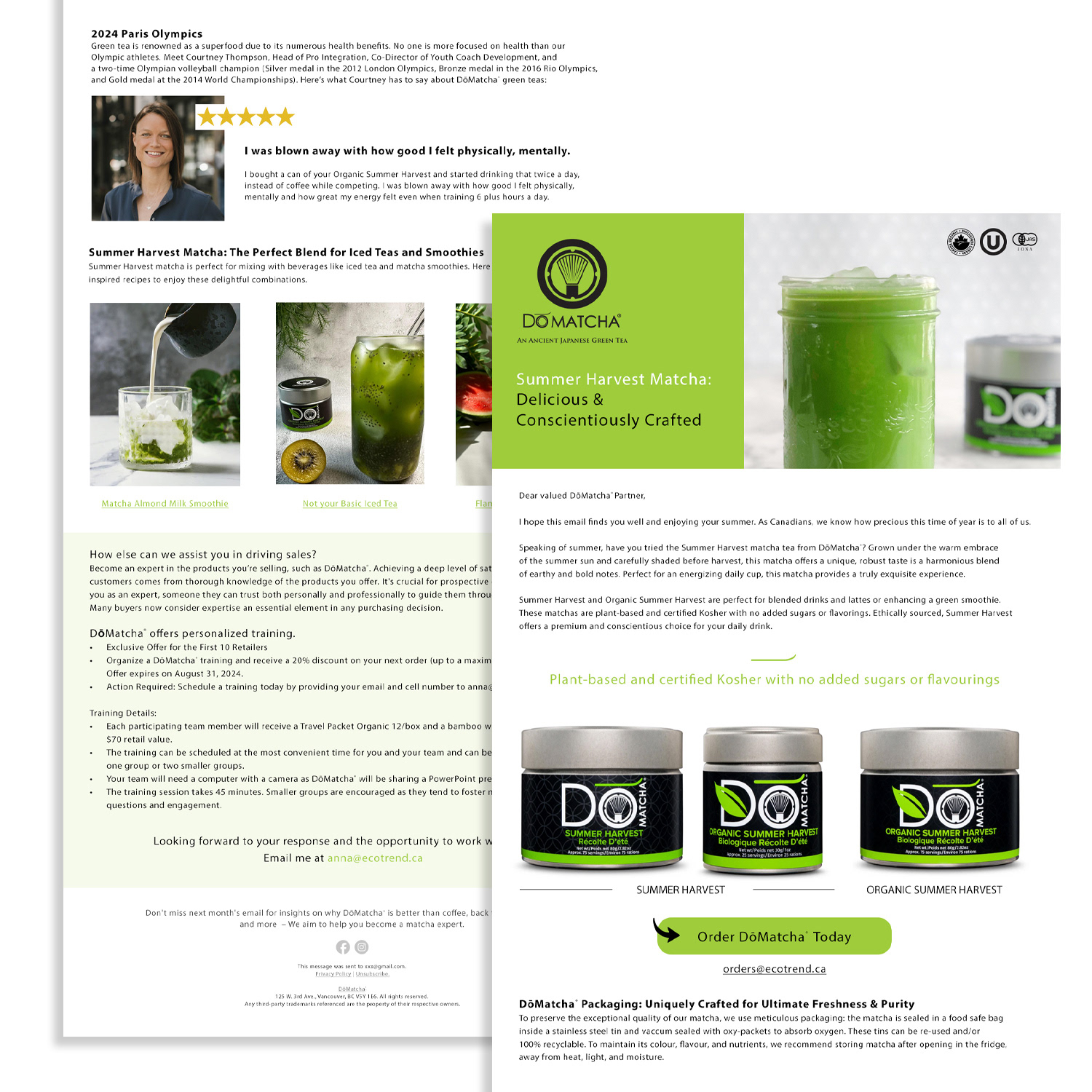
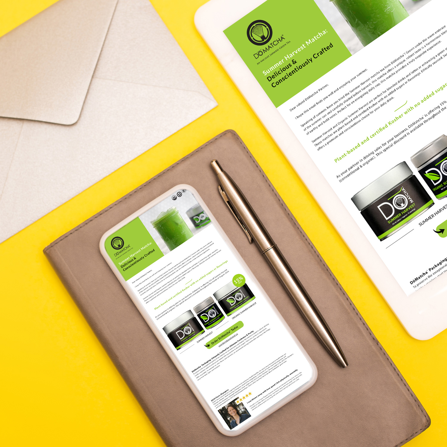
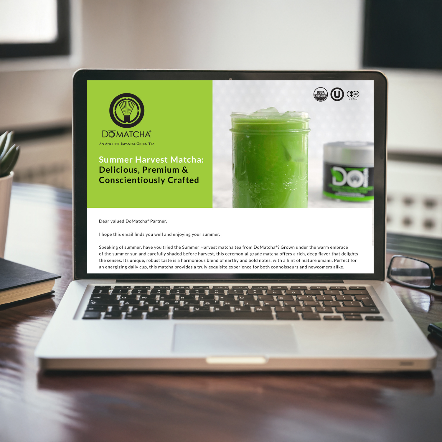
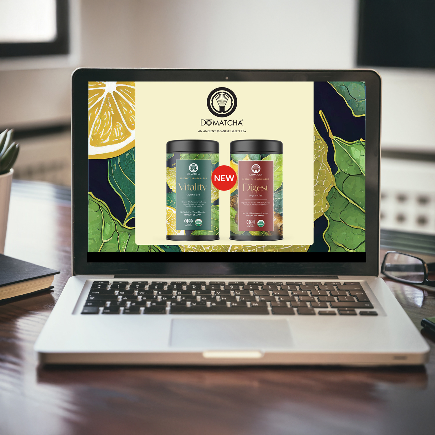
I create visually rich, animated emails featuring dynamic charts, motion graphics, bold product imagery, and clear calls-to-action. Campaigns are continuously optimized using engagement metrics, site analytics, and consumer demand insights. Layouts prioritize readability, mobile responsiveness, and inbox rendering to maximize impact.
I create visually rich, animated emails featuring dynamic charts, motion graphics, bold product imagery, and clear calls-to-action. Campaigns are continuously optimized using engagement metrics, site analytics, and consumer demand insights. Layouts prioritize readability, mobile responsiveness, and inbox rendering to maximize impact.
Result
These campaigns boost inventory reorders, secure in-store demo bookings, and strengthen retailer relationships, increasing shelf presence and sales velocity. Engagement metrics—including open rates, click-throughs, and conversions—improve consistently, solidifying DōMatcha’s position as the premium choice in specialty tea and wellness products.
These campaigns boost inventory reorders, secure in-store demo bookings, and strengthen retailer relationships, increasing shelf presence and sales velocity. Engagement metrics—including open rates, click-throughs, and conversions—improve consistently, solidifying DōMatcha’s position as the premium choice in specialty tea and wellness products.
Key Skills & Expertise
B2B email design, animated email production, data-informed optimization, interactive charts, retail trade marketing, motion graphics, CTA-driven campaigns, and brand-consistent digital marketing for specialty food and wellness brands.
B2B email design, animated email production, data-informed optimization, interactive charts, retail trade marketing, motion graphics, CTA-driven campaigns, and brand-consistent digital marketing for specialty food and wellness brands.
EMAIL DESIGN
Animated B2B Email Campaigns Driving Inventory Reorders & In-Store Demos
Animated B2B Email Campaigns Driving Inventory Reorders & In-Store Demos
Situation
DōMatcha wants to increase inventory reorders and secure in-store demo bookings for its premium Japanese ceremonial matcha among grocery retailers and natural health buyers across North America.
DōMatcha wants to increase inventory reorders and secure in-store demo bookings for its premium Japanese ceremonial matcha among grocery retailers and natural health buyers across North America.
Solution
As Marketing Art Director, I design and launch monthly animated B2B email campaigns that educate retail teams, promote products, and drive measurable wholesale results while maintaining DōMatcha’s premium brand identity.
As Marketing Art Director, I design and launch monthly animated B2B email campaigns that educate retail teams, promote products, and drive measurable wholesale results while maintaining DōMatcha’s premium brand identity.
Execution
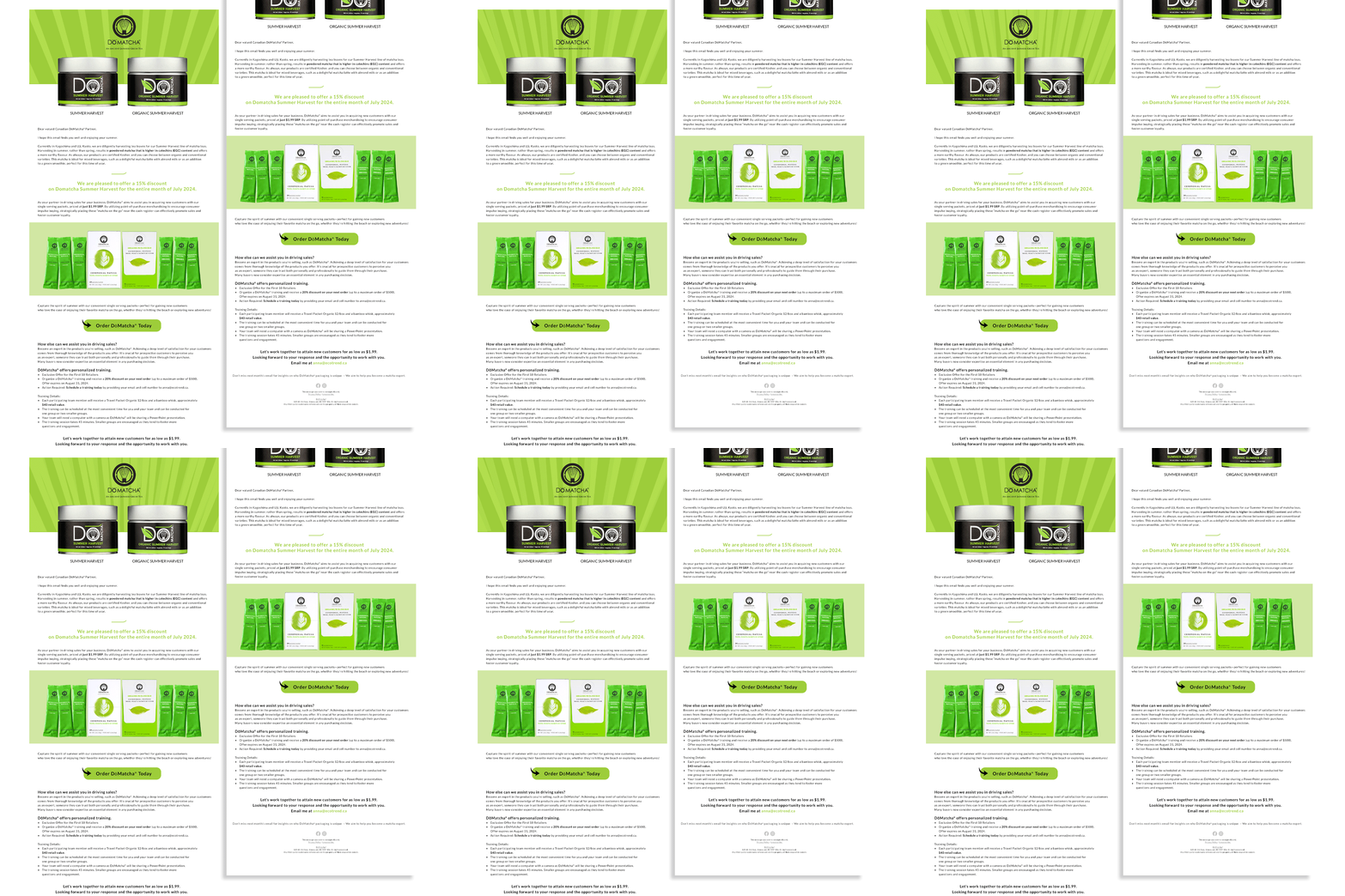
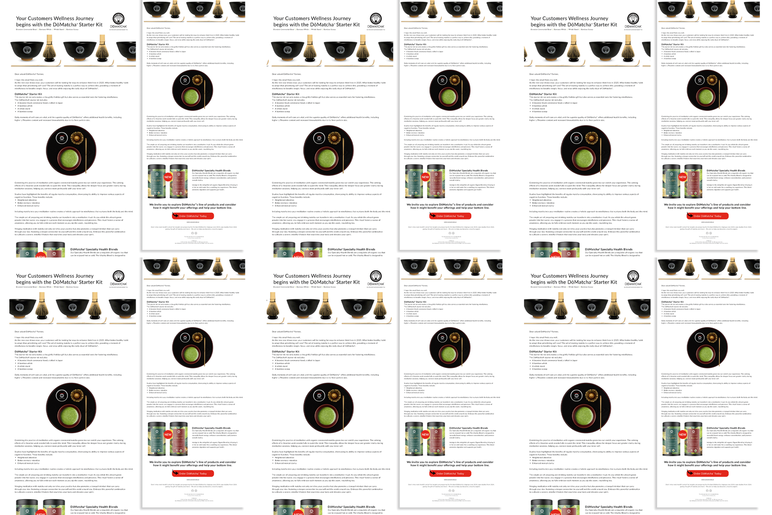
I create motion-driven emails featuring interactive charts, product close-ups, benefit callouts, and smooth animations. Campaigns integrate consumer insights, engagement analytics, and traffic data to optimize content for inbox performance, mobile responsiveness, and maximum engagement. Emails highlight trends, educational matcha facts, and clear calls-to-action, equipping retail staff to confidently recommend products.
I create motion-driven emails featuring interactive charts, product close-ups, benefit callouts, and smooth animations. Campaigns integrate consumer insights, engagement analytics, and traffic data to optimize content for inbox performance, mobile responsiveness, and maximum engagement. Emails highlight trends, educational matcha facts, and clear calls-to-action, equipping retail staff to confidently recommend products.
Result
These campaigns increase inventory reorders, secure demo bookings, and strengthen retailer relationships, boosting shelf presence and wholesale growth. Engagement metrics—including open rates, click-throughs, and conversions—improve consistently, reinforcing DōMatcha’s position as the premium choice in specialty tea and wellness products.
These campaigns increase inventory reorders, secure demo bookings, and strengthen retailer relationships, boosting shelf presence and wholesale growth. Engagement metrics—including open rates, click-throughs, and conversions—improve consistently, reinforcing DōMatcha’s position as the premium choice in specialty tea and wellness products.
Key Skills & Expertise
Animated B2B email design, motion graphics, interactive chart integration, data-driven campaign optimization, retail trade marketing, brand-consistent animation, and results-focused digital marketing for specialty food, beverage, and wellness brands.
Animated B2B email design, motion graphics, interactive chart integration, data-driven campaign optimization, retail trade marketing, brand-consistent animation, and results-focused digital marketing for specialty food, beverage, and wellness brands.
COPYWRITING
Trade Publication Design & Copywriting: Educating & Converting Retail Buyers
Trade Publication Design & Copywriting: Educating & Converting Retail Buyers
Situation
DōMatcha aims to educate natural health and grocery buyers on the benefits of ceremonial-grade matcha and increase wholesale inquiries and in-store demo bookings through trade publications in North America.
DōMatcha aims to educate natural health and grocery buyers on the benefits of ceremonial-grade matcha and increase wholesale inquiries and in-store demo bookings through trade publications in North America.
Solution
As Marketing Art Director, I design and author print advertisements and feature articles that combine compelling, science-backed copy with premium visual storytelling to position DōMatcha as the gold-standard in ceremonial matcha.
As Marketing Art Director, I design and author print advertisements and feature articles that combine compelling, science-backed copy with premium visual storytelling to position DōMatcha as the gold-standard in ceremonial matcha.
Execution
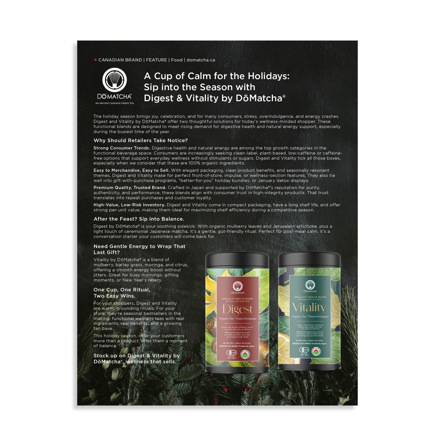
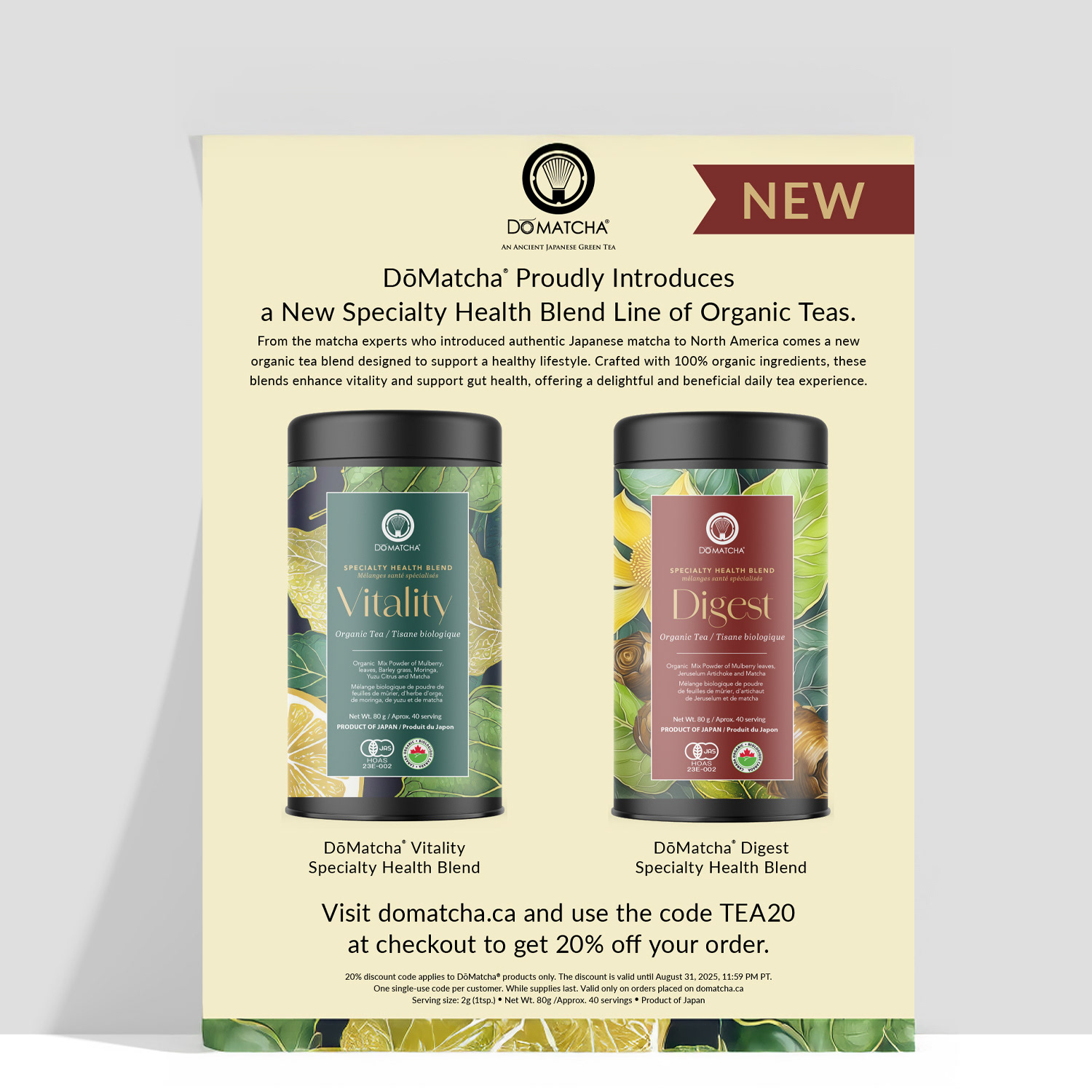
I create elegant, minimalist layouts integrating authentic Japanese-inspired imagery, high-resolution product photography, clean typography, and strategic visual hierarchy. Each piece highlights matcha’s health benefits, ceremonial heritage, and retail potential while guiding readers toward actionable outcomes such as inventory inquiries and demo requests. I ensure brand consistency and credibility across all trade publications.
I create elegant, minimalist layouts integrating authentic Japanese-inspired imagery, high-resolution product photography, clean typography, and strategic visual hierarchy. Each piece highlights matcha’s health benefits, ceremonial heritage, and retail potential while guiding readers toward actionable outcomes such as inventory inquiries and demo requests. I ensure brand consistency and credibility across all trade publications.
Result
These campaigns drive measurable retail engagement, increase wholesale interest, and reinforce DōMatcha’s premium brand authority in the natural products channel. Buyers are better informed, confident in recommending products, and motivated to request demos or reorder inventory.
These campaigns drive measurable retail engagement, increase wholesale interest, and reinforce DōMatcha’s premium brand authority in the natural products channel. Buyers are better informed, confident in recommending products, and motivated to request demos or reorder inventory.
Key Skills & Expertise
Trade publication design, print ad copywriting, ceremonial matcha marketing, minimalist editorial layouts, premium product photography integration, retail trade advertising, bilingual natural health collateral, and results-oriented print marketing for specialty food, beverage, and wellness brands.
Trade publication design, print ad copywriting, ceremonial matcha marketing, minimalist editorial layouts, premium product photography integration, retail trade advertising, bilingual natural health collateral, and results-oriented print marketing for specialty food, beverage, and wellness brands.

SEO SKILLS
Monthly Content Strategy: Educational, SEO-Optimized, Product-Integrated
Monthly Content Strategy: Educational, SEO-Optimized, Product-Integrated
Situation
DōMatcha seeks to establish authority in the premium ceremonial matcha market, educating consumers and driving engagement, traffic, and conversions through monthly blog content.
DōMatcha seeks to establish authority in the premium ceremonial matcha market, educating consumers and driving engagement, traffic, and conversions through monthly blog content.
Solution
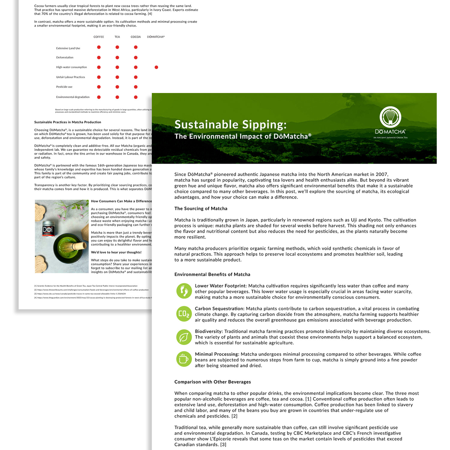
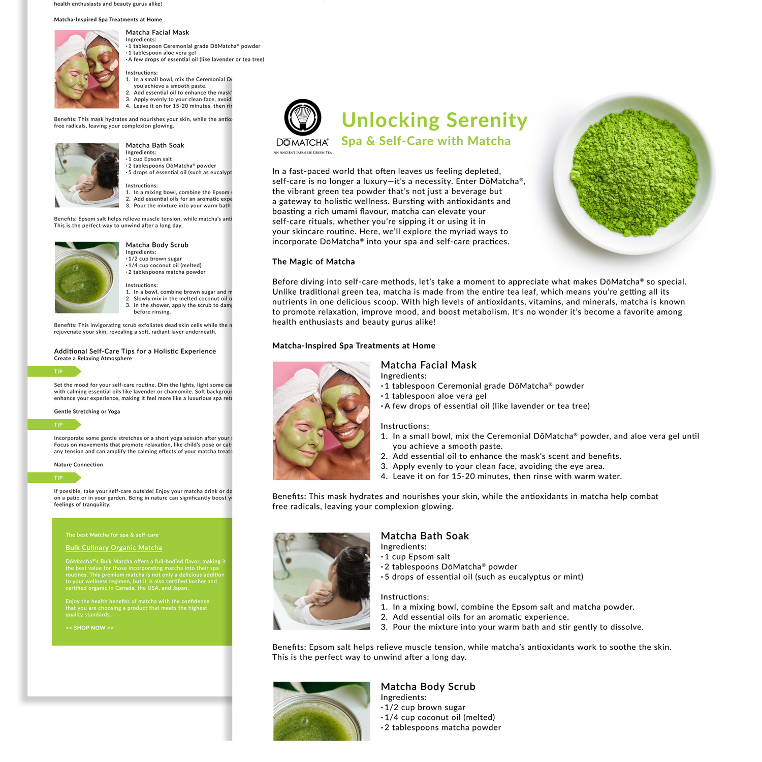
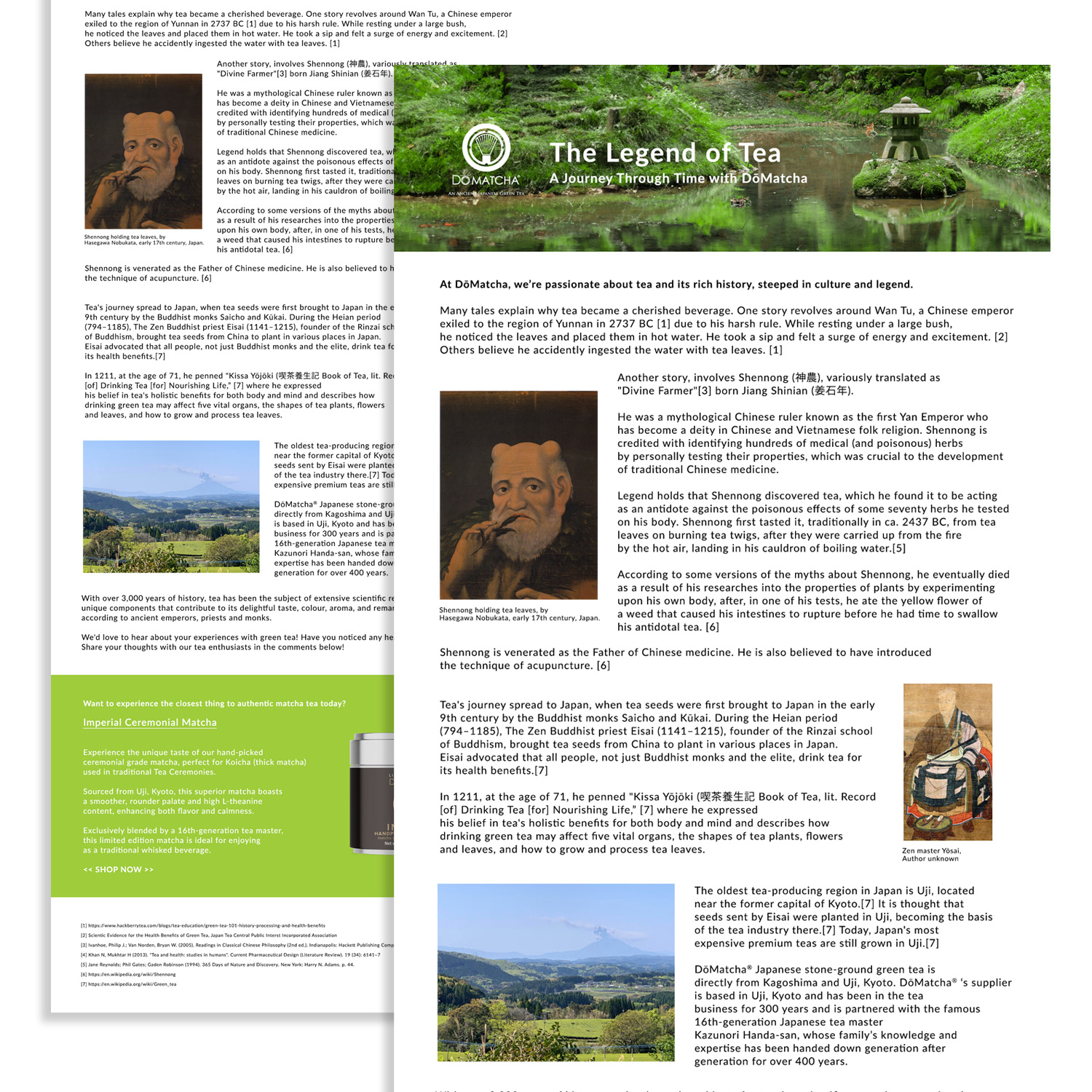
As Marketing Art Director, I lead the end-to-end creation of monthly blogs, combining research, writing, design, and SEO optimization to position DōMatcha as the trusted source for matcha expertise and premium products.
As Marketing Art Director, I lead the end-to-end creation of monthly blogs, combining research, writing, design, and SEO optimization to position DōMatcha as the trusted source for matcha expertise and premium products.
Execution
I produce SEO-optimized educational content covering health benefits, traditional preparation, flavor profiles, sourcing authenticity, and modern recipes. Blogs integrate strategic product links, calls-to-action, and related offerings to drive conversions. I enhance each post with custom infographics, charts, high-quality photography, and illustrations, all optimized for accessibility, mobile responsiveness, and user experience. I structure content for maximum readability using subheads, concise paragraphs, bullet points, internal linking, and targeted keywords to improve search rankings and attract organic traffic.
I produce SEO-optimized educational content covering health benefits, traditional preparation, flavor profiles, sourcing authenticity, and modern recipes. Blogs integrate strategic product links, calls-to-action, and related offerings to drive conversions. I enhance each post with custom infographics, charts, high-quality photography, and illustrations, all optimized for accessibility, mobile responsiveness, and user experience. I structure content for maximum readability using subheads, concise paragraphs, bullet points, internal linking, and targeted keywords to improve search rankings and attract organic traffic.
Result
This approach builds brand trust, increases organic traffic, and drives measurable engagement, reinforcing DōMatcha’s position as the premium authority in ceremonial matcha. Readers gain actionable insights, enhancing loyalty and purchase confidence while boosting product awareness and conversions.
This approach builds brand trust, increases organic traffic, and drives measurable engagement, reinforcing DōMatcha’s position as the premium authority in ceremonial matcha. Readers gain actionable insights, enhancing loyalty and purchase confidence while boosting product awareness and conversions.
Key Skills & Expertise
Blog writing, content strategy, SEO optimization, authority-building brand content, product-integrated blog design, infographics & photography, responsive layout, monthly content production, and strategic digital storytelling for specialty food, wellness, and beverage brands.
Blog writing, content strategy, SEO optimization, authority-building brand content, product-integrated blog design, infographics & photography, responsive layout, monthly content production, and strategic digital storytelling for specialty food, wellness, and beverage brands.