Freelance Lead Designer // 2018-2019
Brand Design & Multi-Channel Execution
Miles Daley Realty: Visual Identity, Print, Signage & Digital
Miles Daley Realty: Visual Identity, Print, Signage & Digital
Situation
Limelight Marketing serves the real estate industry, and its niche clients needed complete visual identities carried consistently across every customer touchpoint. Miles Daley Realty, a North Shore Vancouver brokerage, needed a bold, urban, premium brand that stood out in a competitive market. The brand also had to work for agents, who needed polished, personalized tools they could use quickly in the field, from business cards and leave-behinds to signs and email.
Limelight Marketing serves the real estate industry, and its niche clients needed complete visual identities carried consistently across every customer touchpoint. Miles Daley Realty, a North Shore Vancouver brokerage, needed a bold, urban, premium brand that stood out in a competitive market. The brand also had to work for agents, who needed polished, personalized tools they could use quickly in the field, from business cards and leave-behinds to signs and email.
Solution
Built the identity from the ground up and rolled it out across print, signage, and digital, working closely with the COO, Miles Daley, copywriters, and developers. The system centred on a clean, confident logo and a palette of rich charcoal for authority, verdant green for the North Shore landscape, and sharp hits of orange for energy. I documented it in a full style guide and built reusable templates, so every deliverable stayed on-brief, recognizable, and fast to produce.
Built the identity from the ground up and rolled it out across print, signage, and digital, working closely with the COO, Miles Daley, copywriters, and developers. The system centred on a clean, confident logo and a palette of rich charcoal for authority, verdant green for the North Shore landscape, and sharp hits of orange for energy. I documented it in a full style guide and built reusable templates, so every deliverable stayed on-brief, recognizable, and fast to produce.
Execution
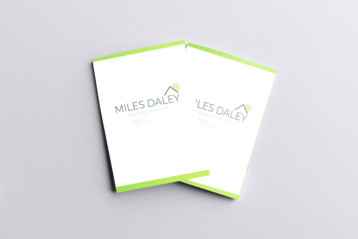
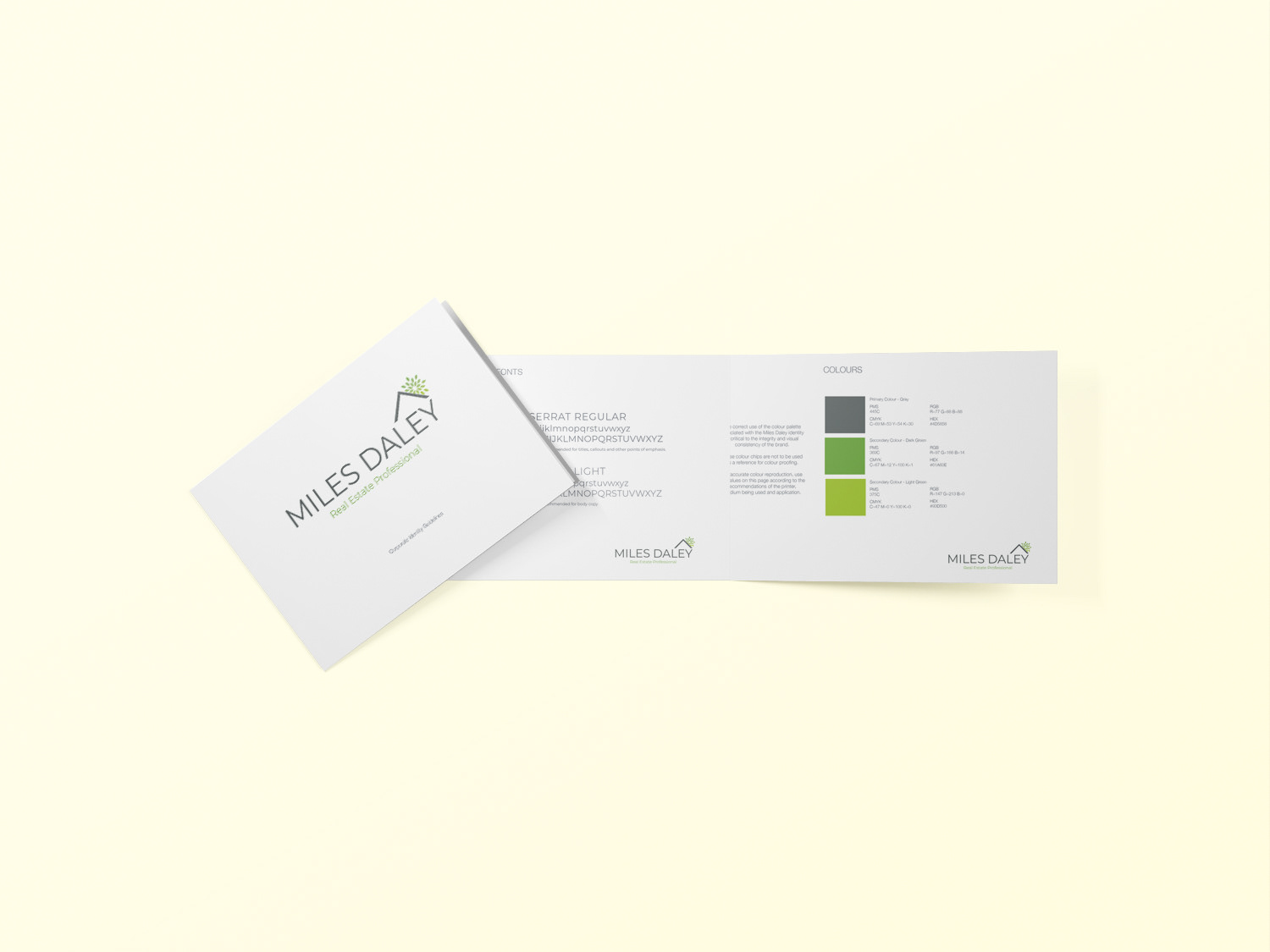
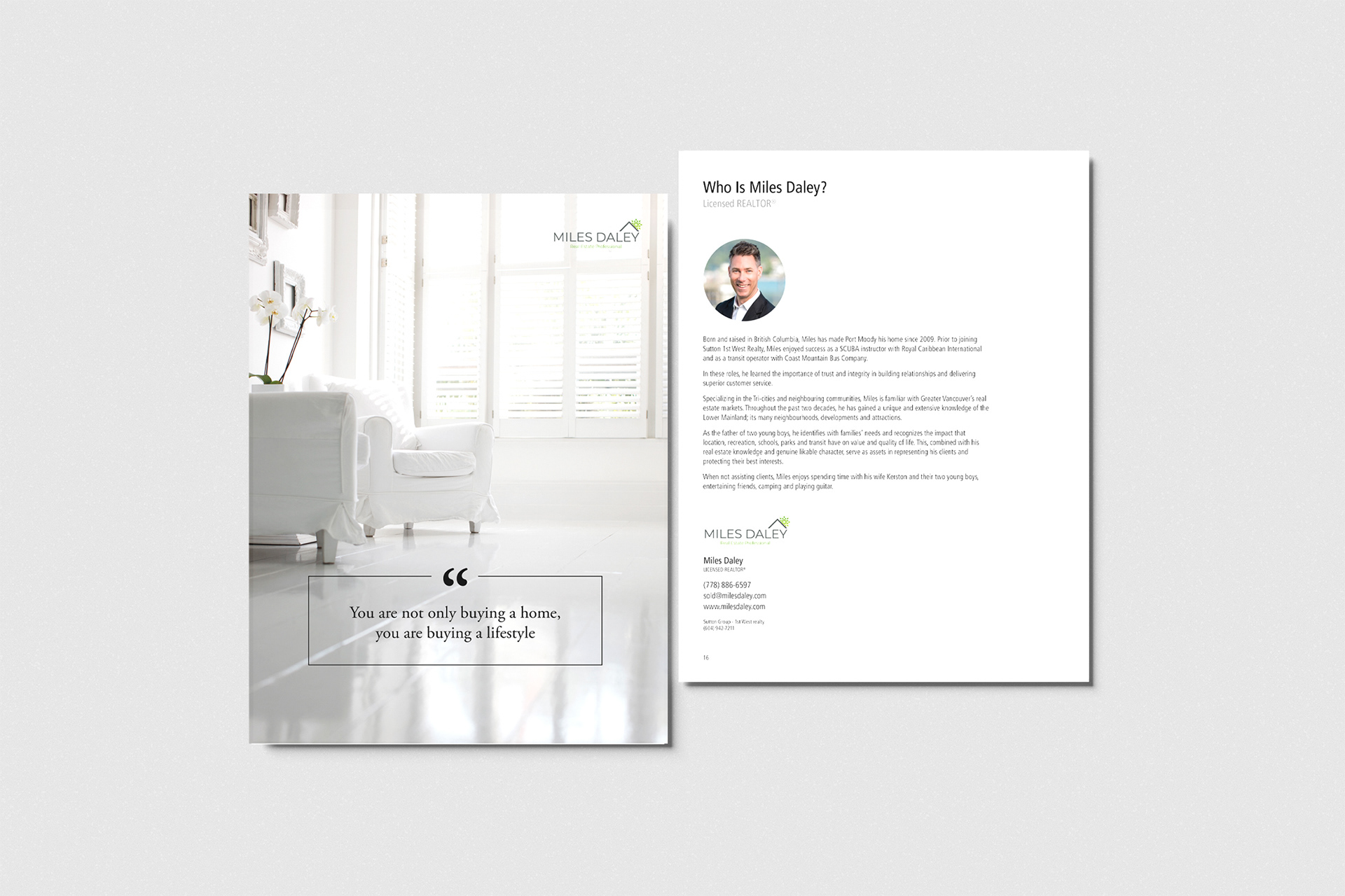
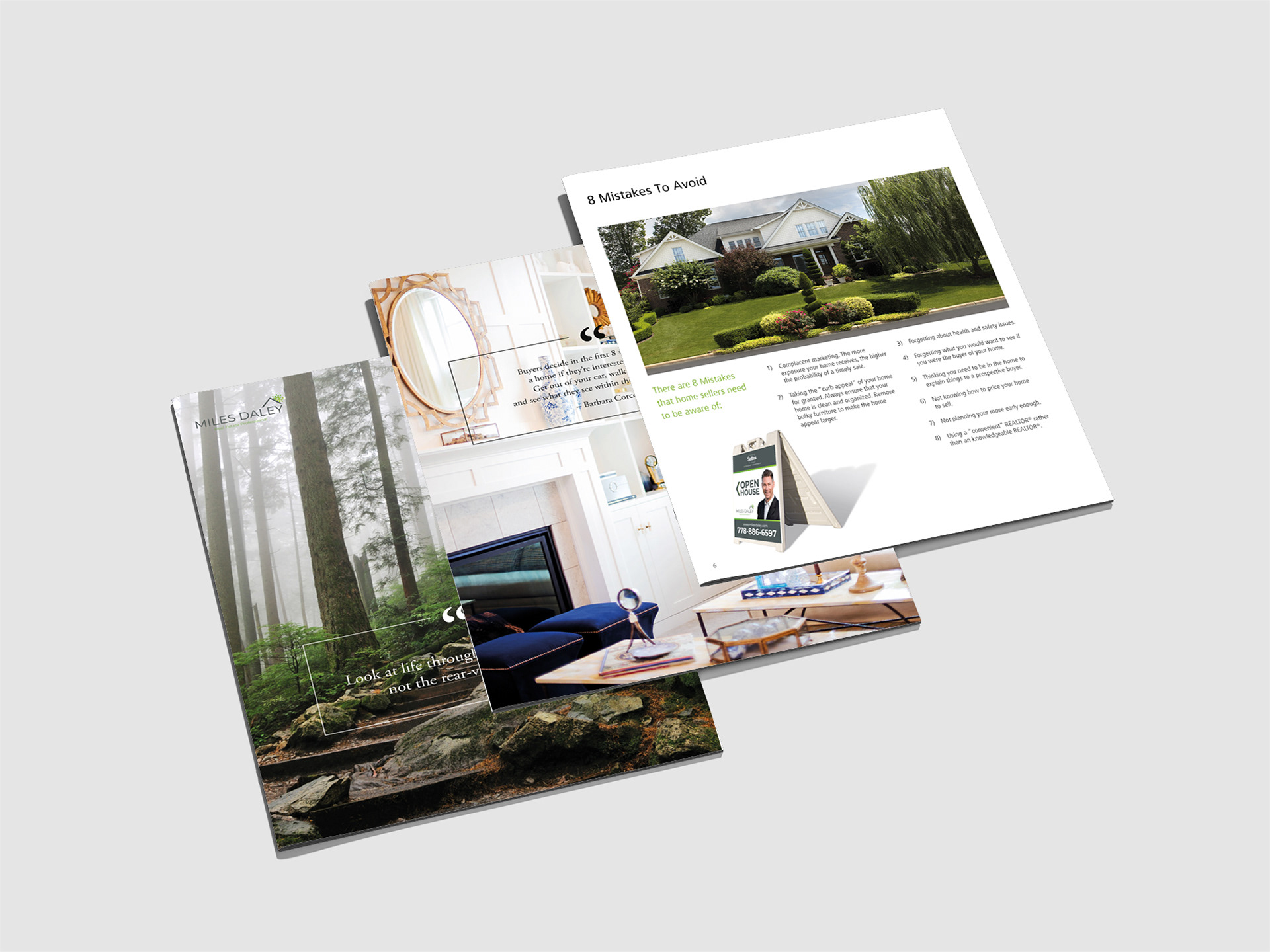
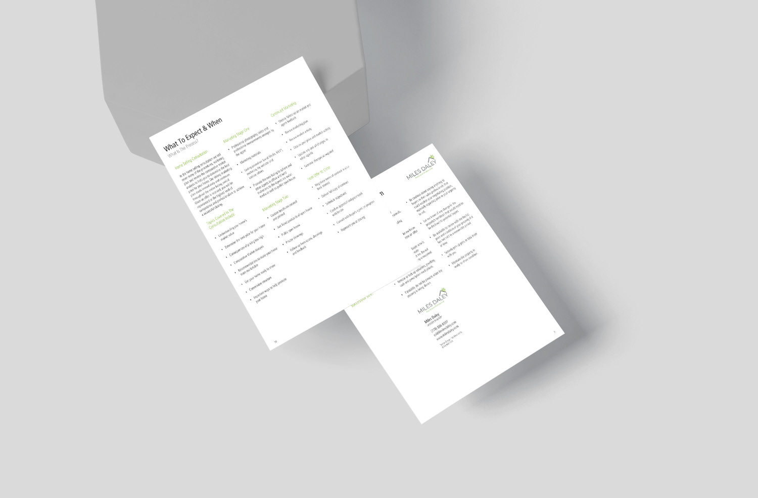
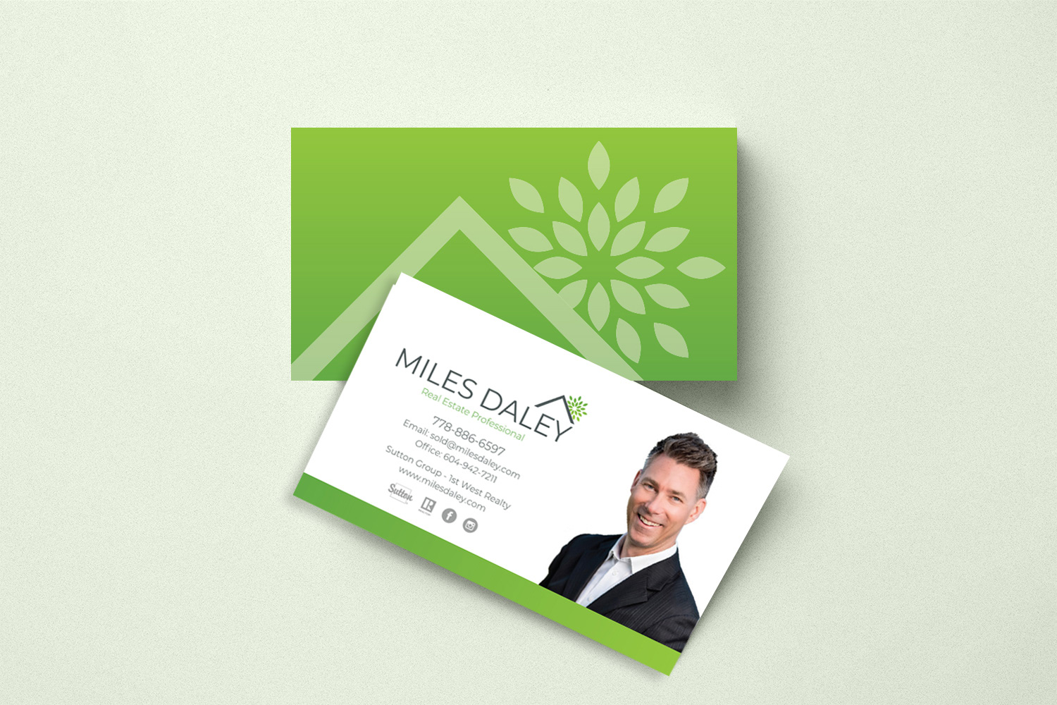
Designed the logo and an 18-page brand guidelines document covering typography, colour values (HEX, RGB, CMYK, and Pantone), photography tone, icon style, grid systems, logo variations, clear space, and correct and incorrect usage examples. I then applied the identity across the brand’s printed collateral. The business cards were printed on thick 20pt cotton stock with a soft-touch finish and orange edge-painting. The presentation folder was die-cut, with a green interior, an orange accent line, pockets for documents, and a slot for the agent’s card. I designed a 28-page Home Buyer Handbook that walked readers through the buying process with infographics, checklists, and timelines while positioning the agent as a trusted guide. I created a two-page fact sheet system that agents could personalize with their photo, contact details, and local market data in minutes, delivered as print-ready and tablet-friendly PDFs. I also designed die-cut door hangers with “Looking to Buy or Sell?” messaging for neighbourhood canvassing.
Designed the logo and an 18-page brand guidelines document covering typography, colour values (HEX, RGB, CMYK, and Pantone), photography tone, icon style, grid systems, logo variations, clear space, and correct and incorrect usage examples. I then applied the identity across the brand’s printed collateral. The business cards were printed on thick 20pt cotton stock with a soft-touch finish and orange edge-painting. The presentation folder was die-cut, with a green interior, an orange accent line, pockets for documents, and a slot for the agent’s card. I designed a 28-page Home Buyer Handbook that walked readers through the buying process with infographics, checklists, and timelines while positioning the agent as a trusted guide. I created a two-page fact sheet system that agents could personalize with their photo, contact details, and local market data in minutes, delivered as print-ready and tablet-friendly PDFs. I also designed die-cut door hangers with “Looking to Buy or Sell?” messaging for neighbourhood canvassing.
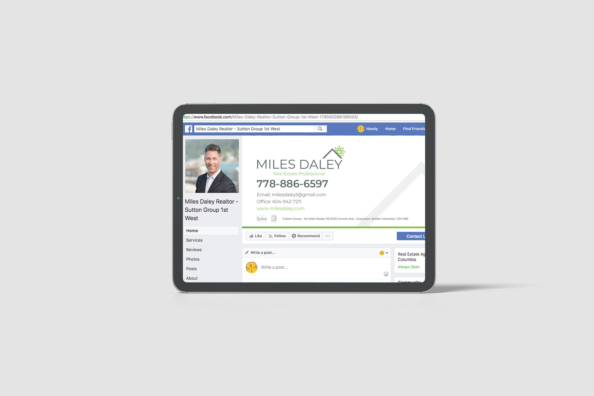
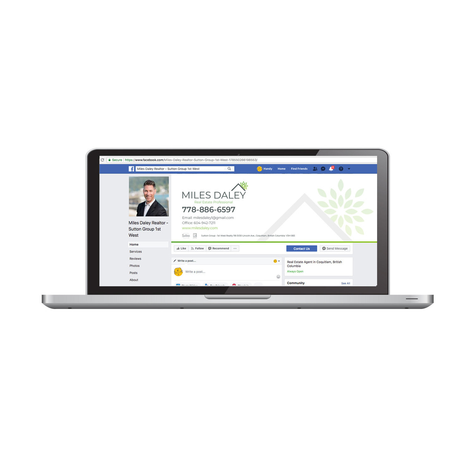
For the street, I designed double-sided, weatherproof sandwich boards and matching For Sale signs that paired Miles’ portrait with the Sutton Group logo, using high-contrast typography and strategic negative space for readability from a distance. For digital, I coded image-free HTML/CSS email signatures with vector icons, live links, and hover effects that rendered consistently in Outlook, Gmail, Apple Mail, and on mobile. Across Limelight’s clients, I also set up social media identities and revived stagnant channels with story-driven graphics, including static posts, animations, carousels, and Reels. I managed the work from concept sketches through feedback rounds to printer proofs, keeping supplier relationships strong, quality control rigorous, and projects on budget.
Result
Miles Daley Realty went from a blank slate to a cohesive, premium identity that read the same on a business card, a street sign, and an email footer. The guidelines and templates gave agents and partners clear rules and ready-to-use tools, which kept the brand consistent and sped up production. Across Limelight’s clients, the work gave niche brands a unified presence across print, signage, digital, and social.
Miles Daley Realty went from a blank slate to a cohesive, premium identity that read the same on a business card, a street sign, and an email footer. The guidelines and templates gave agents and partners clear rules and ready-to-use tools, which kept the brand consistent and sped up production. Across Limelight’s clients, the work gave niche brands a unified presence across print, signage, digital, and social.