


Montreal Media
Freelance Graphic Designer // 2000-2011
Freelance Graphic Designer // 2000-2011
From 2000 to 2011, I worked as a freelance graphic designer for Montreal Media, a start-up born in the dot-com boom that built bilingual websites for businesses of all sizes in Montreal, Quebec. Working alongside a digital production manager, developers, copywriters, and French translators, I created logos and brand identities, website and UX/UI designs, email templates, social media posts, print marketing, and presentations for a wide range of clients. Whatever the medium or language, my goal was the same: a clear, consistent brand experience that reached each client’s audience wherever they met it.
BRANDING
Logo Design & Branding Guidelines
Logo Design & Branding Guidelines
Situation
Montreal Media, a start-up from the dot-com boom that built bilingual websites for businesses of all sizes in Montreal, had clients who needed distinctive corporate identities to go with their sites. Two of them were a U.S.-based online mental health consultancy and a company specializing in fluid motors. Each needed a logo that captured its ethos and a framework that kept the brand consistent everywhere it appeared.
Montreal Media, a start-up from the dot-com boom that built bilingual websites for businesses of all sizes in Montreal, had clients who needed distinctive corporate identities to go with their sites. Two of them were a U.S.-based online mental health consultancy and a company specializing in fluid motors. Each needed a logo that captured its ethos and a framework that kept the brand consistent everywhere it appeared.
Solution
Worked with each client to develop a corporate brand identity, starting with a range of logo options to present to stakeholders and ending with a brand style guide. That gave each client one clear reference for how the brand should look and sound.
Worked with each client to develop a corporate brand identity, starting with a range of logo options to present to stakeholders and ending with a brand style guide. That gave each client one clear reference for how the brand should look and sound.
Execution
In Adobe Illustrator, I created a series of logo concepts for each client and presented them to stakeholders to gather feedback. For the mental health consultancy, I built the mark around a lark, a symbol of positivity and resilience that matched the client’s mission. For the fluid motors company, I worked within the client’s specified colour palette and reflected its industry expertise. Once the final logos were approved, I developed style guides covering typography, colour palette, iconography, tone of voice, and a concise mission statement.
In Adobe Illustrator, I created a series of logo concepts for each client and presented them to stakeholders to gather feedback. For the mental health consultancy, I built the mark around a lark, a symbol of positivity and resilience that matched the client’s mission. For the fluid motors company, I worked within the client’s specified colour palette and reflected its industry expertise. Once the final logos were approved, I developed style guides covering typography, colour palette, iconography, tone of voice, and a concise mission statement.
Result
Each client left with a distinctive logo and a style guide to keep every future piece of communication consistent and recognizable.
Each client left with a distinctive logo and a style guide to keep every future piece of communication consistent and recognizable.


















WEB DESIGN
UX/UI, Wireframing & Website Layout
UX/UI, Wireframing & Website Layout
Situation
Montreal Media’s clients needed websites that were easy to navigate, built around real user behaviour, and consistent with each brand. They ranged from a venture capital education platform to a playwright’s workshop, and some sites had to work in both English and French.
Montreal Media’s clients needed websites that were easy to navigate, built around real user behaviour, and consistent with each brand. They ranged from a venture capital education platform to a playwright’s workshop, and some sites had to work in both English and French.
Solution
Led the UX and visual design for these sites, working closely with the project manager, developers, and copywriters. I used wireframes as blueprints so the whole team built to the same plan, and I used data and analytics to guide decisions on content and layout.
Led the UX and visual design for these sites, working closely with the project manager, developers, and copywriters. I used wireframes as blueprints so the whole team built to the same plan, and I used data and analytics to guide decisions on content and layout.
Execution
For VCTV, a platform blending YouTube-style video and podcasts around venture capital and education, I designed the logo around a TV screen icon, then worked with the developer on a site with strong calls-to-action, an intuitive menu, and easy navigation. I also created online banners and a PowerPoint presentation for investors, using concise visuals, infographics, and key data points so the presenter could keep a clear narrative and a good pace.
For VCTV, a platform blending YouTube-style video and podcasts around venture capital and education, I designed the logo around a TV screen icon, then worked with the developer on a site with strong calls-to-action, an intuitive menu, and easy navigation. I also created online banners and a PowerPoint presentation for investors, using concise visuals, infographics, and key data points so the presenter could keep a clear narrative and a good pace.
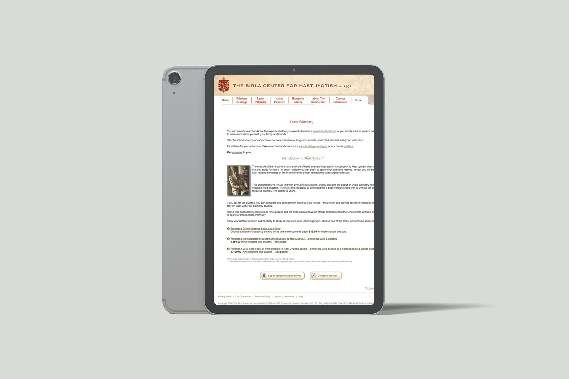
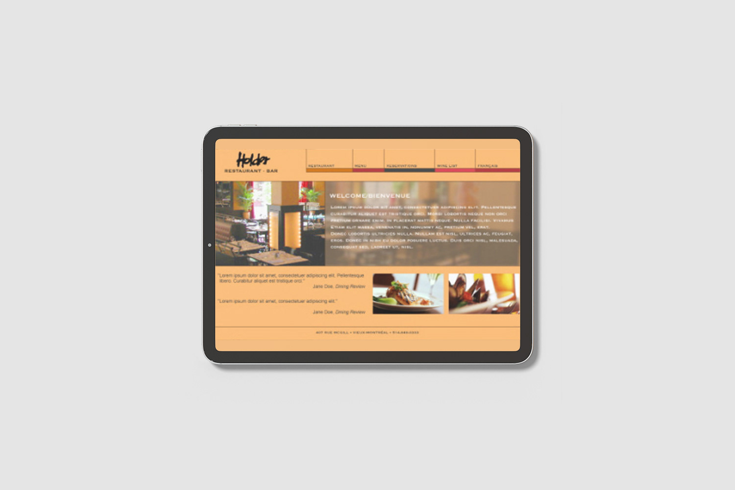
For a bilingual client site, I shaped the UX with a robust search function and customer account set-up, and built wireframes that allocated space, prioritized content, and defined functionality and expected user behaviour. I also designed full-page print ads and French publication layouts.
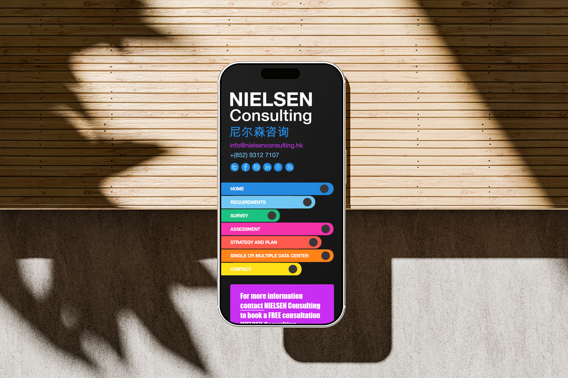
For other client sites, I worked with the project manager and developer on a data-informed experience that used analytics to understand user behaviour and pain points, integrated dynamic content, and placed strong calls-to-action along the customer journey. I built the creative in Adobe Photoshop. For a playwright’s workshop, I designed the logo in Adobe Illustrator, drawing on storytelling and theatre, and applied the same approach to its website.
Result
Clients launched sites that were easier to navigate and consistent with their brands, with wireframes that kept designers, developers, and copywriters aligned. VCTV also had the investor presentation it needed to pitch with confidence.
Clients launched sites that were easier to navigate and consistent with their brands, with wireframes that kept designers, developers, and copywriters aligned. VCTV also had the investor presentation it needed to pitch with confidence.






PRINT DESIGN
Menus, Packaging, Ads & Stationery
Menus, Packaging, Ads & Stationery
Situation
Local businesses working with Montreal Media needed printed materials that matched their brands and reached their target audiences. A new diner needed a logo, menus, and a grand opening handbill. Strathmore Creative needed advertising and stationery that reflected its brand. Casey’s Kettle Corn needed packaging that would help drive impulse purchases while keeping the product fresh.
Local businesses working with Montreal Media needed printed materials that matched their brands and reached their target audiences. A new diner needed a logo, menus, and a grand opening handbill. Strathmore Creative needed advertising and stationery that reflected its brand. Casey’s Kettle Corn needed packaging that would help drive impulse purchases while keeping the product fresh.
Solution
Designed print materials for each client that matched their brand and the way their audience would meet it, then managed production so the finished pieces held up to professional printing standards.
Designed print materials for each client that matched their brand and the way their audience would meet it, then managed production so the finished pieces held up to professional printing standards.
Execution
For the diner, I presented a selection of logos in a branding presentation, drawing on the nostalgic atmosphere of a classic diner, with fork, knife, and spoon icons representing breakfast, lunch, and dinner. I designed menus listing food and beverage options with clear pricing, and a handbill to promote the grand opening.
For the diner, I presented a selection of logos in a branding presentation, drawing on the nostalgic atmosphere of a classic diner, with fork, knife, and spoon icons representing breakfast, lunch, and dinner. I designed menus listing food and beverage options with clear pricing, and a handbill to promote the grand opening.
For Strathmore Creative, I designed print ads for prominent local newspapers and magazines in Adobe InDesign, along with corporate stationery. In Adobe Illustrator, I created a range of business card designs for clients to choose from, then customized the chosen template to match each client’s branding. I also checked printed materials for quality, worked with printing partners, and gathered client feedback and approvals before production.
For Casey’s Kettle Corn, I led the research, concept, and production of a stand-up mylar bag designed to attract impulse buyers and preserve freshness, while staying true to the brand.
Result
Each client received print materials that were consistent with their brand and ready for the market, from a restaurant opening to a packaged retail product.
Each client received print materials that were consistent with their brand and ready for the market, from a restaurant opening to a packaged retail product.


