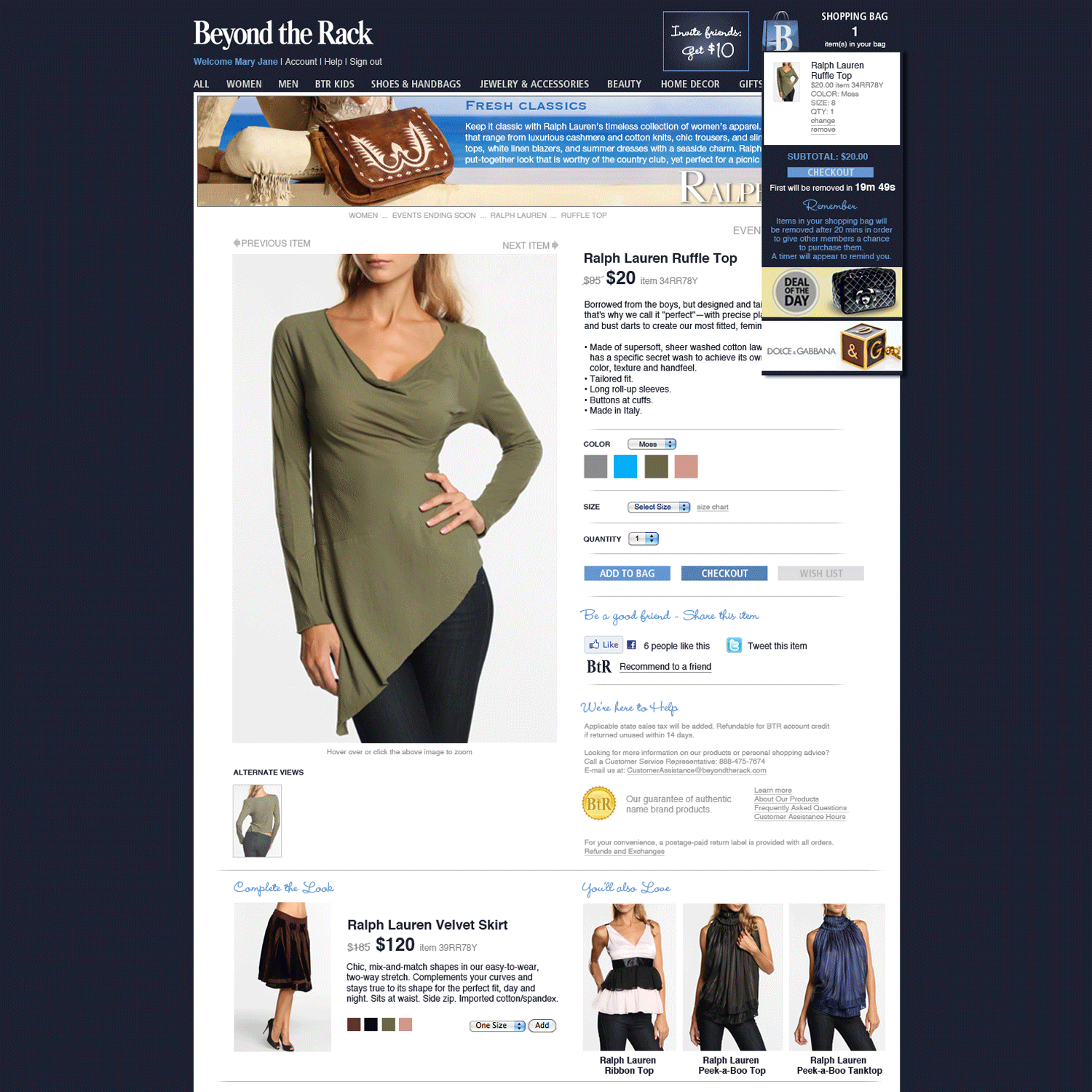
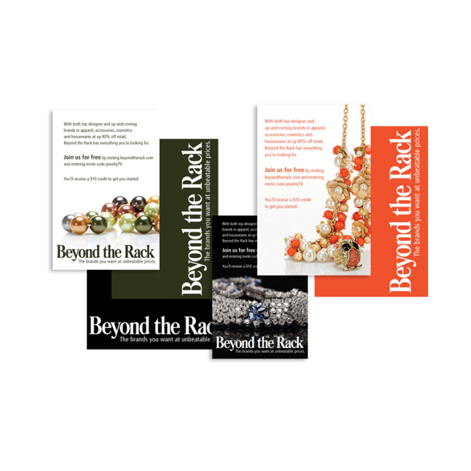
Beyond the Rack
Art Director & Studio Manager // 2010-2012
Art Director & Studio Manager // 2010-2012
CREATIVE DIRECTION & OMNI-CHANNEL DESIGN
Art Director & Studio Manager Beyond the Rack (2010–2012)
Art Director & Studio Manager Beyond the Rack (2010–2012)
Situation
Beyond the Rack, a fast-growing e-commerce flash sales platform, was scaling rapidly and needed strong creative leadership to support explosive growth, maintain brand consistency, and deliver high-impact marketing assets across all customer touch-points in a highly competitive market.
Beyond the Rack, a fast-growing e-commerce flash sales platform, was scaling rapidly and needed strong creative leadership to support explosive growth, maintain brand consistency, and deliver high-impact marketing assets across all customer touch-points in a highly competitive market.
Solution
As Art Director and Studio Manager, I led the creative vision and execution that helped drive the company’s revenue from $50M to $100M. I directed an in-house team of designers, copywriters, and specialists while developing unified omni-channel strategies.
As Art Director and Studio Manager, I led the creative vision and execution that helped drive the company’s revenue from $50M to $100M. I directed an in-house team of designers, copywriters, and specialists while developing unified omni-channel strategies.
Execution
• Built and managed a multidisciplinary creative team while establishing efficient workflows and vendor partnerships.
• Designed and enforced brand consistency across all channels — website, email, social media, banners, landing pages, print collateral, and trade show materials.
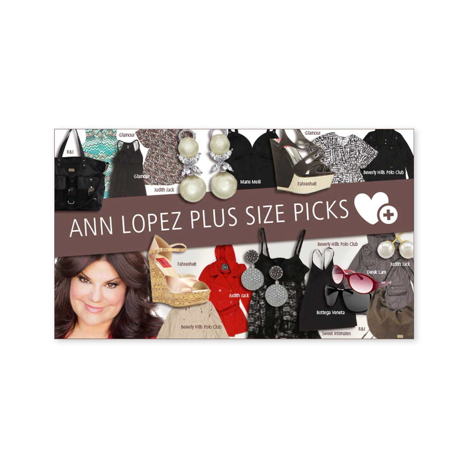
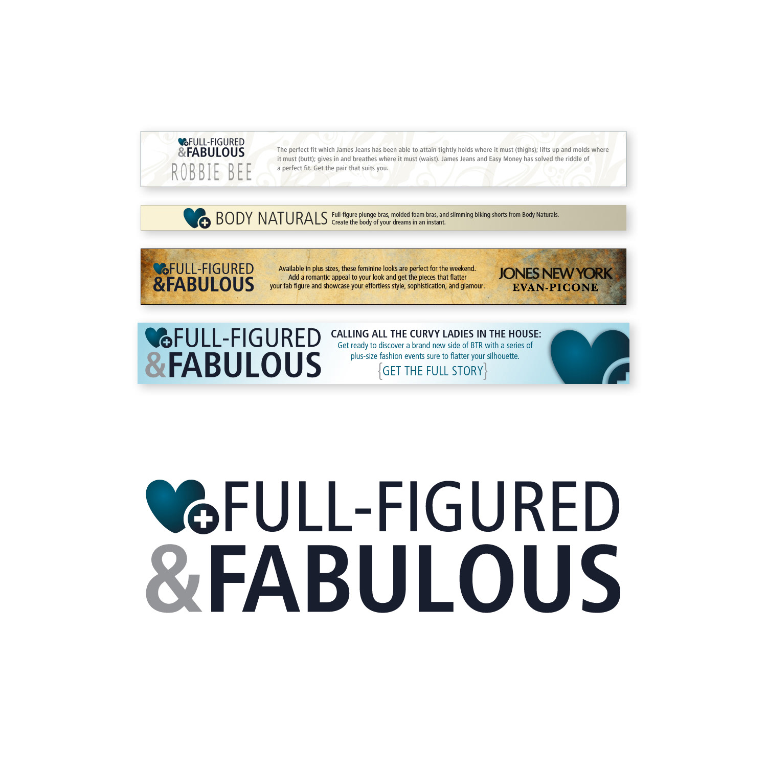
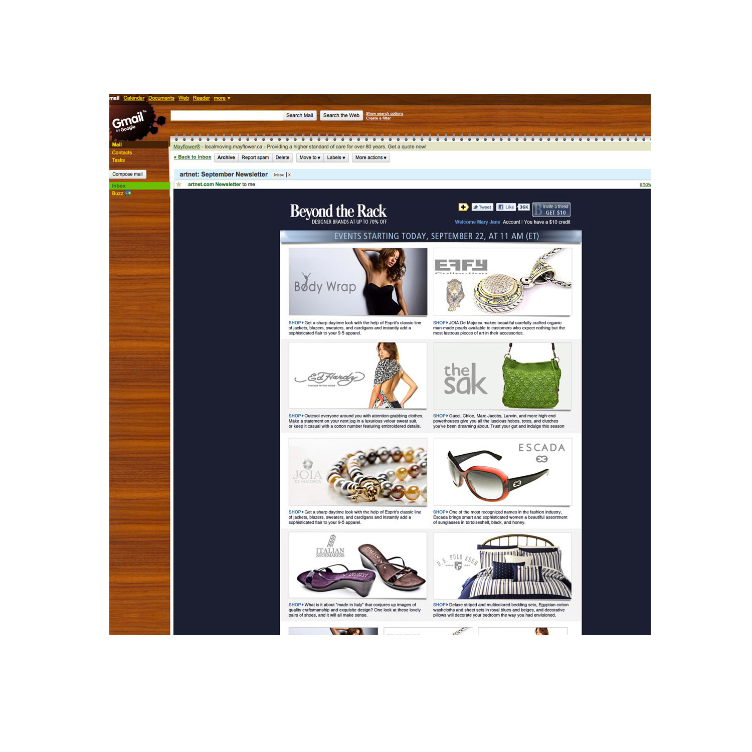
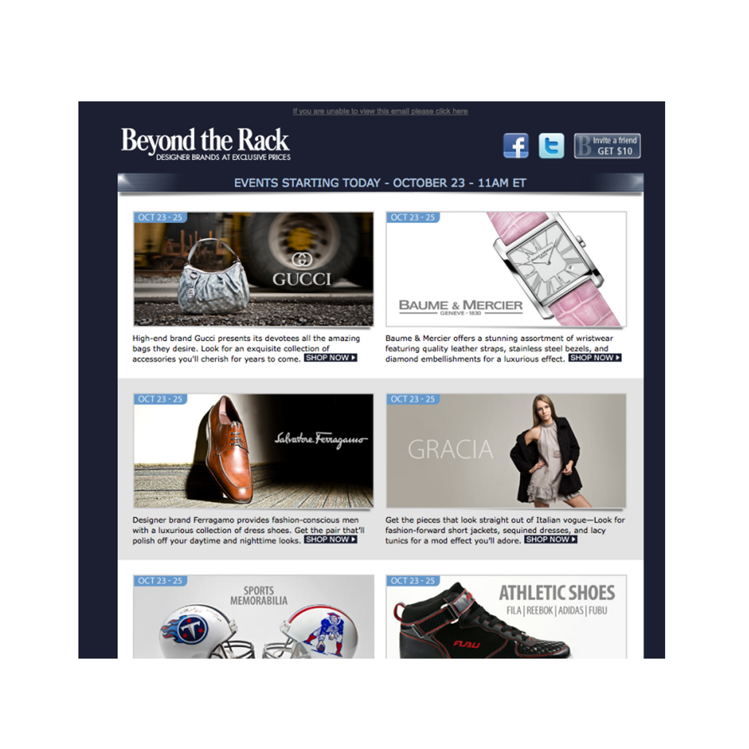
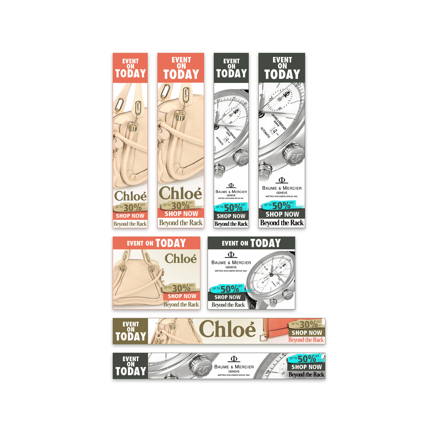
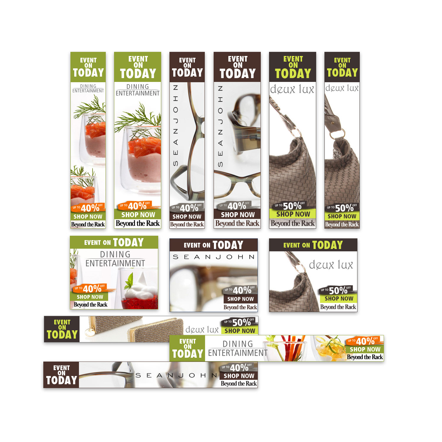
• Created high-conversion assets for daily 24-hour flash sales, including campaign logos, promotional banners, email templates, blog graphics, and infographics.
• Led multi-channel campaigns for major promotions, contests, and corporate events.
• Built and managed a multidisciplinary creative team while establishing efficient workflows and vendor partnerships.
• Designed and enforced brand consistency across all channels — website, email, social media, banners, landing pages, print collateral, and trade show materials.
• Created high-conversion assets for daily 24-hour flash sales, including campaign logos, promotional banners, email templates, blog graphics, and infographics.
• Led multi-channel campaigns for major promotions, contests, and corporate events.
Result
The cohesive visual strategy and high-performing creative assets significantly boosted customer acquisition, engagement, and loyalty. My leadership played a key role in the company’s rapid growth to $100M in revenue, establishing Beyond the Rack as a standout player in the e-commerce flash sales space.
The cohesive visual strategy and high-performing creative assets significantly boosted customer acquisition, engagement, and loyalty. My leadership played a key role in the company’s rapid growth to $100M in revenue, establishing Beyond the Rack as a standout player in the e-commerce flash sales space.
This work demonstrates expertise in art direction for e-commerce, omni-channel brand consistency, flash sale creative strategy, team leadership, and high-growth marketing asset design for fast-paced retail startups.

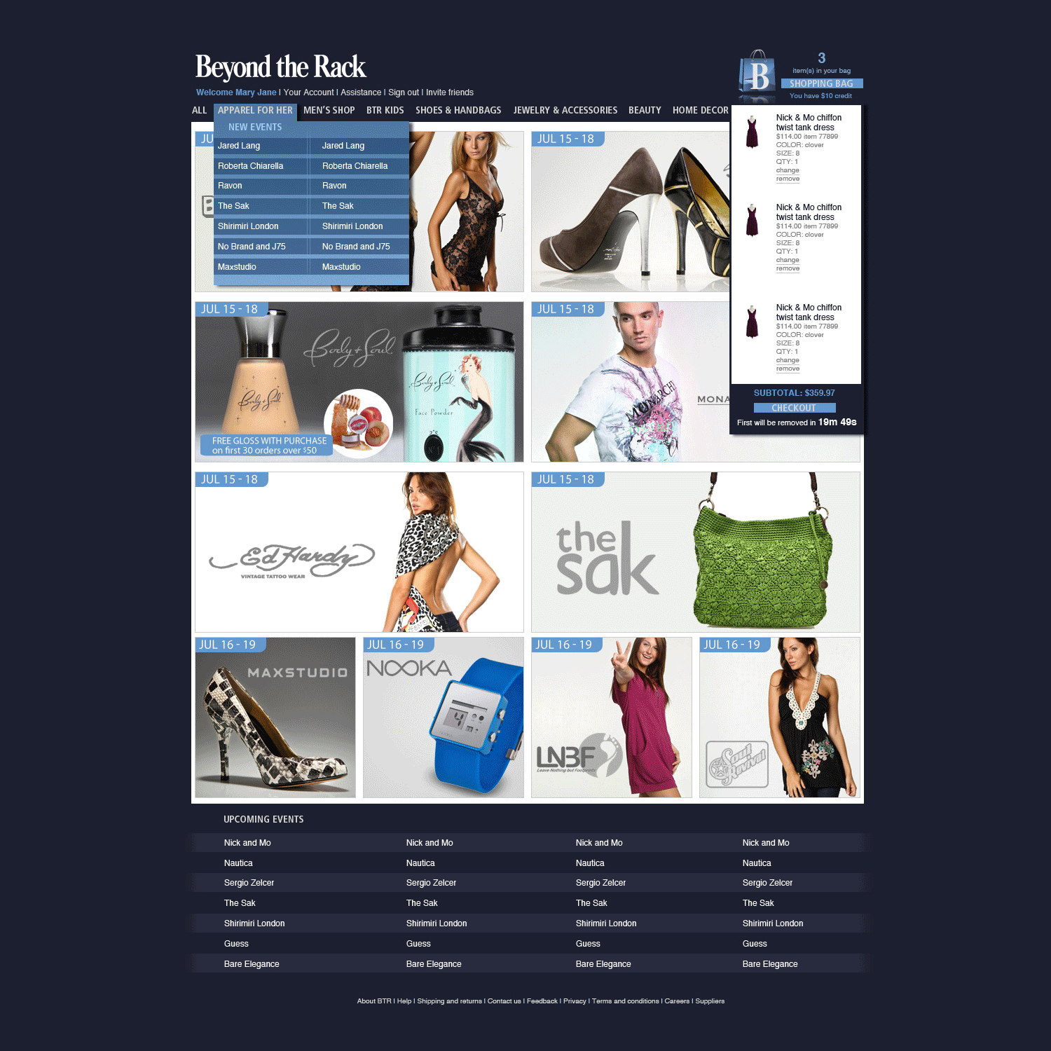
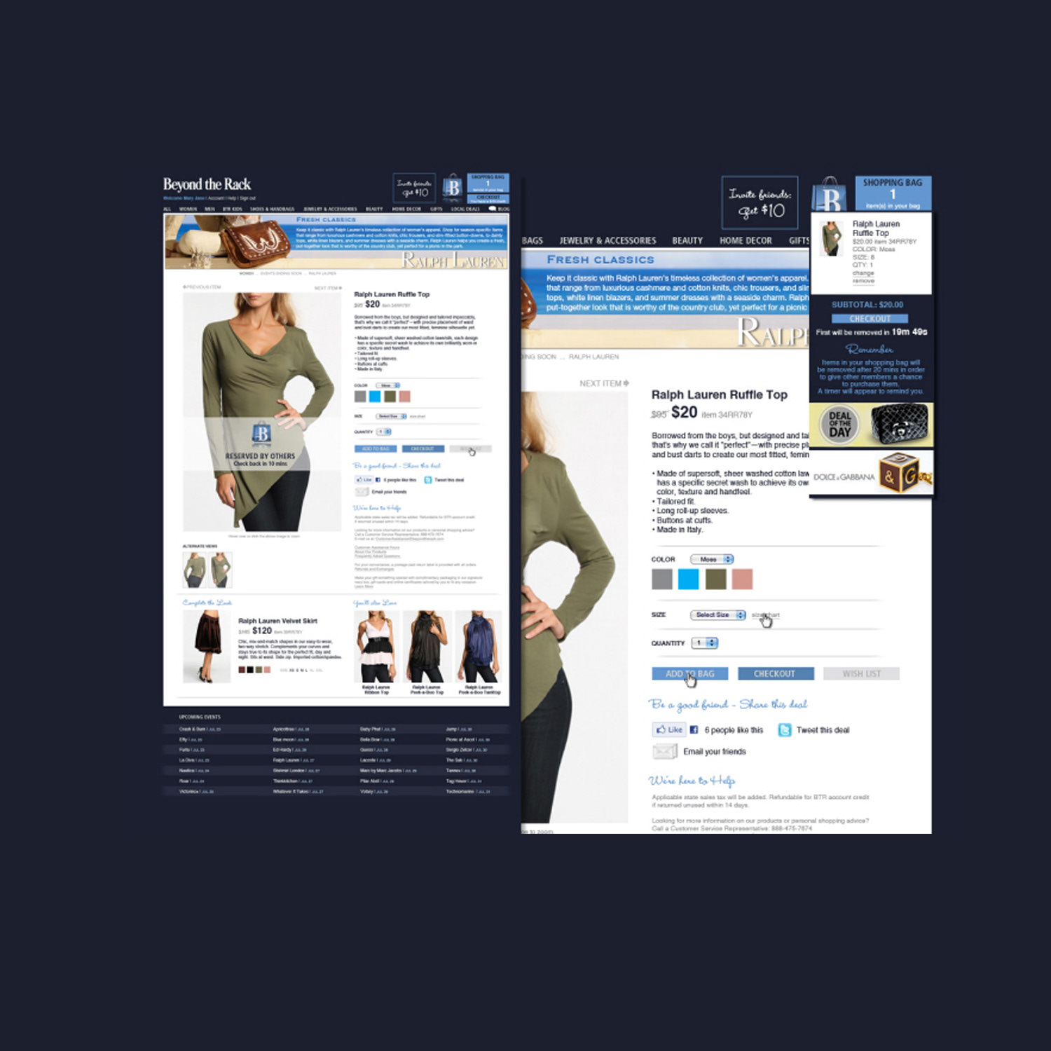
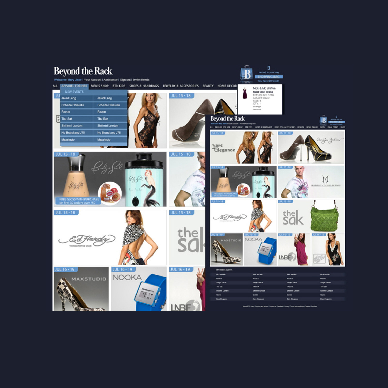
BTR Website
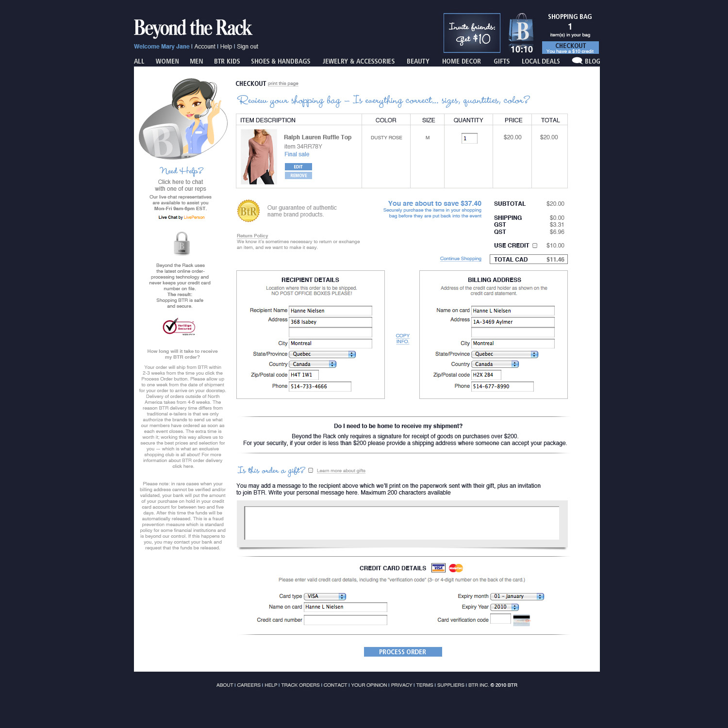
BTR Website
UX/UI DESIGN
E-Commerce Website Redesign Beyond the Rack Flagship Platform
E-Commerce Website Redesign Beyond the Rack Flagship Platform
Situation
Beyond the Rack, a fast-growing flash-sale e-commerce platform, needed a modern, high-performing website that could deliver an intuitive user experience, support rapid sales cycles, and drive higher engagement and conversions in a highly competitive online retail environment.
Beyond the Rack, a fast-growing flash-sale e-commerce platform, needed a modern, high-performing website that could deliver an intuitive user experience, support rapid sales cycles, and drive higher engagement and conversions in a highly competitive online retail environment.
Solution
As lead UX/UI Designer, I directed the complete redesign of the flagship B2C website, creating a branded, conversion-focused digital experience that aligned with the company’s fast-paced business model.
As lead UX/UI Designer, I directed the complete redesign of the flagship B2C website, creating a branded, conversion-focused digital experience that aligned with the company’s fast-paced business model.
Execution
• Developed detailed wireframes and high-fidelity mockups in Adobe Photoshop, focusing on intuitive navigation, content hierarchy, and user behavior optimization.
• Collaborated closely with programmers to ensure accurate implementation of the design vision.
• Led extensive A/B testing to refine layouts, calls-to-action, and flows for maximum performance.
• Designed fully branded interfaces with consistent visual language across all pages and devices.
• Provided developers with optimized assets and style guides while overseeing ongoing enhancements and SEO improvements.
Result
The redesigned website significantly improved user engagement, dwell time, and conversion rates. The project earned the prestigious 2012 Best of Web Design and Publishing award and played a key role in supporting Beyond the Rack’s rapid growth and strong market presence in the competitive e-commerce flash-sale sector.
The redesigned website significantly improved user engagement, dwell time, and conversion rates. The project earned the prestigious 2012 Best of Web Design and Publishing award and played a key role in supporting Beyond the Rack’s rapid growth and strong market presence in the competitive e-commerce flash-sale sector.
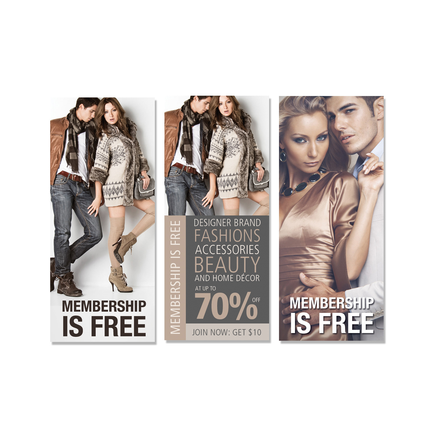
CAMPAIGN DESIGN
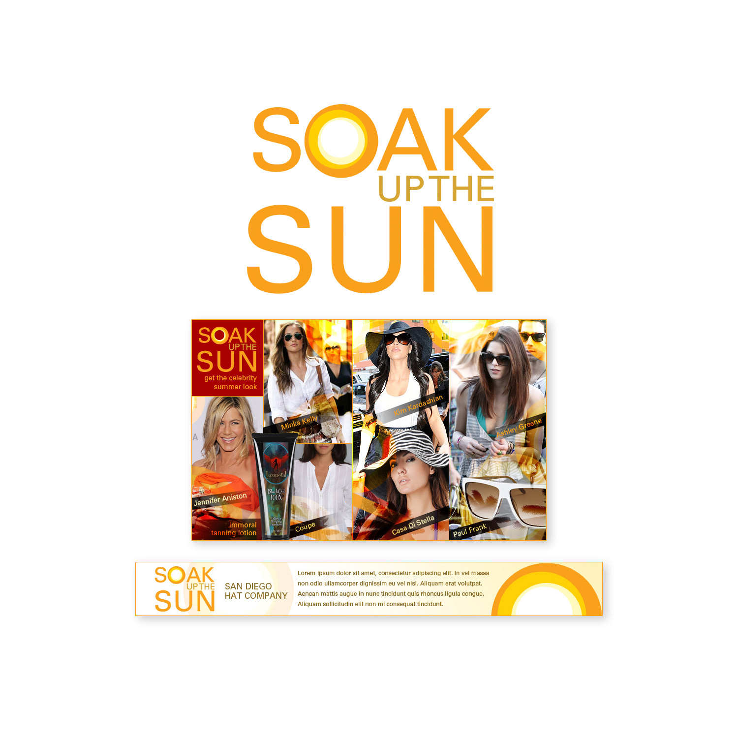
Soak Up The Sun Campaign Vibrant Summer Seasonal Promotion
Soak Up The Sun Campaign Vibrant Summer Seasonal Promotion
Situation
The brand needed a compelling seasonal campaign to capture the energy and joy of summer, drive product engagement, and strengthen emotional connections with the audience during peak retail periods.
The brand needed a compelling seasonal campaign to capture the energy and joy of summer, drive product engagement, and strengthen emotional connections with the audience during peak retail periods.
Solution
I led the creative direction for the “Soak Up The Sun” campaign, developing a cohesive, high-impact visual and messaging system that evoked feelings of warmth, relaxation, adventure, and carefree summer living.
I led the creative direction for the “Soak Up The Sun” campaign, developing a cohesive, high-impact visual and messaging system that evoked feelings of warmth, relaxation, adventure, and carefree summer living.
Execution
• Designed a full suite of assets including promotional banners, social media graphics, email templates, and print materials.
• Created bright, energetic colour palettes, sun-drenched photography, bold yet approachable typography, and uplifting slogans.
• Collaborated closely with designers, copywriters, and marketers to ensure all elements worked together as a unified campaign ecosystem.
• Focused on emotional resonance while maintaining strong alignment with the brand’s core identity and product offerings.
Result
The campaign successfully deepened audience engagement, boosted emotional brand affinity, and reinforced customer loyalty during the summer season. The vibrant, joyful creative approach helped highlight key products and promotions while creating an immediate and memorable connection with the target audience.
The campaign successfully deepened audience engagement, boosted emotional brand affinity, and reinforced customer loyalty during the summer season. The vibrant, joyful creative approach helped highlight key products and promotions while creating an immediate and memorable connection with the target audience.
CAMPAIGN DESIGN
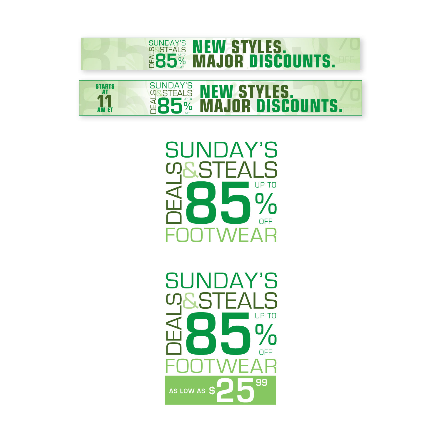
Sunday Deals & Steals Weekly 24-Hour Flash Sale Campaign
Sunday Deals & Steals Weekly 24-Hour Flash Sale Campaign
Situation
Beyond the Rack required a consistent, high-impact creative system to power their weekly “Sunday Deals & Steals” 24-hour flash sales. The campaign demanded fast turnaround, brand consistency, and scalable assets to support rapid business growth in a competitive e-commerce environment.
Beyond the Rack required a consistent, high-impact creative system to power their weekly “Sunday Deals & Steals” 24-hour flash sales. The campaign demanded fast turnaround, brand consistency, and scalable assets to support rapid business growth in a competitive e-commerce environment.
Solution
As lead creative overseer, I directed the full creative strategy and production for this recurring campaign, building a flexible and efficient design system that enabled quick weekly execution while maintaining strong visual quality and brand integrity.
As lead creative overseer, I directed the full creative strategy and production for this recurring campaign, building a flexible and efficient design system that enabled quick weekly execution while maintaining strong visual quality and brand integrity.
Execution
• Designed and managed a complete creative ecosystem including custom logos, vibrant colour palettes, typography systems, reusable banner templates, and promotional graphics.
• Developed modular, scalable templates that allowed the team to efficiently update content, imagery, and promotions every week.
• Collaborated closely with copywriters, programmers, and the marketing team to ensure seamless integration across the website, email, and social channels.
• Established streamlined creative workflows and production processes to support increasing campaign volume with speed and consistency.
Result
The “Sunday Deals & Steals” campaign became a reliable driver of weekly revenue and customer engagement. The scalable creative systems reduced production time, minimized errors, and supported Beyond the Rack’s rapid expansion while delivering a consistent, high-quality brand experience to shoppers.
The “Sunday Deals & Steals” campaign became a reliable driver of weekly revenue and customer engagement. The scalable creative systems reduced production time, minimized errors, and supported Beyond the Rack’s rapid expansion while delivering a consistent, high-quality brand experience to shoppers.
CAMPAIGN DESIGN
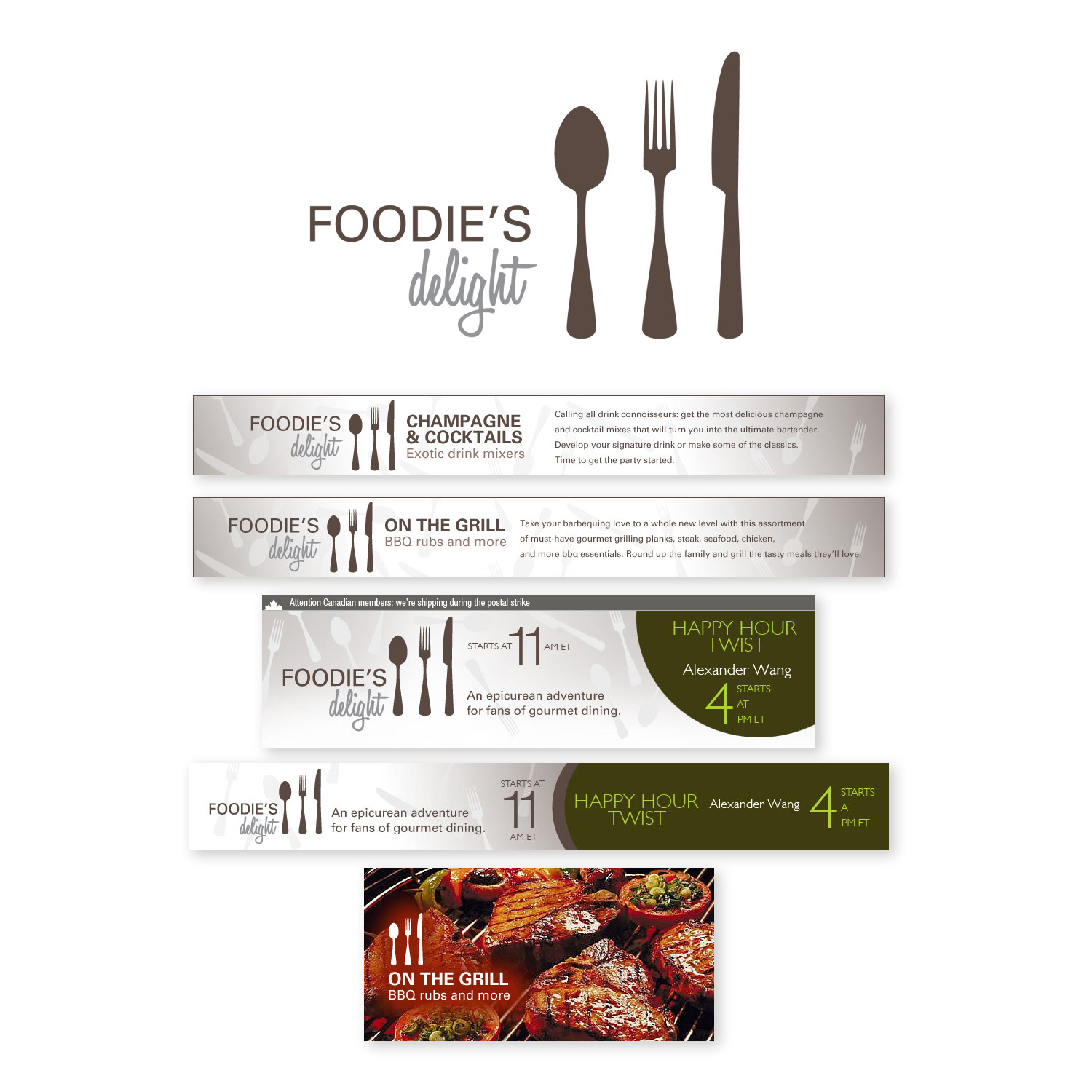
Art Direction & Gastronomic Branding
Sensual Food-Focused Campaign Creative
Art Direction & Gastronomic Branding
Sensual Food-Focused Campaign Creative
The “Foodie’s Delight Campaign” offered a mouthwatering celebration of culinary discovery, where my art direction captured the pure joy and artistry of food exploration. Drawing inspiration from the rich textures, vivid colours, and sensory allure of exceptional cuisine, I curated a visually irresistible collection of campaign assets that evoked passion, indulgence, and gastronomic excitement.
Every design decision—from warm, rustic backgrounds and carefully styled food photography to intricate detailing of utensils, ingredients, and plating—was intentionally crafted to tantalize the senses and immerse viewers in the emotional pleasure of dining. The result was a cohesive, appetizing aesthetic that not only highlighted featured products and promotions but also built deep emotional connections with food lovers, driving engagement across digital channels, email marketing, social media, and promotional materials.
This campaign exemplifies expertise in food branding and campaign design, gastronomic art direction, appetizing visual storytelling, culinary photography styling, rich texture and colour palette development, food-focused promotional creative, and sensory-driven marketing for lifestyle, retail, and hospitality brands.
PRINT DESIGN
Printed Inserts for Every Outgoing Shipment
Enhancing Customer Experience & Brand Touchpoint in Every Package
Printed Inserts for Every Outgoing Shipment
Enhancing Customer Experience & Brand Touchpoint in Every Package
I designed and produced professional drop-ship announcement inserts that were printed and included in every outgoing shipment. These compact, high-quality printed pieces served as a branded touchpoint, clearly informing customers that their order was fulfilled via drop-shipping while reinforcing trust, transparency, and the brand’s identity.
The announcements featured clean layouts, concise messaging, strategic typography, the company logo, contact information, and subtle calls-to-action encouraging repeat purchases, reviews, or social follows. Optimized for cost-effective mass printing on lightweight, durable stock, the inserts maintained perfect brand consistency across thousands of daily shipments, turning a routine logistics detail into a positive, professional customer experience that strengthened loyalty and perception of reliability.
This project demonstrates expertise in drop-ship announcement design, printed package inserts, high-volume direct mail collateral, branded shipping notifications, customer communication print design, e-commerce fulfillment inserts, mass production print management, and strategic touchpoint marketing for online retail brands.
CAMPAIGN DESIGN
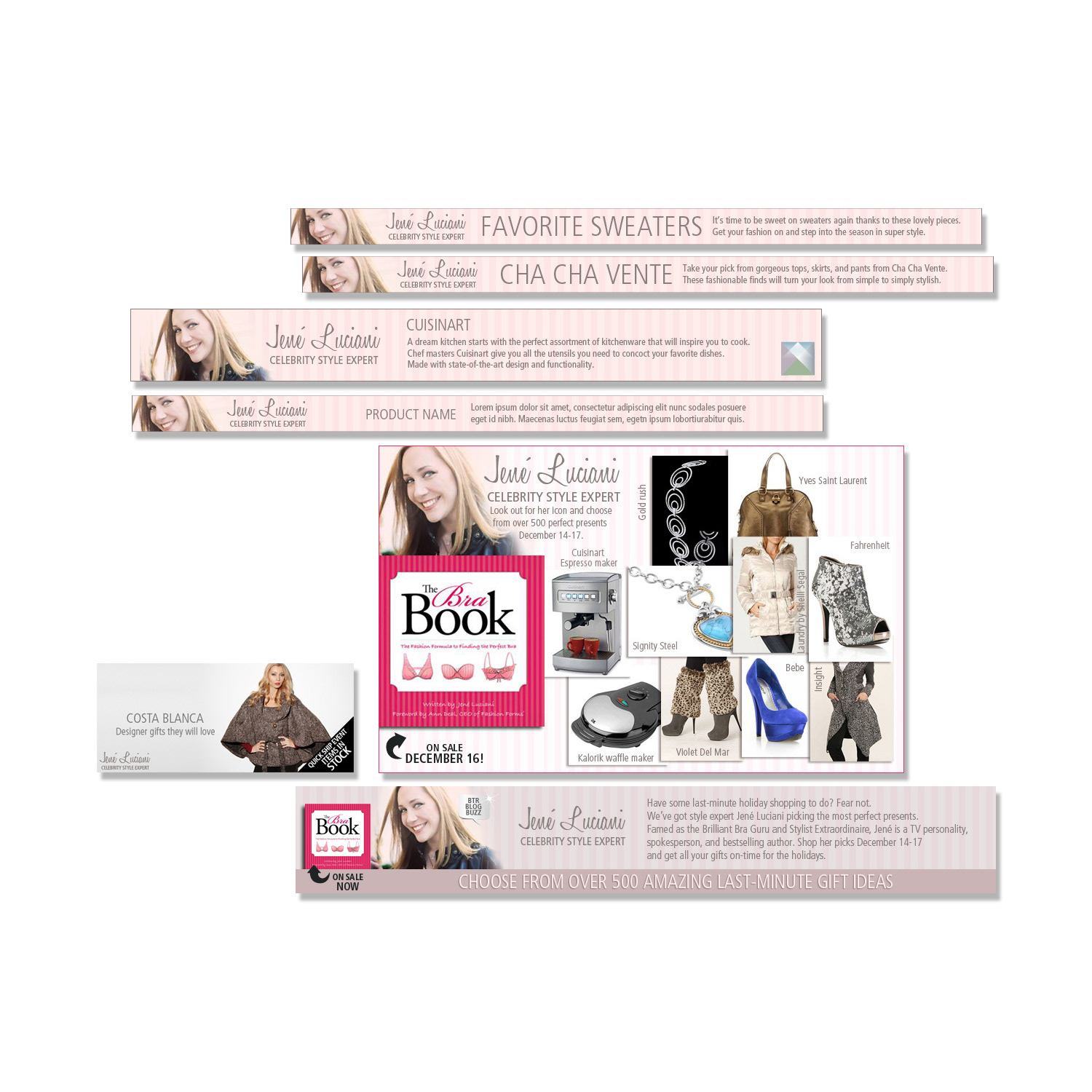
Celebrity Style Expert Book Promotion Campaign
Jene Luciani’s Hand-Picked Favourite Products Featured Alongside Her Book on Beyond the Rack
Celebrity Style Expert Book Promotion Campaign
Jene Luciani’s Hand-Picked Favourite Products Featured Alongside Her Book on Beyond the Rack
I designed and produced a complete suite of premium marketing assets for a high-profile collaboration between celebrity style expert Jene Luciani and Beyond the Rack, centred on promoting her book while spotlighting her personally selected favourite products available on the platform. Jene Luciani, renowned for her fashion expertise, hand-curated a collection of standout clothing, accessories, and lifestyle items sold on Beyond the Rack, creating an authentic editorial-style endorsement that blended her book’s styling advice with real-world shopping inspiration.
My creative direction included elegant promotional banners, social media graphics, email newsletter templates, dedicated landing page visuals, product highlight carousels, and integrated blog-style content—all crafted to reflect Jene’s polished, approachable style while seamlessly merging with Beyond the Rack’s vibrant e-commerce aesthetic. The assets featured refined typography, sophisticated yet accessible colour palettes, beautiful lifestyle photography, and strategic calls-to-action that emphasized the expert endorsement, exclusive curation, and direct link to purchase.
This partnership successfully bridged celebrity authority with online retail, driving brand exposure, audience trust, increased traffic, and conversions among fashion-conscious shoppers seeking trusted styling guidance. The campaign demonstrates expertise in celebrity collaboration design, style expert book promotion, curated product marketing assets, lifestyle editorial creatives, multi-channel e-commerce graphics, high-end visual storytelling, and strategic brand alignment for fashion, retail, and publishing partnerships.
BLOG DESIGN
Eye-Catching Blog Graphics
Static and Animated Images Promoting Fashion Content & Strengthening Brand Identity
Eye-Catching Blog Graphics
Static and Animated Images Promoting Fashion Content & Strengthening Brand Identity
I created a comprehensive series of blog images, both static and animated, specifically designed to accompany fashion-focused blog posts and elevate overall brand recognition. These visuals served as powerful promotional companions, transforming written content into engaging, scroll-stopping experiences that captured the essence of current trends, styling inspiration, seasonal collections, and lifestyle narratives.
The static images featured clean compositions, high-quality product photography, bold typography overlays, curated colour palettes aligned with the brand’s aesthetic, and strategic layout choices for instant visual appeal on desktop and mobile. The animated versions—optimized GIFs and short MP4 loops—added dynamic movement through subtle transitions, floating elements, text reveals, and product zooms that brought fashion stories to life and increased dwell time on the blog.
All assets were fully branded with consistent logo usage, typography, and visual language to reinforce recognition across the website, social media shares, email newsletters, and repurposed content channels. The result was a cohesive visual ecosystem that not only supported SEO through improved user engagement and time-on-page but also built stronger emotional connections with fashion audiences and solidified the brand’s position as an authoritative voice in the industry.
This work demonstrates expertise in fashion blog image design, static & animated blog graphics, promotional visual content creation, brand recognition visuals, GIF and MP4 animation for fashion, blog post enhancement creatives, multi-format fashion marketing assets, and high-engagement digital storytelling for lifestyle and apparel brands.
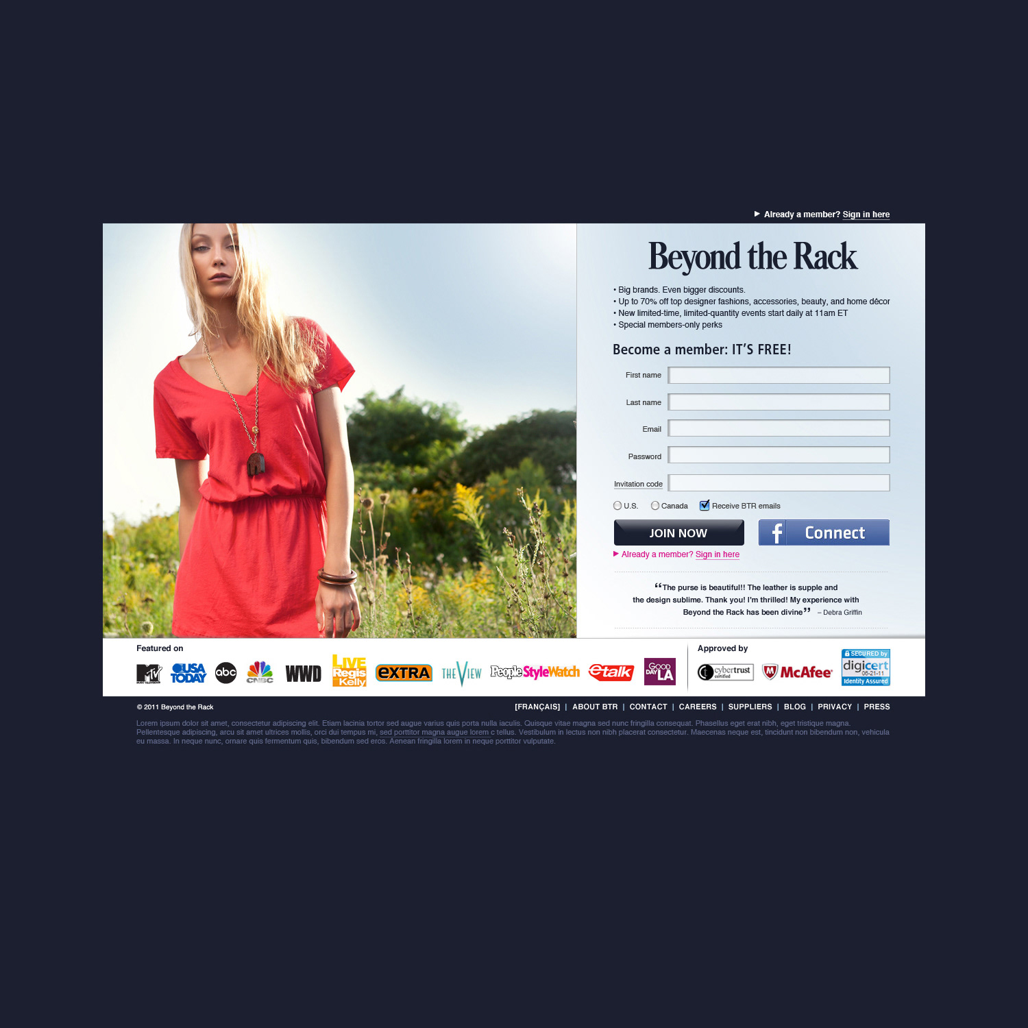
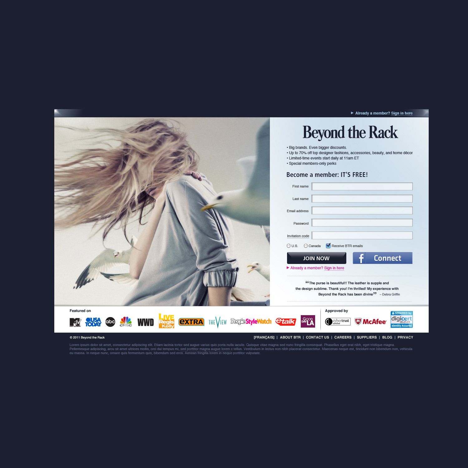
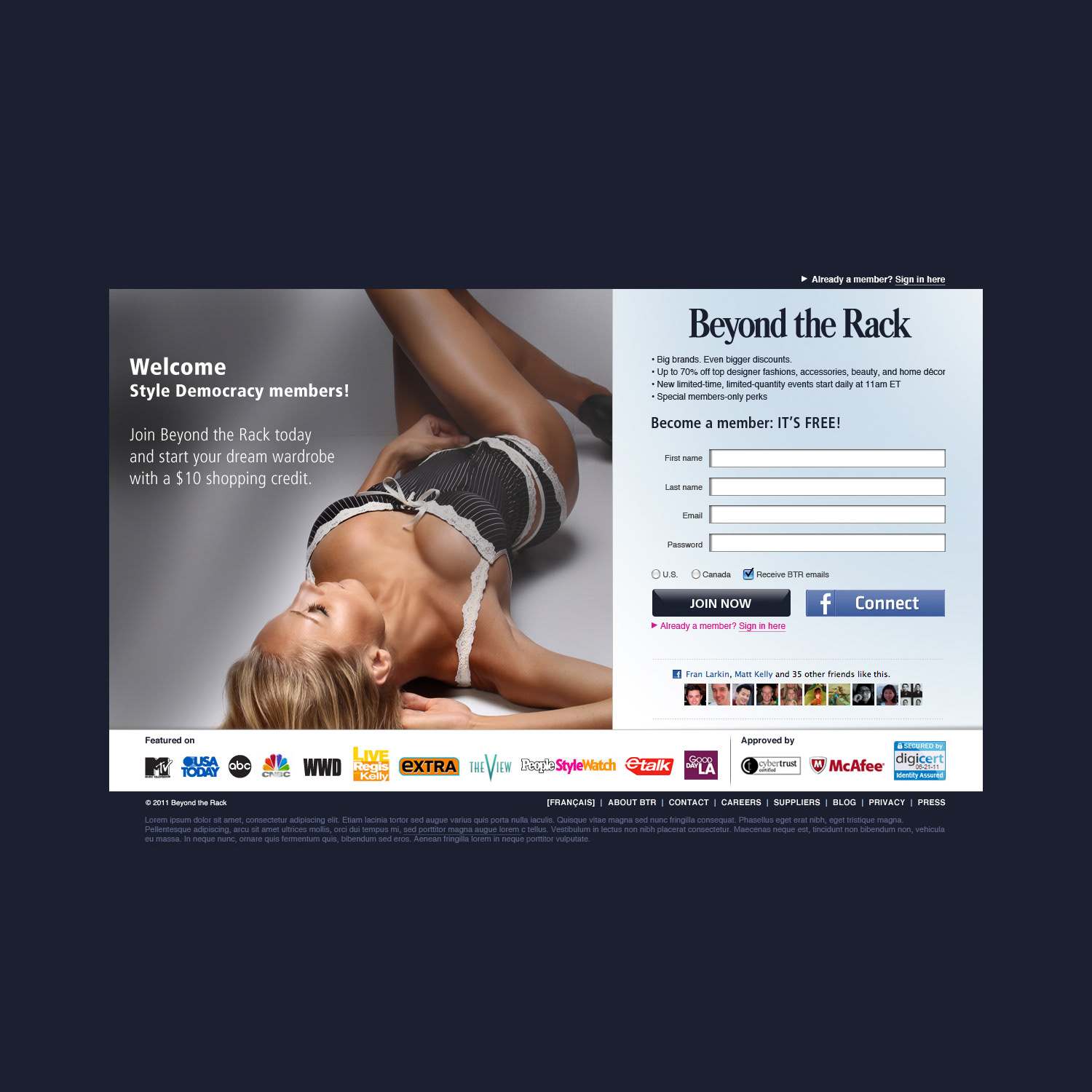
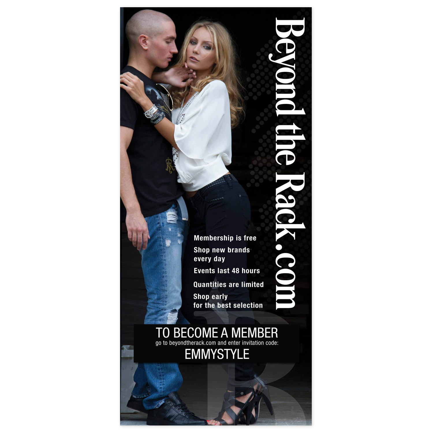
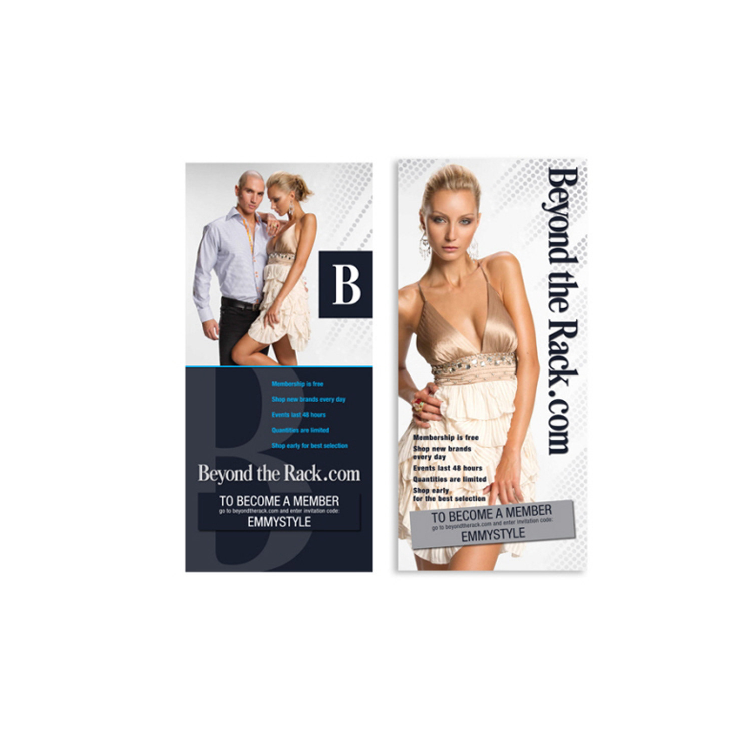
WEBSITE DESIGN
Member-Only Sign-In Page Exclusive Access & Secure Login Experience
Member-Only Sign-In Page Exclusive Access & Secure Login Experience
Situation
The client required a premium, secure sign-in page for an exclusive, invitation-only website protected by a firewall. Access was limited to invited users only, and the page needed to immediately convey prestige, trust, and exclusivity while remaining highly usable.
The client required a premium, secure sign-in page for an exclusive, invitation-only website protected by a firewall. Access was limited to invited users only, and the page needed to immediately convey prestige, trust, and exclusivity while remaining highly usable.
Solution
I designed a sophisticated, gated login experience that reinforced the platform’s elite status from the very first interaction.
I designed a sophisticated, gated login experience that reinforced the platform’s elite status from the very first interaction.
Execution
• Created a clean, modern interface using refined typography, subtle animations, and a premium colour palette aligned with the brand identity.
• Incorporated a prominent “Featured On” section showcasing respected media and partner logos to build instant social proof and credibility.
• Designed intuitive elements including clear input fields, password recovery links, and helpful error messaging.
• Maintained a high-trust, gated aesthetic while ensuring smooth usability and accessibility.
Result
The sign-in page delivered a powerful first impression that encouraged invited users to complete registration. It successfully reinforced the platform’s exclusivity and value while establishing trust and professionalism for a private, members-only community.
The sign-in page delivered a powerful first impression that encouraged invited users to complete registration. It successfully reinforced the platform’s exclusivity and value while establishing trust and professionalism for a private, members-only community.
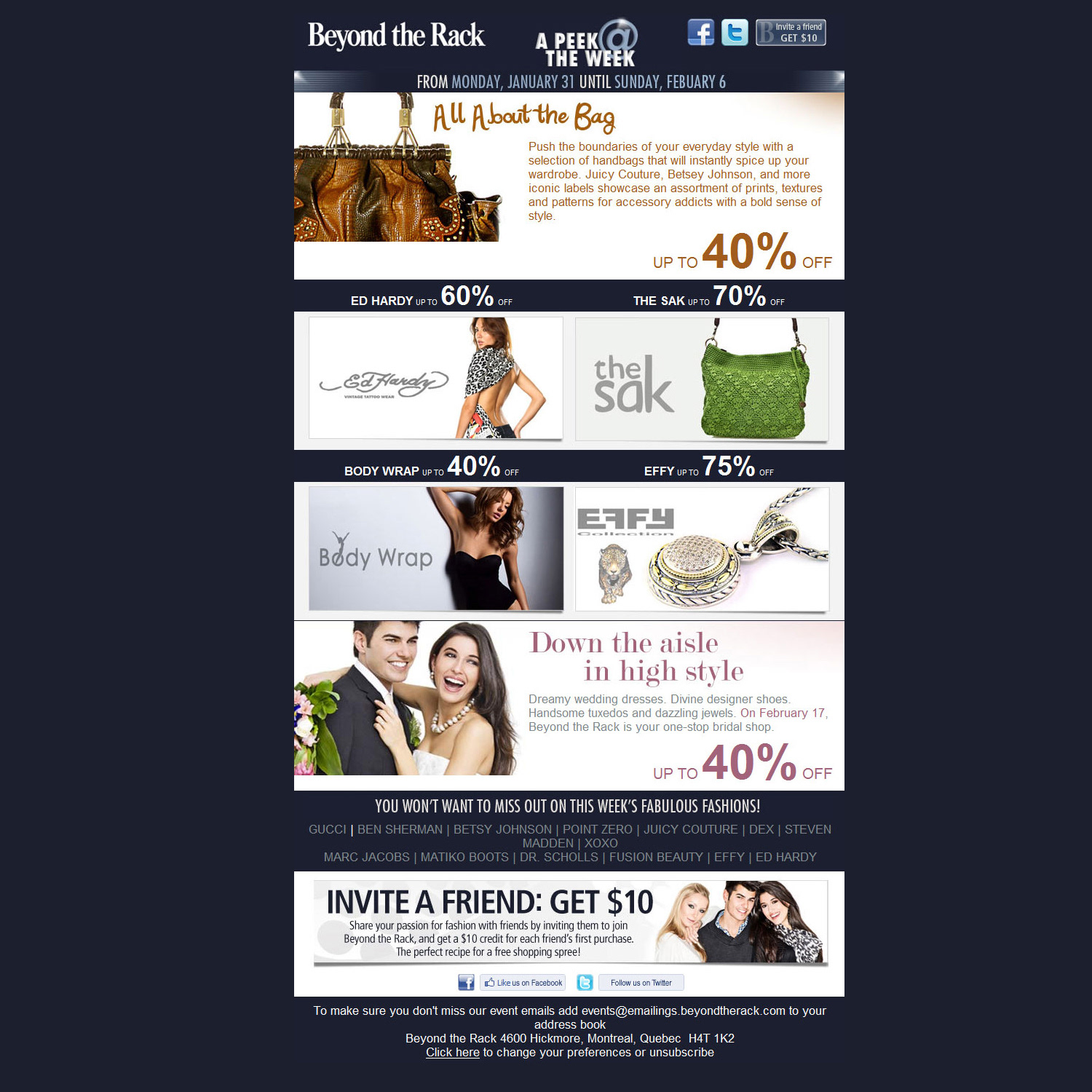
BANNER DESIGN
Canada Post Strike Emergency Banners Crisis Communication Graphics
Canada Post Strike Emergency Banners Crisis Communication Graphics
Situation
During the Canada Post strike, the company needed to quickly communicate shipping delays, alternative delivery options, and service updates to customers, partners, and internal stakeholders to maintain transparency and minimize disruption.
During the Canada Post strike, the company needed to quickly communicate shipping delays, alternative delivery options, and service updates to customers, partners, and internal stakeholders to maintain transparency and minimize disruption.
Solution
I rapidly designed and deployed a full set of emergency banners for both internal and external platforms, providing clear, calm, and reliable information during the logistics crisis.
I rapidly designed and deployed a full set of emergency banners for both internal and external platforms, providing clear, calm, and reliable information during the logistics crisis.
Execution
• Created high-visibility banners using bold, high-contrast colours, large sans-serif typography, concise messaging, and simple icons.
• Adapted designs for multiple channels including the company website, email footers, partner portals, and social media embeds.
• Ensured full brand consistency while balancing urgency with a professional, reassuring tone.
• Delivered the assets with a fast turnaround to meet the time-sensitive nature of the situation.
Result
The banners successfully kept stakeholders informed, reduced customer confusion and frustration, and helped preserve trust during the strike. The clear, responsive communication supported business continuity and reinforced reliability in a challenging period.
The banners successfully kept stakeholders informed, reduced customer confusion and frustration, and helped preserve trust during the strike. The clear, responsive communication supported business continuity and reinforced reliability in a challenging period.
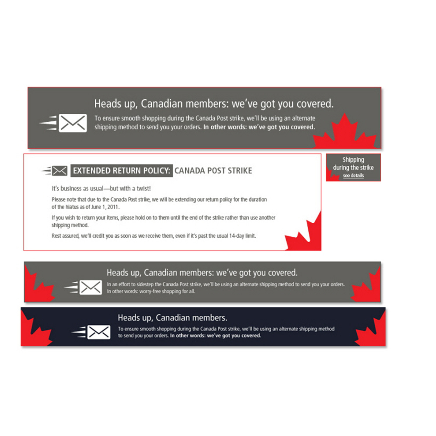
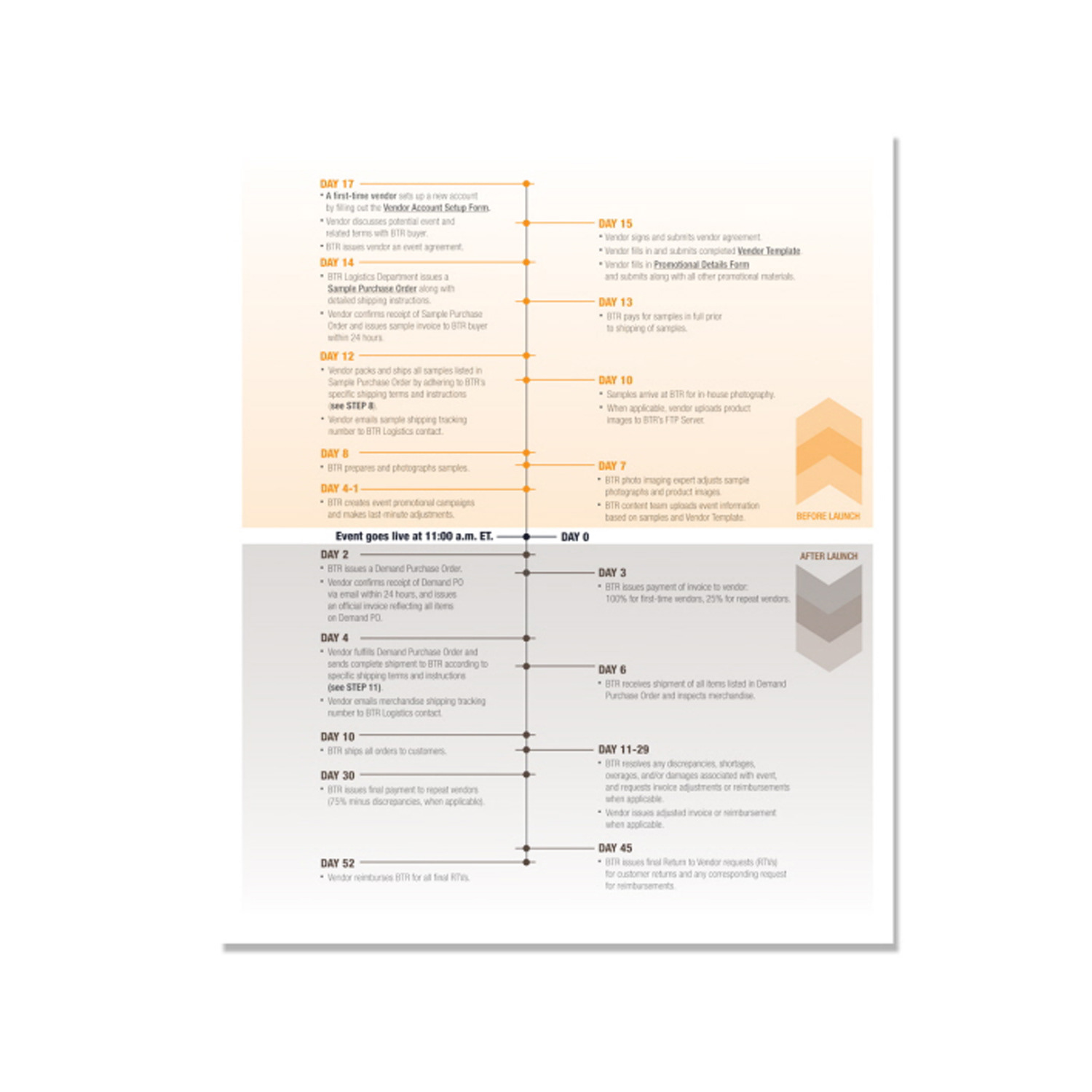
CHART DESIGN
Data Visualization Charts Simplifying Complex Information
Data Visualization Charts Simplifying Complex Information
Situation
Clients needed to communicate dense, technical, statistical, or process-heavy information in a way that was easy for audiences to understand quickly across reports, presentations, websites, and marketing materials.
Clients needed to communicate dense, technical, statistical, or process-heavy information in a way that was easy for audiences to understand quickly across reports, presentations, websites, and marketing materials.
Solution
I designed custom data visualization charts that transform complex ideas and datasets into clear, intuitive, and instantly digestible visuals.
I designed custom data visualization charts that transform complex ideas and datasets into clear, intuitive, and instantly digestible visuals.
Execution
• Created clean, reader-friendly charts using strategic layouts, intuitive hierarchy, purposeful colour coding, icons, and precise typography.
• Optimized designs for both digital (websites, infographics, social media, presentations) and print applications.
• Focused on accuracy, visual flow, and simplicity to help audiences grasp key insights at a glance.
• Ensured every chart maintained strong visual storytelling while preserving data integrity.
Result
The visualizations significantly improved comprehension, retention, and engagement with complex content. They became effective communication tools that supported better decision-making and strengthened messaging in technical, corporate, educational, and B2B environments.
The visualizations significantly improved comprehension, retention, and engagement with complex content. They became effective communication tools that supported better decision-making and strengthened messaging in technical, corporate, educational, and B2B environments.
CAMPAIGN DESIGN
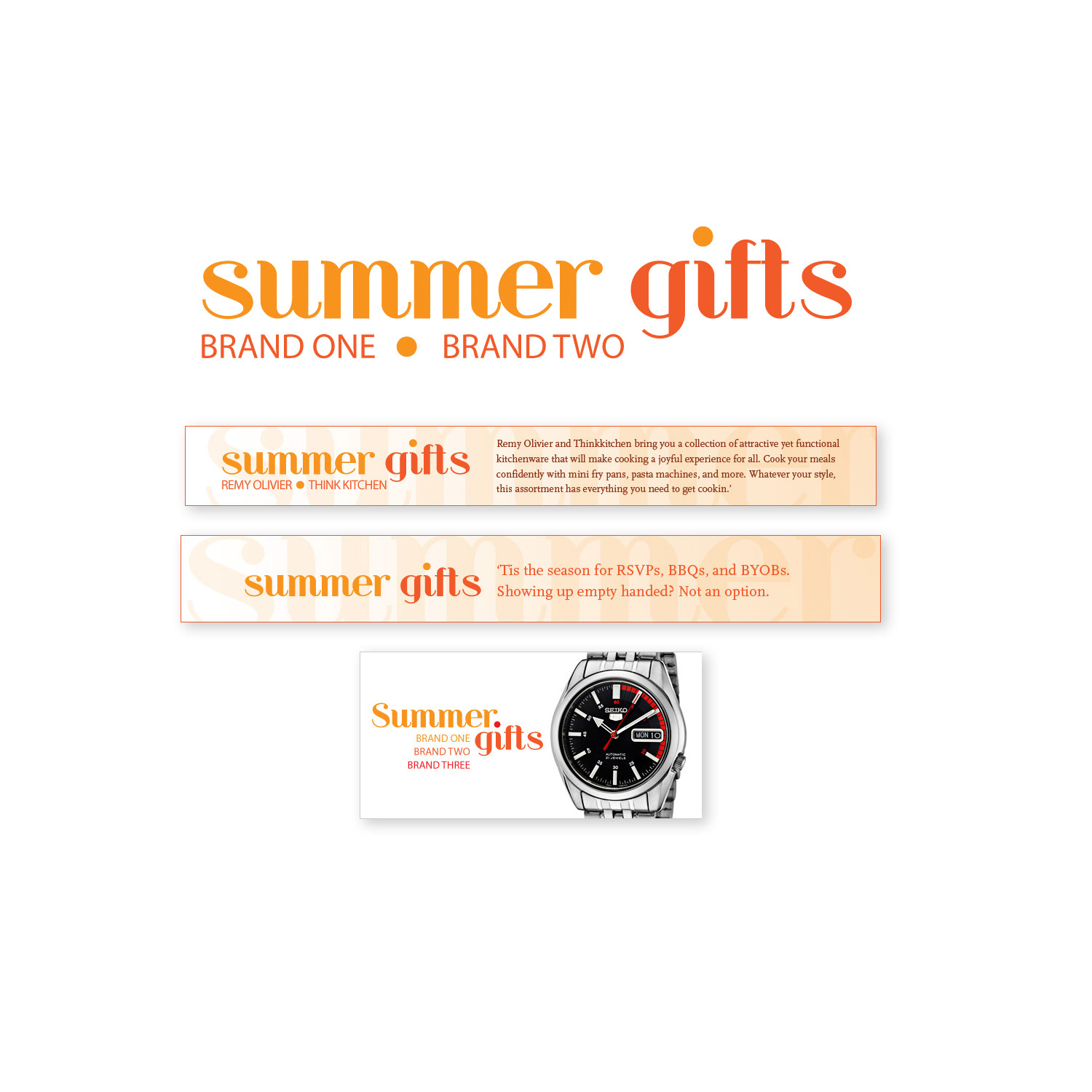
Summer Gifts Campaign
Vibrant Summer Gifting Visuals
Summer Gifts Campaign
Vibrant Summer Gifting Visuals
The “Summer Gifts Campaign” celebrated the spirit of seasonal generosity through thoughtful, sun-drenched creative direction. Inspired by the golden light of sunlit beaches, gentle warm breezes, and the carefree joy of summer, I led the art direction to craft a vibrant collection of branding and promotional visuals that perfectly embodied the essence of summer gifting.
Every design choice was intentional and evocative: playful yet elegant typography that felt light and inviting, a lively and uplifting colour palette dominated by sunny yellows, ocean blues, soft corals, and tropical accents, and imagery that radiated warmth, gratitude, and anticipation. The campaign visuals highlighted not only the beauty and quality of the featured gifts but also the deeper sentiment of thoughtful giving, creating an emotional connection that encouraged recipients to feel truly appreciated.
This seasonal campaign successfully translated the relaxed, positive energy of summer into cohesive marketing assets that drove engagement, reinforced brand affinity, and positioned the client as a go-to source for meaningful summer presents. The result was a joyful, high-impact creative expression that resonated deeply with audiences seeking heartfelt ways to celebrate the season.
This project demonstrates expertise in summer campaign design, seasonal gifting branding, art direction for lifestyle promotions, vibrant colour palette development, playful typography strategy, emotional visual storytelling, gift-focused marketing creatives, and multi-channel promotional design for retail and e-commerce brands.
EMAIL DESIGN
Email Template Design & Production
Mobile-Responsive, High-ROI Marketing Emails
Email Template Design & Production
Mobile-Responsive, High-ROI Marketing Emails
As a specialist in email template design and responsive email production, I created and maintained high-performing email templates for daily, weekly, and monthly campaigns, where success was measured by key metrics including demand generation, audience engagement, website traffic, and conversion rates. Email remains the most powerful and effective marketing channel available, boasting three times more accounts than the combined total of Facebook and Twitter, and consistently delivering the highest ROI compared to other digital channels.
Unlike broad social media broadcasts, email enables hyper-targeted communications tailored to user location, interests, purchase history, and behavior, making it the ideal medium for driving personalized results. I ensured every template was fully mobile-ready, delivering flawless rendering and optimal user experience across smartphones, tablets, and desktops to maximize open rates, click-throughs, and overall performance.
During peak seasonal periods and strategic refresh cycles, I re-designed and re-imagined existing email templates to keep the brand fresh and competitive. Working in Adobe Photoshop, I developed multiple creative options, presented polished mockups to stakeholders for approval, and then integrated the selected designs into production-ready email templates. I also updated corresponding email spec sheets to guide the programming team, ensuring seamless handoff and effortless daily, weekly, and monthly population by the production crew.
This work demonstrates expertise in mobile-responsive email design, email template creation, high-conversion email marketing, Adobe Photoshop for email creatives, responsive email production, seasonal email redesign, stakeholder presentation & approval workflows, and scalable email systems that drive measurable ROI for e-commerce and direct marketing brands.
Weekly Email Template
CAMPAIGN DESIGN
Fashion Branding & Art Direction
Elegant & Empowering Fashion Campaign
Fashion Branding & Art Direction
Elegant & Empowering Fashion Campaign
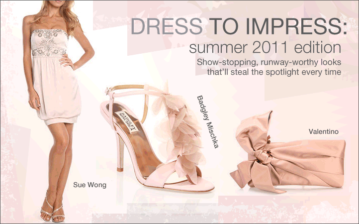
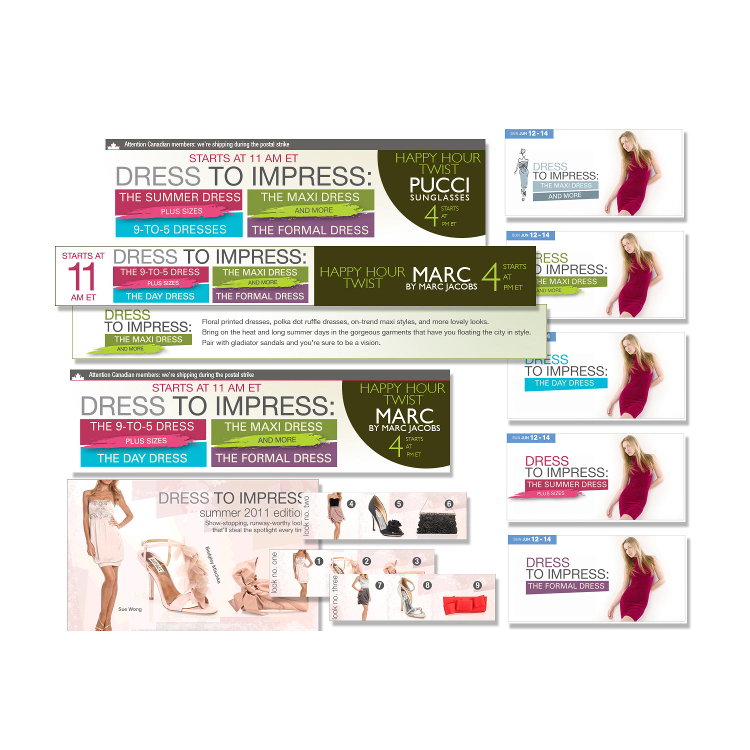
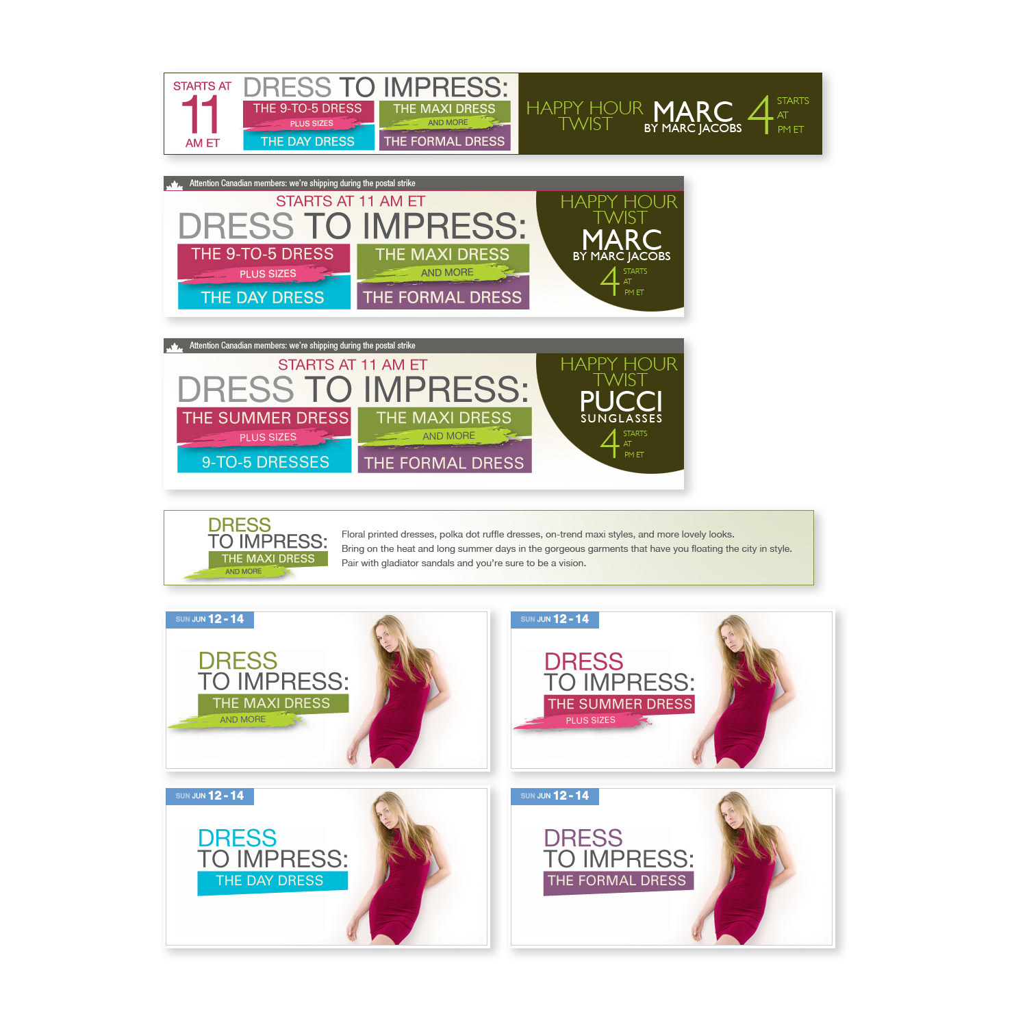
The “Dress to Impress Campaign” served as a captivating celebration of fashion’s transformative power, where my art direction played a central role in conveying allure, elegance, and unwavering confidence. Drawing inspiration from timeless aesthetics blended with contemporary trends, I orchestrated a cohesive visual narrative that honoured individuality, sophistication, and personal empowerment.
Every element was thoughtfully curated to evoke emotion and aspiration: luxurious textures that invited touch, a refined yet vibrant colour palette that balanced richness with modernity, meticulous detailing that highlighted craftsmanship, and strategic composition that positioned each garment as a statement of style and self-assurance. The campaign visuals wove together a story of transformation, encouraging the audience to see fashion not merely as clothing, but as an extension of personal identity and confidence.
Through precise art direction, the campaign elevated the brand’s offerings, creating an aspirational experience that resonated deeply with discerning fashion enthusiasts. The result was a powerful collection of branding and promotional assets that inspired sartorial choices, strengthened emotional connection, and reinforced the brand’s position as a leader in elegant, empowering style.
This project highlights expertise in fashion campaign design, luxury brand art direction, elegant visual storytelling, sophisticated color palette development, textural fashion photography styling, empowerment-focused branding, contemporary fashion marketing creatives, and high-impact promotional design for premium apparel and lifestyle brands.
CAMPAIGN DESIGN
Omni-Channel Creative for 24-Hour Promotions
Unique Logos, Color Palettes, Banners, Emails & Blog Assets Driving Maximum Engagement & Conversions Across Every Digital Touchpoint
Omni-Channel Creative for 24-Hour Promotions
Unique Logos, Color Palettes, Banners, Emails & Blog Assets Driving Maximum Engagement & Conversions Across Every Digital Touchpoint
In a fast-paced e-commerce environment, I spearheaded the creative strategy and design for a continuous series of 24-hour flash sales, each treated as a standalone mini-campaign with its own distinct identity. This approach allowed us to keep customer excitement high while maintaining strong brand recognition across all digital customer touch-points.
My core responsibility involved conceptualizing and designing unique promotional logos that instantly captured the theme, mood, and value proposition of each individual flash sale. I paired each logo with a carefully curated color palette specifically chosen to resonate emotionally with the target audience and align with the sale’s featured products or seasonal vibe. Once these foundational branding elements were presented to stakeholders and approved, I moved forward with developing a full suite of high-performing assets: comprehensive banner templates optimized for website, display networks, and social placements; captivating email layouts designed for maximum open and click-through rates; and visually striking blog images that enhanced content and drove traffic.
To ensure flawless execution under tight daily deadlines, I collaborated closely with a specialized cross-functional team—including social media managers, additional designers, and programmers—effectively delegating production tasks while maintaining strict oversight on quality, brand consistency, and on-time delivery. This cohesive, multi-channel strategy delivered seamless customer experiences across every digital connection point, resulting in heightened engagement, increased urgency, and significantly improved conversion rates during each flash sale event.
This work showcases expertise in flash sale campaign design, 24-hour promotion creative, custom promotional logo design, branded color palette development, omni-channel digital advertising, responsive banner templates, email marketing layouts, blog graphic design, stakeholder presentation & approval workflows, and scalable creative systems for high-volume e-commerce marketing.
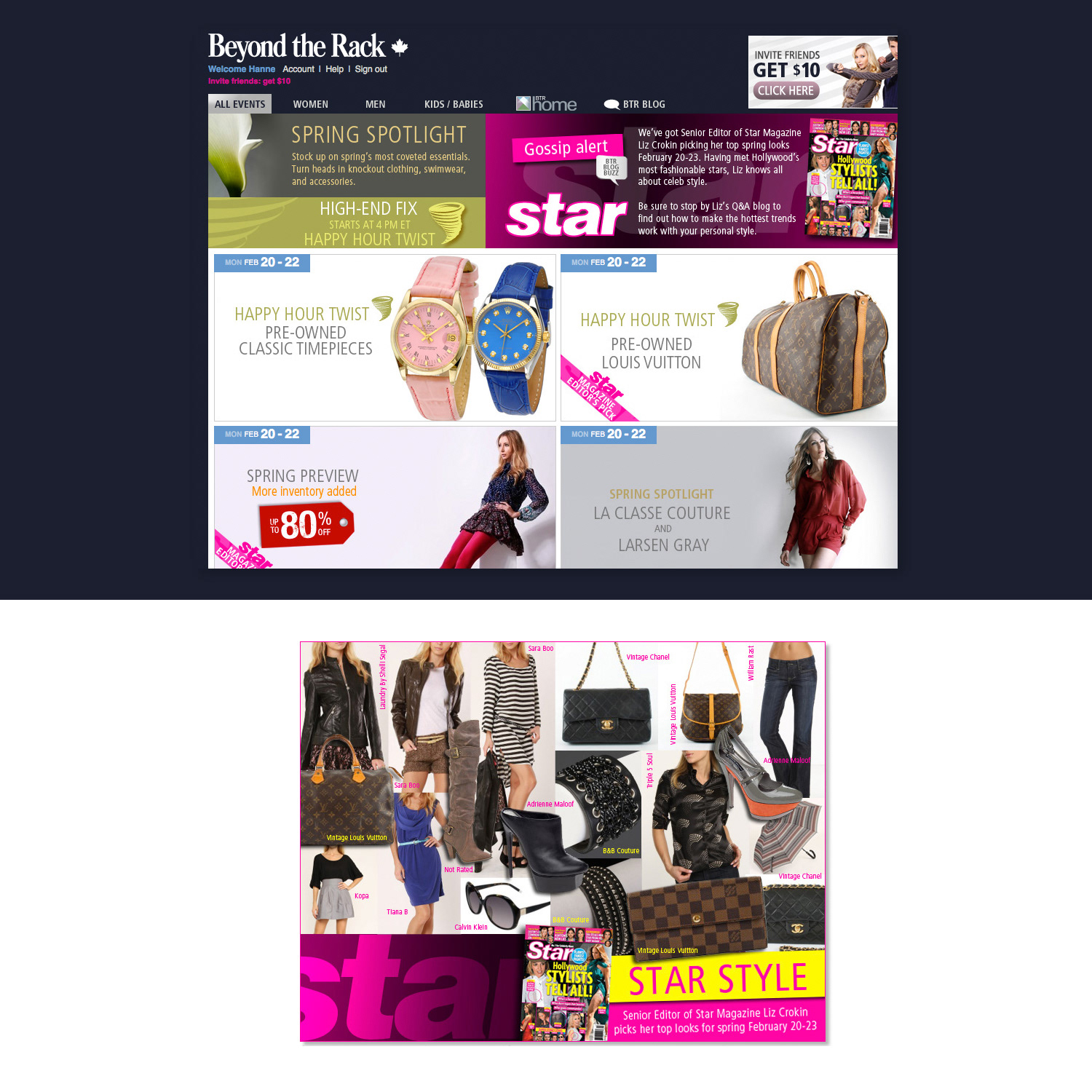
CAMPAIGN DESIGN
Star Magazine Collaboration Multi-Channel Partner Campaign
Star Magazine Collaboration Multi-Channel Partner Campaign
Situation
Beyond the Rack partnered with Star Magazine to create a high-visibility collaborative campaign. The challenge was to integrate the partnership seamlessly across BTR’s entire digital ecosystem while maintaining strong brand consistency and driving meaningful engagement and conversions.
Beyond the Rack partnered with Star Magazine to create a high-visibility collaborative campaign. The challenge was to integrate the partnership seamlessly across BTR’s entire digital ecosystem while maintaining strong brand consistency and driving meaningful engagement and conversions.
Solution
I led the creative direction and execution of a comprehensive multi-channel campaign that extended the Star Magazine collaboration across BTR’s website, blog, email newsletters, and social media platforms.
I led the creative direction and execution of a comprehensive multi-channel campaign that extended the Star Magazine collaboration across BTR’s website, blog, email newsletters, and social media platforms.
Execution
• Designed a full suite of dynamic assets including animated MP4 videos, GIFs, and static marketing elements.
• Created product listing pages (PLPs), interactive fly-down modules, and optimized social media and display banners for both mobile and desktop.
• Ensured all visuals aligned with campaign objectives while maintaining cohesive brand messaging and high production quality.
• Delivered responsive, high-impact creatives tailored for each platform to maximize user interaction and traffic.
Result
The campaign successfully amplified brand exposure and strengthened the partnership’s reach across all digital touchpoints. The integrated approach drove increased user engagement, traffic, and conversions, demonstrating effective cross-channel execution in a high-profile collaboration.
The campaign successfully amplified brand exposure and strengthened the partnership’s reach across all digital touchpoints. The integrated approach drove increased user engagement, traffic, and conversions, demonstrating effective cross-channel execution in a high-profile collaboration.
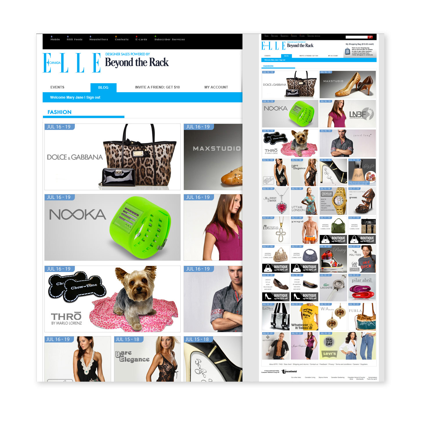
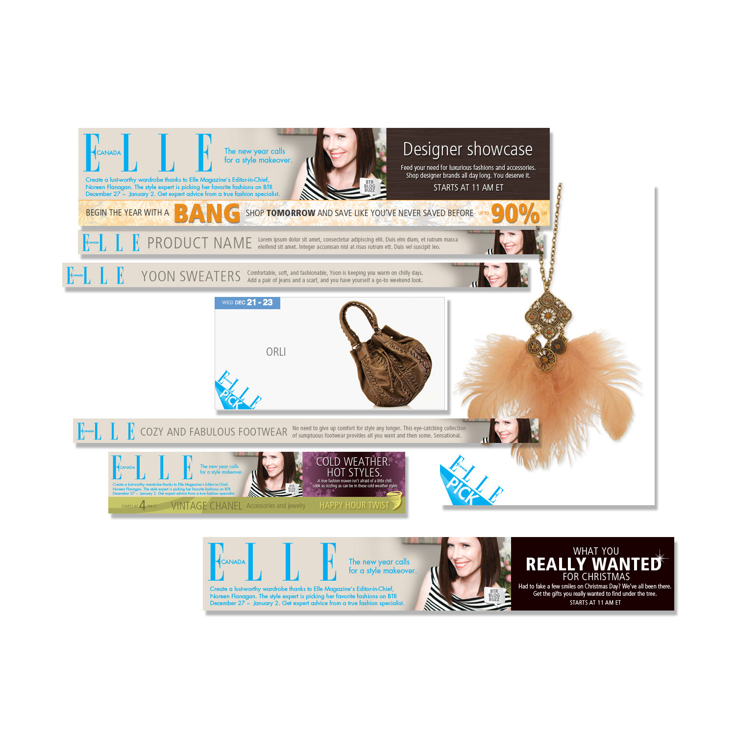
CAMPAIGN DESIGN
Elle Magazine Collaboration High-Visibility Partner Campaign
Elle Magazine Collaboration High-Visibility Partner Campaign
Situation
Beyond the Rack partnered with Elle Magazine for a premium collaborative campaign. The objective was to extend the partnership beyond Elle’s channels and seamlessly integrate it into BTR’s full digital ecosystem to drive brand exposure, user engagement, and conversions.
Beyond the Rack partnered with Elle Magazine for a premium collaborative campaign. The objective was to extend the partnership beyond Elle’s channels and seamlessly integrate it into BTR’s full digital ecosystem to drive brand exposure, user engagement, and conversions.
Solution
I led the creative direction and execution of a cohesive, high-impact multi-channel campaign that unified the Elle collaboration with Beyond the Rack’s brand identity across all customer touch-points.
I led the creative direction and execution of a cohesive, high-impact multi-channel campaign that unified the Elle collaboration with Beyond the Rack’s brand identity across all customer touch-points.
Execution
• Developed a comprehensive suite of assets including dynamic animated MP4 videos, GIFs, and compelling static visuals.
• Designed product listing pages (PLPs), interactive fly-down modules, and optimized social media and display banners for mobile and desktop.
• Ensured all elements maintained strong brand consistency while delivering exceptional user experience and visual appeal.
• Strategically aligned every asset with campaign goals to boost interaction and drive traffic across the website, blog, email newsletters, and social platforms.
Result
The campaign successfully amplified brand visibility and deepened audience engagement across all digital channels. The integrated creative strategy strengthened the partnership’s impact and delivered measurable improvements in user interaction, traffic, and conversions within the competitive e-commerce and fashion lifestyle space.
The campaign successfully amplified brand visibility and deepened audience engagement across all digital channels. The integrated creative strategy strengthened the partnership’s impact and delivered measurable improvements in user interaction, traffic, and conversions within the competitive e-commerce and fashion lifestyle space.
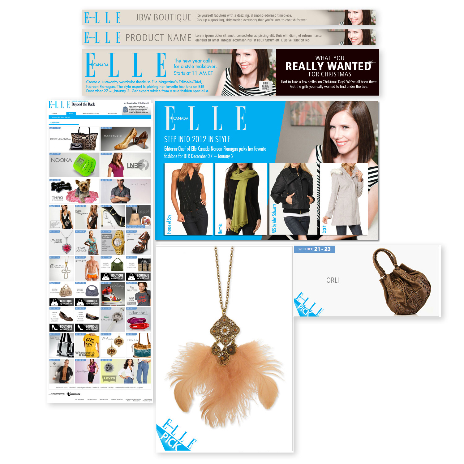
Elle Campaign
BANNER DESIGN
Dynamic Digital Advertising for E-commerce Performance-Optimized Banner Campaigns
Dynamic Digital Advertising for E-commerce Performance-Optimized Banner Campaigns
Situation
E-commerce partners needed high-performing banner advertisements to increase brand visibility, drive qualified traffic to product pages, and boost conversions across multiple digital platforms in a competitive online retail space.
E-commerce partners needed high-performing banner advertisements to increase brand visibility, drive qualified traffic to product pages, and boost conversions across multiple digital platforms in a competitive online retail space.
Solution
I designed dynamic, results-driven banner ads tailored to each partner’s specific marketing objectives, optimized for strong performance across display networks, social media, retargeting campaigns, and website integrations.
I designed dynamic, results-driven banner ads tailored to each partner’s specific marketing objectives, optimized for strong performance across display networks, social media, retargeting campaigns, and website integrations.
Execution
• Created bold, visually compelling banners with strategic colour palettes, clear typography, and strong calls-to-action.
• Ensured full responsiveness and fast loading across desktop, tablet, and mobile devices.
• Analyzed campaign goals, audience behaviours, and platform specifications to align every design choice with business outcomes.
• Delivered assets focused on elevating brand awareness, increasing click-through rates, and driving direct traffic to product pages.
Result
The banner campaigns successfully enhanced visibility, improved engagement, and delivered measurable traffic and conversions for e-commerce partners. The strategic, performance-focused approach provided high-impact digital assets that consistently performed well in competitive online environments.
The banner campaigns successfully enhanced visibility, improved engagement, and delivered measurable traffic and conversions for e-commerce partners. The strategic, performance-focused approach provided high-impact digital assets that consistently performed well in competitive online environments.
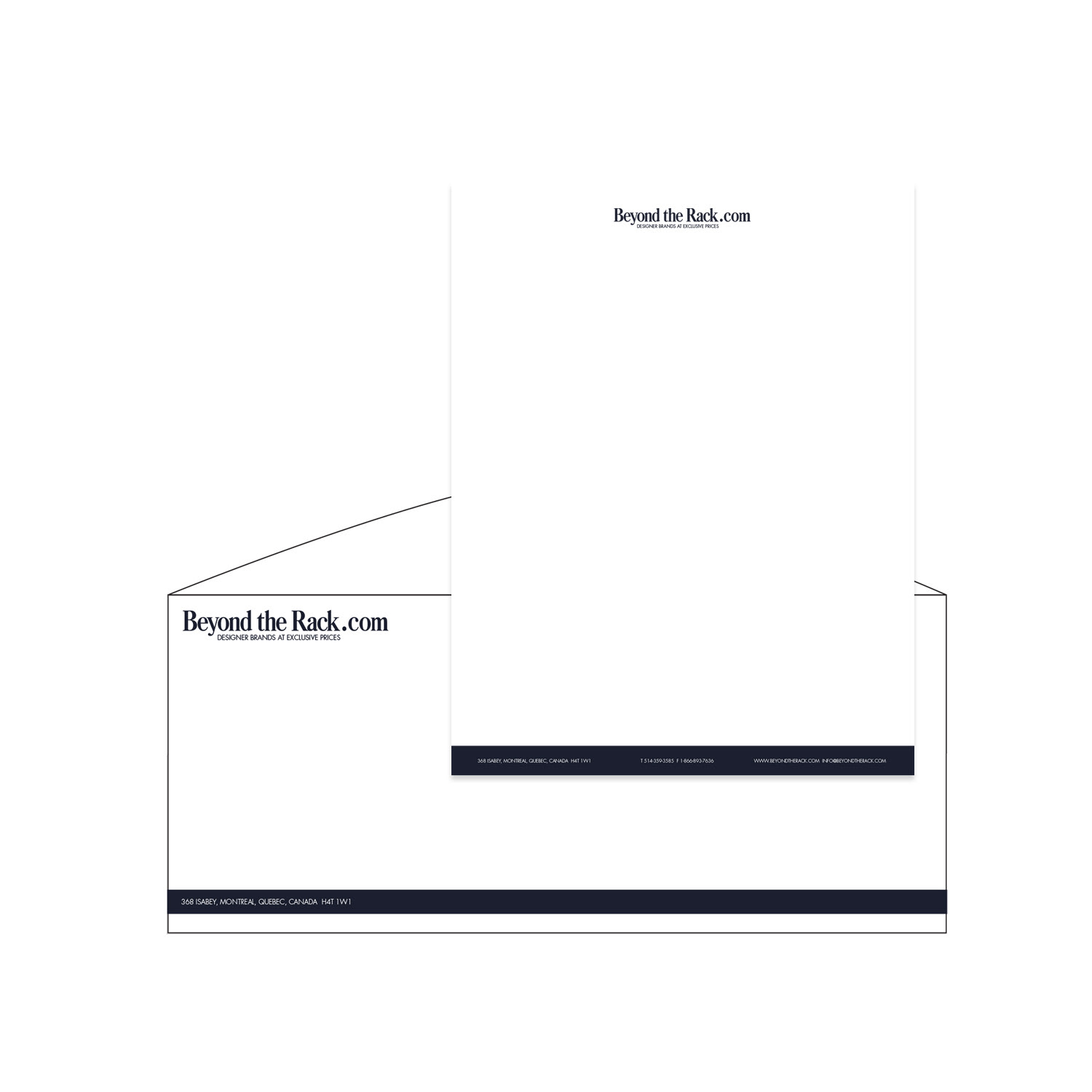
PRINT DESIGN
Premium Brand Identity Collateral Corporate Stationery Suite
Premium Brand Identity Collateral Corporate Stationery Suite
Situation
The organization required a complete, high-end corporate stationery suite that would consistently reflect their professional stature, core values, and brand identity across all physical touch-points, from client correspondence to executive communications.
The organization required a complete, high-end corporate stationery suite that would consistently reflect their professional stature, core values, and brand identity across all physical touch-points, from client correspondence to executive communications.
Solution
I led the design of a cohesive, premium stationery system that served as a daily ambassador of the brand, combining elegance with clear communication of the company’s professionalism and reliability.
I led the design of a cohesive, premium stationery system that served as a daily ambassador of the brand, combining elegance with clear communication of the company’s professionalism and reliability.
Execution
• Designed a full suite including letterheads, business cards, envelopes, compliment slips, and supporting collateral.
• Developed refined typography systems, precise colour palettes (Pantone, CMYK, and digital equivalents), and balanced layouts that integrated essential information without compromising visual sophistication.
• Maintained strict adherence to brand guidelines to ensure consistency and a luxurious tactile experience.
• Focused on both aesthetic excellence and functional clarity to create a powerful, lasting impression.
Result
The stationery suite successfully elevated brand perception in every interaction with clients, partners, and stakeholders. It reinforced credibility, professionalism, and trust while providing a consistent, high-quality brand experience across all printed materials — strengthening relationships and supporting the organization’s premium positioning.
The stationery suite successfully elevated brand perception in every interaction with clients, partners, and stakeholders. It reinforced credibility, professionalism, and trust while providing a consistent, high-quality brand experience across all printed materials — strengthening relationships and supporting the organization’s premium positioning.
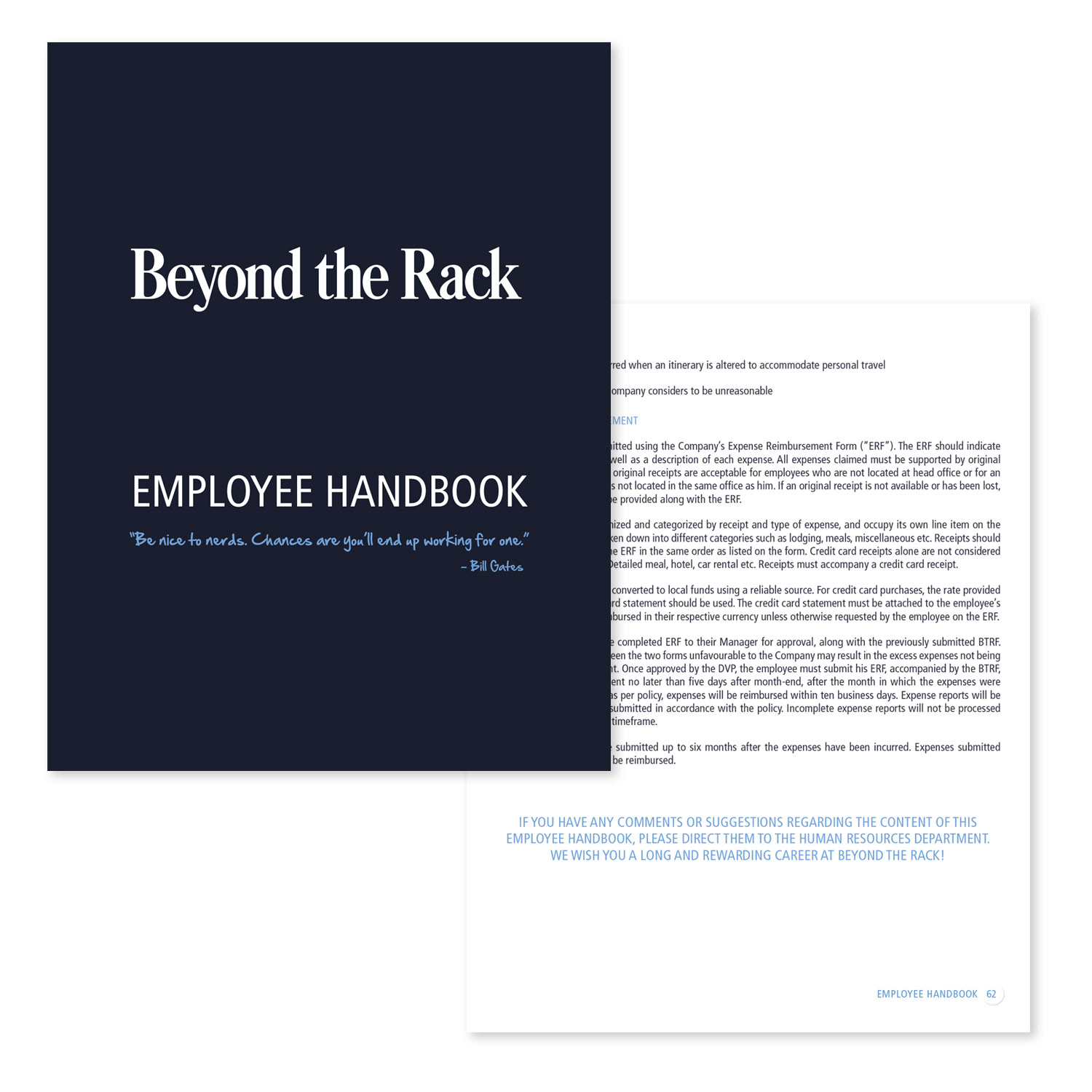
PRINT DESIGN
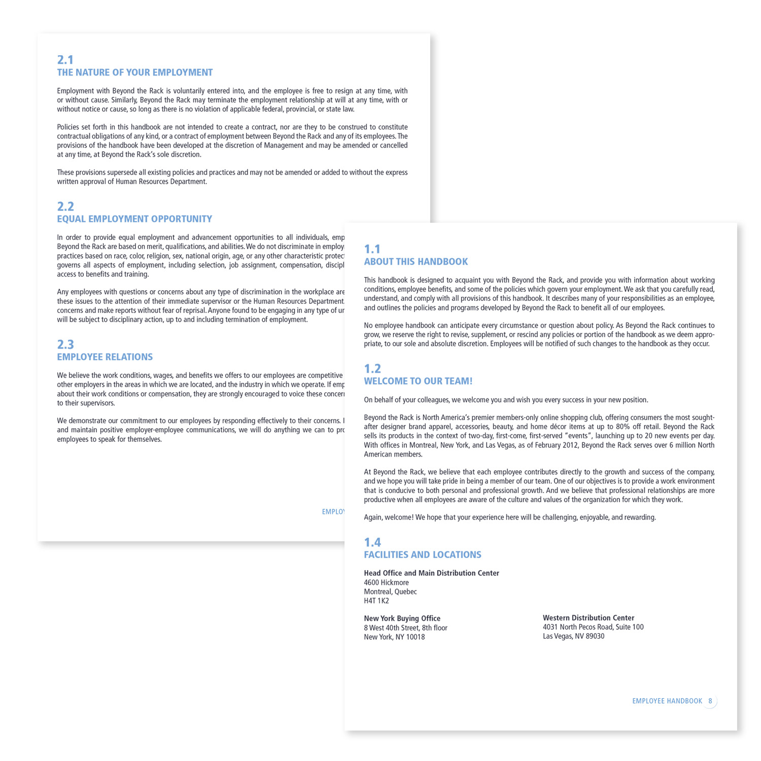
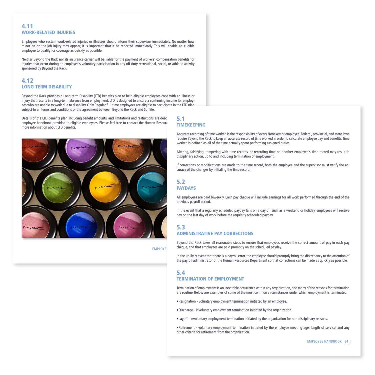
Branded Onboarding Guide Employee Handbook & New Hire Resource
Branded Onboarding Guide Employee Handbook & New Hire Resource
Situation
The company needed a professional, consistent, and user-friendly onboarding resource to help new employees quickly understand policies, procedures, benefits, and company culture while reinforcing brand identity from day one.
The company needed a professional, consistent, and user-friendly onboarding resource to help new employees quickly understand policies, procedures, benefits, and company culture while reinforcing brand identity from day one.
Solution
I designed a comprehensive employee handbook that functions as both a premium printed piece and a fully interactive digital PDF, ensuring a high-quality experience regardless of location or device.
I designed a comprehensive employee handbook that functions as both a premium printed piece and a fully interactive digital PDF, ensuring a high-quality experience regardless of location or device.
Execution
• Created a cohesive design that strictly followed the company’s brand guidelines for typography, colour palette, logo usage, and visual language.
• Developed clear information hierarchy, intuitive navigation (table of contents, section dividers, thumb tabs in print; hyperlinks and bookmarks in PDF), and approachable icons/visual cues.
• Delivered both a tactile, high-quality printed version and a responsive, searchable interactive PDF optimized for desktop, tablet, and mobile.
• Balanced professionalism with readability to make complex information more accessible and memorable.
Result
The onboarding guide became a valuable resource that improved new employee understanding, accelerated integration, and reduced early-stage questions. It reinforced brand consistency and professionalism from the very first day, contributing to a smoother and more positive onboarding experience.
The onboarding guide became a valuable resource that improved new employee understanding, accelerated integration, and reduced early-stage questions. It reinforced brand consistency and professionalism from the very first day, contributing to a smoother and more positive onboarding experience.
PACKAGING DESIGN
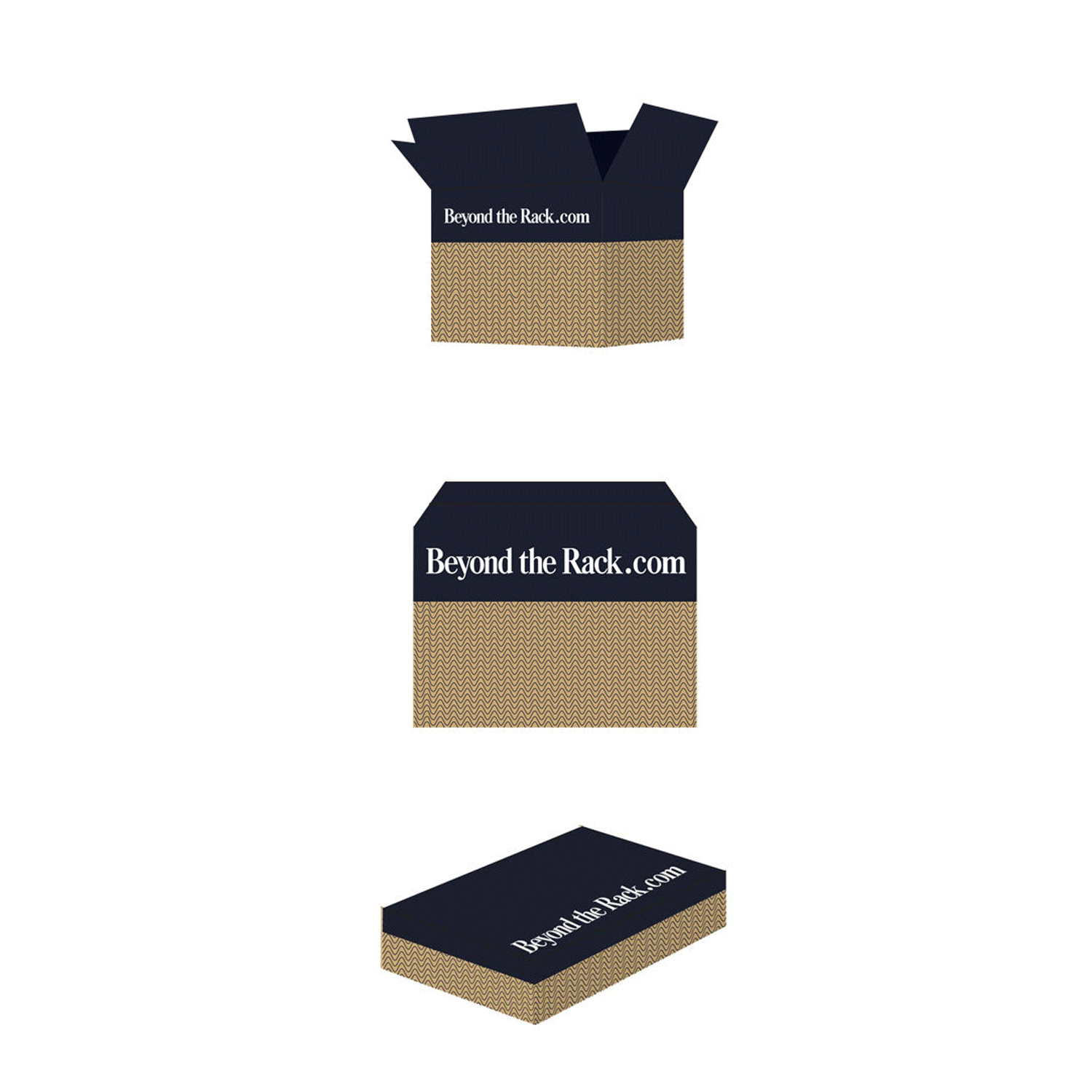
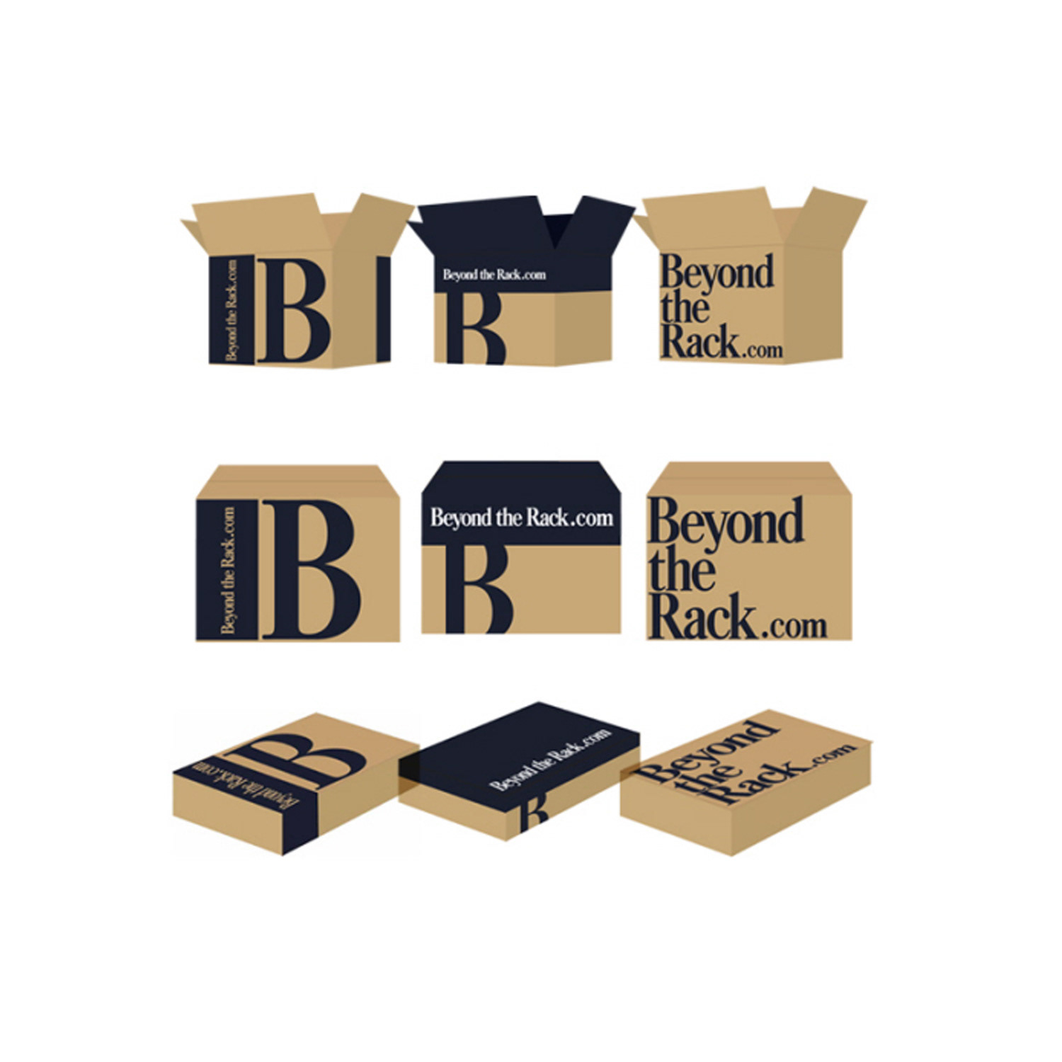
Strategic Packaging Solutions
Shipping Boxes & Brand Coherence
Strategic Packaging Solutions
Shipping Boxes & Brand Coherence
As the primary steward of visual brand coherence, I ensured every packaging solution aligned seamlessly with the brand's core identity, messaging, and aesthetic standards. Specializing in packaging design for shipping boxes, I conceptualized and developed captivating, brand-consistent solutions tailored to a wide range of sizes, from compact retail parcels to large-scale e-commerce shipments.
My process began with in-depth research into contemporary packaging trends, competitor benchmarks, and emerging materials, allowing me to present well-informed, forward-thinking options to stakeholders through comprehensive, visually compelling presentations. Beyond creative direction, I led detailed cost analysis, managed budget allocations, and negotiated favorable pricing, timelines, and shipment logistics with a trusted network of suppliers.
By nurturing strong, collaborative supplier relationships, I maintained rigorous quality control at every stage—from material selection and prototyping to final production—guaranteeing flawless execution that met both aesthetic and functional requirements. This holistic approach delivered innovative, market-relevant packaging that reinforced brand recognition, enhanced unboxing experiences, and supported operational efficiency while positioning the brand for sustained growth in competitive e-commerce and retail environments.
This work demonstrates expertise in shipping box packaging design, brand-consistent packaging solutions, custom packaging for e-commerce, packaging trend research, stakeholder presentation & packaging concepts, cost analysis & budget management for print production, supplier negotiation & vendor coordination, and full-cycle packaging project leadership.
CAMPAIGN DESIGN
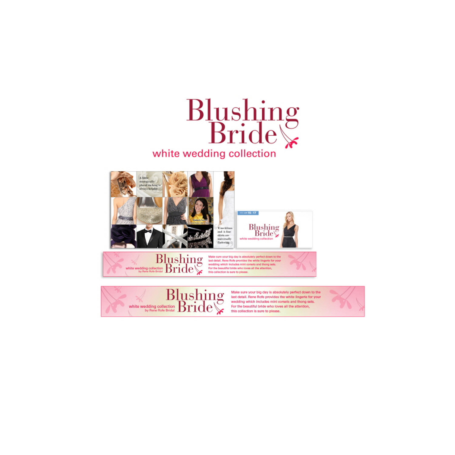
Blushing Bride Campaign
Wedding Branding & Romantic Creative Direction
Blushing Bride Campaign
Wedding Branding & Romantic Creative Direction
The “Blushing Bride Campaign” was a heartfelt celebration of the journey to matrimony, where my creative direction and art direction brought the romance, elegance, and joyful anticipation of wedding planning to life. I steered the entire visual strategy to perfectly reflect the dreams, emotions, and aspirations of every bride-to-be, creating an aspirational and deeply resonant experience for the target audience.
Through a carefully curated soft colour palette—featuring gentle blush tones, creamy ivories, subtle golds, romantic pastels, and whisper-soft neutrals—I established a serene, feminine, and luxurious aesthetic that evoked tenderness and sophistication. Every design element was meticulously chosen to harmonize with this delicate palette: intricate patterns, refined typography, layered textures, and evocative imagery that captured intimate moments, floral details, bridal silhouettes, and the magic of love and commitment.
The result was a fully cohesive campaign narrative that celebrated beauty, anticipation, and joyful celebration, guiding the audience through the emotional and aesthetic essence of this life milestone. Each visual asset—from promotional graphics and social media posts to campaign logos, mood boards, and supporting materials—reinforced a unified story of romance and elegance that inspired connection and strengthened brand affinity.
This project demonstrates expertise in wedding campaign design, bridal branding creative, romantic art direction, soft colour palette development, feminine visual storytelling, elegant wedding marketing assets, delicate typography and texture integration, and high-emotion promotional design for bridal, lifestyle, and luxury retail brands.
DIRECT MARKETING DESIGN
National Print Marketing Campaign
Engaging Scratch-Off Reveal with Instant Discount
National Print Marketing Campaign
Engaging Scratch-Off Reveal with Instant Discount
I designed and produced a high-impact print postcard distributed nationwide across Canada as part of a targeted direct mail campaign. The front featured compelling visuals, strong calls-to-action, and brand-aligned messaging to immediately capture attention in the mailbox. The back incorporated an innovative scratch-off element that revealed an exclusive instant discount code upon scratching, creating a tactile, gamified experience that boosted excitement and encouraged immediate redemption.
This interactive scratch-off postcard combined strategic design with proven psychological triggers: curiosity, instant gratification, and perceived value. The layout ensured the scratch area was prominently placed for maximum visibility, while maintaining clean typography, high-contrast colors, and premium print quality to reinforce brand professionalism. Every detail—from paper stock selection to die-cutting precision—was managed to deliver a luxurious unboxing feel and high perceived value.
The postcard successfully drove engagement, increased redemption rates, and supported customer acquisition across diverse regions. This project highlights expertise in interactive print design, scratch-off postcard production, direct mail marketing, national postcard campaigns, discount postcard creative, gamified direct mail, print production oversight, and results-oriented promotional collateral for e-commerce, retail, and subscription brands.
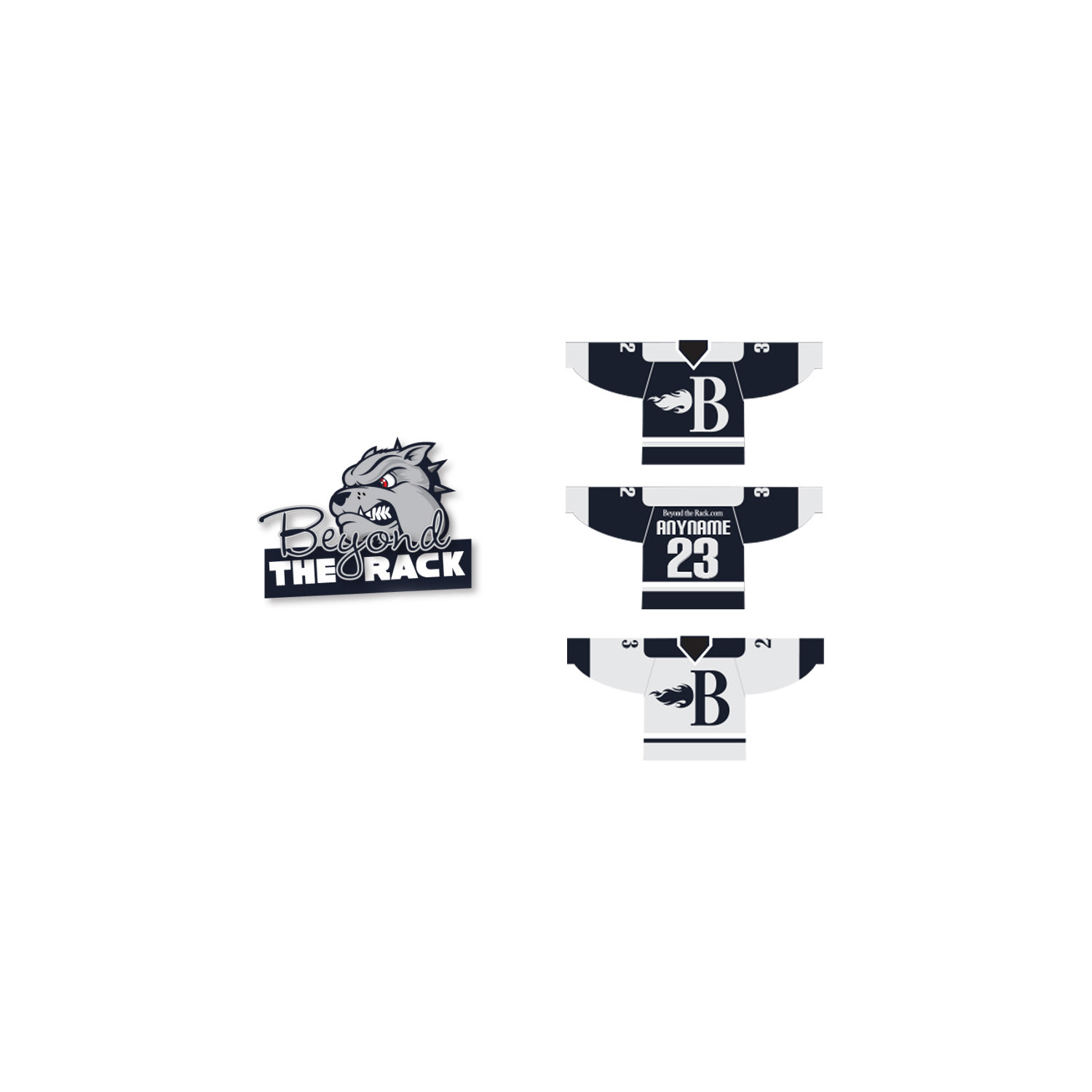
BRANDING DESIGN
Custom Logo & Branded Jersey Creation
Professional Identity for a Corporate Hockey Team
Custom Logo & Branded Jersey Creation
Professional Identity for a Corporate Hockey Team
I designed a complete visual identity package for a corporate hockey team, starting with a custom logo that captured the team’s competitive spirit, unity, and professional character. The logo was crafted to be versatile, scalable, and instantly recognizable—suitable for jerseys, helmets, equipment, merchandise, digital profiles, and print collateral.
Using clean lines, bold typography, and a powerful yet approachable colour palette, the logo conveyed strength, teamwork, and corporate sophistication while remaining true to the fast-paced, energetic nature of hockey. Once the logo was finalized and approved, I extended the brand identity to the team’s primary jersey design. This included strategic placement of the logo on the chest and sleeves, player numbering, name bars, sponsor integration, and accent details that ensured both visual impact and functionality during play.
The jersey design balanced aesthetics with practical considerations such as breathable fabric compatibility, readability from the stands, and compliance with league standards. The result was a cohesive, professional look that elevated the team’s presence on the ice, fostered pride among players, and strengthened the corporate team’s internal branding and camaraderie.
This project highlights expertise in corporate hockey logo design, team jersey branding, sports identity creation, custom logo development, athletic apparel graphics, professional team branding, logo-to-jersey application, and full visual identity systems for recreational and corporate sports teams.
PRINT DESIGN
Versatile Pull-Up Banner Design
Elevating Brand Presence at Trade Shows, Offices & Corporate Events
Versatile Pull-Up Banner Design
Elevating Brand Presence at Trade Shows, Offices & Corporate Events
I created a comprehensive range of pull-up banners, roll-up displays, and large-format graphics tailored for high-visibility use across multiple environments. These included portable trade show pull-ups designed for quick setup and maximum impact on busy exhibition floors, durable office decor pieces that reinforced brand identity in reception areas, meeting rooms, and common spaces, as well as event-specific banners optimized for conferences, corporate gatherings, product launches, and internal celebrations.
Each design maintained strict brand consistency through precise application of logos, typography, colour palettes, and messaging, while incorporating strategic layout choices to ensure readability from a distance and strong visual hierarchy in crowded or high-traffic settings. The project encompassed everything from initial concept sketches and stakeholder presentations to final production-ready files, with careful attention to material specifications, hardware compatibility, and print quality to deliver professional, long-lasting results that elevated brand perception and engagement in real-world settings.
This work highlights expertise in pull-up banner design, trade show graphics, large-format printing, office brand decor, event banner production, roll-up display creative, corporate environmental branding, and scalable visual solutions for professional and promotional spaces.
CAMPAIGN DESIGN
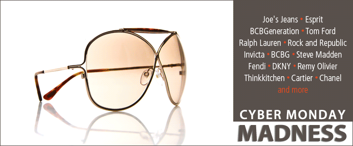
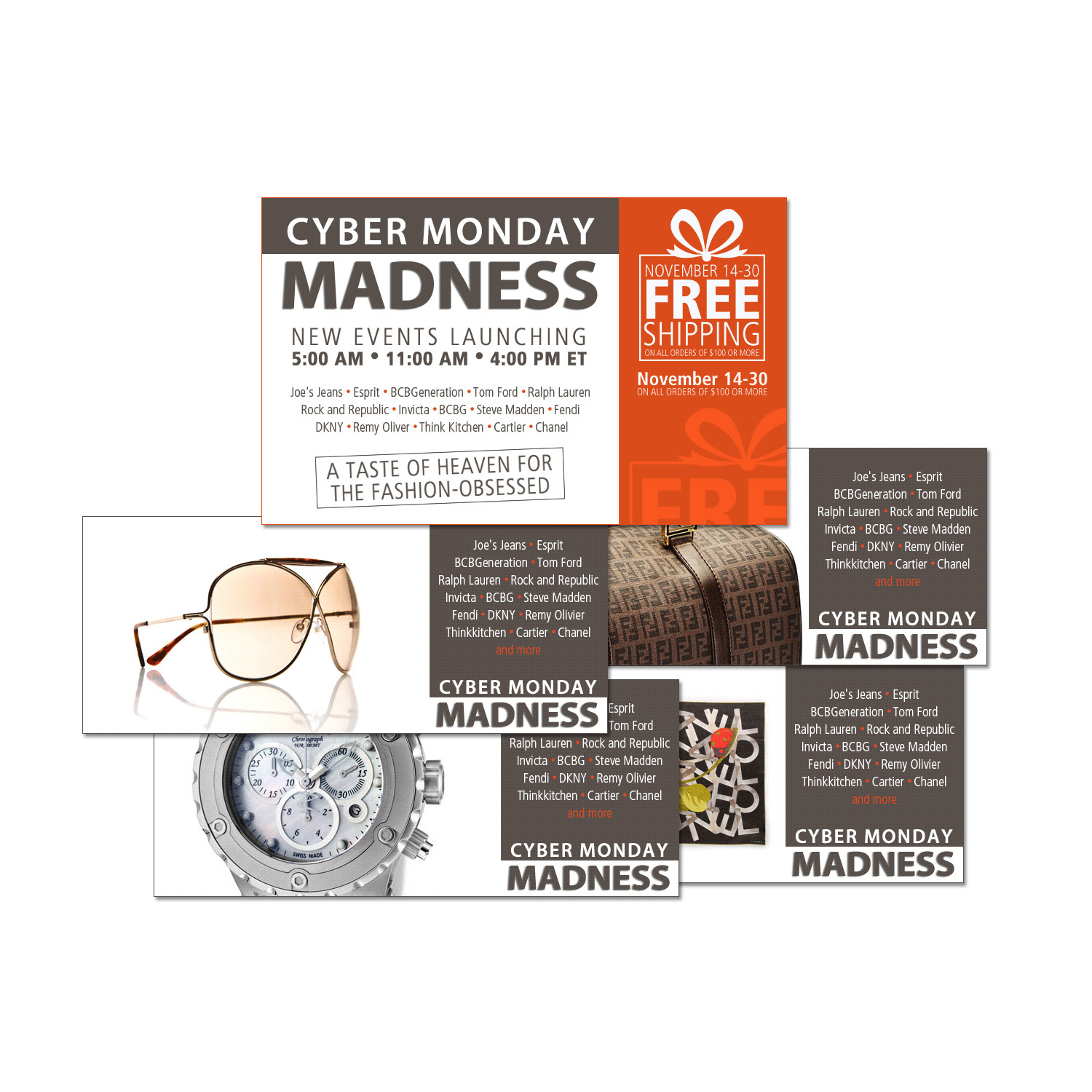
Cyber Monday Campaign
High-Impact Digital Graphic Design & Promotion
Cyber Monday Campaign
High-Impact Digital Graphic Design & Promotion
The “Cyber Monday Campaign” showcased the full scope of my graphic design expertise in delivering high-energy, conversion-focused digital promotions. Designed specifically for the intense, fast-paced nature of online shopping events, the campaign featured a complete suite of compelling visuals that captured the excitement, urgency, and irresistible value of Cyber Monday deals.
I crafted attention-grabbing graphics, intuitive layouts, and optimized promotional assets tailored to digital channels, ensuring seamless performance across websites, email campaigns, social media feeds, display ads, and landing pages. Every element—from bold, high-contrast color palettes and dynamic typography to strategic call-to-action placement and responsive composition—was carefully aligned to maximize user engagement, encourage clicks, and drive immediate conversions in a highly competitive online environment.
Through meticulous attention to detail and innovative design techniques, the visuals elevated the brand’s digital presence, created a cohesive and thrilling user experience, and reinforced the sense of limited-time opportunity that defines Cyber Monday success. The campaign effectively balanced aesthetic appeal with functional performance, turning casual browsers into eager buyers.
This project demonstrates expertise in Cyber Monday campaign design, e-commerce digital graphic design, high-urgency promotional visuals, conversion-optimized layouts, attention-grabbing color palette strategy, responsive digital creatives, online flash sale graphics, and fast-paced seasonal marketing for retail and e-commerce brands.
CAMPAIGN DESIGN
Seasonal Fashion Branding & Visual Storytelling
Autumn-Inspired Campaign Design
Seasonal Fashion Branding & Visual Storytelling
Autumn-Inspired Campaign Design
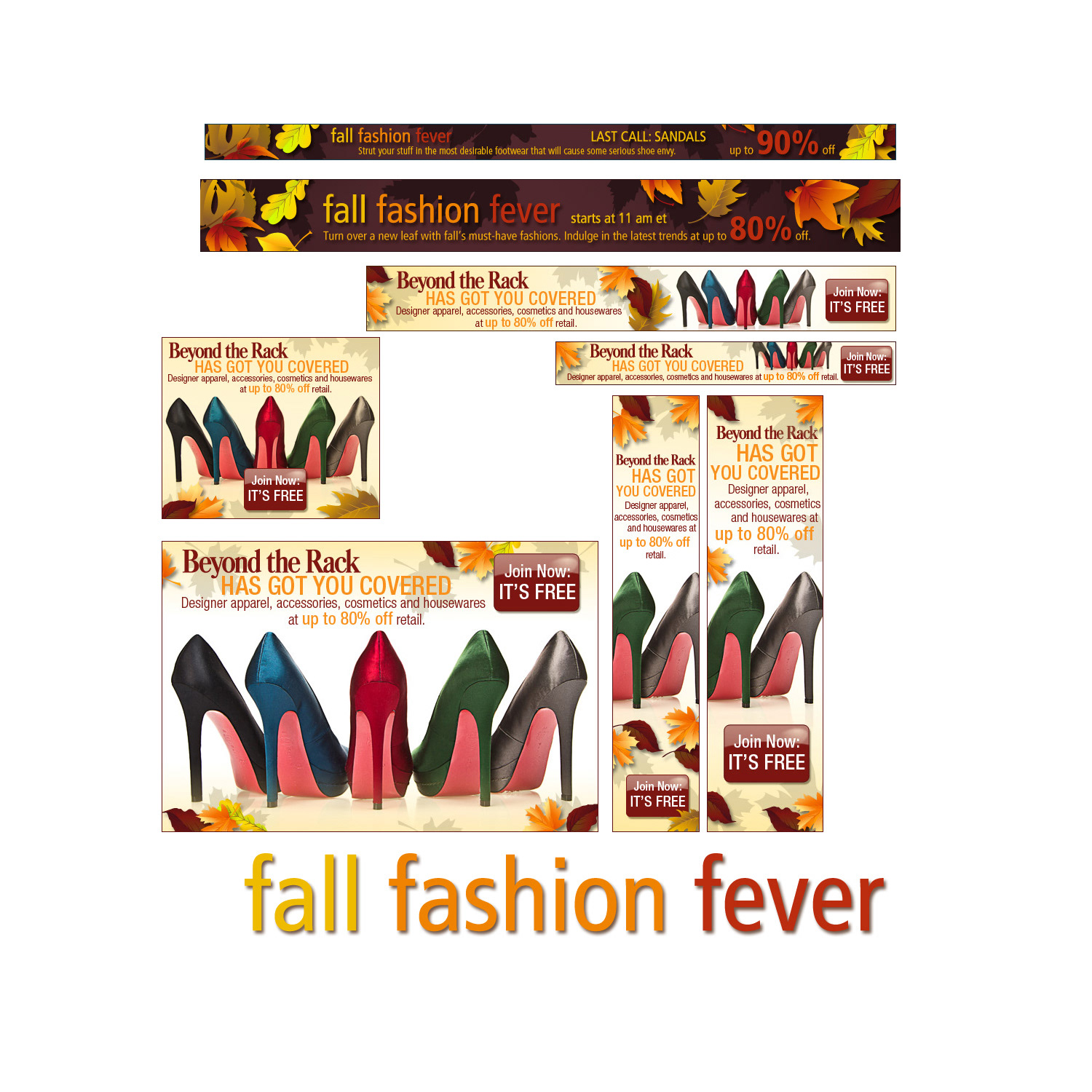
The “Fall Fashion Fever Campaign” showcased the full depth of my seasonal fashion design expertise, creating a cohesive visual narrative that perfectly captured the essence of autumn elegance, warmth, and timeless style. Drawing inspiration from the rich colours of changing leaves, cozy textures, and the sophisticated mood of fall, I curated a complete suite of campaign assets that brought the brand’s autumn collection to life in an aspirational and emotionally resonant way.
I meticulously selected a luxurious seasonal colour palette featuring deep burgundies, warm terracottas, burnt oranges, rich golds, soft taupes, and forest greens—each shade thoughtfully chosen to mirror the natural beauty of autumn foliage while evoking comfort, luxury, and sophistication. Intricate patterns, layered textures, and refined motifs were strategically integrated to add depth and tactile appeal, while elegant typography choices—combining classic serifs with modern sans-serif accents—reinforced the campaign’s polished, high-fashion aesthetic.
Every element was intentionally placed and balanced to guide the viewer’s eye, build anticipation, and create a compelling story around the collection. The resulting visuals not only highlighted key pieces and styling details but also connected deeply with fashion enthusiasts, inspiring them to embrace the season’s trends with confidence and style. The campaign stood out in the competitive fall fashion market through its harmonious blend of creativity, strategic design principles, and emotional storytelling.
This project demonstrates mastery in fall fashion campaign design, seasonal branding creative, autumn-inspired visual storytelling, rich colour palette development for fashion, intricate pattern & texture integration, sophisticated typography strategy, high-end fashion marketing assets, and cohesive promotional design for luxury and lifestyle retail brands.
SOCIAL MEDIA DESIGN
Social Media Aesthetics Management
Consistent Visual Identity & Aesthetic Direction for Corporate Social Media Channels
Social Media Aesthetics Management
Consistent Visual Identity & Aesthetic Direction for Corporate Social Media Channels
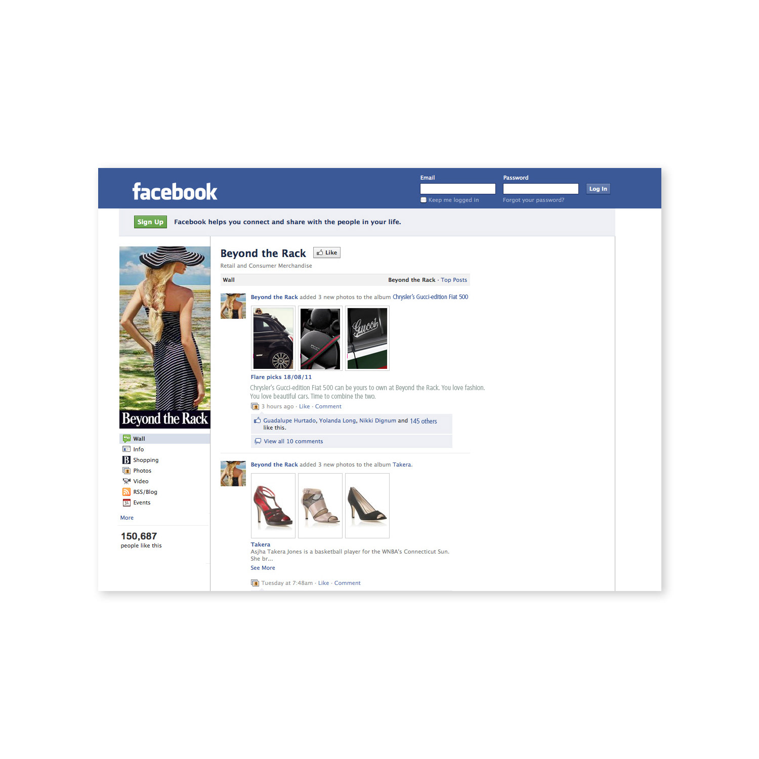
I managed the complete visual aesthetics and brand presentation for the corporate Facebook and Twitter (now X) accounts, ensuring every post, cover image, profile photo, banner, and graphic aligned perfectly with the company’s established identity. This role involved overseeing the day-to-day look and feel of the channels, maintaining strict visual consistency in colour palettes, typography, imagery style, tone, and overall design language across all content.
Through careful curation and strategic planning, I developed and enforced guidelines that kept the feeds polished, professional, and instantly recognizable, reinforcing brand trust and credibility with followers. My approach included creating or approving branded templates for promotional posts, announcements, event graphics, quote cards, infographics, and engagement visuals, while adapting designs to each platform’s best practices and dimensions for optimal display and impact.
This hands-on management of corporate social media aesthetics resulted in a cohesive, high-quality online presence that strengthened brand recognition, supported marketing objectives, and contributed to sustained audience growth and engagement on both Facebook and Twitter/X.
This work highlights expertise in corporate social media aesthetics, Facebook page branding, Twitter/X profile management, visual consistency across platforms, branded social media graphics, social media template design, digital brand guidelines enforcement, and ongoing aesthetic direction for professional business accounts.
CAMPAIGN DESIGN
Energetic Summer Campaign Design
Vibrant Seasonal Art Direction & Branding
Energetic Summer Campaign Design
Vibrant Seasonal Art Direction & Branding
The “Summer Kicks Campaign” showcased my art direction expertise in capturing the vibrant, energetic essence of summer while creating a compelling brand experience that resonated deeply with the target audience. I led the creative vision, drawing inspiration from the season’s warmth, freedom, and excitement to craft a cohesive visual narrative that perfectly aligned with the campaign’s goals of engagement, excitement, and connection.
I curated a dynamic colour palette inspired by sun-kissed beaches, golden sunsets, tropical skies, and fresh summer vibes—featuring bright corals, electric blues, sunny yellows, crisp whites, and energetic accents—to evoke feelings of joy, vitality, and carefree adventure. These hues were harmonized with bold, modern typography choices and layered graphical elements that added movement and depth. Dynamic imagery—featuring action shots, lifestyle scenes, and seasonal motifs—was strategically integrated to immerse viewers in the summer spirit and highlight key products or promotions.
Every design decision, from layout composition to visual hierarchy and thematic consistency, was intentionally crafted to reinforce the campaign’s core message and create an immersive, scroll-stopping experience across digital channels, social media, email marketing, banners, and supporting assets. The result was a highly engaging campaign that not only captured the true essence of summer but also elevated brand visibility, fostered emotional connections with consumers, and drove measurable interaction and participation.
This project demonstrates mastery in summer campaign design, seasonal art direction, vibrant colour palette development, dynamic visual storytelling, energetic branding creative, sun-kissed aesthetic strategy, high-engagement promotional visuals, and cohesive multi-channel marketing for lifestyle, retail, and e-commerce brands.
ADVERTISEMENT DESIGN
Air Canada In-Flight Magazine Full-Page Ad
Premium In-Flight Print Advertising
Air Canada In-Flight Magazine Full-Page Ad
Premium In-Flight Print Advertising
I designed a full-page advertisement featured in Air Canada's in-flight magazine, delivering a high-impact visual experience to thousands of captive passengers during their flights. The campaign focused on elevating Air Canada brand exposure while promoting the Aeroplan eStore with an exclusive offer: earn double Aeroplan miles on qualifying purchases.
The ad was crafted to blend seamlessly with the premium, travel-inspired aesthetic of the in-flight publication, using elegant typography, high-resolution imagery, bold yet sophisticated color palettes, and clear, compelling calls-to-action. Strategic layout choices ensured maximum readability in a magazine format, highlighting the Aeroplan eStore's benefits, featured partners, and the limited-time double miles incentive to motivate immediate engagement and conversions.
This project demonstrates expertise in in-flight magazine advertising, airline print ad design, loyalty program promotion creatives, Aeroplan eStore marketing, full-page magazine layout, travel brand advertising, rewards and incentives campaigns, and premium print collateral for aviation and hospitality industries.
PRINT DESIGN
Comprehensive Vendor Reference Guide
Streamlined 12-Step Onboarding Process in Branded Print & Digital Interactive Formats
Comprehensive Vendor Reference Guide
Streamlined 12-Step Onboarding Process in Branded Print & Digital Interactive Formats
I designed and produced a complete 12-step vendor onboarding guide that serves as the definitive reference resource for new vendors partnering with the organization. This essential document outlines every stage of the onboarding process with clarity, structure, and professionalism, helping vendors quickly understand requirements, timelines, compliance standards, communication protocols, and best practices.
The guide was created in two complementary formats to maximize accessibility and usability: a high-quality printed piece for tangible, in-person reference during meetings or training sessions, and a fully interactive PDF optimized for digital distribution. The interactive version includes clickable table of contents, internal hyperlinks for easy navigation between steps, expandable sections, bookmarks, searchable text, and responsive layout for seamless viewing on desktop, tablet, and mobile devices.
Throughout the design, I maintained strict brand consistency by applying the company’s typography system, colour palette, logo usage rules, and visual language, ensuring the guide feels like an official extension of the brand from the first page. Clean information hierarchy, intuitive icons, numbered step-by-step layouts, and clear callouts make complex information approachable and easy to follow, reducing questions and accelerating vendor integration.
This project demonstrates expertise in vendor onboarding guide design, 12-step process documentation, reference manual creation, print-to-interactive PDF hybrid production, branded internal collateral, information design for compliance & training, step-by-step guide layout, and user-friendly reference materials for corporate, supply chain, and partnership programs.
CORPORATE FORMS DESIGN
Professional Corporate Forms
Dual-Format Design for Print, Online Fillable PDF & Fax Compatibility
Professional Corporate Forms
Dual-Format Design for Print, Online Fillable PDF & Fax Compatibility
I designed a complete suite of corporate forms that serve as essential business tools in both physical and digital environments. These forms were created to support seamless internal and external workflows, ensuring usability across traditional print and modern digital channels.
The forms exist in two fully compatible formats: high-quality printed pieces for in-office use, mailing, or physical filing, and interactive fillable PDFs optimized for online completion, digital signatures, saving, emailing, or direct fax transmission. The interactive PDF version includes clickable form fields, dropdown menus, checkboxes, radio buttons, date pickers, and auto-calculations where appropriate, with responsive layout that maintains perfect readability and functionality on desktop, tablet, and mobile devices.
Throughout the design process, I maintained strict brand consistency by applying the company’s official typography, color palette, logo placement, and visual hierarchy rules. This ensures every form—whether printed or digital—reinforces professional credibility and brand recognition. The forms were engineered for maximum usability, with clear labeling, logical field sequencing, generous spacing, and intuitive instructions to minimize errors and speed up completion.
This project demonstrates expertise in corporate forms design, fillable PDF form creation, print-to-digital hybrid documents, interactive business forms, fax-compatible form layout, branded office forms, Adobe Acrobat & InDesign for forms, and user-friendly documentation solutions for companies, HR, finance, legal, and administrative departments.
CAMPAIGN DESIGN
Top Buyer Reward Art Direction & Branding
High-Engagement Reward Campaign
Top Buyer Reward Art Direction & Branding
High-Engagement Reward Campaign
As art director for the “Shopaholic Showdown” Top Buyer Reward Campaign, I led the creative vision and execution, designing a dynamic and visually compelling program that celebrated and incentivized the brand’s most loyal and high-value customers. The campaign was built to stand out in a competitive e-commerce landscape, blending creativity with strategic intent to drive deeper engagement, strengthen loyalty, and motivate continued spending.
I curated a distinctive visual identity for the campaign, incorporating bold yet brand-aligned graphics, innovative layouts, high-energy imagery, and cohesive design elements that evoked excitement, exclusivity, and achievement. Every asset—from promotional banners, social media posts, email sequences, landing page visuals, and winner announcements—was meticulously crafted to resonate with the target audience of passionate shoppers, creating an immersive experience that made participants feel recognized and rewarded.
Through precise art direction, I ensured all elements harmonized perfectly with the brand’s aesthetic while amplifying the campaign’s core message of competition, reward, and community. The result was a standout reward initiative that not only captured attention but also fostered long-term customer loyalty, increased repeat purchases, and reinforced the brand as a go-to destination for dedicated shoppers.
This project highlights expertise in top buyer reward campaign design, loyalty program art direction,
e-commerce engagement creatives, high-impact promotional graphics, cohesive campaign branding, strategic visual storytelling, shopper-focused marketing visuals, and reward-based promotional design for retail and online fashion brands.
e-commerce engagement creatives, high-impact promotional graphics, cohesive campaign branding, strategic visual storytelling, shopper-focused marketing visuals, and reward-based promotional design for retail and online fashion brands.
CAMPAIGN DESIGN
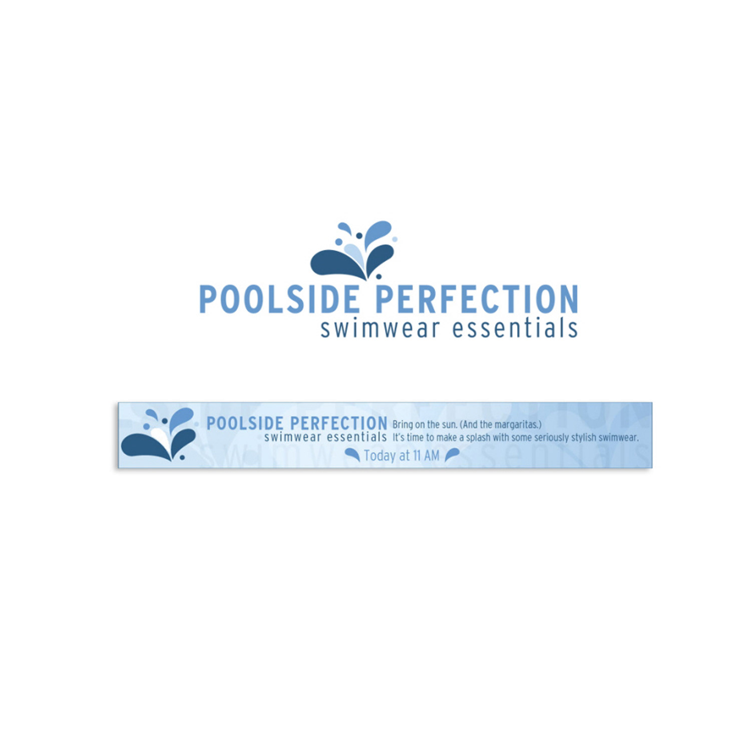
Poolside Perfection Campaign
Luxury Poolside Branding & Art Direction
Poolside Perfection Campaign
Luxury Poolside Branding & Art Direction
The “Poolside Perfection Campaign” highlighted my art direction expertise in creating a luxurious, aspirational brand experience centred on the ultimate poolside lifestyle. I led the creative vision, orchestrating a seamless blend of aesthetics and strategic intent to encapsulate the sophistication, relaxation, and timeless allure of poolside elegance.
I curated a refined, cohesive colour palette featuring cool aquas, crisp whites, sun-drenched golds, soft corals, and tropical accents—each hue carefully selected to evoke freshness, serenity, and high-end leisure. These colours were paired with evocative, high-quality imagery of pristine pools, luxurious loungers, sparkling water reflections, and stylish details that transported viewers into an idyllic summer escape. Every visual element, from typography choices and layout composition to graphical motifs and texture overlays, was meticulously directed to harmonize perfectly, building an immersive ambiance that resonated deeply with the target audience’s desires for refinement, exclusivity, and effortless sophistication.
Through precise art direction, the campaign captured attention instantly while stirring emotions of aspiration, indulgence, and escape. The result was a memorable, impactful brand presence that elevated the client’s offerings, strengthened emotional connections, and positioned the brand as the definitive choice for luxury poolside living.
This project demonstrates mastery in poolside campaign design, luxury lifestyle branding, art direction for summer promotions, evocative imagery curation, cohesive colour palette strategy, aspirational visual storytelling, high-end leisure marketing creatives, and immersive brand experiences for hospitality, fashion, travel, and premium retail brands.
CAMPAIGN DESIGN
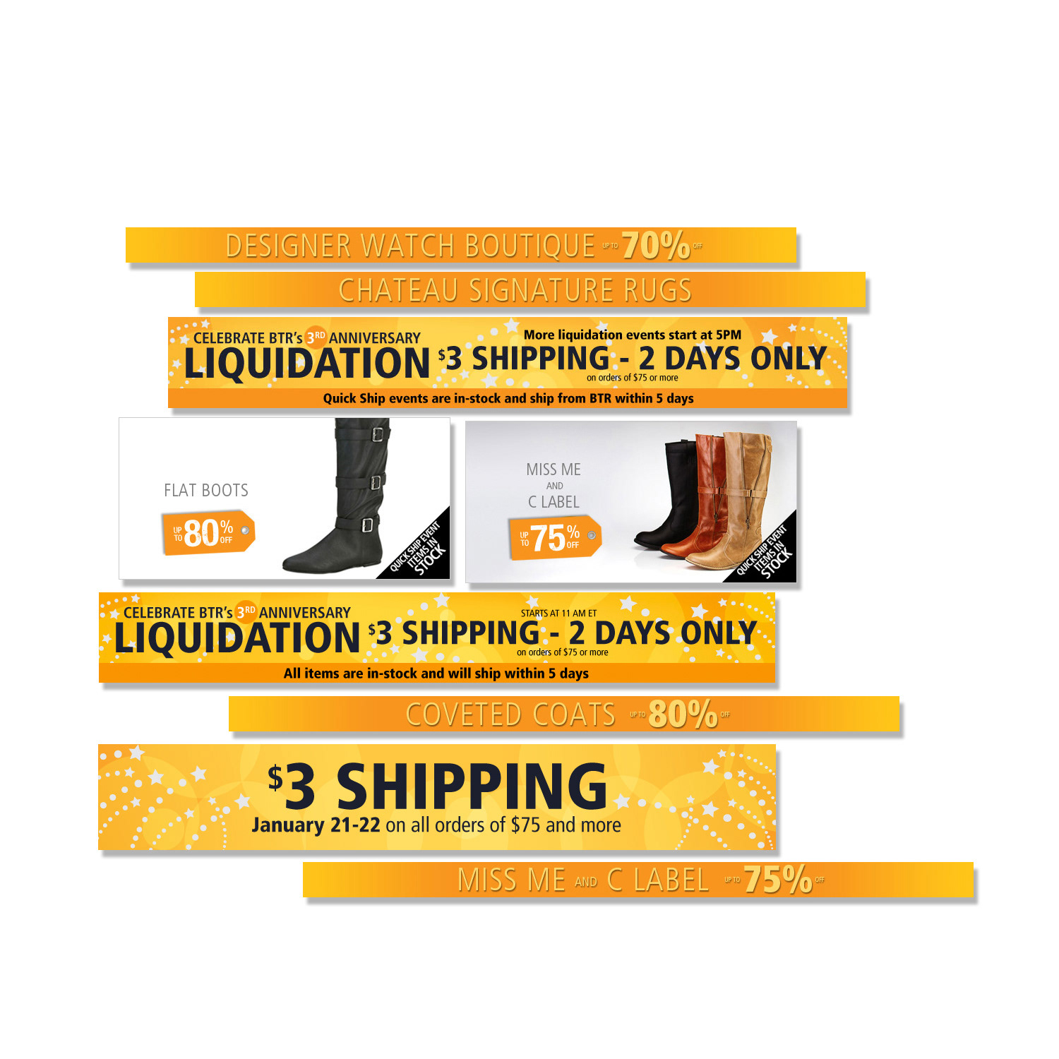
High-Impact Liquidation Flash Sale Design
Creative Assets & Art Direction
High-Impact Liquidation Flash Sale Design
Creative Assets & Art Direction
As lead creative for the Liquidation Campaign, I directed the full development of specialized, high-energy marketing assets tailored to maximize urgency and conversions during time-sensitive 24-hour flash sales. Collaborating closely with copywriters, programmers, and the broader marketing team, I conceptualized and produced essential site components that formed the backbone of each liquidation event, ensuring rapid execution while delivering standout visual impact.
I created distinctive promotional logos, curated bold and thematic colour schemes, selected high-contrast typography systems, and developed versatile, reusable banner templates optimized for website headers, product pages, email campaigns, and social media placements. These assets were intentionally designed to communicate clearance urgency, value, and exclusivity—key drivers in liquidation-style promotions—while maintaining seamless alignment with the overall brand identity.
Through strategic process improvements, I established scalable creative frameworks that enabled efficient asset production, smooth cross-channel integration, and operational agility under tight daily deadlines. These initiatives not only supported flawless campaign delivery but also laid a strong foundation for business expansion, accelerated growth, and consistent performance in the competitive fast-fashion and e-commerce liquidation space.
This work demonstrates expertise in liquidation campaign design, 24-hour flash sale creatives, clearance sale branding, custom promotional logo development, urgency-driven color scheme strategy, typography for high-impact promotions, reusable banner template systems, multi-channel asset production, and scalable creative leadership for e-commerce and retail brands.
CAMPAIGN DESIGN
Marketing Design & Promotional Graphics
Custom Campaign Assets Driving Participation, Excitement & Brand Interaction
Marketing Design & Promotional Graphics
Custom Campaign Assets Driving Participation, Excitement & Brand Interaction
I created a complete suite of campaign marketing assets for a high-profile sweepstakes promotion, designed to generate buzz, maximize entries, and strengthen brand affinity. The project required fast-paced, attention-grabbing visuals that communicated the prize value, entry process, rules, and deadlines with clarity and excitement while maintaining full brand consistency across all touch-points.
The assets included eye-catching social media graphics, promotional banners for website and email integration, dedicated landing page visuals, entry form styling, teaser posts, countdown timers, winner announcement templates, and supporting print/digital collateral. Each piece was strategically crafted with bold typography, vibrant yet on-brand colour palettes, compelling imagery, and clear calls-to-action to evoke urgency, joy, and aspiration—key psychological drivers for sweepstakes success.
The campaign visuals were optimized for multi-channel performance, ensuring seamless display on desktop, mobile, social feeds, email clients, and paid ads. This cohesive approach helped boost participation rates, increase shareability, extend organic reach, and create memorable brand moments that encouraged long-term audience loyalty.
This work demonstrates expertise in sweepstakes campaign design, contest marketing assets, promotional graphic creation, giveaway branding, entry form & landing page visuals, social media contest graphics, urgency-driven promotional design, multi-channel campaign creative, and high-engagement seasonal or event-based marketing for e-commerce, retail, and lifestyle brands.
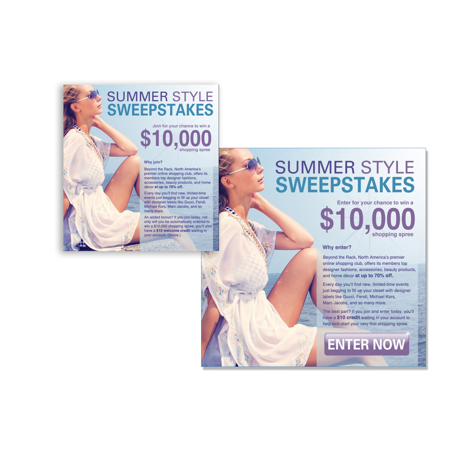
CAMPAIGN DESIGN
Indoor & Outdoor Summer Living Campaign
24-Hour Flash Sale Campaign Design
Indoor & Outdoor Summer Living Campaign
24-Hour Flash Sale Campaign Design
I led the strategic creative development and execution for the “Indoor & Outdoor Summer Living Campaign,” reimagining daily specials as high-energy 24-hour flash sales that celebrated versatile summer lifestyles. Working in close collaboration with copywriters, programmers, and the marketing team, I conceptualized and produced a full suite of essential site assets tailored to drive urgency, excitement, and conversions during peak seasonal shopping periods.
For each daily promotion, I crafted distinctive thematic logos that captured the essence of indoor relaxation and outdoor adventure, harmonized vibrant yet cohesive color palettes inspired by summer sun, fresh greens, cool blues, and warm neutrals, selected strategic fonts for readability and impact, designed intuitive custom icons, refined typography systems for consistency, and created versatile banner templates optimized for website headers, product pages, email blasts, and social media. These assets were intentionally built to evoke the carefree spirit of summer living while maintaining strong brand alignment across all touch-points.
To support rapid scaling and operational efficiency, I engineered streamlined creative processes that enabled fast asset iteration, seamless integration into the e-commerce platform, and scalable production under tight daily deadlines. These frameworks not only facilitated flawless campaign execution but also laid a robust foundation for business expansion, sustained growth, and consistent performance in the competitive seasonal retail space.
This project demonstrates expertise in summer campaign design, daily flash sale creatives, indoor outdoor lifestyle branding, custom promotional logo development, seasonal colour palette strategy, typography & icon design for promotions, reusable banner template systems, multi-channel asset production, and scalable creative processes for e-commerce and retail brands.
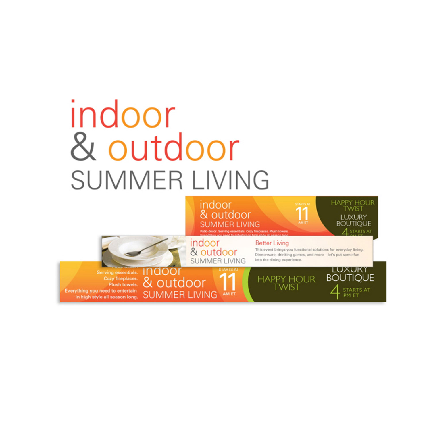
CAMPAIGN DESIGN
Happy Hour Twist Campaign
Daily Flash Sale Branding & Creative Assets
Happy Hour Twist Campaign
Daily Flash Sale Branding & Creative Assets
I directed the full creative development and execution of the “Happy Hour Twist Campaign,” a high-energy daily flash sale initiative built around the playful tagline “Twist the Hour, Elevate the Power.” The campaign transformed everyday shopping moments into exciting limited-time events, driving urgency, participation, and conversions through consistent, on-brand visuals.
Working closely with copywriters, programmers, and the marketing team, I conceptualized and crafted all essential site assets for each 24-hour promotion. This included designing distinctive thematic logos that captured the campaign's fun, empowering spirit, harmonizing vibrant yet cohesive colour palettes, selecting strategic fonts for maximum readability and impact, creating intuitive custom icons, refining typography systems for visual flow, and developing adaptable banner templates optimized for website headers, product pages, email blasts, and social media placements.
To ensure long-term scalability and operational excellence, I spearheaded the design and implementation of structured creative processes that streamlined asset production, enabled seamless cross-channel integration, and supported rapid daily execution under tight deadlines. These frameworks not only delivered flawless campaign performance but also strengthened the foundation for business expansion, enhanced team efficiency, and sustainable growth in the competitive e-commerce flash sale space.
This work highlights expertise in daily flash sale campaign design, 24-hour promotion creatives, custom logo development for seasonal campaigns, branded colour palette & typography strategy, icon & banner template systems, multi-channel asset production, creative process optimization, and high-volume promotional branding for retail and e-commerce brands.
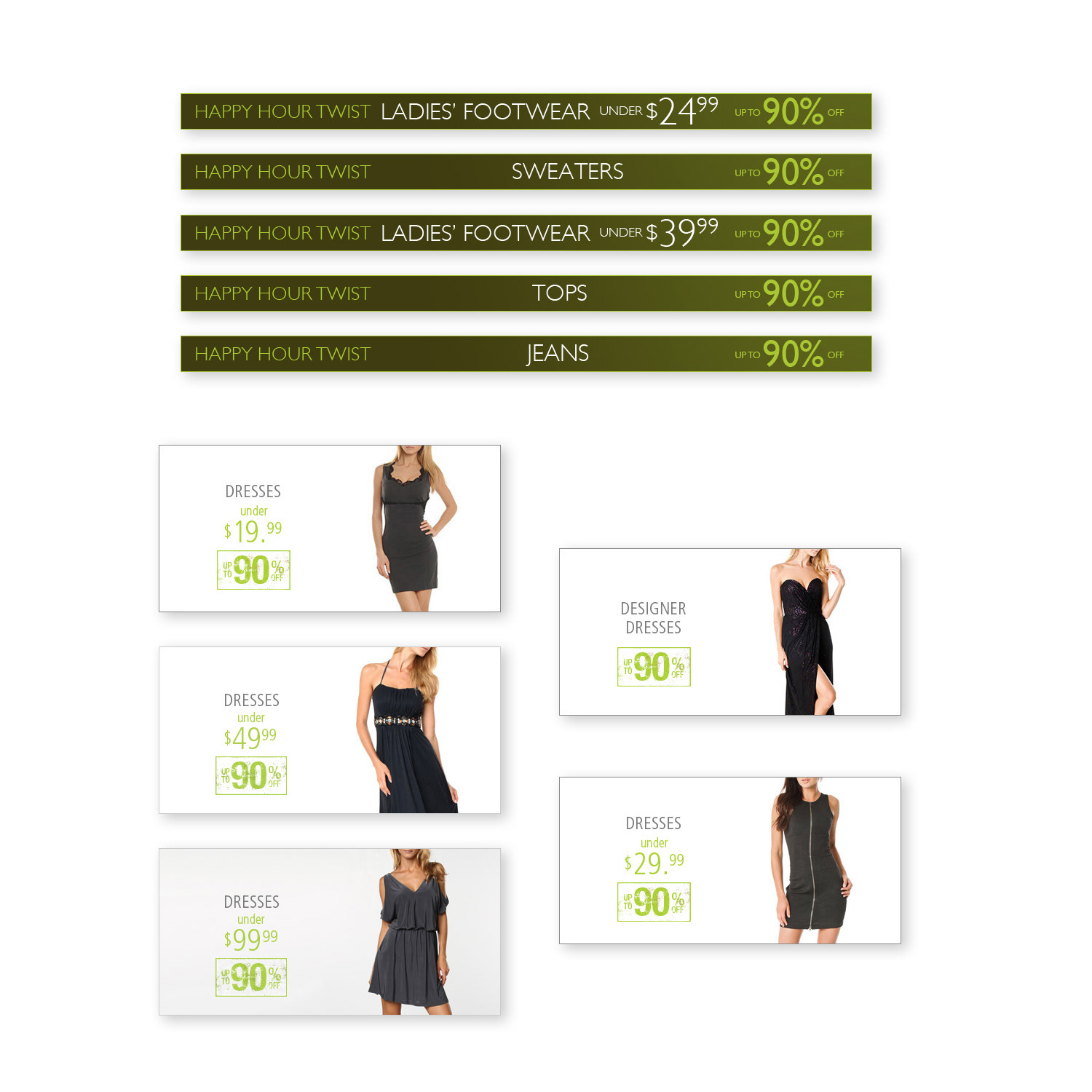
CAMPAIGN DESIGN
Bold & Beautiful Campaign
Vibrant Campaign Celebrating Unapologetic Beauty
Bold & Beautiful Campaign
Vibrant Campaign Celebrating Unapologetic Beauty
The “Bold & Beautiful Campaign” served as a powerful celebration of audacity, vibrancy, and unapologetic beauty, where my art direction expertise drove the creation of a visually striking and boundary-pushing brand experience. I orchestrated a true visual symphony that intentionally broke from conventional norms, embracing fearless design choices to inspire confidence and challenge traditional perceptions of beauty.
I curated an intense, high-contrast colour palette featuring electric jewel tones, deep blacks, fiery reds, vivid magentas, and metallic accents—each hue selected to evoke strength, energy, and individuality. These bold colours were paired with striking, high-impact visuals, dynamic compositions, layered textures, and powerful graphic elements that commanded attention and stirred deep emotional responses. Every aspect of the campaign, from typography choices and layout rhythm to imagery selection and motif integration, was meticulously directed to create a cohesive narrative that empowered the audience and celebrated diverse expressions of beauty.
The result was a standout, memorable campaign that not only captured immediate attention in a saturated market but also fostered genuine inspiration, self-assurance, and emotional connection. Through innovative art direction, the campaign successfully redefined beauty standards, positioning the brand as a champion of bold, inclusive, and confident self-expression.
This project demonstrates mastery in bold beauty campaign design, audacious branding creative, high-contrast colour palette strategy, dynamic visual storytelling, unapologetic fashion & lifestyle marketing, striking graphic compositions, empowering art direction, and boundary-pushing promotional design for inclusive beauty, fashion, wellness, and self-expression brands.
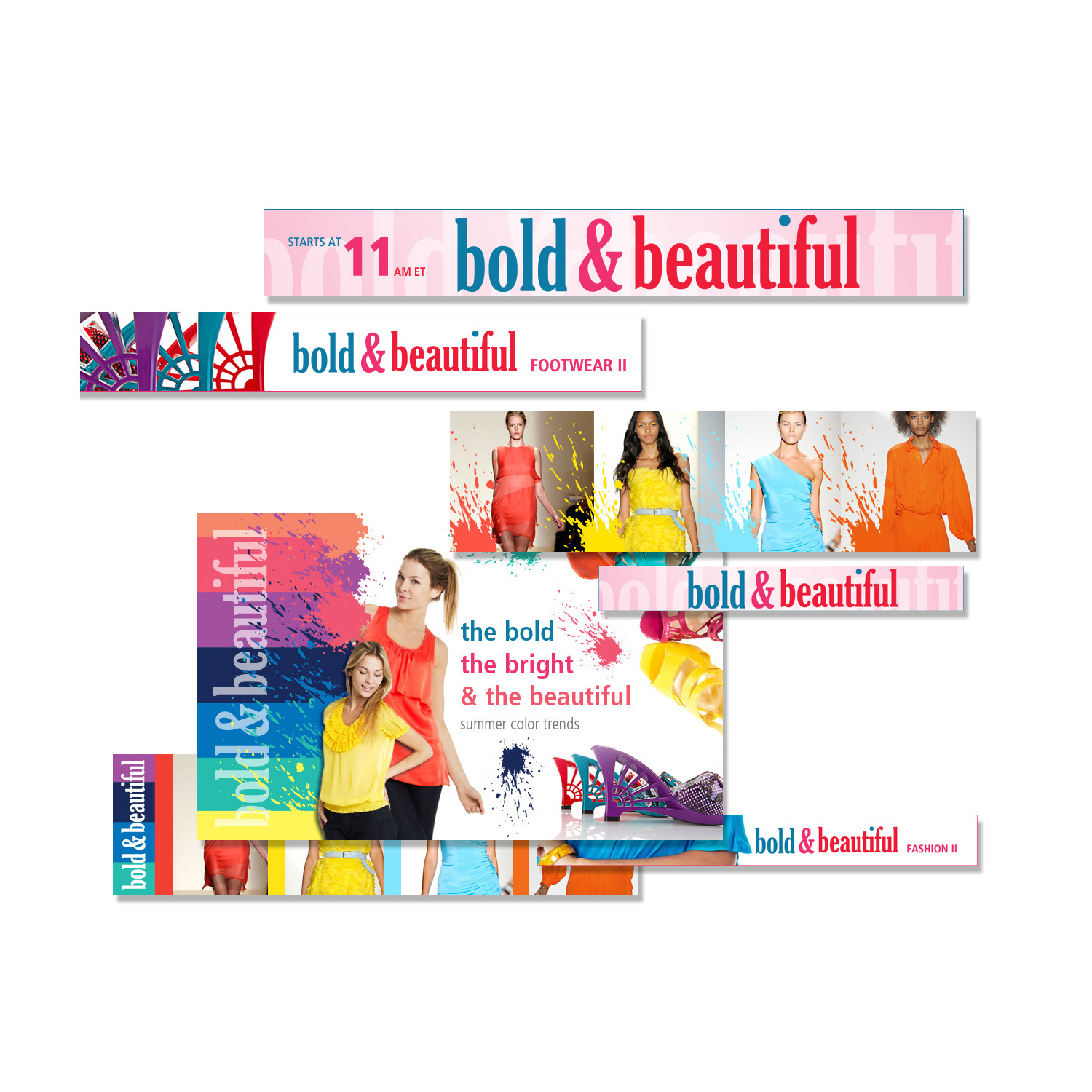
CAMPAIGN DESIGN
Heavy Metal Campaign
Art Direction & Genre-Specific Branding
Heavy Metal Campaign
Art Direction & Genre-Specific Branding
The “Heavy Metal Campaign” showcased my art direction expertise in translating the raw power, grit, and rebellious spirit of heavy metal music into a visually intense and authentic brand experience. Drawing inspiration from iconic album covers, complex metalwork craftsmanship, and the genre's unapologetic energy, I crafted a cohesive visual narrative that perfectly captured the passion, intensity, and distinctiveness of heavy metal culture.
I embraced a moody, high-contrast aesthetic featuring deep blacks, charcoal greys, and midnight blues as the foundation, layered with striking metallic accents—chrome silvers, brushed gunmetals, burnished golds, and fiery copper tones—to evoke the tactile shine of stage lights on instruments and armour-like details. Intricate designs, including engraved-style patterns, spiked motifs, chain links, and distressed textures, were meticulously integrated to add depth and authenticity, while bold, aggressive typography choices reinforced the genre's edge and attitude.
Every element was thoughtfully curated to resonate deeply with heavy metal enthusiasts, creating an immersive visual world that felt genuine, powerful, and instantly recognizable. The campaign successfully bridged musical identity with brand storytelling, delivering graphics, promotional assets, social media visuals, and supporting materials that stood out in the music, lifestyle, and apparel space.
This project demonstrates mastery in heavy metal campaign design, genre-specific branding, metallic accent visual strategy, dark & intricate art direction, rock music marketing creatives, high-contrast aesthetic development, rebellious visual storytelling, and authentic promotional design for music, subculture, and alternative lifestyle brands.
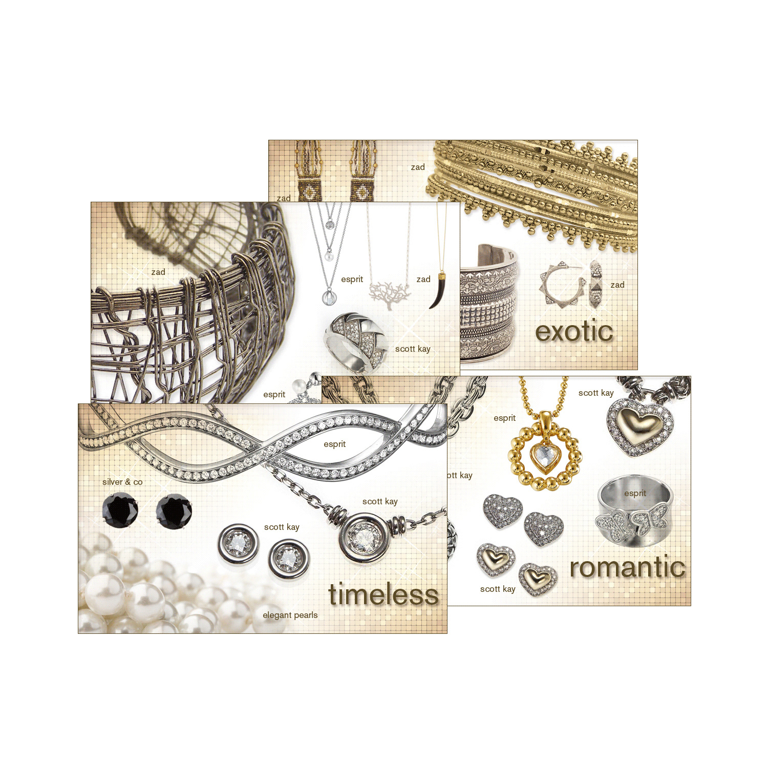
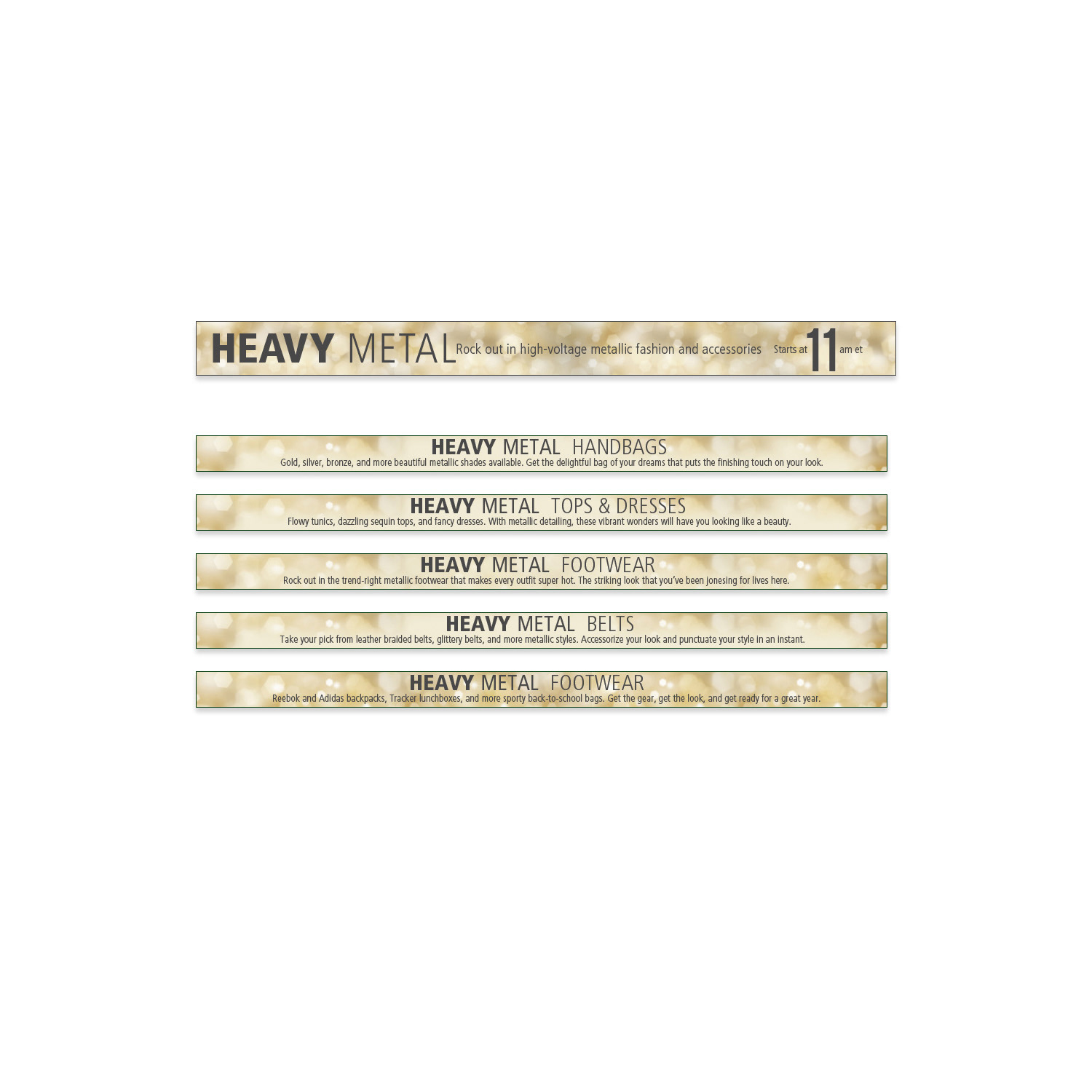
CAMPAIGN DESIGN
Full Figured & Fabulous Campaign
Empowering Logo & Visual Identity
Full Figured & Fabulous Campaign
Empowering Logo & Visual Identity
The “Full Figured & Fabulous Campaign” represented a meaningful creative endeavour focused on empowerment, body positivity, and authentic self-love. As lead designer, I developed a custom logo that beautifully captured the campaign's core message of confidence, strength, and inclusive beauty for women of all shapes and sizes.
The logo design masterfully combined bold, assertive typography with graceful, elegant curves—symbolizing both inner resilience and feminine grace. This thoughtful fusion created a powerful visual metaphor that speaks directly to the audience, conveying unapologetic confidence while remaining approachable and uplifting. The selected colour palette radiated vibrancy, warmth, and inclusivity, featuring rich jewel tones, soft pastels, and energetic accents that celebrate diversity and evoke joy, vitality, and representation.
Every element—from letterform proportions and kerning to colour harmony and symbolic details—was meticulously curated to resonate deeply with the target demographic, serving as a beacon of inspiration and a strong visual anchor for the entire campaign. The logo not only amplified the message of empowerment and self-love but also fostered genuine emotional connection, positioning the campaign as a champion of body positivity and authentic representation in the fashion, wellness, and lifestyle space.
This project demonstrates expertise in body positive branding, empowerment logo design, inclusive campaign creative, bold typography for women's campaigns, vibrant & diverse colour palette development, self-love visual storytelling, feminine strength symbolism, and meaningful design for diversity-focused marketing initiatives.